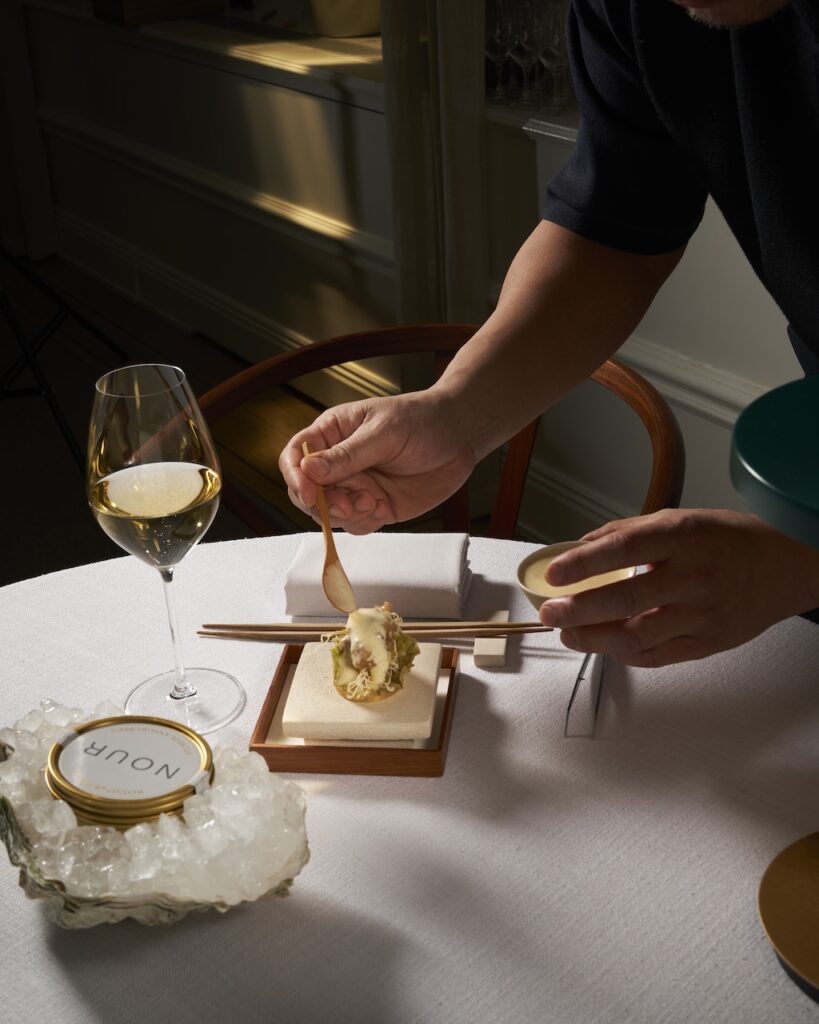
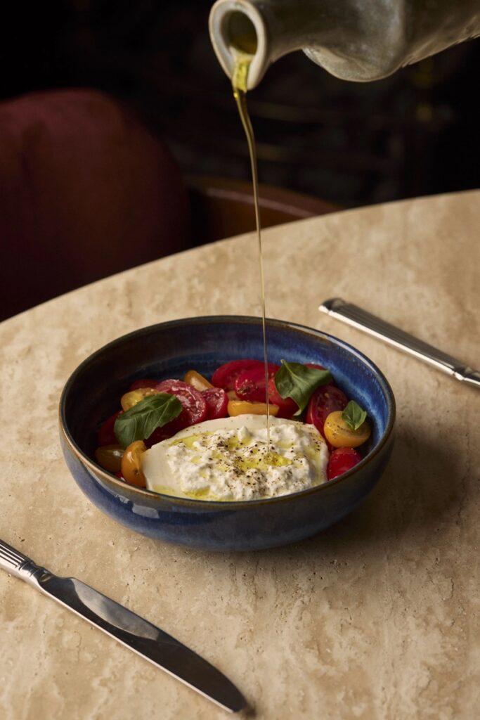
Author name: Saskia Clarke

Travel, Uncategorized

Not Just a Renovation: The Reinvention of Sheraton Stockholm

Not Just a Renovation: The Reinvention of Sheraton Stockholm images courtesy Sheraton  Sheraton Stockholm is in the middle of a transformation that goes far beyond new carpets and fresh paint. It’s a rethink of purpose, identity and relevance; a shift from being a global chain outpost to becoming a place with a point of view.    In this conversation, Elin Roquet reflects on why a traditional renovation would have been too small a gesture, how “A Journey Towards the Light” became the guiding principle for every decision, and what it takes to lead a long, complex redesign without losing momentum.    The result is a hotel aiming to feel less like a brand template and more like a lived‑in, confident part of Stockholm’s rhythm.     What convinced you that Sheraton Stockholm needed a full transformation rather than a traditional renovation? Because a cosmetic update would have been dishonest. The problem was never the surface, it was relevance. The city had moved forward. The hotel had stayed put. At that point, changing the carpets isn’t enough. You have to question the whole thing. What are we actually for, and why would anyone choose us tomorrow?   How would you describe the identity you’re shaping for the “new” Sheraton Stockholm? International in feel, local in confidence. Not sterile luxury, something more lived-in. Where it feels just as natural to stop by for a glass of wine as it does to check in for a week. Less “global chain”, more someone’s beautifully considered home.   What does “A Journey Towards the Light” mean to you in practical terms? It’s a filter for everything. Light shapes how we think about materials, movement, how we meet the guest. Less heavy, less closed, more air. In practice, it means removing friction. Anything that feels dark, complicated or unnecessary gets cut.   What did you consciously decide to leave behind? The idea of being “for everyone” in a way that makes you relevant to no one. And anything generic — that feeling of being interchangeable with a hotel in any other city.   Part of what drove that decision is that luxury and premium have been applied so broadly and so indiscriminately across the global hospitality market that the labels have genuinely lost their meaning. When everything is five-star, nothing is. The lifestyle segment matters more than ever right now precisely because it’s the space where taste, curation and personality still carry weight. That’s where we want to operate. When you walk into the renovated rooms, what detail tells you the design is working? When it feels quiet in the right way. Not literally, mentally. When the room doesn’t ask anything of you and you land without needing to adjust, rearrange or think. That’s when you know the proportions, the light and the materials are right.   Can you point to a moment where you had to make a difficult trade-off? Several. But the clearest one was how far to open up the public spaces. Design-wise, you want to dissolve every boundary. Operationally, you need control. We had to find a balance that still feels free but actually works on a Saturday night when every seat is taken.   What moment in this transformation most tested you as a leader? The middle. Not the beginning, when everything is possibility, and not the end, when you can see the finish line, but the middle, when it’s still far away and everyone is tired. That’s where leadership is actually decided.   How do you sustain energy in a team going through something this long and complex? By being very clear about why we’re doing it. People can handle more than you think, but only if they understand what they’re building. And you have to actually celebrate progress along the way, because otherwise it just feels like an endless construction site with no horizon. Can you share a moment where Marriott’s global standards and Scandinavian hospitality philosophy pulled in different directions? It happens more than you’d think. Marriott is built on structure and recognition, while Scandinavian hospitality is more intuitive and understated. A concrete example is the level of formality in how we meet guests. We’ve pushed it toward the personal, even when that means stretching the framework a little.   What role do you want Sheraton Stockholm to play in the city’s cultural and social life? I want it to be part of the city’s rhythm. A place where things happen but without feeling like they’re trying to, where you end up by chance and stay longer than you planned. If we get it right, people won’t think of it as “the hotel”. They’ll think of it as “where we go”.   How are guest expectations changing? People are more sophisticated now and they see through anything built on autopilot. Correct service isn’t enough anymore, it has to feel like something. We’ve shifted from optimizing processes to curating experiences. Less standard, more point of view.   What do you hope guests will still remember ten years from now? A feeling rather than a specific detail. That it was somewhere they felt at ease without quite being able to explain why. And maybe a night at the bar that ran a little longer than planned.   If you had to describe the future Sheraton Stockholm in one sentence? A place that Stockholm didn’t know it was missing, until now.

Beauty Articles

MERIT: Where Minimalism Meets Modern Skin Care

MERIT : Where Minimalism Meets Modern Skin Care As a makeup artist, I’m constantly drawn to products that don’t just perform—but simplify the entire experience. MERIT is one of those brands that keep me interested. Since its launch in 2021, it has built its identity around a clear philosophy: makeup should be effortless, intuitive, and enhance the skin rather than cover it. The aesthetic is clean, modern, and rooted in a “less is more” approach.  Many of the products are multifunctional, vegan, and designed to fit into a minimal routine. It’s everyday makeup with a refined, elevated feel—something I value both personally and in my work with clients. Their newest launch, The Uniform – a tinted lightweight mineral sunscreen has quickly become a staple in my kit. Formulated with non-nano zinc oxide, it delivers mineral broad-spectrum (UVA/UVB) protection. What I love most is how it feels on the skin. It gives a very sheer, even coverage that lets the skin show through, it looks alive and very natural. And the SPF 50 is a major plus – sun protection is non-negotiable. The texture is smooth and breathable, almost like a second skin. It delivers a healthy glow without feeling greasy or heavy, and importantly, it doesn’t leave that typical SPF film on the surface. On days when I want a bit more coverage, it builds beautifully without ever looking heavy. The shade range is thoughtfully designed, making it easy to match a wide variety of skin tones—something that’s essential in my work. With 20 shades to choose from, it offers enough flexibility and nuance for nearly everyone to find a match. What keeps me drawn to MERIT is their consistent philosophy: skin first, makeup second. Everything is designed to create a fresh, modern look that feels as good as it looks. And for me, who loves skincare, this fits perfectly. The Uniform is the perfect reflection of that—effortless, skin-focused, and exactly what modern beauty should be. By Sanna Image courtesy of Merit 

Opiates

Topologie x Maison MIHARA YASUHIRO

Topologie x Maison MIHARA YASUHIRO Launch Early Morning Inspired Collection  Topologie and Maison MIHARA YASUHIRO (MMY) are collaborating on a capsule collection that takes inspiration from early mornings: those quiet hours before the rest of the world is up. The partnership mixes MMY’s deconstructed style with Topologie’s focus on function, resulting in bold, playful pieces that reflect both brands’ Japanese design heritage. The collection combines MMY’s playful Banana, Soft Serve, and Toothpaste designs with Topologie’s Wares System™ bags, straps, and phone accessories. These familiar motifs get reimagined with a surrealist twist, adding bold visuals and a sense of fun to everyday carry wares. A key innovation of the collection is the detachable handle components that expand the Wares System™. Users can swap handles to transform the look and feel of each piece, adding new levels of customisation.   The Topologie x Maison MIHARA YASUHIRO capsule collection launches exclusively at the Topologie Hyundai Pop-up in Seoul from 16–22 April 2026. Hong Kong launch follows on 1 May at topologie.com, our K11 Art Mall Store and Hysan Place Store.

BackStage

CHANEL CRUISE 2026/27 SHOW IN BIARRITZ – BEAUTY BACKSTAGE

CHANEL CRUISE 2026/27 SHOW IN BIARRITZ – BEAUTY BACKSTAGE SKINCARE: Apply a small amount of SUBLIMAGE L’EXTRAIT DE NUIT to the cheeks, forehead and neck. With both hands, smooth over the face from the centre outwards. For the neck, follow your jawline.   Apply SUBLIMAGE LA CRÈME TEXTURE UNIVERSELLE and perform: Le geste sublime radience: bend the fingers and massage from the centre of the face outwards in a wide circular motion.   For an extra touch of pampering, apply SUBLIMAGE L’EXTRAIT HUILE LÈVRES occasionally throughout the day. The golden metal applicator fits the shape of the lips perfectly and delivers just the right amount for an immediate feeling of comfort.   Apply SUBLIMAGE LA BRUME under or over makeup. Spray on each side of the face, followed by the forehead. With closed hands, help the product absorb by using your knuckles to apply light upward pressure to the face, working from the centre outwards. COMPLEXION: Apply LES BEIGES WATER-FRESH COMPLEXION TOUCH using the 2-IN-1 FOUNDATION BRUSH FLUID AND POWDER N°101.   Correct any imperfections on the face with ULTRA LE TEINT LE CORRECTEUR using the RETRACTABLE DUAL-ENDED CONCEALER BRUSH N°105 where needed.   Apply LES BEIGES HEALTHY GLOW BRONZING CREAM under the cheekbones, blending along the hollow of the cheek, from the inside to the outside of the face with the RETRACTABLE KABUKI BRUSH N°108.   Pick up a small amount of BAUME ESSENTIEL – Sculpting or BAUME ESSENTIEL – Scintillement (depending on your skin tone) with a brush or fingertips, then apply with light touches to the tops of the cheekbones for a fresh and luminous result. Gently tap to blend the product into the skin. EYES: Apply BAUME ESSENTIEL – Sculpting over the entire mobile eyelid, gently tapping with your fingers, then blending with the CONTOUR SHADER BRUSH N° 203. EYEBROWS:  Redefine your brow line using the STYLO SOURCILS HAUTE PRÉCISION, then brush them upward. LIPS:  Apply ROUGE COCO FLASH – 280 Sweet directly onto the lips with the bullet, in a single motion.    

Opiates

MAIN ROSE launches Swim campaign with Zara Larsson

MAIN ROSE launches Swim campaign with Zara Larsson For MAIN ROSE, summer isn’t defined by the calendar, it’s an attitude. That ethos takes center stage in the brand’s new Swim collection, an extension of co founder and creative director Zara Larsson’s vibrant, sun drenched world. Rooted in the idea of “first layer” dressing, pieces worn closest to the body yet designed to be seen, the collection blends expressive design with confident silhouettes. Think scoop and triangle bikini tops with metal accents, high cut swimsuits reminiscent of Baywatch, and a mix of Brazilian and tie side bottoms that emphasize movement and form. Visually, the line draws from Larsson’s signature aesthetic, leopard and python prints softened through a dreamy lens, paired with bold hues of red, pink, and citrus. The result is both playful and self assured, capturing the essence of long, luminous summer days. Function meets personality throughout the collection. Each piece is created to move effortlessly from water to stage to everyday life, while optional charms add a customizable, lighthearted detail. The campaign, shot by Charlotte Rutherford just outside Miami, leans into a cinematic underwater narrative. It begins with stillness, Larsson floating alone at sea, before descending into a surreal, hyperreal dreamscape that mirrors the collection’s immersive mood. Launching April 22 on mainrose.com, the Swim collection offers sizes XS to XXL, with prices ranging from €30 to €70.

Opiates

New Balance Grey Days 5k Run with Sound Curation by Empetre

New Balance Grey Days 5k Run This May, New Balance brings its global Grey Days initiative to Stockholm through Grey Days 5k Run with sound curation by empetre – a community moment where running, music and coffee culture come together in one shared space. Grey Days is New Balance’s annual celebration of the color grey, originally introduced in the 1980 as a functional choice for urban running and now one of our most recognizable design expressions. The color continues to embody New Balance’s dedication to craft, quality, and fearless independence, in every field.  On May 1, New Balance will launch The Grey Shop in our stores and on newbalance.com, highlighting the classic shade across footwear and apparel released thourghout the month. The assortment ranges from timeless classics to new silhouettes across both running and lifestyle (see details below). This year’s campaign offers an invitation into the world of grey, brought to life by a cast of New Balance athletes and ambassadors including Sydney McLaughlin-Levrone, Darius Garland, Marvin Harrison Jr., and Andrew Reynolds. From Aminé raising the Grey Days flag in celebration to Quincy Wilson narrating “The Origins of Grey,” each individual lends their own authentic personality to the campaign, united by the unwavering foundation of grey.  The Stockholm event takes place on May 2, starting with a 5k social run at an easy pace through central Stockholm, led by run leaders from our local New Balance community. After the run, the energy moves in-store for a post-run moment featuring DJ sets by DJ Carli, Alexi and Femme Fatale Selection, along coffee and snacks in collaboration with Balue Stockhom. Sign up here Image courtesy of New Balance 

Art

BALENCIAGA ARTEAN – EDUARDO CHILLIDA

BALENCIAGA ARTEAN – EDUARDO CHILLIDA From April 21 to 26, 2026, in parallel with Milan’s Salone del Mobile, Balenciaga presents a special installation within its Via Montenapoleone flagship, inaugurating a new artistic chapter for the house. Conceived by Creative Director Pierpaolo Piccioli, the project marks the first time Balenciaga engages a major artist through a dedicated, ongoing platform.  Titled Artean, the series takes its name from the ancient Basque language, where the word signifies “between.” The term suggests a space of connection, an interval where disciplines, ideas, and histories intersect. In this context, Artean becomes both concept and framework, establishing a dialogue between art and fashion while subtly echoing linguistic associations with the word “art” itself. For its inaugural edition, the house turns to the work of Eduardo Chillida, presenting seven pieces by the celebrated artist within the store environment. Some of these works directly reference Cristóbal Balenciaga, founder of the house, extending a conversation that began decades earlier and remains resonant today. Installed among the current collections, the works invite an encounter where sculpture and garment coexist, each informing the perception of the other.   Piccioli frames the project as an exploration of art’s emotional and intellectual capacity. For him, art operates not only as a cultural expression but as a generator of energy, curiosity, and thought. His decision to foreground Chillida’s work in Milan is rooted in a personal connection to the artist’s philosophy, as well as in a desire to reconnect with the Basque heritage that underpins the house. Through this installation, that lineage is made visible, offering visitors a space where memory and modernity converge . The relationship between Chillida and Balenciaga dates back to their shared origins in the Basque region. The sculptor was first introduced to the couturier through his grandmother, Juana Eguren Jáuregui, a hotelier in San Sebastián, the city where Balenciaga opened his first store. It was later in Paris, where both men had relocated, that they met in person. By that time, each had established himself as a leading figure in his respective discipline. Their exchange revealed a mutual sensitivity to form, particularly in their approach to volume and space. For Balenciaga, volume shaped the body, while for Chillida, volume articulated space itself.   BALENCIAGA MILAN FLAGSHIP 23 Via Montenapoleone 20121 Milan Italy Image courtesy of BALENCIAGA 

Scroll to Top