Author name: Ulrika Lindqvist

Design

Historiska Hem and Toniton Look to Stockholm’s Past for a New Colour Palette

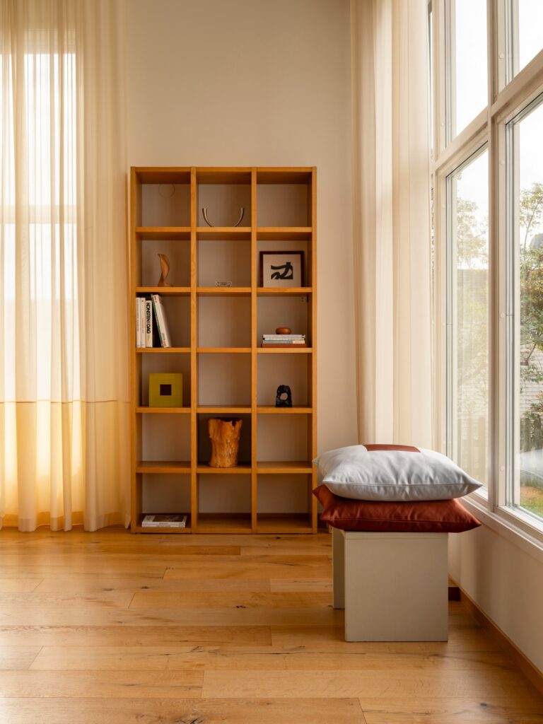
Historiska Hem and Toniton Look to Stockholm’s Past for a New Colour Palette images courtesy of Historiska Hem & Toniton What if the colours of Stockholm’s historic homes could be gathered into a single palette? This autumn, Historiska Hem and Swedish colour and design studio Toniton present a collection of 18 carefully selected shades, drawn from the architecture, interiors and changing light of the city. The collaboration brings together two distinct approaches to colour. Historiska Hem has spent years documenting Stockholm’s older homes, revealing the details that give them their character, from original joinery and painted ceilings to natural materials, intricate mouldings and the particular way Nordic light moves through a room. Toniton approaches colour as a system, creating considered palettes and colour coordinated products designed to allow walls, surfaces and interiors to exist as a coherent whole. For Historiska Hem, colour has always been part of the story. Since its founding, the agency has developed a distinctive way of presenting homes. Working closely with writers, photographers and set designers, each property is treated almost like an editorial feature. Architecture, materials, light, colour and original details are carefully observed and brought together to reveal the character of a place. It is an approach that has helped shift attention towards the qualities of older architecture, celebrating what remains rather than disguising it. Colour plays an important role in that process. A carefully chosen shade can emphasise an architectural detail, bring warmth to a material or give an old room an entirely new atmosphere without erasing its history. The new collection grows directly from this experience. Together, Historiska Hem and Toniton have revisited a vast number of colours and gathered the shades that have appeared repeatedly throughout the homes the agency has worked with over the years. The resulting palette moves between muted and expressive tones, inspired by painted woodwork, ceilings, natural materials and the shifting qualities of Scandinavian daylight. Rather than being tied to a particular period, the colours are intended to feel both rooted and contemporary. They can be used individually or layered together, creating tonal interiors, gentle contrasts or more unexpected combinations. Walls, ceilings and woodwork become part of the same composition. The paint itself is equally central to the collaboration. Toniton’s ecological, plastic free formula uses natural pigments, giving each colour a depth that responds to the light around it. As the day changes, so does the appearance of the shade, bringing a sense of movement to what might otherwise be a static surface. For Katarina Ljung, founder of Historiska Hem, this return to colour is also a return to a more expressive way of thinking about interiors. “Historically, our homes were often much more colourful than they are today. Colour was used to create atmosphere, with ceilings, woodwork, mouldings and walls painted in shades that gave rooms character and depth. I find that incredibly inspiring. Taking colours and details from the past and using them in new ways, especially in unexpected combinations, can completely transform a space. I hope this collection will inspire more people to be a little bolder and have more fun with colour.” There is something distinctly Stockholm about the palette, but its appeal lies in the fact that it does not attempt to recreate the past. Instead, it looks at the city’s architectural history as a source of ideas. The colours feel collected rather than prescribed, shaped by the thousands of homes that have passed through Historiska Hem’s hands. “What if Stockholm’s walls could talk? Inspired by the thousands of homes that Historiska Hem has represented over the years, we have selected the shades that work best with different types of light, materials and spaces. The result is a palette where the colours are just as beautiful on their own as they are together, while the natural pigments give each shade a living quality that changes with the daylight.” The collection ultimately offers more than a selection of paint colours. It is a way of looking at the city through its interiors, tracing the relationship between colour, architecture and everyday life. In these 18 shades, Stockholm’s past becomes something to live with again, interpreted through a contemporary eye and allowed to change with the light.
News

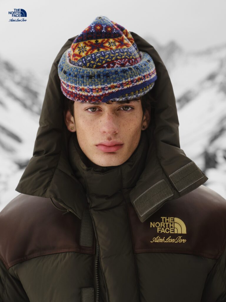
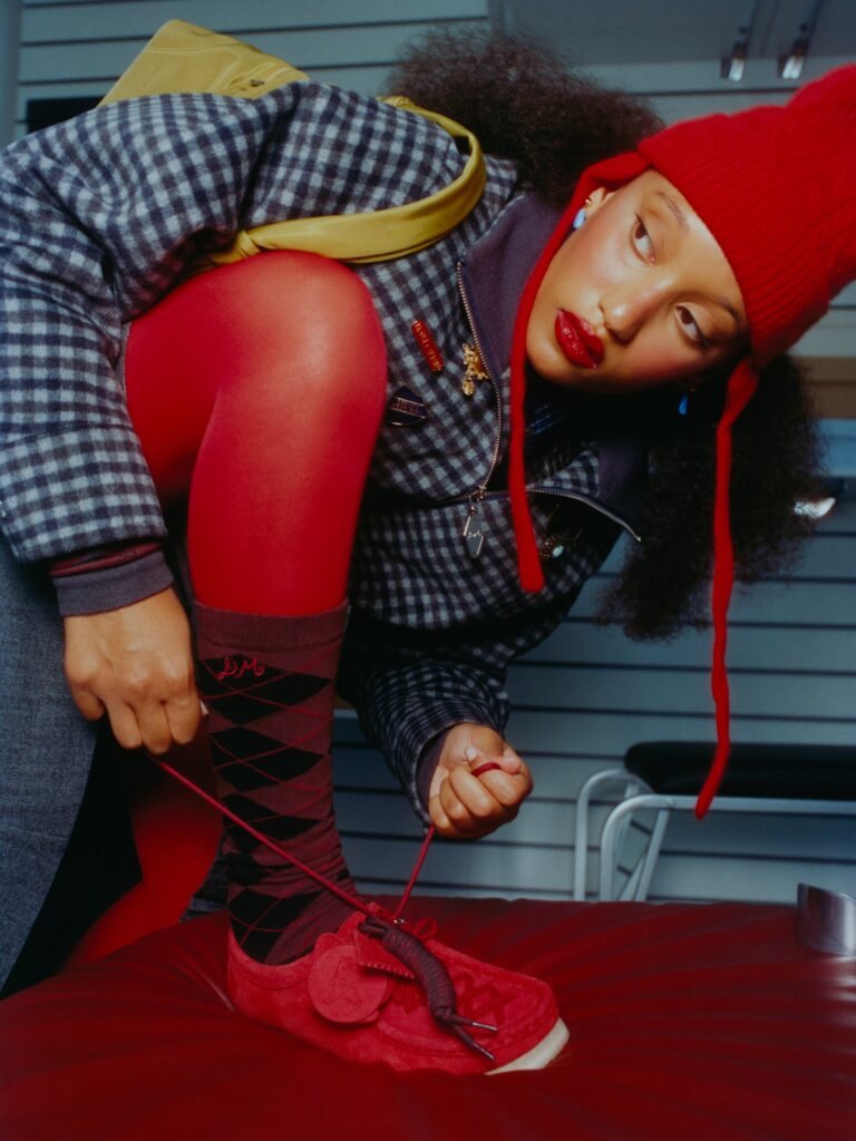
When Birkenstock Meets Etro: Paisley, Fringe and a New Take on the Everyday Icon

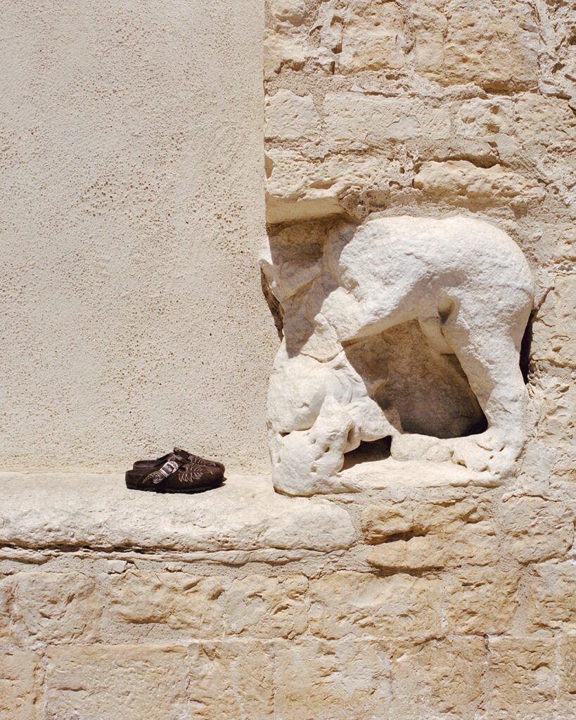
When Birkenstock Meets Etro: Paisley, Fringe and a New Take on the Everyday Icon Birkenstock and Etro bring two distinct design languages together in a collaboration where utilitarian icons meet Italian maximalism. There is something particularly compelling about a familiar object seen through an entirely different lens. For its latest collaboration, Birkenstock has invited Italian fashion house Etro to do exactly that—taking two of its most recognisable silhouettes and dressing them in the richly textured world of Etro. First revealed during Etro’s Fall/Winter 2026 runway show in Milan, the collaboration has now arrived worldwide, marking a meeting of two heritage houses whose approaches may differ, but whose appreciation for craftsmanship and enduring design runs deep.At the centre of the first chapter are two Birkenstock icons: the Boston clog and the Gizeh sandal. The timing feels particularly fitting for the Boston, which celebrates its 50th anniversary in 2026. First introduced in 1976, the enduring clog has become a fixture far beyond its original functional roots. Here, it is transformed through Etro’s unmistakable visual vocabulary.The Gizeh, meanwhile, brings a lighter silhouette to the collection. Originally introduced in 1983, the thong sandal is reworked in premium suede and supple nappa leather, providing a canvas for the collaboration’s more intricate details. And there are plenty of them. Etro’s iconic paisley is woven throughout the collection, appearing alongside embroidery, rich textures and long, flowing fringe. Western-inspired buckles introduce a sense of ornamentation, while exclusive Pegasus-branded rivets provide another unmistakable Etro signature. Yet beneath the decoration, Birkenstock’s philosophy remains intact. Each style is built around the brand’s anatomically shaped cork-latex footbed, wrapped in tonal leather. It is this balance between comfort and craftsmanship that keeps the collaboration grounded: Etro brings its decorative language, while Birkenstock retains the functional foundation that has defined its footwear for decades. Even the soles have been given the collaborative treatment. Birkenstock’s characteristic bone-pattern tread is reimagined with Etro’s paisley motif, turning a usually overlooked detail into a signature of the partnership. The colour palette keeps things quietly sophisticated. Taupe and chocolate provide a warm, earthy foundation, while polished hardware and metallic accents bring a sharper, contemporary finish. It is maximalism approached with restraint—a collection where the details do much of the talking. The first Birkenstock by Etro chapter is available globally from September 10, 2026. With further chapters promised in the months ahead, the collaboration leaves the door open for more unexpected encounters between Birkenstock’s functional icons and Etro’s richly expressive world. For now, the message is clear: the everyday sandal has entered a more decorative era. images courtesy of Birkenstock

Opiates

Gant x Yale: Returning to New Haven, where Ivy League style began

Gant x Yale: Returning to New Haven, where Ivy League style began Some fashion stories are built around a moment. Others are built around a place. For Gant, that place is New Haven. In 1949, the brand first found its footing on the campus of Yale University, when the Yale Co op became the first retailer to carry Gant’s innovative button down shirts. It was the beginning of a relationship that would help shape the visual language of American Ivy style, and one that now comes full circle with an exclusive multi season partnership between Gant and Yale. Rather than simply looking back, Gant x Yale explores what Ivy style means today. Across multiple collections, the collaboration draws on the archives and traditions of both the brand and the university, bringing collegiate dressing into a contemporary context while preserving the codes that made it so enduring. For Fall 2026, classic Ivy League references are given a fresh perspective. Traditional tailoring meets heritage fabrics, varsity inspired silhouettes are reworked with modern proportions, and vintage inspired lettering adds a distinctly collegiate character. The result is a collection that feels rooted in American sportswear while remaining relevant to a new generation. The menswear offering brings together some of the most recognisable elements of Ivy dressing, from Letterman knitwear and tailored tweed blazers in premium British wool to Italian cotton chinos and signature Oxford shirts. Wool corduroy suits and a leather varsity jacket add a more relaxed, distinctly American edge. For womenswear, familiar Ivy staples are reinterpreted with a more contemporary attitude. A hand stitched pinstripe club blazer, leather pleated skirt, varsity inspired outerwear, heavyweight ruggers and classic cardigans capture the balance between collegiate tradition and modern dressing. The campaign was photographed on the historic Yale campus in New Haven, returning the collection to the place where Gant’s story first began. Against the university’s distinctive architecture and iconic collegiate surroundings, the images reflect not only the clothes, but the cultural legacy behind them. There is something particularly fitting about Gant returning to Yale. The relationship between the brand and the institution is part of the history of American fashion itself, when the Ivy League campus became a place where a new approach to dressing was taking shape. Gant was there at the beginning, helping turn the button down shirt and other collegiate staples into enduring symbols of American style. Today, Gant x Yale is less about recreating that past than understanding why it continues to resonate. It is a conversation between archive and now, tradition and reinvention, campus life and contemporary culture. The Gant x Yale capsule collection is available in select Gant stores, on gant.com and through select wholesale partners. images courtesy of Gant

Design

LAYERED Meets Collina Strada in an Expressive Dialogue Between Fashion and Interiors

LAYERED Meets Collina Strada in an Expressive Dialogue Between Fashion and Interiors photography  Ryan Petrus What happens when the irreverent spirit of New York fashion finds its way into the home? Today, LAYERED and Collina Strada unveil the result of their new collaboration, bringing together colour, craftsmanship and a distinctly individual point of view. There is little about Collina Strada that could be described as conventional. Founded by Hillary Taymour, the New York fashion house has spent more than a decade cultivating a world that is playful, instinctive and wonderfully unpredictable. Now, that world extends beyond clothing and into the realm of interiors, in a collaboration with Swedish design house LAYERED. The partnership marks a first for both brands. For LAYERED, best known for its hand tufted rugs, it is the brand’s first collaboration with a fashion designer. For Collina Strada, it signals a move into interiors, translating the label’s distinctive visual language into a collection for the home. Rather than simply transposing fashion into furniture and textiles, the collaboration considers how the emotional qualities of clothing can inhabit a room. The result is deliberately expressive, with pieces that resist the idea of interiors as a quiet backdrop and instead invite them to become part of the conversation. The collection comprises four hand tufted rugs and two sofas, drawing on Taymour’s characteristic use of colour and pattern. Shades of pink and green run throughout, while references to Collina Strada’s own history are woven into the designs. One rug takes its pattern directly from the floor of the brand’s New York flagship, while another echoes the distinctive check featured in its AW26 show. Elsewhere, two sculptural rugs take the form of oversized flowers, introducing a softer, more organic silhouette to the room. Their fluid shapes offer a playful counterpoint to the straight lines and familiar geometry of contemporary interiors, blurring the line between object and artwork. “In design, I am interested in creating tension between contrasting ideas: beauty and discomfort, fragility and strength, fantasy and realism. I believe fashion and design should evoke emotion and individuality rather than perfection.” – Hillary Taymour, Founder and Creative Director, Collina Strada That sense of spontaneity is carried through into the craftsmanship. Each rug is hand tufted by two to three textile artisans, with the process taking up to four days. The pile heights and edges are then cut by hand, preserving something of the freedom and irregularity of a fashion sketch. No two pieces are entirely alike, with subtle variations becoming part of their character. For LAYERED, the collaboration offered an opportunity to bring its expertise in traditional textile craftsmanship into dialogue with Collina Strada’s more instinctive approach to design. The result is a collection that feels considered without ever becoming overly polished. “We have long admired Hillary’s ability to create an immersive world where imperfection and complexity become irresistibly beautiful. Although we work within different fields, we share a deep appreciation for bold, tactile storytelling. By bringing Collina Strada’s visionary aesthetic together with our expertise, we have created a collection of striking statement pieces.” -Malin Glemme, Founder and Creative Director, LAYERED At its heart, the collection is a celebration of personality over perfection. It suggests an interior that is allowed to be expressive, unexpected and perhaps a little eccentric. A room does not have to be restrained to feel sophisticated, nor does design have to be serious to be considered. With LAYERED and Collina Strada, the language of fashion finds a new setting. The rug is no longer simply something beneath your feet. It becomes a focal point, a conversation starter and, ultimately, another way of dressing the room.

Opiates

ARKET Autumn/Winter 2026: Noticing Everyday Beauty

ARKET Autumn/Winter 2026: Noticing Everyday Beauty For Autumn/Winter 2026, ARKET turns its attention to the quiet beauty found in everyday life. Titled Noticing Everyday Beauty, the campaign explores a more considered way of looking, where subtle details, familiar rituals and fleeting moments become a reflection of what beauty can mean. Captured by Dudi Hasson, Adrian Levander and Daphne Terrasson, and starring models Iselin Steiro and Badhiel Lony Nyang, the campaign brings the season’s collections into focus through a delicate balance of energy and ease. Garments, objects and food come together to create an intimate portrait of contemporary living, revealing the design language behind ARKET’s Autumn/Winter collections. Across the imagery, expansive natural landscapes meet the tactile richness of wool knitwear, shearling, leather and crisp shirting. The contrast creates a quiet conversation between the natural world and the rituals of everyday life, highlighting the beauty that exists in both. The campaign also unfolds through a series of short films in which Steiro and Nyang share their personal perspectives on beauty. For Steiro, it can be found in nature and in the act of recognising what is already there. Nyang finds it in kindness, connection and community. Together, their reflections offer a gentle reminder that beauty does not always demand attention. Sometimes, it simply asks us to notice. Find the collection here      images courtesy of Arket

Opiates

& Other Stories Fall 2026: A New Perspective on the Season

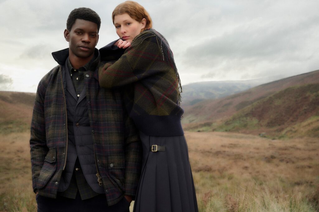
& Other Stories Fall 2026: A New Perspective on the Season Charismatic, contrasting and unapologetically expressive, Fall 2026 offers a fresh interpretation of the changing season. Rooted in the energy of city life, the collection draws on design influences from across decades, bringing together references from different eras to create a wardrobe that feels distinctly contemporary. The result is a confident and considered collection designed for movement, reinvention and personal expression. Layering takes centre stage, with pieces intended to be mixed, adapted and styled according to the individual. Rather than prescribing a singular way of dressing, the collection leaves room for instinct, spontaneity and the unexpected. “This season is about individuality and creative freedom. The collection is inspired by the energy of women living their lives in the city and their instinctive approach to dressing throughout the day, from work to evening and all the moments in between. With a focus on investment pieces, characterful textures and considered details, the collection is designed to be styled with spontaneity and ease. It encourages a sense of confidence that leaves room for unexpected combinations,” says Gabriella Cullhed, Collection Designer. Find the collection here  photography Oliver Hadlee Pearch

Opiates

Leni Klum Becomes the Face of FOREVER GUESS, Celebrating the Many Dimensions of Modern Femininity

Leni Klum Becomes the Face of FOREVER GUESS, Celebrating the Many Dimensions of Modern Femininity Leni Klum steps into the spotlight as the face of FOREVER GUESS, bringing a new sense of confidence, individuality and self expression to the brand’s iconic G logo. Inspired by the glamour, drama and unapologetic energy of 1990s soap operas, the campaign unfolds as a cinematic series of four distinct stories. At the centre of each is Klum, effortlessly embodying a series of modern female archetypes while showcasing the versatility of the FOREVER GUESS collection and its ability to transform with every new expression of identity. Created by Nicolai Marciano, the campaign continues GUESS’s long standing tradition of creating visually striking imagery with a strong cultural presence. At the same time, it reflects a new generation of women whose identities are fluid, multifaceted and entirely their own. Throughout the campaign, the FOREVER GUESS G logo becomes more than a recognisable brand signature. Reappearing across the collection and within each character’s story, it becomes an emblem of personal style, confidence and individuality. “FOREVER GUESS is about celebrating individuality and the freedom to express every side of yourself. Leni embodies this idea naturally by taking on different characters while remaining completely authentic. Through each story, the FOREVER GUESS G logo becomes a symbol of confidence, attitude and the evolution of what GUESS represents today.” -Nicolai Marciano, Chief New Business Development Officer Find the collection here  all images courtesy of GUESS

Fashion Articles

ATP Atelier x Tretorn: Design for All Weather

ATP Atelier x Tretorn: Design for All Weather ATP Atelier and Tretorn bring together two distinct design identities in a new collaboration shaped by Scandinavian weather, city life and a shared belief in thoughtful design. Combining Tretorn’s technical expertise with ATP Atelier’s refined approach to craftsmanship and proportion, the collection explores how beauty and function can coexist. text by Ulrika Lindqvist  Ulrika Lindqvist: Congratulations on the collaboration! How did the idea of bringing ATP Atelier and Tretorn together first come about?  Maj-La Pizzelli: The collaboration felt very natural from the beginning. Tretorn has an incredible heritage in functional outerwear, while ATP Atelier has always been about refined everyday essentials. What brought us together was a shared belief that good design should genuinely improve everyday life. Since the beginning, ATP Atelier has challenged the traditional idea of luxury. For us, luxury isn’t about excess, it’s about creating thoughtful, beautifully crafted products that combine function, longevity and timeless design. That’s what we call smart luxury – a philosophy that felt naturally aligned with Tretorn’s heritage and values. UL: How did the creative process differ from developing collections for your own brand? Were there any new perspectives or challenges that came from designing together? Carl-Henrik Hallén: Working on a collection with another brand always challenges you in a positive way because you need to define what each brand brings to the table, and how these two identities can be weaved together. Instead of starting from a blank page, we began with two strong identities that needed to complement rather than compete. MLP:  It was an inspiring process of combining Tretorn’s technical expertise with our Scandinavian approach to proportion, materials and design. We constantly asked ourselves how to make each piece feel both beautifully refined and genuinely purposeful, because to us, thoughtful design should never ask you to choose between beauty and function. UL: For ATP Atelier, this marks your first venture into outerwear. What was that experience like, and what did you want to bring to this category? MLP:  Outerwear felt like a very natural extension of our universe. We’ve always designed products that accompany women through everyday life, and outerwear simply expands that wardrobe. Our ambition wasn’t to reinvent the raincoat, but to bring our perspective on silhouette, detailing and longevity into the category. We wanted to create pieces that perform beautifully while feeling refined – products people will want to wear season after season. UL: What inspired the collection, and what story or mood did you want it to convey? CHH: The collection is inspired by the unpredictability of Scandinavian weather and the rhythm of city life. Weather is something we all experience, yet we often see it as something to overcome. MLP:  The creative concept actually started with a simple observation: weather has a way of following us. Even when we’re indoors, it’s still part of our day, influencing how we dress, move and feel. That inspired the playful idea of bringing dramatic weather conditions into an office environment,  blurring the boundaries between inside and outside. There’s a subtle sense of humour to it, but it also reflects a very Scandinavian mindset: life doesn’t stop because the weather changes. CHH:  Ultimately, both the collection and the campaign celebrate the idea that thoughtful design can be both beautiful and purposeful. We wanted to create products that combine beauty with purpose – pieces that become lasting wardrobe favourites rather than seasonal statements. UL: Can you walk us through the design process? How did the collaboration evolve from the initial concept to the final pieces? CHH:  It was a very open and collaborative process. Rather than dividing responsibilities, we worked closely together from the very beginning, constantly challenging each other and refining every detail. MLP:  Tretorn brought deep technical expertise, while we contributed our perspective on design, proportion and craftsmanship. One of the most interesting outcomes was introducing natural hair-on cowhide into the collection – a material Tretorn had never used before, but a natural extension of ATP Atelier’s heritage of working with genuine leather. Because every hide is unique, no two products are exactly alike. It felt like a beautiful meeting between Tretorn’s technical expertise and ATP Atelier’s craftsmanship, bringing warmth, character and individuality to the collection. CHH:  The goal was never to create a compromise between two brands, but to create something that genuinely felt like the best of both. UL: Both ATP Atelier and Tretorn have distinct design identities. How did you balance those signatures while creating a collection that feels cohesive? MLP:  We never wanted one brand to overpower the other. Instead, we focused on the values we genuinely share. Tretorn brings decades of expertise in weather protection and technical innovation, while ATP Atelier contributes a refined design language rooted in craftsmanship, thoughtful design and enduring quality. The result is a collection where both identities remain recognisable, but together they create something neither brand would have designed on its own. UL: Looking ahead, what’s next for you? Are there any upcoming projects or ideas you’re particularly excited about? MLP:  We’re always interested in exploring new product categories and meaningful collaborations, but only when they feel authentic to who we are. This collaboration reflects the direction we’re taking as a brand. We’ll continue creating products that combine exceptional craftsmanship with thoughtful design, continuing to challenge the traditional idea of luxury through our philosophy of smart luxury. CHH: At Tretorn we’re continuing to explore what our weather protective products can look like, experiment with new materials and a more elevated design language. We’re entering our prime season with rain, wind and snow and we’re really excited about launching new beautiful products for this season.  The collection consists of five products: a tall boot, two ankle boots, an oversized rain trench coat, and a bowling bag and is released on september third.   

Art

RAVINEN Kulturhus – Where art meets the landscape

RAVINEN Kulturhus – Where art meets the landscape On the edge of the Bjäre Peninsula, where the horizon opens towards the sea, RAVINEN Kulturhus sits in quiet dialogue with its surroundings. More than a building for exhibitions, it is a place shaped by the landscape that surrounds it. Designed by Møller Arkitekter, the cultural house takes its name from the ravine beside the site, anchoring the architecture in the natural contours of the peninsula. The idea behind RAVINEN began with artists Ulla Kraitz and Gustav Kraitz, who spent three decades transforming their vision of a place for art into reality. Their ambition was not simply to create another exhibition space, but to establish a meeting point where art could exist in conversation with nature, architecture and human experience. Throughout the building, contrasts become a guiding principle. The permanent and the changing, tradition and experimentation, expression and reflection come together to create an atmosphere that encourages both engagement and contemplation. At the centre of the cultural house is the Kraitz Hall, dedicated to the work of Ulla and Gustav Kraitz, whose artistic practice has brought international recognition through public commissions in places including New York, San Francisco, Stockholm and Båstad. With three exhibition spaces, a concert hall, educational facilities, a design shop, café and bistro, and a growing sculpture park overlooking the sea, RAVINEN has been conceived as a complete cultural experience. The journey through the building extends beyond the galleries, inviting visitors to spend time, pause and engage with the surroundings. The restaurant forms an essential part of this experience, offering a natural continuation of the cultural house’s attention to atmosphere, quality and connection to place. Here, the encounter with art is complemented by the experience of gathering around the table, creating a destination that unfolds slowly throughout the day. Today, RAVINEN continues to develop this relationship between art, design and landscape. The experience extends into spaces that encourage different forms of engagement. The design shop brings together Swedish design, local makers and objects connected to the exhibition programme, while the creative workshop introduces younger visitors to the process of making. In the Birgit Nilsson Hall, acoustic live music is presented in a space specifically designed to enhance the qualities of acoustic instruments. The current exhibition, Peter Frie: Over the Hill, continues this dialogue with its surroundings. Through painting and sculpture, Frie explores the relationship between landscape, memory and perception. His restrained compositions do not describe recognisable locations, but instead evoke the emotional traces that places leave behind. Subtle shifts in colour and simplified forms create landscapes that feel both familiar and elusive. At RAVINEN, the exhibition gains another dimension through its connection with the view beyond the gallery walls. Frie’s paintings enter into conversation with the surrounding landscape, while his bronze sculptures of trees appear as quiet markers of memory and orientation. Alongside these works, a selection of Artist Books created in collaboration with Tomas Tranströmer brings together visual and literary reflections, creating a layered encounter between image and word. photography Lasse Olsson The next chapter at RAVINEN further explores the relationship between artistic practice and the character of the region. Biærghe: Contemporary Swedish Silver Meets Norrviken brings together contemporary silver and goldsmithing with the landscapes and cultural heritage of the Bjäre Peninsula. Featuring more than two hundred and fifty works by forty members of Nutida Svenskt Silver, the exhibition presents jewellery, vessels, sculptures and conceptual works inspired by the area’s natural environment, botanical settings and history. Here, craftsmanship becomes a way of interpreting place, connecting traditional techniques with contemporary perspectives. The works explore themes ranging from the sea and cultivated landscapes to ecological questions and humanity’s relationship with nature. Through this meeting between material, landscape and artistic innovation, the exhibition reflects RAVINEN’s wider approach: creating encounters where heritage can be reimagined and where new expressions can emerge from a strong sense of place. Rooted in the vision of Ulla and Gustav Kraitz, RAVINEN continues to grow as a destination where art, design, architecture and gastronomy meet. Surrounded by the changing landscape of the Bjäre Peninsula, the cultural house offers a rare kind of experience: one where the journey through art is inseparable from the place in which it is encountered. Peter Frie: Over the Hill exhibition. Image courtesy of RAVINEN Kulthurhus  Biærghe: Contemporary Swedish Silver Meets Norrviken . photography Sara Danielsson

Culinary

Kuurna Is the Helsinki Bistro That Perfects the Art of Simplicity

Kuurna Is the Helsinki Bistro That Perfects the Art of Simplicity text and photography Ulrika Lindqvist Some restaurants chase the next big thing. Others quietly perfect what they already do best. Kuurna belongs firmly in the latter category. Hidden away in Helsinki’s tranquil Kruununhaka neighbourhood, the intimate bistro has been welcoming guests since 2005, becoming one of the restaurants that paved the way for the city’s now thriving bistro culture. More than two decades later, it still feels refreshingly honest. Seasonal ingredients, carefully considered cooking and genuine hospitality remain at the heart of everything. The menu changes every three weeks, following the rhythm of the seasons and whatever regional producers have at their best. Daily specials often make their way onto the blackboard, while the thoughtfully curated wine list celebrates both classic and natural wines from ecologically and socially sustainable producers. Stepping inside Kuurna feels less like arriving at a restaurant and more like being welcomed into someone’s dining room. Soft lighting, black tables and an eclectic collection of beautiful ceramics create a space that is effortlessly stylish without ever feeling designed. Every plate is different, adding another quiet detail to a dining room full of character. From the very first moment, the warmth of the staff makes it clear why so many guests return again and again. The opening dish captured everything that makes seasonal cooking so compelling. Silky trout met crisp kohlrabi with just enough acidity, sweet strawberries and fresh scallions in a composition that was clean, vibrant and beautifully balanced. Nothing felt unnecessary. Every ingredient had a purpose. Then came the dish everyone tells you to order. Kuurna’s legendary pepper steak has remained on the menu for twenty years, and after tasting it, removing it would almost feel like a crime. The beef arrived perfectly cooked beneath a pepper sauce that was rich, creamy and confidently seasoned without ever becoming overpowering. Roasted potatoes and a crisp green salad dressed with Dijon completed a dish that proves classics become classics for a reason. Some recipes simply do not need reinventing. They only need perfecting. Even the bread deserves its own paragraph. Served warm alongside excellent butter, it was impossible to stop reaching for another piece between courses. The cheese course continued the evening with three carefully selected cheeses accompanied by crisp cracker bread and remarkable local honey that transformed every bite. The Tomme de Chambrouse stood out in particular, its rich character pairing beautifully with the sweetness of the honey. Dessert arrived as a reminder that restraint can often create the strongest impression. A delicate mille feuille balanced crisp, flaky pastry with silky cream carrying elegant floral notes, creating something both refined and comforting. The evening concluded with what may well become one of the most memorable desserts in Helsinki. Parsley and herb sherbet brought unexpected freshness to creamy yoghurt, perfectly ripe cloudberries, an impossibly light flan and vibrant wood sorrel. It was playful, surprising and wonderfully balanced. A dessert that challenges expectations while remaining deeply satisfying. It is worth travelling to Helsinki for in its own right. As Kuurna prepares to celebrate twenty one years this September, it stands as proof that true longevity comes not from following trends but from remaining devoted to quality, craftsmanship and consistency. In a city filled with exciting places to eat, Kuurna continues to feel quietly exceptional. It is not trying to impress you. It simply does.

Scroll to Top