Author name: Ulrika Lindqvist

Art

The Blooming: Art and Botany at Waldemarsudde

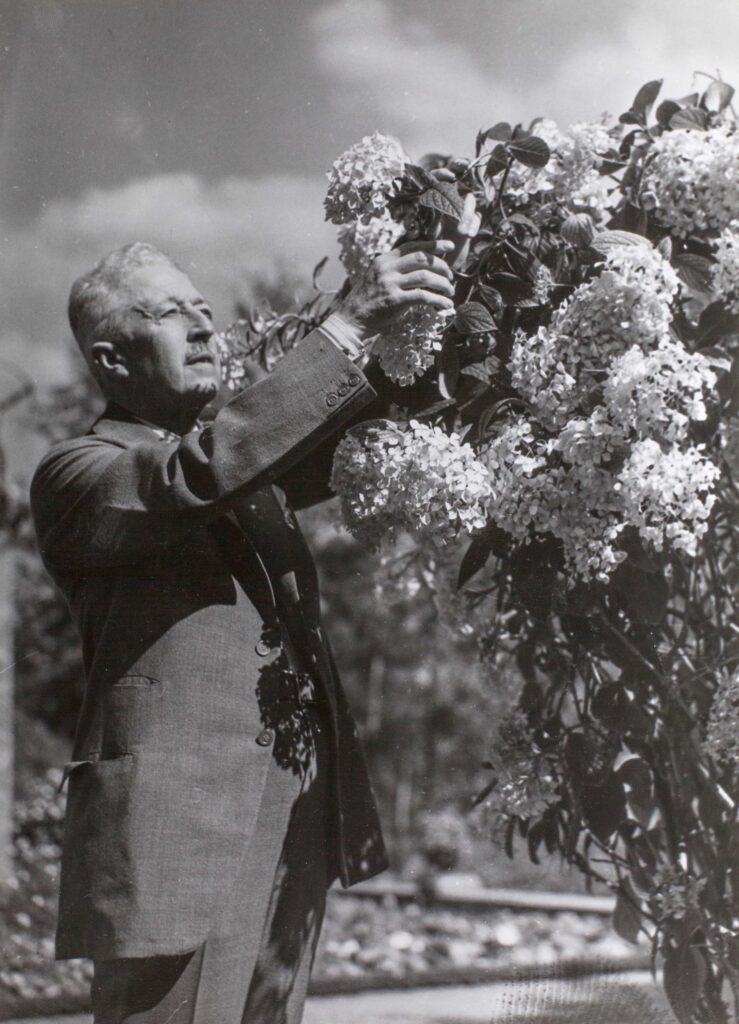
The Blooming: Art and Botany at Waldemarsudde An interview with Karin Sidén, museum director of Waldemarsudde, on an exhibition and book that explores the relationship between art, flowers, and the cultivated landscape. Ulrika Lindqvist: Can you tell us how the idea for the exhibition came about? Karin Sidén: The exhibition The Blooming: Art and Botany is an identity project for Prince Eugen’s Waldemarsudde. Its point of departure is the relationship between art and flowering at Waldemarsudde, as well as the museum’s historic park and garden, which includes its own gardening practice and in house florist. Waldemarsudde has always been associated with both art and flowering, indoors and outdoors, but the idea behind this exhibition, which emerged several years ago, is to further highlight these connections and to expand the subject from the site specific to also include themes such as the artist’s garden as a phenomenon, flowers in relation to symbolism, the role of art in the development of botany as a science, and flowers as decoration in applied arts and as sensuous inspiration for music and poetry. UL: Could you tell us about Waldemarsudde’s connection to flowers and plant life? KS: Prince Eugen’s Waldemarsudde is a total work of art in which art, architecture, nature, park, and garden come together as a unified whole. This total work was created by the artist and collector Prince Eugen, who was also responsible for the design of the garden’s floral rooms, plantings, terraces, and the planting of trees in dialogue with the surrounding landscape, as well as with both older and newer buildings, the latter designed by the architect Ferdinand Boberg in close collaboration with Prince Eugen. Eugen acquired the Waldemarsudde estate in 1899 and immediately began transforming the site, including the garden, and he had a greenhouse for cultivating flowers built as early as 1902, before the main building was constructed between 1903 and 1905. UL: How did you decide on what to include in the exhibition, and how did the collection of the works come about? KS: The curators of The Blooming: Art and Botany are myself and the museum’s exhibition coordinator Catrin Lundeberg. We collaborated with the museum’s gardener, florist, and archivist, as well as with fifteen contemporary artists and lenders including major public art museums, other institutions, and private collectors in Sweden and abroad. The selection follows several themes: the artist’s garden at Waldemarsudde and as a broader phenomenon, floral symbolism past and present, art and botany as a science, and flowers as decoration, aesthetics, and sensuous experience. The exhibition presents historical and contemporary art, applied arts, and design from the sixteenth century to today side by side, with close to two hundred works in total.   Prince Eugen at Waldemarsudde. Image courtesy of Waldemarsudde  UL: How did you work to update the book Prince Eugen’s World of Flowers twelve years after its first release? KS: In connection with the exhibition, Waldemarsudde has produced an extensive publication of more than three hundred pages, richly illustrated and featuring essays by leading experts in art history, book arts, botany as a science, and garden history. There are also earlier publications, including a book on the garden at Waldemarsudde written by our gardener in 2014, and the so called Flower Book from the same year, produced together with the museum’s florist Kristina Öhman. UL: Were there any other exhibitions that served as inspiration for this one? KS: Several exhibitions have explored the theme of art and flowers, but none with exactly our approach. The exhibition at Waldemarsudde is entirely produced in house. The exhibition Language of Flowers at the Nationalmuseum in 2005 has been an inspiration. Shortly after our opening, we also saw that the Ashmolean Museum in Oxford had opened an exhibition on the same subject, which suggests that the theme is very much of the moment. UL: The book also discusses the Waldemarsudde pot. What is the story behind it? KS: The Waldemarsudde pot was designed by Prince Eugen in two sizes in 1915 in what is known as contra Jugend style. It was initially produced at the Gustavsberg porcelain factory and used in the home at Waldemarsudde, but was also given as gifts to family and friends. Since the 1950s, after Eugen’s death in 1947, it has been produced in additional sizes. In recent years, we have also developed versions in different colors and in glass, the latter in collaboration with the Reijmyre glassworks. UL: Do you have the pot at home, and what do you usually fill it with? KS: Yes, I love the Waldemarsudde pot and have several at home in different sizes, both the classic white versions, the anniversary color, and in glass. I use them for both potted plants and cut flowers. UL: The book covers the different seasons of the year. What are you most looking forward to this spring? What do you plan to grow or decorate with? KS: All seasons are beautiful at Waldemarsudde, both outdoors in the park and garden and indoors in the reception rooms of the main building. At home, I look forward to decorating in spring with beautiful varieties of tulips and narcissus in my Waldemarsudde pots. UL: Waldemarsudde is known for its beautiful tables and settings. If you could invite any four guests for dinner, who would they be? KS: I would invite Prince Eugen, although he passed away in 1947, the contemporary artist Cecilia Edefalk, the writer Paul Auster, and the pianist Roland Pöntinen. It would have been a fascinating dinner conversation.   Image courtesy of Waldemarsudde Roland Persson “Head of Medusa” Photography Sara Appelgren 

News

COS Unveils SS26 in Seoul, Balancing Structure and Fluidity

COS Unveils SS26 in Seoul, Balancing Structure and Fluidity Presented on March 25,  COS’ Spring Summer 2026 show marks the brand’s first runway presentation in South Korea. Staged in Seoul after several seasons across Europe and consecutive appearances at New York Fashion Week, the show signals a continued expansion of COS’s global presence while refining its evolving design language. Set within a brutalist space on the outskirts of the city, the scenography established a stark and geometric atmosphere. Empty swimming pools formed a surreal architectural landscape, while a soundscape inspired by the Seoul subway system grounded the show in the city’s rhythm. The result was an environment where structure and movement coexisted, mirroring the collection itself. Across forty looks, the palette remained controlled and cohesive. Slate grey, warm browns, cream and white created a sense of tonal harmony, punctuated by accents of blue and deep oxblood to introduce depth. The effect was one of quiet uniformity, where variation emerged through nuance rather than contrast.  Materiality played a central role. Leather and technical fabrics were combined with precision to shape sculptural silhouettes and deliberate draping. Linen introduced texture, while sheer and transparent layers revealed the body in motion. Light, airy fabrics moved freely, softening the collection’s architectural foundation with a sense of ease. In this balance between rigidity and fluidity, COS continues to explore a space where minimalism becomes expressive. The Seoul show does not disrupt the brand’s identity, but rather sharpens it, suggesting that its future lies in the careful negotiation between structure, sensation and movement. A selection of the garments are available in COS stories and at their website.  Images courtesy of COS

Opiates

Gant Reimagines Occasion Dressing for Everyday Moments

Gant Reimagines Occasion Dressing for Everyday Moments With For Every Invite, Gant approaches occasion dressing through a lens of effortlessness rather than formality. The collection brings together light linen tailoring, soft color palettes and fluid silhouettes, proposing a wardrobe that moves naturally between daytime gatherings and more elevated moments. What emerges is a redefinition of occasionwear, one that prioritizes adaptability over strict codes. Pieces are designed to shift with the rhythm of the day, allowing the wearer to navigate different settings without the need for transformation. Tailoring is softened, dresses are relaxed, and the overall impression is one of quiet confidence rather than overt statement. The campaign reinforces this perspective. Set within a sunlit garden, it captures an intimate gathering shaped by familiarity and ease. At its center is chef Erika Blu, joined by her mother, as they prepare a seasonal meal. Their presence introduces a sense of continuity, where heritage and personal expression intersect. This narrative extends into the collection itself. Just as recipes evolve across generations, so too does style, carried forward through reinterpretation rather than reinvention. Clothing becomes part of a shared experience, shaped by context, memory and connection. Rather than dressing for the occasion as a fixed concept, For Every Invite suggests something more fluid. It is about responding to moments as they unfold, with pieces that feel considered yet unforced. In this space between casual and elevated, Gant proposes a version of sophistication that is lived in, personal and quietly assured. Find the collection here from April 2nd Image courtesy of Gant 

Opiates

Extending Luca: Mille Notti and Eva Schildt Refine the Bedroom Landscape

Extending Luca: Mille Notti and Eva Schildt Refine the Bedroom Landscape With the continued collaboration between Mille Notti and Eva Schildt, the Luca series evolves beyond its original scope, moving closer to a fully articulated bedroom environment. The introduction of a bed bench and a wall mounted bedside table extends the collection’s visual and functional language, reinforcing a sense of cohesion across furniture and textiles. This progression feels inherent to Mille Notti’s identity. Long defined by a textile driven approach where material, proportion and tactility guide design, the move into furniture continues that same philosophy in a more spatial form. The aim is not to separate objects, but to create a unified atmosphere where each element supports the whole. Eva Schildt’s contribution remains central to this balance. Known for navigating the space between the robust and the refined, her approach to proportion and materiality continues to shape Luca’s character. The series is defined by its distinct upper volume resting on slender legs, a deliberate contrast that gives the pieces both presence and lightness. In the new additions, this interplay is further refined. The wall mounted bedside table introduces a sense of openness by lifting the form from the floor, creating a lighter and more fluid spatial expression. Its generous depth and solid wood drawer integrate functionality without disrupting the overall calm. The bed bench, placed at the foot of the bed, is conceived with equal restraint. Its proportions are carefully calibrated to relate to the bed without overwhelming the room, offering a stable and enduring presence. The absence of storage shifts focus toward construction and line, while a subtle brass knob introduces a quiet point of detail. Produced in Småland using solid materials selected for longevity, the pieces continue to emphasize durability as part of their design language. Rather than adding complexity, these new elements deepen the Luca series’ core identity, suggesting that a complete bedroom is not built through excess, but through consistency, balance and a considered relationship between form and function. Image courtesy of Mille Notti

Fashion Articles

Through Her Own Lens: Julia Hetta’s Poetic Portrait of Sweden for Louis Vuitton

Through Her Own Lens: Julia Hetta’s Poetic Portrait of Sweden for Louis Vuitton Book Images courtesy of Louis Vuitton In Fashion Eye Sweden, Julia Hetta captures her home country through a deeply personal and painterly lens, using Polaroid film to trace shifting seasons, textures, and light. Created as part of Louis Vuitton’s travel-inspired series, the book unfolds as an accordion-style visual diary. An evocative sequence of landscapes and quiet moments that transform everyday life into something cinematic and poetic. Text Ulrika Lindqvist Ulrika Lindqvist: How did your relationship with photography begin? What first drew you to this medium? Julia Hetta: Well, it really started through my father, who was interested in photography, while I was interested in painting and drawing. Then we had a darkroom in the basement, so little by little I started experimenting with photography instead. UL: That cannot have been very common, having a darkroom in the basement? JH: I actually think it was. This was in the seventies. Back then people had basement living rooms and hobby spaces and so on, so I do not think it was all that unusual at the time. UL: How did this collaboration with Louis Vuitton come about? And what attracted you to the project? JH: I got an inquiry from Patrick Remy, who works on the project, and I immediately felt quite strongly that it was a very fun project, because I had been longing to work on something of my own and just have the camera and be by myself. The condition was that it would be done in Polaroids, so both the technique itself and the project as a whole were exciting to me. I also trust Patrick Remy’s judgment. UL: Had you worked much with the Polaroid format before, and how does it differ from other techniques? JH: Yes, I had. When I was younger I worked a bit with large format Polaroids, and I also did that in this project, partly in the self portraits. But apart from that I had not done it for many, many years. UL: And compared to how you usually photograph, how does the technique and the result differ? JH: It is much more spontaneous, a more spontaneous kind of photography, and that was what I liked and felt I wanted to return to. UL: What did your creative process behind Fashion Eye Sweden look like? Did you work from already existing material, or was everything created specifically for the book? JH: No, it was created specifically for this book, and it began almost like a diary project and also ended that way, because I made the self portraits at the end. But it took me a while to understand what I was going to do, because I felt it was difficult to depict your own country and how to approach that, until one day I realized that this is my life here in Sweden. I had already started doing that a little before the project, but then I developed it further. UL: I think the colors really capture Sweden and the light. JH: Oh, how nice. I think very much about colors and materials and light. Those are the three components that are very important to me in my photography. UL: How did you work with the selection of which images would be included in the book? JH: Editing is a very big part of the job for a photographer, I think. It is something I have trained myself in over the years, and also when I worked as a photo editor when I was twenty, so it is something I am very practiced in, and I think it is an important part of a photographer’s work. I had a large number of Polaroids, maybe a body of material four times as large, which I then edited down. UL: Was an editor involved, or did you make the selection yourself? JH: No, I made the selection myself, but I did discuss it back and forth with the team at Louis Vuitton and with Patrick Remy. UL: What would you say you yourself are trying to express and explore in your photography? JH: In this project, I think I was trying to explore what my perception looks like, what I see, and to be as direct as possible. More broadly, I think my photography is really about that, about somehow lifting up life, elevating life as such in some way. I am also interested in details and materials, and in what beauty is, and also darkness and light. UL: What do you want the viewer to feel when looking at your images and at Fashion Eye Sweden? JH: I hope that I have, in some way, visualized one side of Sweden, and that people abroad who either have a connection to Sweden or are interested in Sweden in some way will get a feeling for the country. Swedes living abroad are one audience, but also people who have recently arrived in Sweden. It feels interesting to present an image of the country to them as well. I also often work in a relatively poetic way, and I want it, in some sense, to be like a story about my life and a country. UL: Where did you take the pictures? Which locations did you use? JH: They are really from northern to southern Sweden, but a large part was done in and around central Sweden, around Uppsala and Stockholm, where I have my country house, but also in Norrland, where we also have a country house with my parents on an isolated island, and some of it was also shot in Skåne. So I think I really tried to stretch across the whole country. That felt right, because Sweden is so large and the landscape is so different from north to south, and I also wanted to capture the different seasons. UL: So how long did it take from when you started photographing for the book until it was finished? JH: Three years. UL: Do you have a project or an image or something within you that you would like to visualize, and if

Opiates

Eton’s Wool Cashmere Dream Capsule Centers Dressing Around Sensation

Eton’s Wool Cashmere Dream Capsule Centers Dressing Around Sensation With the Wool Cashmere Dream Capsule, Eton turns attention toward one of fashion’s most understated luxuries: how a garment feels in wear. Comprising four pieces, the capsule is defined less by visual excess than by texture, weight and the intimate experience of material against the body. At the center of the release is an exclusive wool cashmere fabric developed for the brand, woven in Como and finished in Biella. These details place the capsule within a tradition of Italian textile craftsmanship, while also reinforcing its emphasis on refinement through process rather than display. What distinguishes the collection is its focus on sensation as a design principle. Rather than building its identity around statement or occasion, the capsule proposes tactility as its core value. The garments are conceived around touch and feel, suggesting a quieter approach to luxury in which comfort, softness and material presence become the defining features. In that sense, Wool Cashmere Dream reads as an exercise in restraint. It is a capsule shaped by fabrication and finish, where the experience of wearing the garment becomes central to its appeal. Rather than asking to be noticed at a distance, it invites appreciation at close range, through texture, movement and the subtle intimacy of clothing made to be felt. Find the collection here       Image courtesy of Eton

Opiates

Marimekko’s Kukasta kukkaan Brings a New Floral Rhythm to SS26

Marimekko’s Kukasta kukkaan Brings a New Floral Rhythm to SS26 For Spring Summer 2026, Marimekko returns to one of its most enduring strengths: the expressive power of print. Framed by the seasonal theme The Art of Pattern, the collection draws attention to the craft behind the brand’s printmaking heritage, using it as the foundation for a wardrobe that feels both spirited and composed. At the center of this new chapter is Kukasta kukkaan, a floral pattern by Finnish print designer Erja Hirvi. Created during a period of intense creative immersion at a summer retreat, the print channels the movement and abundance of the season. Its name, translating to from flower to flower, evokes the drifting path of bumblebees among blooms, giving the pattern a sense of motion as well as play. This interplay between energy and structure runs throughout the wider collection. Floral prints meet bold stripes, while playful proportions are balanced by composed silhouettes, creating a visual language that blends femininity with pragmatism. It is an approach that feels distinctly Marimekko, where joy is never separate from utility, and decoration is always anchored by design logic. Kukasta kukkaan appears across a range of garments, from silk dresses, skirts and tops to more classic cotton dresses and shirts, allowing the print to shift across different textures and forms. In this way, it becomes more than a seasonal motif, functioning instead as a through line within the brand’s broader narrative. The collection reinforces the idea that print, in Marimekko’s world, is never static. It moves, adapts and lives in dialogue with the person wearing it. Find the Kukasta kukkaan here Image courtesy of Marimekko

Opiates

Birkenstock Steps Into Beauty With a Nail Polish Collection

Birkenstock Steps Into Beauty With a Nail Polish Collection With the introduction of its first nail polish collection, Birkenstock extends its long standing focus on feet into a new category, bringing beauty into dialogue with care. As part of the brand’s Care Essentials range, the launch builds naturally on a philosophy rooted in comfort, function and the idea of walking as nature intended. Rather than treating nail colour as separate from wellbeing, the collection frames it as an extension of foot care itself. In doing so, Birkenstock positions the foot not only as functional, but also expressive, deserving of attention that moves beyond support and into ritual. The result is a category expansion that feels less like departure than continuation. The formulas reflect this balance between design and responsibility. Vegan and plant based, the polishes are developed with an emphasis on both performance and safety, using natural ingredients such as sugar beets and cane where possible. This approach aligns the collection with the brand’s broader values, translating practicality into a beauty context without losing coherence. Comprising five shades, from muted neutrals to more vivid tones, the range is designed to complement the brand’s open toe silhouettes across both seasonal and permanent styles. A base coat, top coat and nail polish remover enriched with sweet almond oil complete the offering, turning the collection into a full at home routine rather than a standalone product. What emerges is a playful yet considered addition to the Birkenstock universe. By pairing colour with care, the brand suggests that utility and self expression need not exist in opposition, and that even the most grounded essentials can make room for a lighter, more expressive gesture. Find the collection here  Image courtesy of Birkenstock

Opiates

OLAPLEX No.3PLUS Bond Repair

OLAPLEX No.3PLUS Bond Repair With No.3PLUS Complete Repair Treatment, OLAPLEX brings its bond building technology into a faster, more streamlined format, shaped around the demands of contemporary routines. Positioned as a pre shampoo treatment, the launch reflects a broader shift in haircare, where professional level repair is expected to work not only effectively, but efficiently. At the center of the treatment is the promise of transformation in three minutes. Using OLAPLEX’s patented Bond Building Technology and its new Damage Defense Cationic Complex, No.3PLUS is designed to repair hair from cortex to cuticle, targeting all three bonds within the hair structure: disulfide bonds, salt bonds and hydrogen bonds. What distinguishes the treatment is its emphasis on total repair rather than surface level improvement. By addressing both previous and existing damage while helping protect against future stress, No.3PLUS presents itself as a comprehensive response to the realities of damaged hair. The language is clinical, but the intention is practical: stronger, softer and healthier looking hair in a format that fits easily into everyday life. The results underline this positioning. After one use, hair is described as visibly improved, with clinically proven claims of being three times stronger and three times softer. In that sense, No.3PLUS continues OLAPLEX’s long standing focus on structural repair, while adapting it to a beauty culture increasingly defined by speed, simplicity and immediate payoff. Find the N0.3PLUS here  All images courtesy of OLAPLEX

Opiates

Casall Reclaims Sport Core for SS26

Casall Reclaims Sport Core for SS26 With its SS26 collection, Casall turns to the past to reframe the present, drawing on the visual language of 90s sport core while grounding it in the realities of modern movement. The result is a collection that positions everyday training and wellbeing as something considered, structured and quietly expressive. At the intersection of motion, function and design, the collection is built through deliberate material choices and precise construction. Each piece is developed to support the body without restricting it, balancing technical performance with a sense of ease. There is an emphasis on detail that does not demand attention, but instead reveals itself through wear. The aesthetic reflects this restraint. Clean silhouettes are layered with both technical and tactile materials, creating depth without excess. Subtle detailing anchors the collection in a minimalist framework, while still allowing for a bolder, more defined presence. It is a reinterpretation of 90s references that feels distilled rather than nostalgic. Structured around different modes of movement, the collection adapts to varied rhythms of training and daily life. Running is approached through a cooling comfort concept, where lightweight materials and functional elements respond to intensity. Studio shifts toward a softer, more fluid expression, with layered textures enabling both personal styling and freedom of movement. Gym focuses on durability and support, merging functionality with design to allow for full range of motion. Athleisure extends these principles beyond training, introducing a refined interpretation of everyday wear where elegance and utility coexist. Rather than separating performance from lifestyle, Casall brings them into alignment. SS26 suggests that movement today is not confined to a single space or purpose, but exists across contexts, shaped as much by how we live as by how we train. Find the collection here    Image courtesy of Casall

Scroll to Top