Author name: Natalia Muntean

Opiates

Maria Nila Reinforces Hair Care with New Multi-Benefit Bond Builder

Maria Nila Reinforces Hair Care with New Multi-Benefit Bond Builder Swedish beauty brand Maria Nila is set to elevate daily hair routines this January 2026 with the launch of its first multi-benefit Bond Builder. Designed as a lightweight leave-in treatment, this innovation addresses the damage caused by heat, UV exposure and daily brushing. The Bond Builder uses Neo-Cuticle Technology to create a bioinspired layer that seals in moisture while protecting the hair’s keratin structure. This one-step solution focuses on three key pillars of hair health: bonding, protection and hydration. It rebuilds internal disulfide bonds to repair hair from the inside out, offers high-level heat protection to defend against future external damage, and delivers instant softness and shine through an Active Care Complex featuring amino acids, provitamin B5 and natural pomegranate and sunflower extracts. True to the brand’s focus on effortless care, the treatment is designed to be applied to both damp hair, allowing it to penetrate the open cuticles, and dry hair, serving as a finishing touch to smooth lengths and add a protective barrier.  Produced in Sweden, the Bond Builder reflects Maria Nila’s commitment to ethical beauty, as it is 100% vegan and animal-friendly.

Art

Tillsammans – Group Exhibition at JUS

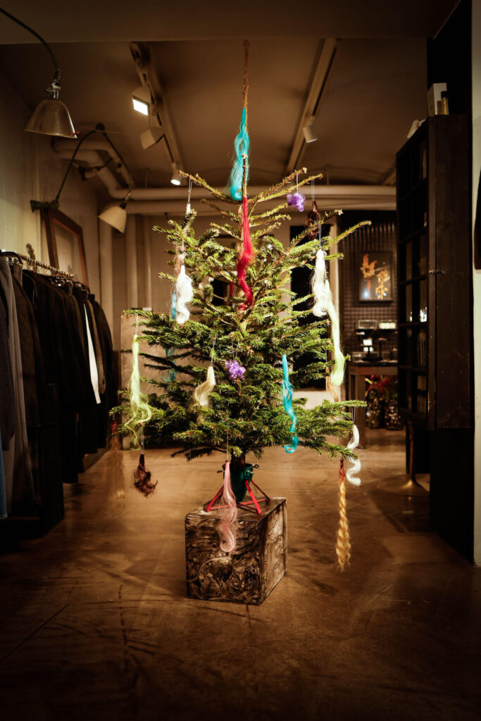
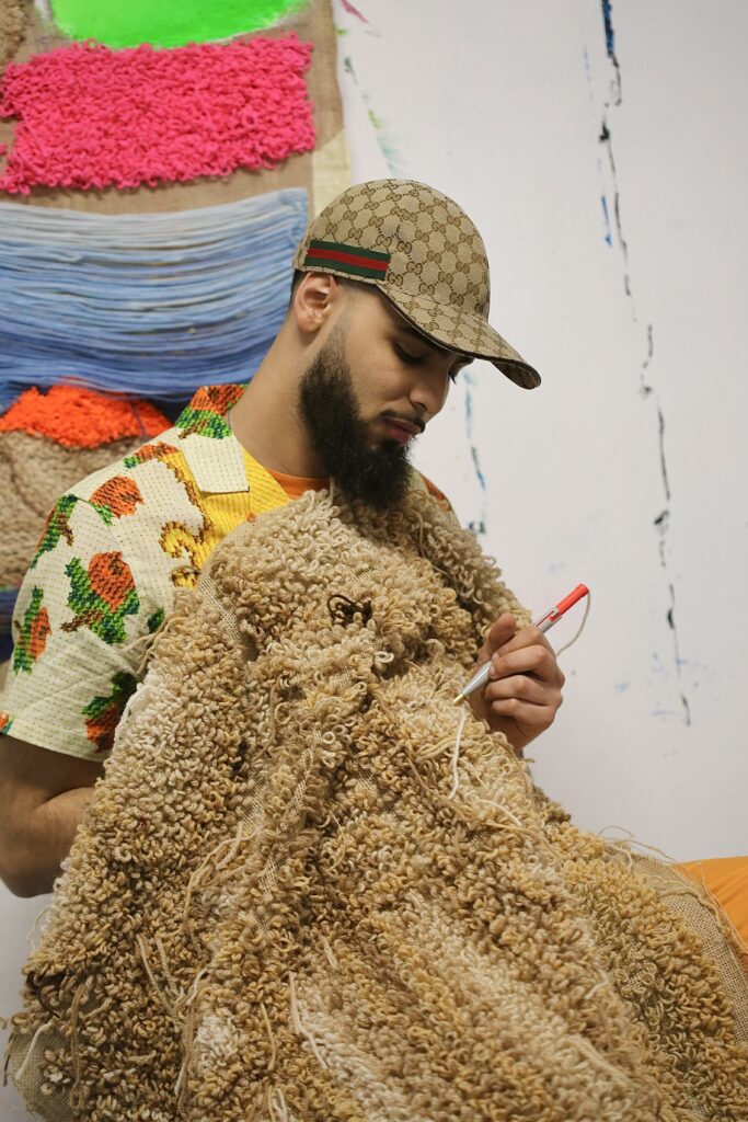
Tillsammans – Group Exhibition at JUS text Natalia Muntean “This exhibition is about celebrating all those years we’ve known each other and collaborated in various forms.” Ann-Sofie Back’s words set the tone for Tillsammans, a group exhibition at JUS that functions as a gathering of “different kinds of eras.” Bringing together Ann-Sofie Back, Diana Orving, Horisaki, Lotta Jansson, Lovisa Burfitt, Martin Bergström, and Yasar Aydin, the exhibition features seven practitioners whose work moves fluidly between fashion, art, jewellery, and objects. Hidden away on a back street in central Stockholm, JUS has for more than thirty years functioned as both destination and platform—a space where fashion, jewellery, objects, scent, and art coexist. Rather than presenting fashion as a fixed system, JUS has long embraced a layered, intuitive approach. For many of the artists, the space is inseparable from their own histories. Material sensitivity and process run throughout the exhibition. Yasar Aydin presents one-of-a-kind silver jewellery, “a twist on something recognisable as me,” while Martin Bergström shows woven works rooted in calmness, nature, and long-standing material exploration.  For Aydin, JUS has been foundational. “Without JUS, I wouldn’t be where I am,” he says, describing how his practice shifted from art jewellery toward a more material-driven, handcrafted approach through years of showing and selling his work at the store. “JUS has been number one for me to develop and be successful in that sense.” Showing work alongside other makers is, for him, about exchange: “To interact with each other, to talk about materials and techniques.” photography Henrik Halvarsson For Ann-Sofie Back, the exhibition became a marker of a relationship that began in the late 1990s when Ulrika Nilsson bought her graduate collection. “This exhibition is about celebrating all those years we’ve known each other and collaborated in various forms,” she explains. Her contribution to Tillsammans, a sculptural Christmas installation made from repurposed wigs, reflects her shift from fashion to interior objects. Currently focusing on objects rather than garments, Back describes her new work as “super decadent” and “vain.” She describes the process as spontaneous and playful, shaped by what materials could be found rather than by a fixed plan: “Now that I don’t have to work with the body, it’s freer. I can objectify the object instead.” For Martin Bergström, the exhibition is a celebration of a relationship with JUS that has “grown together for years,” beginning in the 1990s. He likens the exhibition to a “shared garden” where “everyone grows in their own way, yet we share the same soil.” Working freely across fashion, art, and interiors, Bergström presents Reflections of My Shoes, a series of jacquard weaves born from a specific moment of connection. “I was on the phone with Ulrika Nilsson, sitting on a jetty at Pålsundet in Stockholm. When I looked down, the water reflected my shoes. I translated that reflection into jacquard weaves.” Bergström views JUS as a “collective lab” and a home that “holds the fragile patterns within us.” His history with the space is marked by moments of deep inspiration, from the time he showed his “poisonous plants” to discovering the writer Vivi Täckholm at the store, who became one of his greatest sources of inspiration. To him, the space remains a “calm and kind place” that addresses the “quite quiet” atmosphere of an institution that has remained “solid for so long.” For less established voices, the exhibition carries a sense of trust. Lotta Jansson speaks of being encouraged rather than judged: “Ulrika just said: ‘Don’t worry, people are kind.’” That atmosphere, supportive, confident, and unselfish, was repeatedly described as central to the JUS experience.  Jansson highlights the unique confidence Ulrika projects: “She’s become very confident in her way of thinking and choosing… that’s also how she shares her confidence with you.” Regarding the theme of the exhibition, Jansson suggests that the “togetherness” might be more about the curator’s perspective than the artists’ own connections: “I think we all individually represent togetherness for her, more than us together.” For Horisaki, whose crushed and reshaped hats form one of the exhibition’s most tactile installations, Tillsammans marks a return to an aesthetic first shown at JUS more than a decade ago. “We’ve always done crushed hats,” they explain. “It’s about making hats that are not fragile. You can sit on them, pack them, reshape them, and they’ll still look great.” The hats are described as carrying “the memories of life, time and randomness” in their structure, objects shaped by use rather than preservation. That philosophy extends beyond the objects themselves. “We don’t believe in competition or sharp elbows,” Horisaki says. “Everything is better when you collaborate and work together.” In this sense, the title Tillsammans is not symbolic but practical, describing a way of working grounded in openness and shared experience. “The installation reflects what we have sought since our very first hats: the beauty of patina, of hats that are crumpled, worn, and cherished… We aim to highlight the hats’ functionality, how they can be worn and reshaped in countless ways, always changing yet remaining true to their character. This last part also applies to how we perceive JUS.” Beyond retail, JUS has long positioned itself as a space for education and exchange, hosting exhibitions, talks, workshops, and art history courses throughout the year. Tillsammans embodies this role not through a single curatorial statement, but through presence: works shown side by side, conversations unfolding quietly, and histories intersecting.  More than a group exhibition, Tillsammans became a reflection on continuity – on what it means to build something over time, and how creative practices, like places, can remain open, generous, and alive by growing together.

Art

Amine Habke: The Garden of Intimacy, Repairing Masculinity

Amine Habke: The Garden of Intimacy, Repairing Masculinity text Natalia Muntean In the delicate, deliberate stitches of Amine Habki’s textile works, a new language of masculinity is being woven. For his first solo exhibition in the Nordic region, I Will Sew Up All the Petals of Your Garden, the French-Moroccan artist transforms the Andréhn-Schiptjenko Gallery in Stockholm into a meditative interior where softness is strength and vulnerability becomes a form of resilience. Drawing on the visual heritage of Islamic ornamentation, European Romanticism, and the diasporic experience, Habki’s practice, spanning embroidery, painting, and sculpture, cultivates a space where the body and the botanical merge. “I don’t have any memories where I wasn’t an artist,” he reflects, “I felt obligated to be an artist and to live by my art.”  Natalia Muntean: Can you elaborate a little bit about the meaning behind the title of the exhibition?Amine Habke: The title, I think, represents the energy and the entire mission of the show. The idea of a garden, for me, represents the area of intimacy, an inner world. But at the same time, the garden is famous in the iconography of romantic paintings. For this show, I was really inspired by The Garden of Earthly Delights by Bosch. The idea of the show is also to talk about the idea of rehabilitation. I am trying to repair an image of what masculinity is. NM: Why is it important for you to challenge these ideas about masculinity through art?AH: This is not about changing something for the world; it’s just for me. It’s a quest for me to take care of this image, of this body. I like the idea of doing a new vision, a new iconography, just for my own healing, just to feel kinder, more connected to what I want to look like. This is a little poetic way to talk about this, and it really helps me, and I think this also helps other people. NM: What are you looking for in this connection to your work?AH: I’m looking for more liberty to represent masculinity, to represent romance, to represent love, vulnerability and fragility. NM: Your practice spans embroidery, painting, and sculpture. How did you begin?AH: I started with a lot of drawing, but I wasn’t really fulfilled because I was trying to find a volume and to have more relief. So, embroidery was a way to give more shapes and three-dimensionality to my drawings. Embroidery also comes as a visual heritage. My family has a lot of tapestries. I feel connected to these objects. The houses of my grandma and my aunties were places of something soft, domestic, warm, and resilient. I was trying to incorporate this aesthetic onto bodies that are generally represented outside, in heavy material, in big forms. The media often destroys the non-white body, centralising some communities and cultures while excluding others. For me, this is a way to make an opposition to Orientalism. Orientalism destroyed our culture and our heritage. When you’re born in the third generation of Moroccan diaspora, you have certain expectations, but then you discover the reality is more complex. I think exploring these objects and the story of civilisations helps. NM: The slow process of embroidery – does it influence the narrative of your work?AH: In my studio, I have a lot of drawings on the wall, and I also write a lot of poems. Sometimes poems give me images, and some images give me poems, so it’s a mutual dialogue. I start by selecting one of the drawings, and I go to the shop for textiles and fabrics. The element of chance comes in because sometimes I can be obsessed with one fabric, and I think, “Okay, it could match with this drawing, with these colours”. Then I create the image. But there’s a lot of improvisation and freestyle. I have the idea and the concept, but I never strictly know what colours I will use, or if I will add extra things. NM: You incorporate found objects into your textile works. What is their role?AH: I think they can symbolise an idea. For example, one piece in the Stockholm show features a lace fabric with flowers already on it. I add painting and embroidery to put a spotlight on, and to make a combination with what I want to symbolise. Found objects are also a way to make more funny combinations. I think this is more the fun and spontaneous aspect of my practice. NM: You get inspired by the ornaments in Islamic art, transforming arabesques into living patterns. How does your French-Moroccan heritage inform your visual style?AH: I’m really inspired by the ornamentation, like the grotesque. I discovered that this is not a well-known or celebrated form because, for many people, grotesque is just like minor art; it’s not a major form. I like this idea of putting a spotlight on a minor form. For me, ornamentation is the beginning of surrealism. You have a lot of different motifs and patterns, and sometimes it can look like something real. The grotesque embodies that by mixing humans with animals, with flowers. You also see this phenomenon in some Islamic cultures, for example, the zellige tiles, where the symmetry and repetition make human or body shapes appear. This is the ornamental aspect that inspired me. I’m also really inspired by my French background, like the Surrealism of Magritte. I like Romantic artists like Friedrich. At the same time, I also like Persian miniatures. It’s a mix of the Mediterranean area. ‘Still Dirty’ ‘Body Guard’ NM: The flower is a recurring symbol. Beyond beauty, what does the flower represent for you?AH: Flowers have different meanings. I tried to show that it can also be a trap. I did some pieces with men holding flowers; it can be a really soft object, but also really dangerous at the same time. Flowers are present in mythology, like Ovid’s Metamorphoses, and also in the poetry of Mahmoud Darwish. I like the idea of the flower as a

Opiates

LUMENE Unveils 2026 Skincare & Makeup Innovations

LUMENE Unveils 2026 Skincare & Makeup Innovations LUMENE is set to launch a series of groundbreaking products in February 2026, combining Nordic ingredients with advanced skincare science. The cornerstone of the launch is the Nordic Bloom Bounce Collection, an expansion of the brand’s bestselling vegan collagen line. The new Bounce Moisturiser and Bounce Eye Cream are powered by next-generation vegan collagen peptides, triple hyaluronic acid, and patented Nordic lingonberry extract. Clinically tested, they are designed to visibly improve skin’s bounce, firmness, and elasticity, targeting the first signs of collagen loss from the late 20s. In makeup, LUMENE is leading the 2026 “blur” trend with the Blur Even Cover Foundation. This high-coverage, 16-hour wear foundation is infused with niacinamide and Nordic bilberry extract to smooth and even the complexion while maintaining a natural, skin-like finish. To create the perfect base for it, LUMENE introduces three skin-loving Primers: the tone-evening CC All-in-One Primer, the pore-blurring Blur Longwear Matte Primer, and the radiance-boosting Natural Glow Instant Radiance Primer. Skincare innovations include a powerful new targeted treatment: the Nordic-C Dark Spot Serum. Utilising a unique Triple Complex technology with patented Arctic cloudberry, vitamin C, and a unifying peptide, it is clinically proven to reduce the appearance of dark spots by 61%. For delicate eye area care, the new Nordic Hydra Hydrating Eye Gel Cream features patent-pending Nordic Hyalu-Birch technology to deliver 72 hours of lasting hydration. The launch is completed with two fan-favourite updates: a new bestseller shade (#300) for the multi-tasking Invisible Illumination Instant Glow Beauty Serum, designed for medium-tan skin tones, and a new on-trend brown shade for the volumising Wild Forces Volume Mascara. All products are vegan, fragrance-free where applicable, developed and manufactured in Finland, and feature a strong focus on sustainable packaging.

Opiates

IDA WARG Beauty Redefines Self-Tanning for 2026

IDA WARG Beauty Redefines Self-Tanning for 2026 IDA WARG Beauty is revolutionising the self-tan category with a major relaunch and new, personalised products arriving in January 2026. The entire core range, including Tanning Drops, Face Lotion, Body Lotion, Spray, and Mousse, has been upgraded with a new, colourless formula enriched with triple hyaluronic acid for deep hydration, designed to minimise transfer and suit sensitive skin. The formulas are now fragrance-free and designed to be suitable for all skin types, including sensitive skin, while delivering an even, natural glow within 4-8 hours. In a category-first for the brand, IDA WARG Beauty introduces the Cool & Warm Self-Tanning Mousses, its inaugural products developed to match the user’s skin undertone. Cool Bronze is designed for neutral to cool undertones. At the same time, Warm Glow complements neutral to warm undertones, ensuring a seamless, sun-kissed result that blends perfectly with the individual’s natural complexion. For those seeking immediate results, the brand is launching its fastest self-tanner yet: the Cocoa Self-Tanning Mousse 1 Hour Express. This advanced mousse allows users to customise their level of colour, offering a subtle glow after one hour or a deeper bronze after three, aided by recycled cocoa shells that act as a natural application guide. All products are 100% vegan, focused on skincare benefits, and easy to apply. With this launch, IDA WARG Beauty reinforces its philosophy that beauty should feel as good as it looks.

Beauty Articles

Selahatin x Rick Owens: The Anatomy of a Ritual

Selahatin x Rick Owens: The Anatomy of a Ritual Written by Natalia Muntean In the space where private ritual meets public identity, Selahatin and Rick Owens have created an alliance of essence. This collaboration, born from a bold Instagram ad, evolved into an 18-month journey to distil discipline into flavour, and ceremony into form. The result is more than a product line; it’s a sensory bridge between two worlds that speak the same refined language. Every object was designed to transform the daily routine into an intentional act. Guided by the principle of “monochrome” complexity, the team developed a signature aroma that holds opposites in quiet tension – black pepper against vanilla, sharp citrus against cool rosemary. Selahatin founder Kristoffer Vural discusses this intriguing collaboration. Natalia Muntean: The intention was to develop a “monochrome” yet complex signature aroma for the collaboration with Rick Owens, “unorthodox” even. Can you walk us through the creative process of blending the elements to create a scent that harmonises both Selahatin’s and Rick Owens’ visionary worlds?Kristoffer Vural: We began with one idea: a monochrome flavour. Both worlds already speak that language – disciplined, refined, and a little severe. The process was intuitive. We kept shaping it until it felt like Rick – sharp lines, quiet tension, opposites balanced just enough to hold. It tastes like his universe, but it’s still unmistakably Selahatin. It’s a new way to experience his world – through flavour. NM: Ritual is described as the core bridge of this collaboration. How did this shared philosophy shape the design and function of each product, moving from concept into physical form?KV: We didn’t start with a strategy – we started with the ritual itself. What do you touch? What do you taste? What do you want to have in your mouth? The decisions became intuitive: materials, shape, flavour – everything needed to feel sharp, disciplined, and worth returning to. NM: How long did the development process take from the initial concept to the final products, and what was the most challenging aspect to perfect?KV: The development took about 18 months – shaping something simple well is always hard. The horn toothbrush demanded incredible precision, and getting the flavour right was its own challenge. There’s a tension between strength and nuance: the fresher it gets, the less of a journey you allow. We kept refining until those opposites held each other in place, and before we were done, we had made over 150 iterations.  NM: How did you ensure the collaboration felt like an authentic extension of both brands, rather than a simple co-branding exercise?KV: Authenticity comes from alignment, not logos. Rick and Selahatin already share a discipline in how we approach the everyday – refined, minimal, and built with care. That’s why it feels natural. We didn’t force a connection; we revealed it. NM: For both you and Rick Owens, personal journeys of recovery and essence are mentioned. How did those deeply personal narratives become the foundation for a collaborative project meant for a wider audience?KV: Personal stories shape the work, but we don’t need to explain them. What matters is that the result feels true – and people can sense that when they use it. NM: This collection elevates daily routines into devoted ceremonies. Do you see this collaboration as a statement on the evolving role of luxury and mindfulness in everyday life?KV: Yes. Luxury is shifting toward the things we touch every day. If a small ritual can bring clarity in a noisy world, that feels like a step forward. NM: Where do you see the future of such ritual-focused products heading?KV: Toward simplicity. Toward things that feel honest and close to us. The future of ritual is making the everyday worth paying attention to.

Opiates

Marimekko Maridenim introduces new elements in 2026

Marimekko Maridenim introduces new elements in 2026 Marimekko enters the new year with a fresh expansion of its Marimekko Maridenim line, combining iconic prints with sustainable innovation. First launched in 2024, the Maridenim range has already established itself as a favourite for effortless, print-forward dressing. For spring 2026, the collection welcomes both new colours and prints. A soft light pink variation of the classic denim shirt and jeans, available in the Barrel and Wide fits, now features the house’s legendary Unikko floral pattern, originally designed by Maija Isola in 1964. This refresh brings a delicate, feminine energy to the iconic poppy motif. Joining the lineup is the rhythmic Keidas print, designed by Annika Rimala in 1967. Originally inspired by the pulse of youth culture, its ornamental energy now appears on the collection’s denim shirt and Loose-fit jeans, marking its debut on denim and showcasing Marimekko’s innovative approach to textile expression.  The collection offers four versatile fits: Barrel, Loose, Wide and Straight, each designed for easy styling. Crafted in alignment with the Ellen MacArthur Foundation’s Jeans Redesign guidelines, every piece uses mono-material cotton and removable hardware to enhance recyclability. Innovative finishing methods, such as laser and ozone washing, replace traditional techniques, highlighting Marimekko’s commitment to circular fashion.

Culinary, Opiates

Comfort & Joy Pop-Up Café Launches in Stockholm

Comfort & Joy Pop-Up Café Launches in Stockholm Stockholm is being warmed by the arrival of Comfort & Joy Pop-Up Café, a holiday collaboration between Martin Bundock (A World Beneath) and Danna Vu (Crème). Now open, the pop-up blends cherished childhood flavours from English and Vietnamese traditions into a cosy festive gathering place. The menu combines sentimental favourites from both founders, featuring items like Vietnamese Coffee, Sticky Toffee Pudding, Vietnamese Ginger Braised Chicken and a co-created vegetarian Christmas Mince Pie – a modern twist on a classic. “This pop-up is all about warmth, nostalgia and community,” said Martin Bundock. “Every dish is meant to spark memories and sweeten the dark December days.” Danna Vu shared the story behind their mince pie: “Martin explained that today’s versions don’t contain meat, even though his mum’s recipe uses suet. After lots of tasting, we created our own vegetarian version, and we think it holds its own against the classics.” The community-focused project also invited local children to craft holiday decorations in exchange for free ice cream during a special workshop earlier this month. There is still time to visit the pop-up café, which is open again between December 19th and 21st. 

Culinary, Opiates

Omnipollo & Bitburger Launch KNÄCKEBROT

Omnipollo & Bitburger Launch KNÄCKEBROT In an interesting cross-border collaboration, Swedish craft brewery Omnipollo has teamed up with Germany’s legendary Bitburger to create KNÄCKEBROT, a German-style pilsner brewed with Swedish knäckebröd. This limited-edition beer marks a delicious collision of traditions, where Bitburger’s dry, characterful pilsner meets Omnipollo’s playful creativity. The base of KNÄCKEBROT is built on classic German pilsner malt, but with a twist: 20% of the mash consists of wood-fired knäckebröd from Skedvi Bröd, a bakery outside Borlänge, Sweden. The result is a pilsner that carries subtle, toasty notes of crispbread. For Henok Fentie, brewer at Omnipollo, the collaboration is a personal milestone. “This partnership is the culmination of over 20 years of admiration for Bitburger,” he says. “They’ve perfected this style of beer since 1909. It was incredible to explore their world and invite them into ours.” The beer is brewed in Omnipollo’s church-turned-brewery using traditional decoction mashing for richer aroma and flavour. It’s cold-fermented and hopped with Bitburger’s own blend of German hops, some from their own hop fields. Dr. Stefan Meyna, brewmaster at Bitburger, describes the process as magical. “When our German brewing tradition met their bold creativity, the energy behind KNÄCKEBROT was renewed. Our shared passion for beer is present in every sip.” Housed in a 44 cl can designed by Omnipollo’s Karl Grandin, the packaging merges Bitburger’s branding with Omnipollo’s aesthetic. “I wanted to unite Bitburger’s iconic expression with Omnipollo’s boundless imagination – a meeting that becomes a dreamlike landscape,” Grandin explains. KNÄCKEBROT Pilsner was released on December 5 and is available for order via Systembolaget in Sweden. 

Art

The Postcard, Reimagined

The Postcard, Reimagined text Natalia Muntean What can a postcard hold? A memory, a gesture, a point of contact, or an entire conversation. At Saskia Neuman Gallery, The Postcard Exhibition brings together 67 artists whose works explore the postcard not just as an object, but as a form of care, critique, intimacy, and distance. In an age dominated by instant digital communication, the postcard becomes almost radical in its slowness: a physical image that demands a hand, an address, and the willingness to wait. Across the gallery, these small works form a network of voices and visual correspondences, each postcard becoming a greeting and an invitation to reflect on how images travel between people. Four artists from the exhibition reflect on how the mass-produced meets the deeply felt in the postcards they’ve created. Niklas Delin Blood moon Postcards can be described as a “gesture in motion.” What was the essential gesture you wanted to capture with your work for this exhibition?Niklas Delin: I view painting as something ongoing, in motion. It is a figuration of time in a way. It is constantly happening while also referring to something that has already happened- the act of painting it, or the moment it depicts. Much like a postcard is an object of the present, when you receive and read it, and at the same time an object of the past, when it was written and sent. You often start your paintings on a black foundation. Did you do the same for your postcard? What “lighter shade” or light did you bring out of the darkness for this small work?ND: The painting Blood (Moon) carries a lot of darkness. I usually cover the first black layer with the darkest shade of colour I can find in my motif. This one depicts a scene seen through a pair of binoculars, where the darkness surrounding what was seen through the lens was truly black, so I kept it. I think what interested me the most about this specific motif was the distortion, the element of unfocus, the lack of a determined border between light and darkness. Your work explores the “interplay between light and darkness.” In your postcard, does the light feel like it’s fighting the darkness, or are they peacefully coexisting?ND: I don’t know, I was going to say peacefully coexisting, at least they need each other. But I think perhaps none of the alternatives is correct. The darkness is always there, beneath the light. And even the darkest parts are just a different level of light. The postcard can be seen as a paradox, both a mass-produced, somewhat clichéd object and a uniquely personal message. How did you engage with this tension in your work?ND: That’s life, I suppose. Everything we see, someone else has already seen, yet to us it can hold personal meaning. This is also a recurring aspect of my work; I paint scenes that aren’t unique to me, on the contrary. But the fact that I choose to paint them, and how, still says something about who I am. If your postcard could be mailed, who would you send it to, and what would that gesture mean?ND: Someone close to me. I think a postcard can and does convey a lot; it can show something you’ve seen, it is a piece of the place you have been, a short message that describes a longer period of time. The gesture itself, sending a postcard to someone, says a lot. It is an act of care. Susanna Marcus Jablonski Postcards can be seen as a “gesture in motion.” What was the essential gesture you wanted to capture with your work for this exhibition?Susanna Marcus Jablonski: I approached the postcard the way I usually approach a material: thinking through its historical, political and material value, and then imagining how I could either deepen or shift some of those pre-established ideas by working with it as a sculptural material. In this case, it led me to work with them in a very concrete way, creating an architectural addition to the gallery. The sculptural ‘gesture’, I suppose, is that transformation: balancing these thousands of objects in one vertical mass. Your work explores “material and conceptual” permanence. What material did you choose for your postcard, and what memory or feeling were you trying to make permanent with it?SMJ: The work is called The 60s and the 70s and the 80s, and it’s an archive of postcards from that era, stacked floor to ceiling, ten thousand images of towns and landscapes from across Sweden. All the layers of time and place that make up the national imagination are in there – lakes, snowy landscapes, buildings, cultural rituals, they’re all pressed together to create a sedimented cross-section of peak Sweden, as well as an architectural pillar.  You often play with the size of objects. How did working on the small, intimate scale of a postcard change your usual sculptural process?SMJ: For me, scale is a medium, and my usual approach manifests in this work: compressing these small parts together until they are perceived as a unified large object. The postcard can be seen as a paradox, both a mass-produced, somewhat clichéd object and a uniquely personal message. How did you engage with this tension in your work?SMJ: Postcards speak to the idea of a world in common. It’s the idea of communication as a ritual, a small ceremonial bridge between places and moments in time – these ideas have always drawn me in. The pre-framed image is also interesting: the view of a place that’s chosen to represent a culture and an identity, and the private message on the verso. I engaged with that by treating these small, intimate paper objects as a collective mass. Both the personal message and the standardised image sit directly on top of each other, and the sculpture becomes a new object, with a new set of horizons.  The 60s and the 70s and the 80s If your postcard could be mailed, who would you send it to, and what would that gesture mean?SMJ: I’m sending a few thank you cards to Svenska Vykortsföreningen Uppsala, who generously donated this remarkable archive for me to work with, and Viktor Berglind Ekman, who

Scroll to Top