Author name: Natalia Muntean

Opiates

Satisfyer Designs Sexual Wellness for Every Body

Satisfyer Designs Sexual Wellness for Every Body Since 2016, Satisfyer has built its product range around anatomical diversity, varied forms of intimacy and the principle that pleasure should be accessible to everyone, regardless of gender identity, body, age, or preference. With a range of over 300 products intended to work across different anatomies, relationship structures, and levels of experience, the sexual wellness brand has sold more than 100 million products globally. Nowadays, it’s distributed in over 100 countries, becoming one of the world’s bestselling brands in its category. This summer, Satisfyer is articulating what has guided its product development from the start: that inclusive design in sexual health is not a niche consideration, but a fundamental one. “Inclusive sexual health means taking people seriously in all their diversity, regardless of how they experience their body or who they love. It is about knowledge, safety, and the freedom to explore one’s own pleasure without shame,” says Melanie Eichhorn, Sexual Education and Diversity Lead at Satisfyer.  That philosophy shapes every product decision, according to Senior Industrial Designer Valeria Lambrecht, who points to the particular responsibility that comes with designing objects for intimate use. “Our products accompany people in a very personal area of life, so they must not only be functional, but also create trust and evoke feeling,” she says. The product range reflects a concrete desire to develop products for different anatomies, preferences, and forms of intimacy. The Pro 2 Generation 3, a pressure wave and vibration device, is designed with an opening that accommodates different anatomical variations, including various forms of clitoral and penile anatomy. The Elastic Game Multivibrator uses a flexible band that adapts to different bodies and can be worn in multiple configurations, regardless of anatomy or gender identity, with over 14 possible uses. The Plug & Play 1 takes a similar approach: a long, elastic band that can be adjusted to stimulate a wide range of areas and used alone, with one or several partners. Accessibility in a broader sense also informs the range. The Easy Lover’s elongated handle and extended opening make it easier to use for pregnant people, those with limited mobility, and those with larger bodies. The G-Spot Flex 5, slim and highly flexible, is described as a gentle option for those with vaginismus or heightened sensitivity, and for those post-gender-affirming surgery once healing is complete, in consultation with medical professionals. The Rotator Plug 2+ Connect App can be controlled remotely by a partner through an app, which the brand notes is particularly useful for people with limited mobility. The commitment to inclusive design is not a Pride campaign, but the underlying logic of how the range has been built since its founding.

Beauty Articles

Lenoites’ Laila Högfeldt on Clean Beauty, Confidence and What’s Next for the Brand

Lenoites’ Laila Högfeldt on Clean Beauty, Confidence and What’s Next for the Brand Laila Högfeldt has a simple test for whether a beauty product is any good. “You use it,” she says. Not saved for a special occasion, but reached for every morning. Since founding Lenoites in Borås in 2021, that conviction has taken the brand from direct-to-consumer sales to shelf space with some of Scandinavia’s biggest retailers, with formulas that can take years and over ten rounds of samples to get right.  Natalia Muntean: You started as an influencer before founding Lenoites in 2021. What gap in the market did you feel wasn’t being addressed?Laila Högfeldt: I noticed I’d split my products into two piles. The beautiful, high-performing ones were expensive, so I saved them for special occasions — they’d sit on my shelf barely touched. Then there was everything I actually reached for every day, which was cheaper, uninspiring to use, and didn’t really deliver. It struck me how backwards that was. Why should the products you use most be the ones that bring you the least joy? Lenoites exist to close that gap, something that performs, feels special, and still earns its place in your everyday routine. NM: What does “age-independent” beauty mean in practice when you’re developing a product?LH: It means we formulate for the concern, not the age on the label. Take a powder designed not to settle into fine lines, blurring the skin and enhancing your features: mature skin benefits from that most, but a 25-year-old isn’t worse off — if anything their makeup looks better for it, because the product lays down more evenly and smoothly than most. The need is what guides us, not a birth year. So much of beauty is marketed as “anti-age” or “for young skin,” and that framing quietly tells people what they’re allowed to buy. We’d rather just make something that works, and let you decide if it’s for you. NM: The Silky Blurring Powder Bronzer uses a baking process rather than pressed powder. Why was that technique important enough to build a product around?LH: Because you can feel the difference the second it touches your skin. Baking gives you a powder that behaves like a cream — it’s lighter, silkier, and melts into the skin instead of sitting on top of it. You get that soft-focus, blurred finish and a natural warmth, never the flat, powdery look pressed formulas can leave. It also means it flatters skin rather than settling into texture or lines. It’s a slower, more expensive way to make a bronzer, but the payoff is right there on your face. We think the result earns it. NM: The setting spray came out of “close dialogue” with your community. What does that dialogue actually look like in practice?LH: Honestly, our community is in the room far earlier than people assume. The setting spray started because so many customers asked us to make one — so instead of just doing it, we asked them what they were missing. Two things came back again and again. Either a spray held their makeup all day but left their skin dry, broke them out, and felt awful by evening. Or they’d chosen a “kinder” formula that was gentle on the skin but didn’t actually keep the makeup in place. They were being forced to pick. On top of that, alcohol-free and fragrance-free really mattered to them. So we built one that does both — it holds all day and is genuinely good for your skin, with no alcohol and no fragrance. That’s the gap we closed. When the same request keeps appearing, that’s not noise — that’s a brief. NM: Both products lean on “clean” formulas. How do you decide where to compromise, if you do, between clean formulation and performance?LH: Performance is non-negotiable — full stop. Clean is the goal, but a clean product that doesn’t perform isn’t clean, it’s just useless. So we start with what actually works, then push to make it as thoughtfully formulated as possible. And I mean push — a single product can take years to develop, with samples going back and forth more than ten times. We don’t settle until it’s exactly right. When a cleaner option performs just as well, it wins every time — but it has to earn its place first. NM: Do you see physical retail as the next phase of growth or will Lenoites primarily remain direct-to-consumer?LH: We’re already both, and that’s deliberate. You’ll find us in Kicks, Åhléns, Lyko and Matas, to name just a few, alongside our own direct channel. Selling direct lets us stay genuinely close to our customers — it’s where we learn the most. Retail gives them something online never can: the chance to touch it, feel the texture, test the shade, or simply pick it up on the spot. You need the intimacy of one and the tangibility of the other to build something that lasts — so it was never really an either/or for us. NM: FSC-certified, recyclable packaging is a stated commitment. Where has that been hardest to deliver without pushing up cost or changing the product experience?LH: When I started, I wanted packaging with no plastic at all — that was the dream. But retail taught me it’s not that simple. Some stores need a window in the packaging so the customer can see the product, otherwise you lose your place on the shelf. So we’ve had to meet both our customers and our retailers halfway on certain products. The hard part is refusing to let those compromises pile up. It would be easy to end up with packaging that’s either sustainable but feels cheap, or premium but wasteful, and we won’t accept either. It often means longer development and higher cost on our side. But I’d rather fight for every detail than pretend the trade-offs don’t exist. NM: Lenoites’ messaging ties beauty closely to self-confidence and well-being rather than just appearance. Is that solely a

Fashion Articles

Agda Studios – the Scandi brand rethinking swimwear

Agda Studios – the Scandi brand rethinking swimwear Text by Natalia Muntean “I just want to make the best garments, because that’s what I’m best at: something that makes you feel good and sits well, with my own aesthetic,” says Caroline Beckman, founder of Agda Studios. Launched in 2023, the Swedish brand offers swimwear designed to move beyond the beach, occupying the space between swimwear and evening wear – versatile, timeless pieces made to last. Produced in small batches in a factory in Portugal, the collection spans bandeau, wrap, cheeky Brazilian, and ’90s high-leg styles, crafted from premium recycled fabrics such as ECONYL® (made from ocean waste like fishing nets) and SEAQUAL®. Beckman’s philosophy is that good garments require time and attention to detail. “I don’t push things out before they’re at 100%,” she says. Natalia Muntean: Was there a moment when you felt like the industry was missing something, and that Agda Studios would fill that gap?Caroline Beckman: I worked as a designer for many years, as a lingerie designer and a swimwear designer, and swimwear was by far the most fun and inspiring category for me. They’re small garments, but there’s a lot of expression in them. Then, when I became a mother, I started to shift how I thought about my time and energy, what I wanted to do with my life. That was definitely what made me take the step to start my own business, to create something of my own after gaining all that knowledge from years of working for other brands. NM: What is the difference between designing swimwear and other types of garments?CB: There’s a lot of expression in this small garment: colour, quality, detail, it all has to fit in. It’s also such a special garment because you’re basically naked, with this tiny piece of fabric, and you’re supposed to feel natural. You go from being fully dressed to almost naked, so it’s so important how the garment makes you feel. There are so many different styles for women to choose from, but for me it was important to design something that made women feel they could be themselves. I also think something is missing in the market: swimwear can be more than a small, colourful bikini that just speaks “resort.” It can be elegant, almost ready-to-wear. It can blend into daytime, even if that’s a bit of a design challenge.  NM: Tell me about the name – does it mean anything to you or is there a message behind it?CB: It’s very personal – it was a nickname of mine from when I was a swimwear designer, and that’s also when the idea was born that if I ever started my own brand, it would be swimwear. I didn’t want to put my own name on the brand, and I didn’t want something typically “resort” or strongly tied to swimwear, because I want to keep the brand open. I can see it growing into a little universe, maybe ready-to-wear eventually, or staying with summer pieces. I just wanted to keep it open, like a creative space.  NM: You have quite a variety of designs and silhouettes – is it different women you’re designing for, or one woman across different moments?CB: Definitely a mix of both, different women, and different moments, but all within the same aesthetic universe. Silhouette is the number one thing I work with, and I think it’s the most important thing in swimwear, because it’s what sits next to your body. It can look beautiful on a hanger, but if it doesn’t feel right on the body, you’re not going to wear it, no matter how good it looks in a photo. So I think it’s important to offer different silhouettes, because we’re all so different. NM: When you imagine that one woman, who is she?CB: I would say a strong, independent woman who follows her own path. Not necessarily super trend-driven, but she loves style and wants to feel good in what she’s wearing. She likes quality and understated luxury. NM: Where’s the line between swimwear and pieces you could wear to lunch or dinner?CB: The only thing that really separates swimwear from ready-to-wear is that it has to be technical – it has to function in water and sit properly on the body. Otherwise, I think a swimsuit can work just as well as a bodysuit, or a bikini top can work as a top under a shirt. I lean in that direction, but I never want anything to feel generic. I like pieces that feel special, that are versatile. A garment you can wear for more than one occasion is a bonus.  NM: Scandinavian minimalism is such a recognisable design language. How do you maintain that identity in a world of fast fashion and micro-trends, while still running a business that needs to turn a profit?CB: I think it comes down to the fact that I’m Swedish, and I have a certain way of designing. It’s about making sure there’s quality, proportion, and fit in place, that’s where the design lives, and it doesn’t change depending on colours or fabrics. It’s not about trend for me, it’s a focus on function, on silhouette, on a clean aesthetic, but also a lot of warm, Mediterranean feeling. Almost like Swedish meets a Mediterranean soul. So it’s more aesthetic than trend-driven. NM: How do you find the balance between wanting to turn a profit without falling into the trend cycle?CB: It comes down to believing in a slow way of creating – developing garments properly takes a long time. When I started, my vision was: begin with a few silhouettes, and if they’re received well, build them out: more colours, more qualities, rather than moving on just because a new season has arrived. Of course, I want to expand the collection over time, but every piece should be considered and have a place that’s worth it. NM: What is Agda Studios’ most successful piece?CB: I would say

Culinary

Culinary Icons at Puente Romano: A Feast for the Senses

Culinary Icons at Puente Romano: A Feast for the Senses Text by Natalia Muntean Puente Romano is not easy to summarise. Named after a first-century Roman bridge at its centre, the resort began as an apartment complex before opening as a hotel in 1979, and has since grown into something closer to a self-contained village. Comprised of whitewashed houses named after local Andalusian towns, subtropical botanical gardens, a long gold beach, its five pools, spread across the resort’s grounds, each offer a distinct atmosphere, true to its moniker of Mediterranean Playground, and enough ground that guests require a map to navigate it, Puente Romano is a kaleidoscope for the senses.  What sets the resort apart gastronomically is not the number of restaurants, more than twenty, but the relationships built that help them thrive. Nobu Marbella, GAIA, Leña, and the recently opened La Petite Maison are not simply tenants. They are the result of two decades of deliberate curation by Daniel Shamoon, who took over the resort from his father in 1995 and has since built something closer to a culinary ecosystem than a dining programme. Culinary Icons is where that ecosystem becomes visible. “It started as an idea to celebrate the chefs whose restaurants have made this resort what it is today,” Shamoon said. “It keeps getting better.” On June 2nd 2016, Puente Romano hosted the second edition of Culinary Icons, gathering five of the world’s best chefs. Two hundred and thirty-five guests had gathered in La Plaza, the resort’s open-air square that can function as something between a piazza and a stage set. SIPS Barcelona, named the World’s Best Bar in 2023 and Best Bar in Europe three years running, is now in summer residence at Bar La Plaza and welcomed guests with a Paloma Santoni Spritz created exclusively for the occasion. In its second year, the event’s format has sharpened considerably. Where the first edition brought together three chefs, this one expanded to five. Nobu Matsuhisa opened the afternoon, followed by Izu Ani with a dramatic Salt Crusted King Crab; Dani García brought his Nitro Tomato with green gazpacho and Motril shrimps, a dish first created at Puente Romano over twenty years ago that has since followed him to kitchens across the world; and Yiannis Kioroglou presented Rigatoni aux Truffes and Caviar Pissaladière, rooted in the French Riviera culinary tradition. Albert Adrià closed the afternoon with dessert. All the proceeds raised from the ticket sales were given to the Spanish Red Cross, the event’s charity partner, in support of their humanitarian work.  Chef Nobu Matsuhisa presented two dishes on stage: Tuna Tataki Tosazu and Seabass Kombujime Oshi Sushi, the latter a pressed rectangle of rice and fish so precisely calibrated it looked closer to architecture than lunch. When asked what he hopes guests notice when they watch him cook live, he said that foremost, he is enjoying himself. “I like to introduce my Nobu style, my sushi, with more passion,” he continued. For a chef with sixty restaurants across the world, the pleasure still appears to be genuine. That pleasure has its roots in a creative rupture that occurred more than forty years ago, when a young Japanese chef arrived in Peru and found an entirely different logic of cooking. “In Japan, fish is sashimi: fresh fish, wasabi and soy sauce. But in Peru, the same fish is cooked in a completely different way, with lemon juice, garlic, chilli, cilantro, onions. Ceviche is what changed my mind. It gave me more freedom to use fish in a different way.” The word he returned to was freedom – the permission, discovered in another culture’s kitchen, to treat Japanese cuisine not as a fixed set of rules but as a foundation. That foundation now supports sixty restaurants worldwide. When asked how he maintains consistency or intimacy across that scale, his answer reframed the question entirely. “The history is the team. A lot of people have been working since the beginning. They know everything. That’s why I’m a very lucky person.”  “My food is very simple,” he continued, “and maybe one misunderstanding people still have is that they think about sashimi in a traditional way. My way: no wasabi, instead jalapeño and different spices. Maybe some people say: This is not sashimi.” And that is the whole point of the Nobu cuisine – to disrupt and bring together different worlds.  If you were wondering what a chef of his calibre reaches for in need of comfort, the answer is simple. “Anything my wife cooks. She’s like my private chef at home.” Albert Adrià closed the afternoon with dessert, presenting two dishes: the Cork Stopper, disguised as a wine cork, and a Chocolate and Yuzu Waffle that balanced richness with the brightness of Japanese citrus. Adrià is sixty-one years old, forty of those years spent in professional kitchens. “Sometimes I believe I don’t know. You always need to learn more and more because I always think about the customers, not about me. People pay a lot of money to eat. So when the plate is empty, and the faces of people are happy, I don’t need to know more. The plate doesn’t lie.” His thoughts on dessert’s place in fine dining were direct. “The dessert is the end of the party,” he says. “It’s the last thing you remember when you go back home.” He has been making that finish for four decades, and his impatience with how little the category has evolved was evident. “I don’t see too many changes in dessert compared to twenty years ago. Of course, we talk about the reduction of fat, of sugar, better balance, but people still like sugar.” On legacy, Adrià said that it is the young chefs who worked with him. “The most famous chefs around the world worked at El Bulli. This is our school.” And the feeling he wants to leave with guests? “ La cocina es felicidad. Cooking is happiness,” he says.  Culinary Icons will return with a Third

Travel

Ruby Frida Opens in Stockholm – Ruby Group’s Scandinavian Debut

Ruby Frida Opens in Stockholm – Ruby Group’s Scandinavian Debut Ruby Group, the Munich-founded hotel brand known for its Lean Luxury concept, opened its first Scandinavian property on 15 June. Ruby Frida is the brand’s first hotel in Sweden and a significant moment in its international expansion.  The choice of the Kungsholmen area in Stockholm is rooted in the neighbourhood’s own musical history. In the decades that shaped Sweden’s outsized influence on global pop, this part of Stockholm was home to influential recording studios and creative spaces. Just steps from the hotel stood the legendary Cheiron Studios, which became one of the world’s most influential pop music operations and a home to some of the era’s most significant producers and songwriters. That legacy is the conceptual heart of Ruby Frida. The design draws on Scandinavian modernism and the unconventional creative energy of the 1960s – warm timber, geometric forms, vinyl culture references, tactile materials, layered lighting, and intimate lounge areas that feel simultaneously nostalgic and contemporary. The building itself is a converted 1960s property, now transformed into a mixed-use destination where the hotel shares the block with offices, restaurants, and retail. “Ruby Frida has a strong connection to Stockholm’s creative soul, with a design and atmosphere shaped by the city’s music heritage. It’s created to feel genuinely Stockholm — open, social and full of character, where guests and locals can meet in a destination with its own clear personality,” says Michael Struck, CEO and Founder of Ruby Group. Music runs through the entire stay, from curated sound experiences and live performances in the evenings to Marshall amplifiers and Bluetooth speakers in every room, connecting guests to the city’s creative life beyond the hotel walls. The 187 rooms are divided across three categories: Cosy, Lovely and Wow, with select rooms offering private balconies overlooking Stockholm. The bar and lounge operate around the clock, with an Italian-inspired snacks menu and international breakfast. Self check-in and a fully digital guest journey keep the experience frictionless. “On Ruby, every hotel begins with the city it operates in. With Ruby Frida, Stockholm’s creative rhythm has been allowed to take form in the design — every detail draws inspiration from the city’s music heritage and cultural energy,” says Lauren Krostue, VP Global Brand Management of Ruby.   The hotel is well positioned for both leisure and business travel: ten minutes to Stockholm Central by public transport, around 40 minutes to Arlanda Airport, and walking distance to Gamla Stan, the waterfront, and the city’s growing creative scene. Rooms start from 1,100 SEK per night, excluding breakfast. IHG One Rewards members can book directly via the IHG app. Ruby Frida is the brand’s first step into Scandinavia, but not its last, with ambitions to grow to more than 120 hotels globally within the next decade and over 250 within 20 years. Founded in 2013 by Michael Struck, Ruby now operates over 20 hotels across Europe’s major cities, including London, Vienna, Amsterdam, Zurich, Rome, and Hamburg. Since early 2025, the brand has been part of IHG Hotels & Resorts, giving it access to IHG’s global distribution network and the IHG One Rewards loyalty programme.

Design

Moomin Arabia Expands Mystic Forest Collection into the Home

Moomin Arabia Expands Mystic Forest Collection into the Home Moomin Arabia is expanding its Mystiska Skogen collection with a new range of home products moving well beyond the table setting of the original launch. The additions span textiles, ceramics, and handmade glassware produced at the Iittala glassworks in Finland, all within the collection’s established palette of clear glass, forest green, aqua blue, and a soft beige in recycled ceramic. The new pieces are drawn from scenes in Tove Jansson’s story Finn Family Moomintroll, introducing several characters from the book. Among them are Tofslan and Vifslan showing Moomintroll the treasure hidden in their suitcase, the legendary King’s Ruby, as well as the Moomin house transformed into a lush jungle after an encounter with the Magician’s hat. These motifs appear across textiles, ceramics, and glass in the collection’s characteristic relief pattern. The new additions include a wool blanket and linen-cotton cushion covers for quieter moments at home, a small round ceramic vase, block candles with printed motifs, and practical kitchen textiles in organic cotton. The glassware, all handmade at Iittala, includes footed serving bowls and tealight lanterns. Across the collection, production choices reflect a focus on longevity: production offcuts are worked back into the ceramics, textiles use 100% organic cotton, and natural materials such as linen are prioritised. Mystiska Skogen becomes part of Moomin Arabia’s permanent range from 29 July 2026, available through the brand’s webshop, Moomin Shops, and selected retailers. 

Opiates

Lenoites Launches the Silky Blurring Powder Bronzer

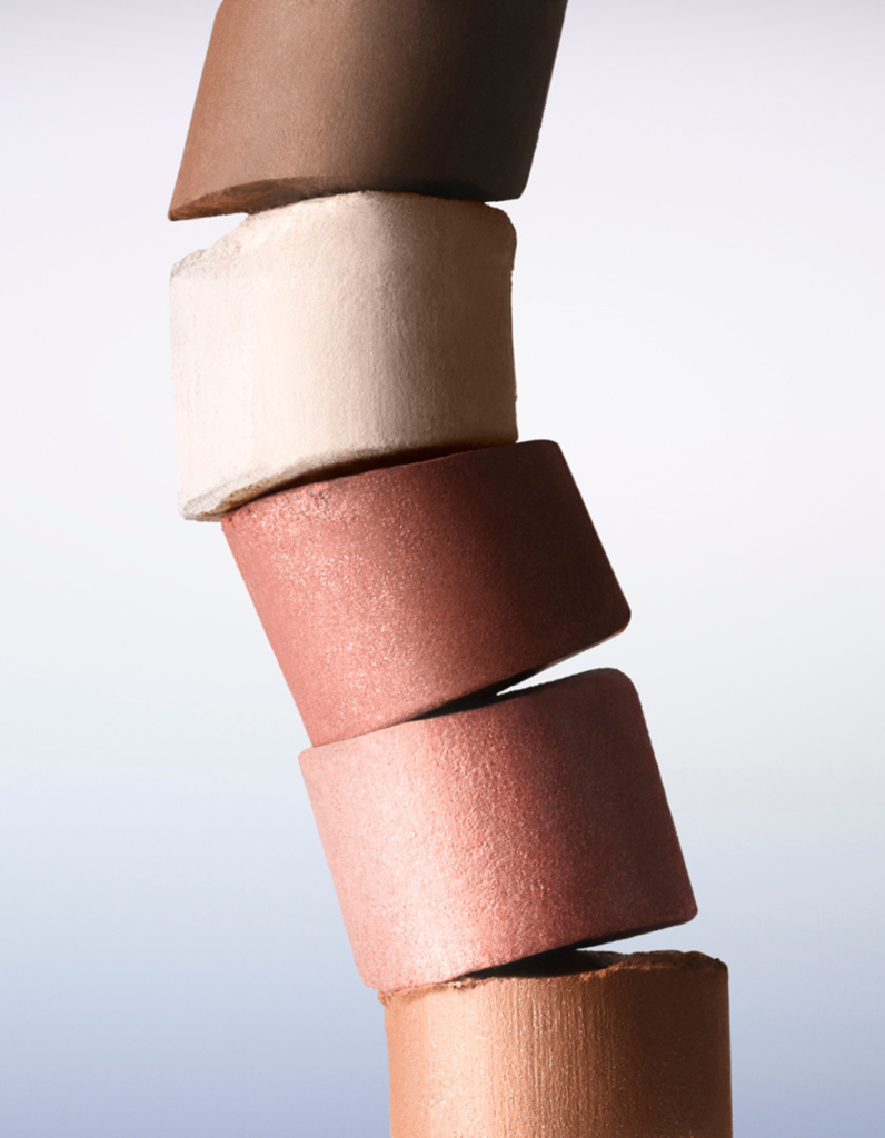
Lenoites Launches the Silky Blurring Powder Bronzer Lenoites, the Swedish clean beauty brand, has launched the Silky Blurring Powder Bronzer – a baked bronzer that sets itself apart from conventional pressed powders through both its production process and finish. The baking technique creates a lighter, more porous texture that melts into the skin rather than sitting on top of it, delivering buildable colour with a seamless, blurred edge and no visible shimmer or orange cast. The formula is talc-free and vegan, with 97% naturally derived ingredients, and combines a mica base with softening ingredients designed to blend evenly without catching on dry areas. The result is a bronzer that works for a light sun-kissed finish or more defined contouring without needing to switch products or brushes. Two shades are available: Light to Medium for fair to medium skin tones or a softer warmth, and Medium to Deep for medium to deeper tones or a more pronounced look. “This is a product we have developed over a long time, with great focus on how it actually feels on the skin. The technique was developed specifically for this product, which makes it different from traditional powders — it melts into the skin in a soft and seamless way,” says Laila Högfeldt, Founder and CEO of Lenoites. The Silky Blurring Powder Bronzer is available now at lenoites.se and selected retailers.

Opiates

Charlotte Tilbury Completes the Unreal System with a New Highlighter Stick

Charlotte Tilbury Completes the Unreal System with a New Highlighter Stick Charlotte Tilbury is adding a new product to its Unreal lineup – the Unreal Highlighter Fresh, Healthy Glow Stick, launching 18 June. The product completes the brand’s Unreal system, which launched in 2024 with the Unreal Skin Sheer Glow Tint Foundation Stick and has since expanded to include the Unreal Blush Healthy Glow Sticks and Unreal Lips Healthy Glow Nectar Oils. Each product in the system is designed to be applied without tools or a mirror, with a texture that blends on contact with the skin. The Highlighter is formulated with 92% skincare ingredients, Hyaluronic Acid and Vitamins C and E, and uses the brand’s Glow-Light Mapping Mesh Tech to diffuse light evenly across the skin for a soft-focus finish. It comes in a single shade, Glazed Goddess, a sheer champagne designed to work across all skin tones. It can be worn as the final step in a skincare routine on no-makeup days, or layered over foundation and blush for a more luminous effect. “I created it to take skin from looking tired and flat to glazed and glowing in seconds — for back-of-the-cab glow-ups, off-duty mornings, sun-kissed holiday moments and red-carpet skin,” says Charlotte Tilbury MBE. Alongside the Highlighter, Charlotte Tilbury is also launching a limited-edition mini version of its Unreal Blush Healthy Glow Stick, available from 16 July at Sephora and charlottetilbury.com in four shades: Rosy Glow, Peachy Glow, Pinky Glow and Cherry Glow.

Art

Galerie Nordenhake Marks 50 Years with a Three-City Exhibition

Galerie Nordenhake Marks 50 Years with a Three-City Exhibition Text by Natalia Muntean Galerie Nordenhake opens its 50th anniversary exhibition across all three of its spaces during the first weekend of July. Stockholm from 3 July to 15 August, Berlin from 4 July to 29 August, and Mexico City from 7 July to 22 August. The exhibition, titled Galerie Nordenhake Berlin, Stockholm, Mexico City, 50 years, brings together historical works and new commissions by 84 artists, functioning as both an exhibition and a living archive of the gallery’s history since its founding in Malmö in 1976. Rather than a chronological survey, the show centres on the relationships between artists and the gallery cultivated over five decades, an acknowledgement that the most significant thing a gallery does is not the buildings it occupies or the fairs it attends, but the sustained commitment to artists and ideas over time. Founded by Claes Nordenhake, the gallery moved to Stockholm in 1986, opened a Berlin space in 2000, and established a Mexico City location in 2017. Along the way it gave early shows to Nan Goldin, Mona Hatoum, Antony Gormley, David Hammons, and Jimmie Durham, among others, and has remained a consistent presence at Art Basel since 1978. “I started my gallery in 1976 in Malmö, a relatively small Swedish city back then. In those early years, the interest in our exhibitions was modest, but I believed deeply in the artists and the vision we presented. Fifty years later, this milestone feels both humbling and affirming — a testament to the commitment of our artists, the loyalty of our collectors and visitors, and the many colleagues who have sustained this endeavour,” says Claes Nordenhake, Founder of Galerie Nordenhake. The Stockholm space, designed by Gerda Persson and Bo Pilo, opens with Olle Bærtling’s seminal 1951 painting Univers en formation, paired with John McCracken’s minimalist Plank Black-Blue from 1985. Works by Donald Judd, Richard Serra, and Antony Gormley, all made during pivotal periods in the artists’ careers, are also on view, alongside photographs from the late 1990s by Dawoud Bey and Nan Goldin, including Goldin’s Ulrika, Stockholm (1998), a portrait of Claes and Margareta Nordenhake’s daughter, taken during the family’s Stockholm years. Important paintings by Swedish artists Torsten Andersson and Cecilia Edefalk are shown alongside newly commissioned works by Sarah Crowner, Ryan Mrozowski, and Ann Edholm. The Berlin space, designed by Gonzalez Haase AAS, spans works from 1961 to the present. The historical selection includes Josef Albers’ Homage to the Square (Receptive), François Morellet’s Seule droite traversant 2 carrés dans deux plans différents (1978), Michael Schmidt’s triptych Waffenruhe (1985–87), and Jimmie Durham’s Schlimmbesserung (1992). New commissions include a large-scale wall drawing by Marjetica Potrč imagining coexistence between people and nature in a post-Anthropocene rural Istria; a new light and colour installation by Spencer Finch, expanding on work first shown in his 2005 debut at the gallery; a life-size cut-collage by Frida Orupabo, Big Regrets, designed as a freestanding sculpture for the main gallery space; and new paintings by Sophie Reinhold and Paul Fägerskiöld. The Mexico City space, designed by Frida Escobedo, presents works that speak to the ongoing dialogue between the gallery’s European legacy and contemporary Latin American practice. Historical works by Robert Morris and Rémy Zaugg, which echo the gallery’s founding program, are shown alongside new commissions created specifically for this anniversary by Iñaki Bonillas, José Eduardo Barajas, Elena Damiani, Naufus Ramírez-Figueroa, and Jerónimo Rüedi. The space, which has served as a vital bridge between the gallery’s European roots and the Americas since opening in 2017, also features work by Mirosław Bałka, Emma Bernhard, Ayan Farah, Eva Löfdahl, Runo Lagomarsino, Silvia Gruner, and Marcelo Pacheco, among others. Ahead of the openings, a catalogue dedicated to the gallery’s history launches at Art Basel. Edited by Gerard Byrne and designed by Peter Maybury, it features commissioned texts by Daniel Birnbaum, Steffanie Hessler, and María Minera, and includes special editions and unique works produced by Iñaki Bonillas, Sarah Crowner, Spencer Finch, Frida Orupabo, and Håkan Rehnberg.

Art

Peripheral emOtions: Alice Shulman on Her Exhibition for the Brixtol Textile Art Scholarship 2026

Peripheral emOtions: Alice Shulman on Her Exhibition for the Brixtol Textile Art Scholarship 2026 Text by Natalia Muntean Photo by Jonas Ingerstedt Every two years, Brixtol Textiles invites an artist to transform deadstock fabrics from its production into a new body of work through the Brixtol Textile Art Scholarship. Established in 2022, the biennial initiative seeks to support artistic experimentation while highlighting the creative potential of existing materials. This year’s scholarship recipient is Stockholm-based artist Alice Shulman. Presented at Sven-Harrys Konstmuseum, her exhibition Peripheral emOtions features nine new sculptural installations that explore the relationship between glass and textile through waxed fabrics, frayed threads, folded surfaces and hand-blown glass. The works continue Shulman’s ongoing project Emotional Landscape, investigating how material, form and space can give shape to emotions that often remain just beyond our immediate awareness. “Brixtol Textiles was founded from a deep appreciation for textiles and the tactile experience of exceptional materials,” says Emil Holmström, co-founder of Brixtol Textiles. “The Brixtol Textile Art Scholarship celebrates artists who share our passion for textile craftsmanship and creative expression. Through this initiative, we hope to inspire new perspectives on textiles and contribute to a more vibrant and innovative creative landscape in Sweden.” For Holmström, the choice of Shulman as the 2026 recipient was clear. “Alice Shulman stood out this year for her unique approach to materiality and her unexpected use of our deadstock fabrics. Working from the medium of glass sculpture, she proposed a dialogue between two contrasting materials, textile and glass, that felt both innovative and poetic.” We spoke with Alice Shulman about peripheral emotions, the conversation between glass and textile and the role of materiality in expressing what words sometimes cannot. Natalia Muntean: What does the phrase Peripheral emOtions mean to you, and why did you choose it for this body of work?Alice Shulman: Peripheral emotions are feelings that linger at a distance. Whether subconscious or intentionally placed in the background, they continue to shape how we experience the world. I chose the title because the work explores these quieter emotional states that often exist outside our immediate attention. NM: What drew you to explore these quieter, less visible emotional states?AS: In this work I”m interested in the emotions that are present but not immediate. They can be conflicting, difficult to capture or just more quiet, yet they often influence us as much as our more obvious feelings. Photo by Jonas Ingerstedt NM: What can glass and textiles communicate that language sometimes cannot?AS: Materials communicate through presence and sensation rather than explanation. Together they create composition, harmony or dissonance. Sometimes it’s close to sublime, sometimes there is friction. Emotions are the starting point of language. NM: How did these two materials begin to speak to each other during the creative process?AS: It’s like both materials contaminate each other through the process. The fabric was made even more sturdy in order to support the glass – it stiffened in a simple motion just as glass does while fired. The glass – I always take clues from textile processes while working with it, by cutting glass while it’s hot, for instance, but in this work, it was also a matter of ornamentation. NM: How did the collaboration with master glassblowers in the Czech Republic shape the work?AS: The collaboration allowed me to work at a larger scale and push the material further. The final pieces emerged through a balance of artistic intention, craftsmanship, and the material’s own behaviour. NM: How did the rooftop setting influence the exhibition?AS: Sven Harry’s Rooftop is an iconic background. The pebbles, the golden walls and the Stockholm skyline with a striking blue sky make a perfect backdrop. It’s a manifestation of Swedish design tradition. With glass playing such a part in Swedish craft history, I think it’s wonderful to push that tradition into the future. NM: Did working with deadstock fabrics influence the ideas behind the exhibition?AS: Yes, through its sturdy, crispy character, it had a very sculptural structure and a natural will to shape by itself. NM: What do you hope visitors take with them after encountering Peripheral emOtions?AS: I hope the works give the visitors some minutes to reflect on their own emotional landscape. Photo by Ida Blom

Scroll to Top