Design

Design

Historiska Hem and Toniton Look to Stockholm’s Past for a New Colour Palette

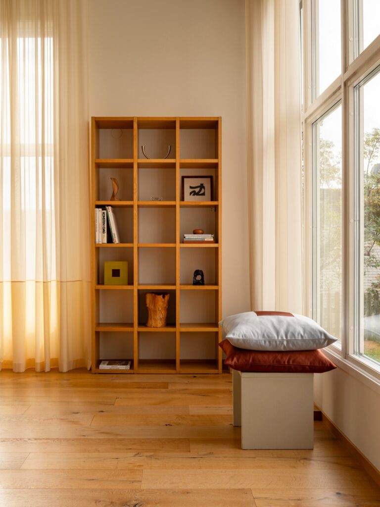
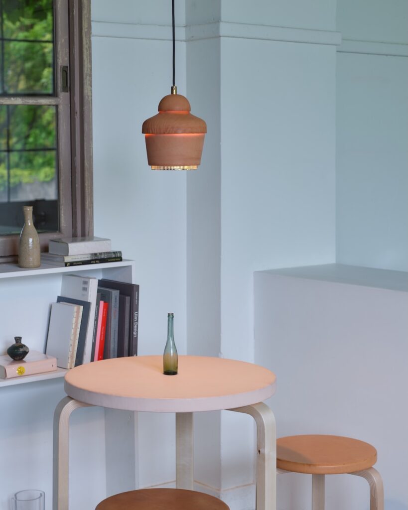
Historiska Hem and Toniton Look to Stockholm’s Past for a New Colour Palette images courtesy of Historiska Hem & Toniton What if the colours of Stockholm’s historic homes could be gathered into a single palette? This autumn, Historiska Hem and Swedish colour and design studio Toniton present a collection of 18 carefully selected shades, drawn from the architecture, interiors and changing light of the city. The collaboration brings together two distinct approaches to colour. Historiska Hem has spent years documenting Stockholm’s older homes, revealing the details that give them their character, from original joinery and painted ceilings to natural materials, intricate mouldings and the particular way Nordic light moves through a room. Toniton approaches colour as a system, creating considered palettes and colour coordinated products designed to allow walls, surfaces and interiors to exist as a coherent whole. For Historiska Hem, colour has always been part of the story. Since its founding, the agency has developed a distinctive way of presenting homes. Working closely with writers, photographers and set designers, each property is treated almost like an editorial feature. Architecture, materials, light, colour and original details are carefully observed and brought together to reveal the character of a place. It is an approach that has helped shift attention towards the qualities of older architecture, celebrating what remains rather than disguising it. Colour plays an important role in that process. A carefully chosen shade can emphasise an architectural detail, bring warmth to a material or give an old room an entirely new atmosphere without erasing its history. The new collection grows directly from this experience. Together, Historiska Hem and Toniton have revisited a vast number of colours and gathered the shades that have appeared repeatedly throughout the homes the agency has worked with over the years. The resulting palette moves between muted and expressive tones, inspired by painted woodwork, ceilings, natural materials and the shifting qualities of Scandinavian daylight. Rather than being tied to a particular period, the colours are intended to feel both rooted and contemporary. They can be used individually or layered together, creating tonal interiors, gentle contrasts or more unexpected combinations. Walls, ceilings and woodwork become part of the same composition. The paint itself is equally central to the collaboration. Toniton’s ecological, plastic free formula uses natural pigments, giving each colour a depth that responds to the light around it. As the day changes, so does the appearance of the shade, bringing a sense of movement to what might otherwise be a static surface. For Katarina Ljung, founder of Historiska Hem, this return to colour is also a return to a more expressive way of thinking about interiors. “Historically, our homes were often much more colourful than they are today. Colour was used to create atmosphere, with ceilings, woodwork, mouldings and walls painted in shades that gave rooms character and depth. I find that incredibly inspiring. Taking colours and details from the past and using them in new ways, especially in unexpected combinations, can completely transform a space. I hope this collection will inspire more people to be a little bolder and have more fun with colour.” There is something distinctly Stockholm about the palette, but its appeal lies in the fact that it does not attempt to recreate the past. Instead, it looks at the city’s architectural history as a source of ideas. The colours feel collected rather than prescribed, shaped by the thousands of homes that have passed through Historiska Hem’s hands. “What if Stockholm’s walls could talk? Inspired by the thousands of homes that Historiska Hem has represented over the years, we have selected the shades that work best with different types of light, materials and spaces. The result is a palette where the colours are just as beautiful on their own as they are together, while the natural pigments give each shade a living quality that changes with the daylight.” The collection ultimately offers more than a selection of paint colours. It is a way of looking at the city through its interiors, tracing the relationship between colour, architecture and everyday life. In these 18 shades, Stockholm’s past becomes something to live with again, interpreted through a contemporary eye and allowed to change with the light.
Design

The Art of Staying Grand

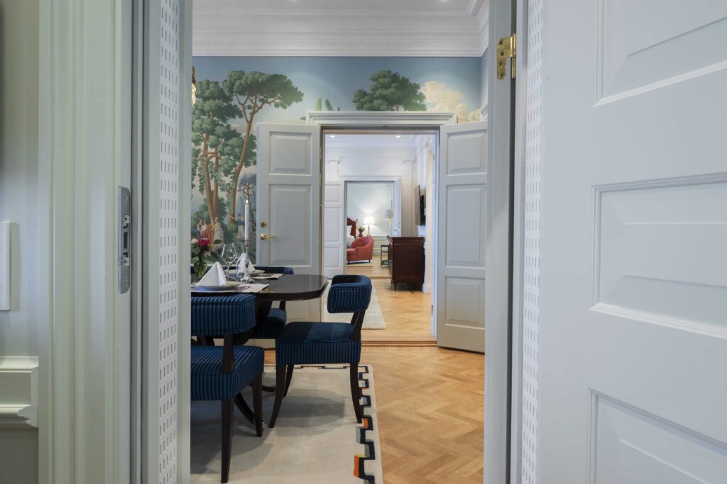
The Art of Staying Grand Inside Grand Hôtel Stockholm’s “soft renovation”, where cinematic turquoise, royal blue and fragments of the past reveal a more personal idea of modern luxury. Guests expect historic hotels to evolve, but rarely want them to change. The rooms must function for the present while retaining the atmosphere that made people return in the first place. Grand Hôtel has never been simply a place to sleep. Since opening in 1874, royalty, diplomats, film stars and Nobel laureates have crossed its floors. For some, it has been a room for the night; for others, a temporary home. For Stockholmers, it has also long been a setting for occasions that call for somewhere special: dinners, meetings, birthdays, first dates and evenings that continue long after the final glass has been cleared from the table. Interior designer Sanna Nathanson describes the work she has carried out with Studio Ramson as a “soft renovation”. The phrase makes sense as we walk through the hotel. Her approach is not built around a dramatic reveal or a single visual concept imposed on every room. It is about knowing what should feel new, what can be reinterpreted and what is better left alone. We begin with an alcohol free cocktail named Postcard from the Riviera before heading upstairs. Behind each door, the atmosphere shifts. One room is calm and almost monochrome, with soft grey walls and a graphic carpet. Another has bespoke headboards upholstered in patterned Le Manach textiles. In Room 448, the original wallpaper remains, its age treated as character rather than something to correct. There is no single contemporary identity repeated throughout the hotel. Even the ceilings have been painted in shades chosen to correspond with the palette below, bringing warmth and completeness to the rooms. Guests can even request a preferred colour. Almost. For those whose hotel preferences already extend beyond the choice of pillow, blue, green or something more neutral can now be added to the conversation.  In the Ingrid Bergman Suite, colour takes centre stage. The corner suite spans 76 square metres and is defined by a shade I immediately think of as “Grand Turquoise”. It recalls Tiffany blue, but is richer and pulled further towards turquoise. The colour gives the room a glamorous, slightly unexpected energy. A portrait of Ingrid Bergman hangs beside the windows, while references to cinema appear throughout the suite. Tiles dating back to 1874 bring a fragment of the hotel’s earliest history into the room without turning it into a museum. From film history, we move to royal history. The Bernadotte Suite is named after Prince Sigvard Bernadotte, who decorated the hotel’s third floor in collaboration with Svenskt Tenn. Across its 165 square metres, classical mouldings and pale walls are interrupted by deep green, rust red and blue. The dining room is the suite’s centrepiece. A landscape unfolds across wallpaper painted by hand, surrounding a table set for eight. Blue striped chairs and a graphic rug keep the room from feeling overly ceremonial. It is unquestionably grand, but still feels ready to be used. This is Grand Hôtel’s interpretation of Swedish design. Not the bare minimalism with which Scandinavia is so often associated, but restraint combined with colour, texture and a taste for ceremony. Luxury is communicated through proportion, materials and the confidence to let an unexpected colour take up space. Beyond the suites, a deep royal blue carpet now runs along the staircase. It changes the mood without changing the architecture and seems destined to become the backdrop for many photographs to come. The practical updates are quieter. Every room now has a coffee machine by the Swedish company Sjöstrand. This leads to one unexpectedly useful lesson: coffee with milk is among the worst things you can spill on a hotel carpet. If it happens, call the front desk immediately. Who knew? These interiors may be carefully composed, but they are still made to be lived in. Perhaps that is what it means for a hotel to remain grand today. It is less about marble, chandeliers or square metres than continuity: allowing new stories to enter without losing those already held within the walls. The renovation is gentle, and that is precisely the point. The art lies in knowing what to touch, what to leave alone and how to make history feel alive. text Jahwanna Berglund
Design

Gift of Love – Moomin Arabia Celebrates Togetherness with New Collection

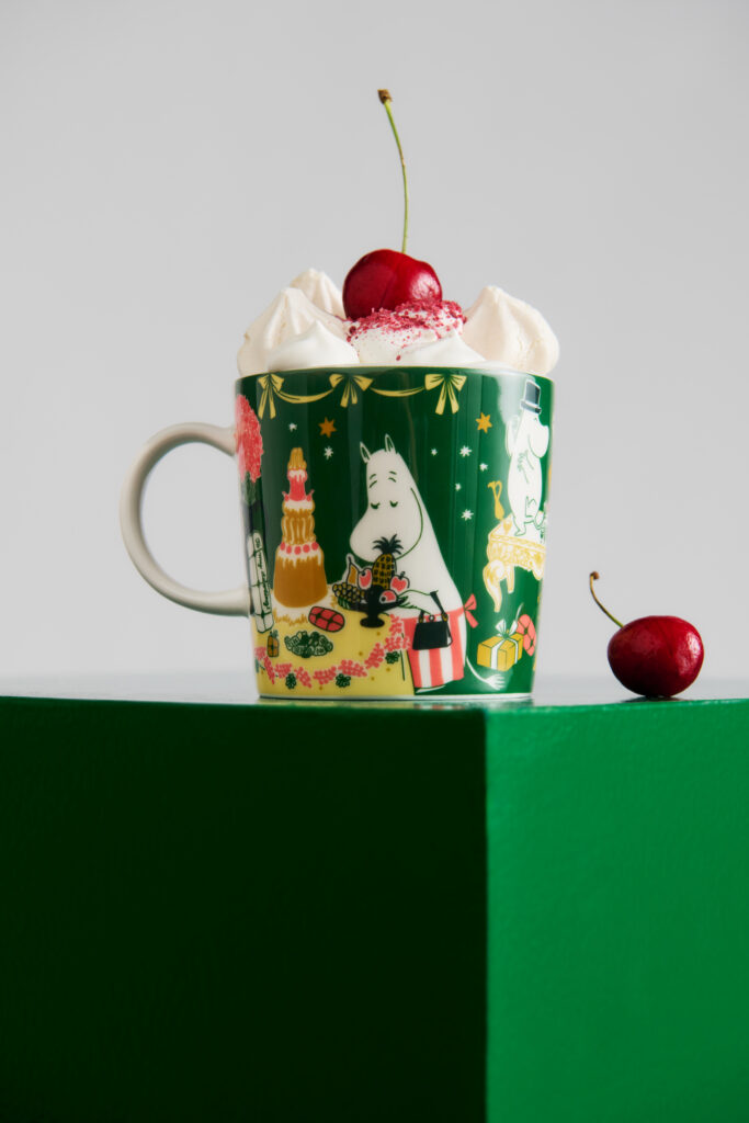
Gift of Love – Moomin Arabia Celebrates Togetherness with New Collection As the final chapter of its 30th anniversary celebration of the beloved Kärlek (Love) illustration, Moomin Arabia is turning its attention to one of the simplest expressions of love: spending time together. Kärleksgåva, or Gift of Love, is a new seasonal collection of ceramics and textiles designed around the idea of gathering, celebrating and creating shared moments with family and friends. The collection launches globally on 1 October 2026. The collection marks the continuation of Moomin Arabia’s year-long Kärlek 30 theme, which has explored different forms of love through a series of collections. While the original Kärlek illustration, featuring Moomintroll and Snorkmaiden, has centred on trust and lasting relationships, and the Sweethearts and Loving Care collections explored forgiveness and care, Kärleksgåva focuses on the importance of togetherness and doing things with the people around us. “We wanted to create a collection that fits all seasons and occasions. In the Moomin philosophy, every day spent together with people you love is a good reason to celebrate,” says Annika Tickle, Creative Director at Moomin Arabia. Kärleksgåva is defined by a new colour palette of green, mustard yellow and beige, with illustrations and patterns inspired primarily by Tove Jansson’s 1958 comic The Golden Tail. In the story, Moomintroll becomes unexpectedly popular thanks to the glowing tassel at the end of his tail and is invited to a lavish party where the guests raise their glasses, cheer and dance on the tables. Additional details draw from Moomin Winter (1955) and Moomin’s Desert Island (1956). The collection is designed to bring a sense of celebration throughout the home. Moomin ornaments can be used to decorate windows, doors and chandeliers, while mugs, plates, bowls and serving pieces are intended for everything from cooking and baking to sharing meals. Matching aprons, oven mitts and pot holders extend the theme into the kitchen, while a festive tablecloth brings the table setting together.
Design

LAYERED Meets Collina Strada in an Expressive Dialogue Between Fashion and Interiors

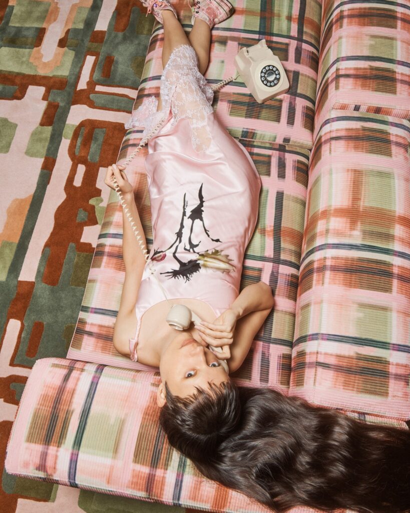
LAYERED Meets Collina Strada in an Expressive Dialogue Between Fashion and Interiors photography  Ryan Petrus What happens when the irreverent spirit of New York fashion finds its way into the home? Today, LAYERED and Collina Strada unveil the result of their new collaboration, bringing together colour, craftsmanship and a distinctly individual point of view. There is little about Collina Strada that could be described as conventional. Founded by Hillary Taymour, the New York fashion house has spent more than a decade cultivating a world that is playful, instinctive and wonderfully unpredictable. Now, that world extends beyond clothing and into the realm of interiors, in a collaboration with Swedish design house LAYERED. The partnership marks a first for both brands. For LAYERED, best known for its hand tufted rugs, it is the brand’s first collaboration with a fashion designer. For Collina Strada, it signals a move into interiors, translating the label’s distinctive visual language into a collection for the home. Rather than simply transposing fashion into furniture and textiles, the collaboration considers how the emotional qualities of clothing can inhabit a room. The result is deliberately expressive, with pieces that resist the idea of interiors as a quiet backdrop and instead invite them to become part of the conversation. The collection comprises four hand tufted rugs and two sofas, drawing on Taymour’s characteristic use of colour and pattern. Shades of pink and green run throughout, while references to Collina Strada’s own history are woven into the designs. One rug takes its pattern directly from the floor of the brand’s New York flagship, while another echoes the distinctive check featured in its AW26 show. Elsewhere, two sculptural rugs take the form of oversized flowers, introducing a softer, more organic silhouette to the room. Their fluid shapes offer a playful counterpoint to the straight lines and familiar geometry of contemporary interiors, blurring the line between object and artwork. “In design, I am interested in creating tension between contrasting ideas: beauty and discomfort, fragility and strength, fantasy and realism. I believe fashion and design should evoke emotion and individuality rather than perfection.” – Hillary Taymour, Founder and Creative Director, Collina Strada That sense of spontaneity is carried through into the craftsmanship. Each rug is hand tufted by two to three textile artisans, with the process taking up to four days. The pile heights and edges are then cut by hand, preserving something of the freedom and irregularity of a fashion sketch. No two pieces are entirely alike, with subtle variations becoming part of their character. For LAYERED, the collaboration offered an opportunity to bring its expertise in traditional textile craftsmanship into dialogue with Collina Strada’s more instinctive approach to design. The result is a collection that feels considered without ever becoming overly polished. “We have long admired Hillary’s ability to create an immersive world where imperfection and complexity become irresistibly beautiful. Although we work within different fields, we share a deep appreciation for bold, tactile storytelling. By bringing Collina Strada’s visionary aesthetic together with our expertise, we have created a collection of striking statement pieces.” -Malin Glemme, Founder and Creative Director, LAYERED At its heart, the collection is a celebration of personality over perfection. It suggests an interior that is allowed to be expressive, unexpected and perhaps a little eccentric. A room does not have to be restrained to feel sophisticated, nor does design have to be serious to be considered. With LAYERED and Collina Strada, the language of fashion finds a new setting. The rug is no longer simply something beneath your feet. It becomes a focal point, a conversation starter and, ultimately, another way of dressing the room.
Design

Inside Trove: Cathy Nordström’s Unexpected Source of Inspiration

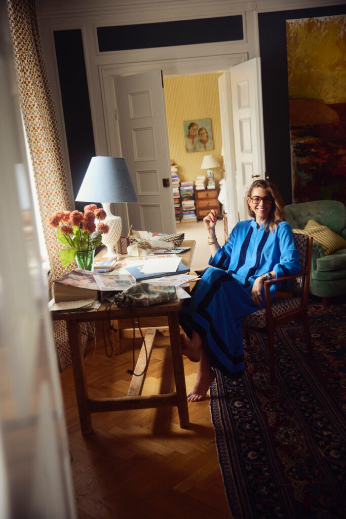
Inside Trove: Cathy Nordström’s Unexpected Source of Inspiration Text by Natalia Muntean An online auction, a mystery box of books and centuries of decorative arts became the surprising starting point for Trove, Cathy Nordström’s latest collection of textiles and wallpapers. What arrived at her studio was far from a carefully curated archive, rather it was a personal library documenting embroidery, ceramics, rugs and ornamental crafts from across Europe, Asia and the Middle East. Instead of reproducing historical motifs, the Swedish pattern designer transformed these references into five original, hand-painted patterns that reflect her use of colour and love of craftsmanship. Six years after launching her brand, Nordström reflects on its beginnings after years of designing for others, the emotional thrill of discovering the archive and why the hardest part of creating Trove was knowing when to stop. Natalia Muntean: You have described yourself as a “passionate textile nerd” in one of your other interviews – was there a moment you can point to when patterns and textiles became a serious interest?Cathy Nordström: I can’t think of a specific moment. Looking back, I can see that it’s always been a part of me. As a child, I loved decorating my room, and there were always patterns and colors involved. I repainted, wallpapered, and played around with cushions and textiles. Since then, it has gradually grown to become more of an obsession than even a passion. There are a few things that make me more excited and more filled up emotionally than old textiles and craftsmanship.  NM: You worked for years licensing patterns to other brands before founding Cathy Nordström in 2019. What made you want to go out on your own?CN: Somebody asked me at one point, “Do you have a lot of your patterns at home?” and I remember answering, “No, definitely not.” Then I started thinking maybe I should actually start designing patterns that I am proud of and that I truly, truly love. I grew more and more tired of just sending away a digital file. When you freelance and license patterns to other brands, very often the customer dictates the outcome, to some extent. I was licensing my patterns to a lot of different kind of brand, from IKEA and UNIQLO, to smaller baby brand in the UK and quilting fabric companies in the US. It was fun, but I didn’t love these patterns. I wanted to design prints that I wanted myself and I knew it was always interiors and homeware that was my passion. I wanted to be part of the whole process: I didn’t just want to send a digital file to someone, and then it was out of my hands. I wanted to be part of everything, from the first idea and moodboarding to the sketching, drawing, creating the screens for the screen printing, being on the factory floor when we print it, and just following through until the finished product. And I wanted it to be made in Sweden, so that was the starting point of everything. I didn’t know what I was throwing myself into, I just went for it.  NM: How would you describe your own design language now, six years into running the brand? CN: Some of the very first patterns I launched in 2020, had already been in my pattern library for some time. They were the prints that I had designed during my freelancing career, but never licensed because I must have known subconsciously that, at some point, these were prints that I wanted to own myself. Two of our best sellers, actually, I made before I started this brand six years ago. I don’t know how to describe my design language, these things are always better described  ny someone on the outside. I think the color scheme and limited use of colors in each pattern is what ties it together. Color is massively important to me. I guess my  designs could be described as modern and simplistic, with a rich color story. I just design what I do. I’ve never designed with a specific style in mind, it’s just what comes out.  I do admire these more richly ornamented fabrics,I love French, Indian and British fabrics that have more details and colors. At some point, you feel like, “Oh God, I wish I could design patterns like that,” but it’s just not me. I try not to think too much about what my style is. I just let my hand dictate what comes out.  NM: The Trove Collection began with a friend’s tip about an online auction. What was going through your mind once the box arrived and you started looking through it?CN: So many feelings and butterflies in my stomach. I knew I had stumbled upon an amazing treasure. Flicking through those pages, especially from the thickest book, which is like a documentation of craftsmanship, textiles, and ceramics from all over the world, dating thousands of years back, I knew I had something golden in front of me. And also, how many other books are out there for everyone to enjoy? NM: Can you describe what was actually in the archive: the books, objects, documented crafts, and the regions and centuries they came from?CN: Books and pamphlets about decorative arts, rugs from the Middle East, books about Swedish traditional sewing & embroidery, about folk costumes, about Swedish textile design in the 50s, books about how to knit and embroider, about curtains, about woven materials, about Asian art and Japanese patterns.  NM: Was there one object, book, or region in the archive that surprised you most, or that you keep coming back to?CN: Yes, a really thick, large brick book called Decorative Art from Foreign People and Cultures. This one is the one I keep coming back to because it’s catalogued. Someone has catalogued so many different pieces from cultures all around the world, and it’s divided into countries and regions. It’s everything from textiles to ceramics to everyday objects, and it is the most amazing piece of work I’ve
Design

Artek reimagines its iconic Zebra print in a new colour way

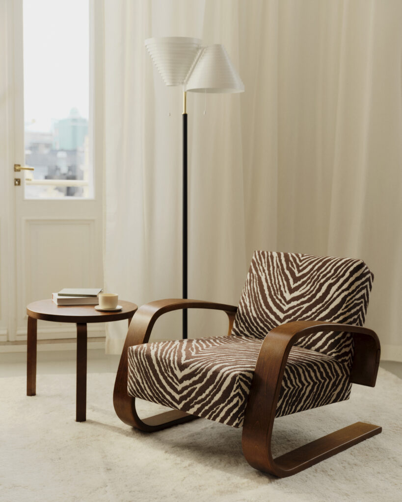
Artek reimagines its iconic Zebra print in a new colour way Artek is revisiting one of the most recognisable patterns in Nordic design. For Autumn 2026, the Finnish design house introduces a new brown-and-white version of its iconic Zebra jacquard textile, expanding the nearly century-old design across upholstered furniture and a collection of lifestyle accessories. Originally added to the Artek collection in 1935, Zebra has long been associated with the playful yet architectural aesthetic of Aino and Alvar Aalto. While animal prints have once again become a defining trend across fashion and interiors, Zebra stands apart as a pattern that has remained in continuous production for almost 90 years. The new colourway softens the textile’s graphic expression without losing its distinctive rhythm. Woven using a double jacquard technique, the fabric combines durability with a rich tactile structure, making it suitable for everything from Artek’s classic armchairs and stools to cushions, bags and pouches. The story behind Zebra stretches far beyond Finland. According to new research commissioned by Artek and written by visual artist and researcher Judith Raum, the textile’s origins can be traced to France in the late 1920s, where woven interpretations of zebra hide emerged amid the Art Deco fascination with exotic animal motifs. Aino Aalto encountered the fabric while travelling through Paris and Zurich in 1935, noting in her diary that it originated from Lyon before ordering it for Helsinki. The pattern debuted on Aalto furniture when Artek opened its first store in 1936 and has remained a defining element of the brand ever since. Raum’s research also revisits the long-held belief that Bauhaus textile designer Otti Berger created Zebra, concluding that while Berger collaborated with Swiss modernist furniture company Wohnbedarf, the iconic pattern predates her work and its original designer remains unknown. Alongside the textile launch, Artek presents a capsule collection featuring walnut-stained editions of the Kanto magazine and firewood rack and Alvar Aalto’s Table 90D. Two of the designer’s celebrated pendant lights, the A330S Golden Bell and A110 Hand Grenade, also return in a rich brick-red finish drawn from the company’s archives. The Zebra collection is available globally from 3 September 2026 through Artek stores, selected retailers and online, with Japan following in mid-November.
Design

Burgundy’s Maison Le Chevreuil Opens with Hästens Beds in Every Room

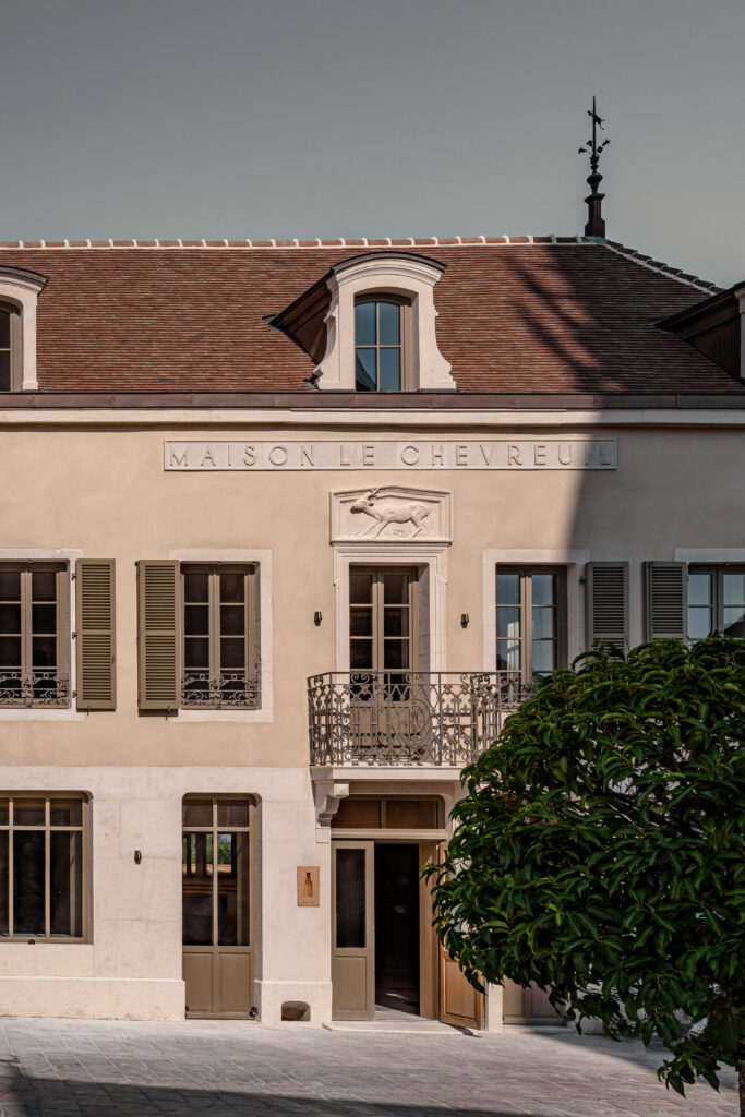
Burgundy’s Maison Le Chevreuil Opens with Hästens Beds in Every Room On 11 September 2026, Maison Le Chevreuil will open in the historic wine village of Meursault, marking the first time a French hotel features handcrafted Hästens beds in every guestroom. Following a meticulous two-year restoration in close collaboration with local artisans, the ten-room boutique property seamlessly blends contemporary design with Burgundy’s deep-rooted traditions of winemaking, gastronomy, and craftsmanship. Every detail has been considered to reflect the tranquillity and natural beauty of the surrounding vineyards. Eight of the rooms are appointed with the Hästens 2000T model, while the two suites feature the luxurious Hästens Maranga, ensuring that sleep, the foundation of any memorable stay, is elevated to an art form. “We wanted Maison Le Chevreuil to be a destination where genuine wellbeing is woven into every detail,” says architect and designer Johanna Leserne. “Our collaboration with Hästens reflects our ambition to offer guests an experience that unites the finest craftsmanship with true hospitality, a place where they can fully rest and reconnect, surrounded by the beauty of Burgundy.” Beyond the bedrooms, the hotel offers the open-fire restaurant Teme, which showcases seasonal Burgundy produce, along with a wine bar, terraces, and a heated pool. Locally crafted products, bespoke bathroom amenities from La Chênaie, and interiors inspired by the wine landscape complete the immersive experience. Maison Le Chevreuil is located on Meursault’s main square, opposite the village’s historic town hall and church, with Burgundy’s famed vineyards just moments away.
Design

Watt & Veke launches exclusive collection with The William Morris Society

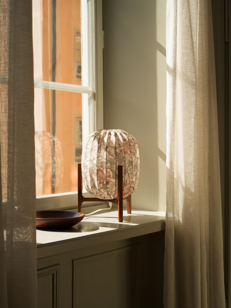
Watt & Veke launches exclusive collection with The William Morris Society Swedish lighting brand Watt & Veke unveils an exclusive new collection in collaboration with The William Morris Society, celebrating the legacy of the Arts & Crafts movement while shining a spotlight on the work of designer and textile artist May Morris. The collection reimagines two iconic Morris patterns in exclusive colourways created specifically for Watt & Veke, bringing together British design heritage and Scandinavian simplicity. At the heart of the collection is Honeysuckle (1881), one of May Morris’s most celebrated designs. Its honeysuckle vines and botanical details come to life as light filters through the fabric, casting soft shadows across a room. The collection also features African Marigold (1876), one of William Morris’s most recognisable floral patterns. Blooms framed by foliage give the design a dramatic yet balanced character. More than simply William Morris’s daughter, May Morris was a pioneering artist in her own right. As head of the embroidery department at Morris & Co., she developed a distinctive visual language defined by movement, craftsmanship and the beauty of nature. Through this collaboration, Watt & Veke celebrates her contribution to design history and honours the women who helped shape one of the world’s most influential artistic movements. The collection includes the Prisma Table lamp, crafted in solid wood with a textile shade, integrated dimmer and decorative fabric cord, alongside the Flat Shade and Oval Shade lampshades. Each piece is handmade in Europe and designed to diffuse light beautifully while highlighting the intricate Morris patterns. Founded in 1955, The William Morris Society preserves and promotes the artistic legacy of William Morris, May Morris and the Arts & Crafts movement from its museum in Hammersmith, London. The collaboration reflects the shared values of both organisations: timeless design, exceptional craftsmanship and the belief that everyday objects can be both beautiful and meaningful. The William Morris Society x Watt & Veke collection is available from 1 September 2026.
Design

Stamuli Opens First Showroom in Stockholm

Stamuli Opens First Showroom in Stockholm Swedish-Italian design studio Stamuli is opening its first pop-up store and showroom in Stockholm for its tenth anniversary. Opening on 27 August 2026, the temporary store and showroom, located in the heart of the city, showcases Stamuli’s own furniture and design objects together with a selected range from European design partners. Founded by Emanuele Stamuli, the Stockholm-based studio has worked with international fashion brands, including Ganni, Magda Butrym, Alexander Wang and J.Lindeberg, over the past ten years, creating their retail spaces. In parallel, the practice has also focused on working with private homes and creating its own furniture designs. Stamuli Collezioni offers visitors the opportunity to explore and purchase a curated selection of the studio’s own furniture and design pieces, alongside objects from European design partners. Drawing inspiration from past architecture and interior projects, Stamuli’s creations have been reimagined as collectible design pieces and are now part of the expanding furniture line available at the showroom. “Stamuli Collezioni brings together the ideas, objects and collaborations that have shaped our first ten years. We wanted to create a place where visitors can experience our approach to architecture and interiors in a direct and personal way,” says Stamuli. Stamuli Collezioni opens to the public on 27 August 2026 at Linnégatan 4, Stockholm, and will be open Tuesday–Sunday until shortly before Christmas. 

Design

An Interview with Tove Slotte: One Last Story from Moominvalley

An Interview with Tove Slotte: One Last Story from Moominvalley Written by Jahwanna Berglund   images courtesy Moomin Arabia Few everyday objects carry memory quite like a Moomin mug. Held in the hands and woven into daily rituals, they have become quiet companions to childhoods, homes, and generations of collectors worldwide. Behind one hundred thirteen of these designs is Finnish artist Tove Slotte, who, for more than three decades, translated Tove and Lars Jansson’s original illustrations from the page onto ceramic. Slotte’s work has always been an exercise in sensitivity: preserving the spirit of Jansson’s drawings while finding new relationships between characters, landscapes, and small, sometimes overlooked details. In doing so, she helped transform familiar scenes from Moominvalley into objects that feel deeply personal, each holding a story of its own. Her final mug brings this extraordinary chapter to a gentle close. Inspired by Tove Jansson’s 1955 comic strip Moomin’s Winter Follies, the autumnal design centres on the Moominhouse as the family prepares for hibernation. Completing the four seasons of the Moomin’s Day series, it feels both like a farewell and a return home. When I spoke with Slotte, I wanted to return to where it all began, long before Arabia and the one hundred thirteen designs: to her earliest memories of Moominvalley and the characters that first captured her imagination. Jahwanna Berglund: You began designing for Moomin Arabia more than three decades ago. Can you take us back to the beginning and tell us what first drew you into the world of the Moomins?  Tove Slotte: I actually grew up with the Moomin stories. My mother read the illustrated Moomin children’s books for my brother and me when we were small, at the beginning of the 1960s, and later on I read all the Moomin novels, and also some of the comic books. As a child, I was fascinated by Little My, and later on I admired Snufkin. I also loved to draw the Moomins as a child, and I drew them everywhere, in the sand with a stick, and in the snow.  About thirty-seven years ago I was working at Arabia as a designer, mostly doing decoration designs. The company hired a new product manager, Christel Vaenerberg, who also had loved the Moomins since her childhood. She planned that Arabia would make a Moomin collection with different items, and she asked me to design the surface decorations on these various items, since we had discussed our mutual love for the Moomins earlier. The first collection, in 1990, included four mugs, a children’s set with a plate, mug, and spoon, six small wall plates, two bigger wall plates with eight corners (later completed with an additional four pieces), and four Moomin figurines. The figurines were sculpted by Tuulikki Pietilä, the partner of Tove Jansson. JB: Your work has involved translating Tove Jansson’s original illustrations onto three-dimensional objects. How did you preserve the spirit of her drawings while gradually developing your own visual language?  TS: I do hope that I have preserved the spirit of Tove Jansson’s original  illustrations in my work. In the beginning, I was very cautious and careful with the illustrations. We promised Tove Jansson back then that we would use only her or her brother Lars Jansson’s original illustrations in the designs.  When working so long with the same theme and characters, I suppose you  just develop your own style, but I can’t really point out exactly what my style  is. I guess it has to do with colours, thickness, and variation in the contour lines, and how to put together different characters and background scenes.  Most of the details in a mug design are picked from different illustrations by  Tove Jansson, and I guess that’s what keeps the motif ‘original’ and contributes to the spirit of her drawings. JB: After creating one hundred thirteen Moomin mug designs, did your relationship with the characters change over time?  TS: Yes, I believe it did. At some point I was really tired of Moominvalley, and also of seeing Moomin trolls all over the place, not only in Moomin Arabia’s products, but on all kinds of items, from clothes to sweets and to furniture,  and everything in between. This also caused a reaction in my own design work, which actually made designing more interesting. As I discovered familiar illustrations on different objects in the stores or in magazines, I started to try to find unique illustrations that nobody else had used in their design work. Sometimes it could be a really small detail in a comic strip square that I enlarged so that it would become the main component in a decoration. I didn’t want to make ‘lazy’ designs with easy illustrations. I also became more interested in side characters, because the main character you could see everywhere. JB: Moomin mugs have grown from everyday objects into cherished collector’s pieces, often connected to deeply personal memories. Did you ever imagine that your designs would become so meaningful to people around the world?  TS: No, I couldn’t see it coming in the beginning. As I don’t think anyone could. It was nothing that was planned and aimed for; it just happened. It feels, of course, extremely nice that I have been able to contribute to these cherished pieces, but I strongly feel that the honour belongs to Tove Jansson. I have never felt that the Moomin mugs are completely my designs; both the shape and motifs of the mugs belong to famous creators, Kaj Franck and Tove Jansson. Not to forget the manufacturer, Moomin Arabia, with its high-quality standards and products. JB: Your final mug is inspired by Tove Jansson’s 1955 comic strip Moomin’s Winter Follies, showing Moominvalley in autumn as the family prepares for hibernation. What made this particular scene feel right for your final design?  TS: It was obvious that the final design would be an autumn motif, since it was the fourth mug in a season series, where summer, winter, and spring already existed. Tove Jansson

Scroll to Top