Uncategorized

Fashion Articles, Uncategorized

An interview with Wood Wood’s Brian SS Jensen on their AW26 collection

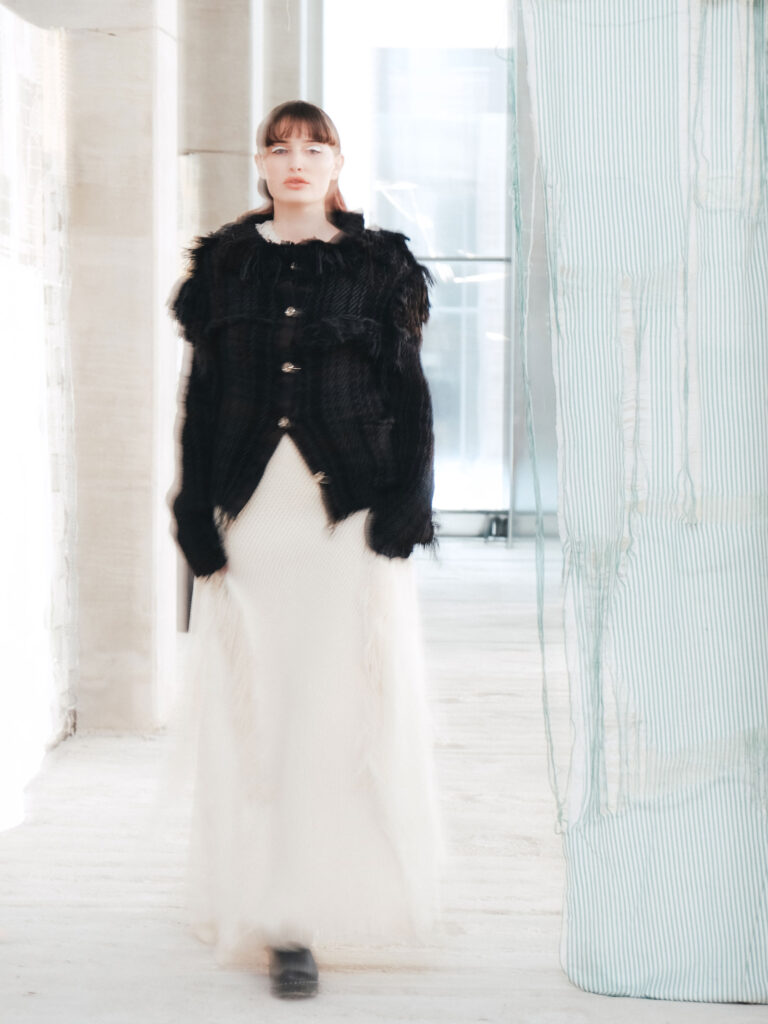
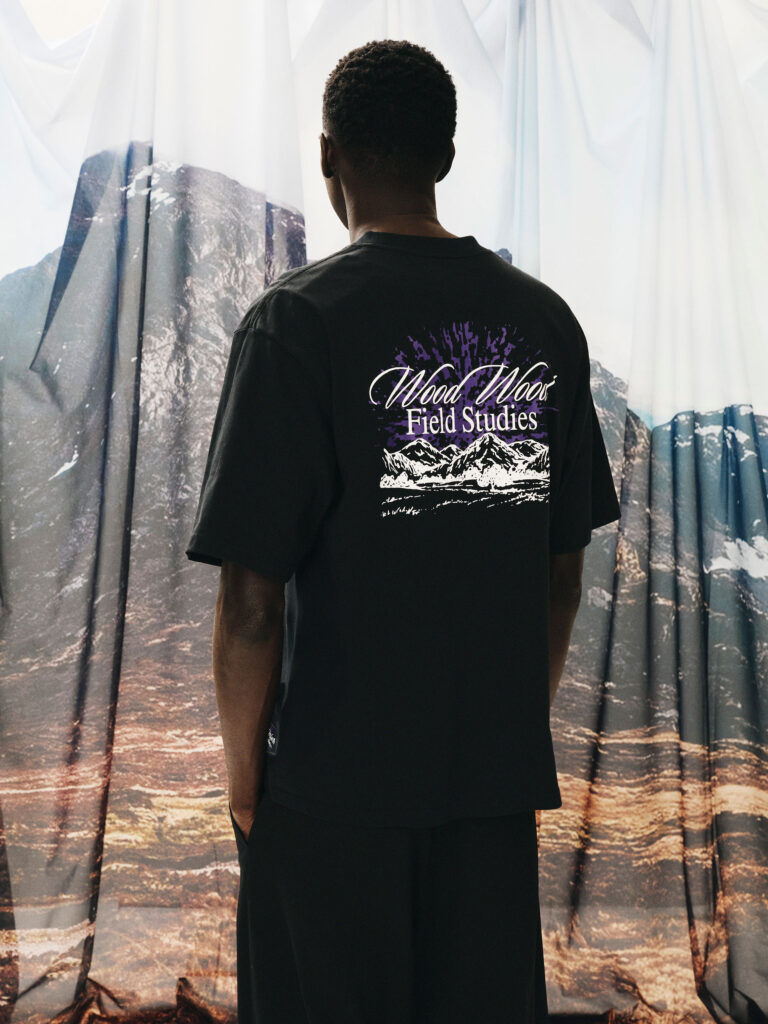
An interview with Wood Wood’s Brian SS Jensen on their AW26 collection text by Ella Nelson For over two decades, Wood Wood’s Magnus Carstensen, Karl-Oskar Olsen, and Brian SS Jensen have built and positioned the Copenhagen-based brand as a defining force within the European street couture scene. With a clear nod to the outdoors—while remaining true to the brand’s contemporary streetwear sophistication—Wood Wood’s AW26 collection, titled ‘Field Studies’, presents a polished selection of outerwear, hefty knits, layered pieces, and select accessories, seamlessly merging functionality with fashion. Drawing inspiration from rural Norway and the Scottish Highlands, the collection’s color palette is dominated by shades of brown and forest green, punctuated by pops of pink and orange. In conversation with Odalisque, Brian SS Jensen, co-founder and creative director of Wood Wood, discusses the starting point of the AW26 collection, its hidden references, and the brand’s continued comeback.  Image Courtesy Wood Wood Please tell us about how the AW26 collection came to life. What inspired it, what did the creative process look like, and how does the installation reflect those ideas?  The collection was inspired by a lot of different things; I think the first spark came from a conversation about the ‘Hessdalen lights’ – this strange light phenomena that happens in rural Norway, which attracts curious visitors from all over the world. We thought a lot about the friction that can occur between outsiders and locals in these small, remote communities. The Scottish highlands became another touchpoint. We wove these different references into a loose narrative that helped guide us through the process, giving the collection a sense of place and story without being too literal about it.    Which key elements played a role in shaping the AW26 collection?  The fundamentals: shape, texture, colours, prints.    Are there any specific pieces, details, or ideas you’d like to highlight from this collection?  I really like some of the heavier wool and leather outerwear pieces. There’s a weight and substance that feels right for the themes we were exploring.  What challenges did you face in creating the collection, and what are you most proud of? I’m generally quite happy about this one. It always feels like a battle to finish a new collection, but when I look at all the pieces together now, I believe we landed in a good place.  What do you hope audiences feel or walk away with after experiencing the AW26 showcase? I hope they will get a sense of the underlying stories that informed the collection. I don’t expect people to recognise or decode the specific references, nor do I really want them to, but hopefully it makes the individual pieces feel connected to a larger context.  How does this collection build on and strengthen the ongoing narrative of WOOD WOOD? Each season represents a new layer added to the brand. This collection is a reflection of our interests right now, but it’s also another chapter of a much bigger story.  Looking ahead, what’s next for WOOD WOOD?  The company has recently gone through a rather significant transformation which took a lot of time and hard work, but we are now in a strong position to build and move forward. I can’t say too much yet, but we are planning some exciting projects, and we have our 25th anniversary coming up next year!

Opiates, Uncategorized

Breitling Joins Aston Martin for a New Chapter in Speed

Breitling Joins Aston Martin for a New Chapter in Speed Image Courtesy Breitling & Aston Martin Breitling steps into a new era as it joins Aston Martin and its Formula One™ Team as Official Watch Partner. The partnership connects handcrafted performance with precision engineering, beginning with the Navitimer B01 Chronograph 43 Aston Martin Aramco Formula One™ Team; a timepiece marking the watchmaker’s return to Formula 1®. Two worlds shaped by speed now move together. From Aston Martin’s vehicles built in Gaydon and St Athan to the team’s pursuit on the circuit, the collaboration spans the full Aston Martin universe. “Every line, finish, and proportion has purpose,” says Georges Kern, CEO of Breitling. Lawrence Stroll highlights the shared values of ambition, craftsmanship and engineering excellence. The Navitimer B01 Chronograph 43 Aston Martin Aramco Formula One™ Team reflects that alignment. Limited to 1,959 pieces, it carries Aston Martin Racing Green with lime accents from the team’s livery. A lightweight titanium case, the first on a Navitimer, meets a carbon‑fiber dial inspired by the cockpit of an F1® car. A textured leather strap recalls a racing harness, while enhanced nighttime visibility keeps the watch legible under pressure. Through the open sapphire‑crystal caseback, the Breitling Manufacture Caliber 01 reveals its COSC‑certified precision, complete with a matte‑black tungsten rotor created for this edition. Engravings mark the series: “One of 1959” and “Instruments for Drivers.” The partnership will be visible throughout the Grand Prix season, beginning with the AMR26 launch on 9 February and continuing at the Australian Grand Prix in March. As the collaboration evolves, fans can look forward to exclusive releases, a continued meeting of time and speed.

Design, Uncategorized

Nordic Nest Brings Design History and Future Visions to Stockholm Design Days

Nordic Nest Brings Design History and Future Visions to Stockholm Design Days As part of the new Stockholm Design Days initiative, Nordic Nest steps outside the boundaries of traditional retail to present two curated public showcases exploring Scandinavian design from legacy to next generation. The focal point is a tribute to Verner Panton, one of modern design’s most influential voices, honored on his 100th anniversary with an exhibition of licensed works still in production today. Founded in 2002, Nordic Nest has steadily grown into a global destination for Scandinavian interiors, now reaching customers in more than 70 countries. What feels different this year is the company’s clear shift toward storytelling. Design is not only displayed, but framed in a broader cultural context, while remaining immediately accessible to those who wish to bring these pieces into their own homes. Celebrating Verner Panton at 100 Walking through the Verner Panton 100 showcase at Gallery Existens, it becomes evident how radical Panton’s vision once was and how current it still feels. His fearless exploration of color, form and materials helped define a new visual language in 20th century design. Decades later, his work continues to feel alive rather than archival. The exhibition gathers licensed pieces still in production through brands such as Montana, Louis Poulsen and &Tradition. There is something powerful about seeing designs that have not only survived but remained relevant enough to stay in production. It quietly reinforces the idea that true icons do not belong to a single era. Visitors can also access these pieces directly through Nordic Nest’s platform, allowing admiration to turn into ownership without friction. Icons of Today and Tomorrow Running alongside the Panton tribute is Icons of Today and Tomorrow, a showcase that asks an interesting question: how does a future classic begin? Featuring Montana, Louis Poulsen, &Tradition, Ferm Living and Flos, the exhibition pairs 2026 novelties with established designs across lighting, furniture and objects. The curation avoids the language of trends and instead focuses on longevity, material exploration and cultural relevance. Previewing upcoming collections in the same space as enduring pieces invites reflection on what makes a design last. It is less about what is new and more about what will matter. A New Format for Experiencing Design Nordic Nest refers to these spaces as editorial environments rather than retail settings, and that description feels accurate. They encourage conversation and contemplation, not just consumption. This approach follows a year of notable steps for the company, including a design dinner at Stockholm’s Nationalmuseum and the opening of its first physical store in Hamburg. What emerges is a brand positioning itself somewhere between curator, retailer and cultural mediator. As the Verner Panton 100 celebration illustrates, looking back at design history can be just as forward-looking as launching something new. Scandinavian design, in this context, feels less like a style and more like an evolving dialogue between past and future. Image Courtesy of Grand Relations

News, Uncategorized

Rörstrand Celebrates 300 Years in Blue

Rörstrand Celebrates 300 Years in Blue Rörstrand continues its 300-year celebration with a focus on blue and white, a palette that carries the brand from spring into summer. This season sees the return of one of its most iconic archive collections as Blå Eld is relaunched, alongside an expansion of the Swedish Grace glass collection in a new blue shade. Together, the releases highlight Rörstrand’s heritage and its ongoing commitment to contemporary design. Blå Eld, designed by Hertha Bengtson and produced between 1951 and 1971, remains one of Rörstrand’s most beloved series. Known for its relief-patterned surface, asymmetrical forms and deep cobalt tones, the collection introduced a unique color concept: white for what one ate or drank from, blue for plates, bowls, jugs and serving pieces. Today, it stands as one of the brand’s crown jewels; a classic that continues to be highly sought after. “Blå Eld shows how Rörstrand’s design throughout history has been ahead of its time,” says Malin Herdevall, Brand Manager at Rörstrand. Relaunching the series during the anniversary year underscores the brand’s ability to honor its heritage while evolving for future generations. The Swedish Grace glass collection, introduced in 2025, now arrives in an elegant blue tone that harmonizes with Rörstrand’s classic patterns, including Blå Eld and Ostindia. The color enhances the collection’s characteristic relief pattern, giving each piece a more defined expression. Mouth-blown and mold-shaped, the glasses and carafe balance precision with a handcrafted feel. The carafe receives additional hand-finishing at the neck and rim, while the glasses, made from robust and thick glass, remain practical for everyday use and refined enough for festive settings. Designed by Rörstrand’s in-house team, the pieces carry the familiar Swedish Grace language: a rounded base, tulip-shaped opening and subtle relief. The result is a collection that complements the brand’s porcelain while standing confidently on its own. image courtesy: Rörstrand

Culinary, Uncategorized

Pontus Wellén on a New Culinary Chapter at Sheraton Stockholm

Pontus Wellén on a New Culinary Chapter at Sheraton Stockholm Sheraton Stockholm Hotel is entering a new chapter and at the heart of this transformation stands its bold new restaurant concept, Mr. Bronck. Named after the Swedish-born settler Jonas Bronck, who gave his name to the New York borough of the Bronx, the restaurant draws inspiration from that same spirit of exploration and cultural exchange.  At Mr. Bronck, Swedish ingredients reinterpret classic American dishes through the lens of local produce and Nordic seasonality. The kitchen is led by medal-winning chef Pontus Wellén, whose craftsmanship and curiosity set the tone for a dining experience that is both confident and welcoming. To understand how the concept comes to life on the plate, chef Pontus Wellén offers his perspective on the ideas driving Mr. Bronck. Image Courtesy Sheraton Stockholm What kind of personality would you give Mr. Bronck? Mr. Bronck has a confident but unpretentious personality. He’s curious, social, and well-travelled — someone who appreciates craft and quality, but never takes himself too seriously. There’s a sense of ease and generosity to him: a place where you feel welcome whether you come for a full dinner, a drink at Sally’s, or simply to see what’s happening.   How does the story of Jonas Bronck and New York influence the restaurant? Jonas Bronck represents movement, exchange, and new beginnings. His journey from Scandinavia to what would later become New York mirrors the idea of cultural cross-pollination. That spirit lives in the restaurant through a meeting of Swedish ingredients and values with American flavours, techniques, and confidence — not as nostalgia, but as a modern interpretation of that transatlantic connection.   What makes Mr. Bronck different from other hotel restaurants in Stockholm? What truly sets Mr. Bronck apart is its breadth and generosity. The menu moves effortlessly from raw bar and seafood to grill classics, comfort dishes, and playful desserts — designed for sharing, mixing, and returning often.   Furthermore, we will offer an ambitious wine program that highlights the energy and curiosity of the New World, with a special focus on American wines. Guests are welcome to simply pop in for a glass at our vibrant wine bar counter.   It’s not a single-lane concept, but a place that works just as well for a long dinner as for a spontaneous bite or a late dessert. That flexibility, combined with a strong culinary identity, is still rare in Stockholm’s hotel restaurant scene.   Will the restaurant be open to the public, or only for hotel guests? Absolutely open to the public. Mr. Bronck is very much intended for Stockholmers as well as hotel guests — a place you come to because you want to, not because you happen to be staying here. Is the concept more casual or fine dining? It sits confidently in between. The food is ambitious and ingredient-driven, but the atmosphere is relaxed and social. You can dress up or dress down, come for a celebration or a spontaneous weekday dinner — the experience adapts to the guest, not the other way around.   How does Mr. Bronck fit into Sheraton’s overall transformation? Mr. Bronck is a key expression of Sheraton Stockholm’s transformation toward a more lifestyle-driven, culturally connected hotel. It reflects our ambition to be part of the city rather than separate from it — creating spaces that feel relevant, contemporary, and rooted in local culture while still international in outlook.   What gap in Stockholm’s restaurant scene does this aim to fill? There’s a gap for a restaurant that combines strong identity, warmth, and generosity with real culinary credibility — without becoming formal or inaccessible. Mr. Bronck aims to be that place where atmosphere and food carry equal weight, and where people genuinely want to linger.   What kind of American dishes are you planning to put on the menu? The menu takes cues from classic American cooking — shrimp cocktail, oysters, lobster roll, smash burgers, steaks from the grill, and iconic desserts like cheesecake and pecan pie. These are familiar reference points, but always executed with precision and restraint, and adapted to a contemporary European dining context.   How will Swedish ingredients influence the menu? Swedish ingredients form the backbone of the menu. From local seafood and roe to Nordic vegetables, apples, cabbage, and regional cheeses, seasonality and origin are central. These ingredients bring freshness, balance, and a lighter expression to dishes inspired by American comfort and confidence.   Could you give examples of how Swedish ingredients will influence American dishes? A classic shrimp cocktail might be lifted with Nordic herbs and bright acidity. American-style grilling is applied to Swedish meats and seafood. Roe from Kalix or Älvdalen appears where you might otherwise expect caviar. Comfort dishes are balanced with Swedish vegetables, apples, and fermented or pickled elements — creating familiarity without heaviness. What attracted you to this concept? I was drawn to the creative freedom of the concept and the cultural dialogue it allows. The idea of blending American food culture with Swedish ingredients and sensibility gives me room to be expressive — while still staying grounded in quality, craft, and simplicity.   How is Mr. Bronck different from your previous work? Mr. Bronck is less about making one strict culinary statement and more about creating a living, social place. It’s broader, more playful, and more people-driven — a restaurant designed to evolve with its guests and with the city.

Fashion Articles, Uncategorized

‘Cadavre Exquis’: Bonnetje AW26

‘Cadavre Exquis’: Bonnetje AW26 text and photography Ella Nelson Marking their final season as part of Copenhagen Fashion Week’s NEWTALENT scheme, the repurposed tailoring brand Bonnetje brought its audience into an intimate living room in Copenhagen’s Old Town for its AW26 showcase. Welcomed by a vintage-inspired, flickering projection and mismatched glasses of pink, sparkling liquid, guests and models mingled under warm, dramatic spotlights while roaming the room to a live musical performance by Francesca Buratelli and Villads Klint. The collection—centered on surrealism and fragmentation—felt intentional, powerful, and sensuous, serving as a strong showcase of what Bonnetje does best: transforming the suit into reassembled silhouettes through creative structures and impeccable craftsmanship. In conversation with Odalisque, co-founders and creative directors Anna Myntekær and Yoko Maja Rahbek Hansen offer a glimpse into the processes behind the collection, reflect on the importance of collaboration, and look ahead to where the brand is headed next. Ella Nelson: Please tell us about how the AW26 collection came to life. What inspired it, what did the creative process look like, and how does the showcase reflect those ideas? Anna Myntekær and Yoko Maja Rahbek Hansen: This season, we have, among other things, explored the blending of time and place. We have drawn inspiration from the methods of Surrealism and worked with misplaced objects. The formal and avant-garde expression of the suit has been combined with glimpses from our youth. We held our showcase in old living rooms which fitted well to the idea of mixing time and space. We also made a video with Casper Sejersen, which was a central part of the showcase.   EN: Your process begins at the opposite end of traditional design, starting with the deconstruction of existing garments. How do you navigate this approach to create pieces that feel distinctly your own, and how did this method inform the development of the AW26 collection? AM & YH: It comes very naturally to us, and the design process flows easily. We usually start by working a bit, cutting pieces apart and putting them back together, and then often pass the work to each other to continue. That’s also why we chose to name the collection ‘Cadavre Exquis’.   EN: Last year, with SS26, you took a slightly new approach compared to previous collections, placing greater emphasis on ready-to-wear. What prompted this shift, and how did it influence the direction of AW26? AM & YH: We felt it was important to show that many of our designs also work in daily life and that they are wearable. Many of the shapes we created for AW26 are quite basic – such as pencil skirts, slip dresses, etc. – and it is more the materials and textures that are slightly less commercial. EN: Which key elements or collaborators played a role in shaping the AW26 collection? AM & YH: Of course, always the suit. But besides that, it was the video we made with Casper Sejersen and stylist Rikke Wackerhausen. From an early stage in the process, we had a strong desire to make a film, and it became something of a starting point. It has been very interesting to see how Casper has translated our universe into a film with his own touch, and it is something we are very proud of. It has also been a great learning process, working with Rikke’s styling and creative consulting on the side, and seeing how it all has come to life.   EN: Collaboration is a strong part of your practice. You’ve built a close-knit creative circle—including Casper Sejersen, Francesca Burattelli, and design studio Alexis Mark. How did these relationships come about, and how have they shaped Bonnetje’s creative identity? AM & YH: Collaborations are a very important part of Bonnetje. We couldn’t have done this without them. We love working across multiple mediums, and we also think it’s important for both small and established artists to stand together. We are grateful for the support and for these collaborators’ intuitive understanding of our universe, and for how they have helped elevate it to new heights.   EN: You’ve also worked closely with leather-goods brand Venczel on collaborations and exclusive drops. What sparked that partnership, and how did you approach those projects creatively? AM & YH: We loved Venczel’s design and her very well made craftsmanship. She’s really talented. It’s a bit of the same – a match made from heaven and an intuitive collaboration on design and material. EN: Are there any specific pieces, details, or ideas you’d like to highlight from this collection? AM & YH: This time, we explored how we could reshape a new material by combining multiple elements, such as collars and cuffs, to create a new narrative, material, and texture. We also worked with the sculptural shoulders of the suits by creating a dress featuring several of them. The result highlights the symbolic power of the suit, resembling a ballroom dress with multiple strong, sculptural shoulders.   EN: What challenges did you face in creating the AW26 collection, and what are you most proud of? AM & YH: As always, it comes down to time and money, haha… And also the format of a presentation instead of a show. We think this is a format that suits us best, but it’s challenging for the models and for us to create an experience lasting two hours instead of ten minutes. A presentation needs to have something special. We wanted it to be intimate, yet inclusive. What we’re most proud of is that it all came together, and that so many lovely and talented people helped us get through it. They have been indispensable.   EN: What do you hope audiences feel or walk away with after experiencing the AW26 showcase? AM & YH: That they’ve been a part of something unique.   EN: How does this collection build on and strengthen the ongoing narrative of Bonnetje? AM & YH: There was a lot of storytelling in this collection – and we hope

Opiates, Uncategorized

A New Expression of Clash de Cartier

A New Expression of Clash de Cartier Cartier unveils a new chapter of Clash de Cartier, expanding the collection with fully flexible yellow‑gold creations, amplified volumes and a richer palette of colored stones. Designed to move with the body, the latest pieces deepen the collection’s tension between structure and fluidity, reinforcing its place as one of the Maison’s most contemporary expressions. Color and scale take the lead. Red‑dyed agate, green‑dyed agate, pink chalcedony and onyx bring new dimension to the collection’s architectural mesh, while extra‑large volumes heighten its bold, tactile character. Hard‑stone beads, precisely graded and aligned, are secured with clou de Paris nails. A complex construction that doubles the components of gold‑only designs. In its most expressive form, Clash de Cartier XL introduces upgraded onyx studs across fully flexible yellow‑gold bracelets, necklaces and a striking three‑finger ring. Transformability continues through multi‑wear earrings in rose or white gold, featuring two supple lines that shift in appearance depending on how they are worn. Rooted in Cartier’s early 20th‑century heritage of studs, clous carrés and industrial‑inspired forms, the collection continues to reinterpret the Maison’s codes through movement. A meeting of preciousness and mechanics, Clash de Cartier affirms that modernity lives in motion. The new designs launch in stores worldwide from February 2026. image courtesy Cartier

Opiates, Uncategorized

ROTATE Debuts Its First-Ever Bag Collection at CPHFW

ROTATE Debuts Its First-Ever Bag Collection at CPHFW ROTATE expands its accessories universe with the launch of its first-ever bag collection, unveiled during Copenhagen Fashion Week. Marking a major new chapter for the brand, the collection is now available at the ROTATE Flagship Store in Copenhagen and will launch online on 3 February. Anchored in ROTATE’s sculptural design codes, the debut introduces three key silhouettes: the Knot Strap, the Bon Bon, and the Knot Scarf. Crafted in leather and suede, the palette moves from crisp neutrals to warm browns and playful pastels, pieces designed to complete the ROTATE look from day to night. The launch took center stage on the brand’s CPHFW calendar, celebrated with an exclusive Belvedere‑hosted party, A Night at The Casino. After dark, fashion, chance, and nightlife collided, capturing the bold, unapologetic energy that defines ROTATE today. The debut sets the tone for a series of global activations across key markets. From London Fashion Week to Amsterdam with Love Stories, and onward to Paris and Stockholm with CHIMI, ROTATE continues to build its international presence through curated, community‑driven moments. As the accessories category grows, ROTATE will continue working closely with regional partners, customers, and leading retailers to accelerate global expansion and bring Scandi‑glam to women everywhere. image courtesy ROTATE

Scroll to Top