Author name: Natalia Muntean

Opiates

Too Faced’s Chocolate Collection Gets a Spring Update

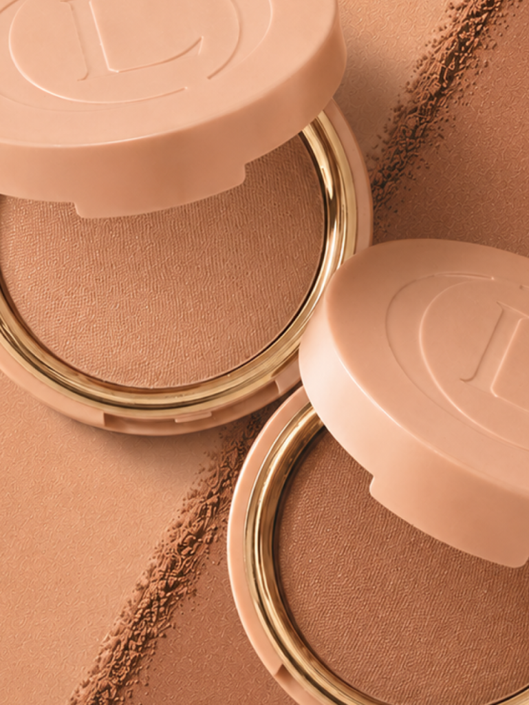
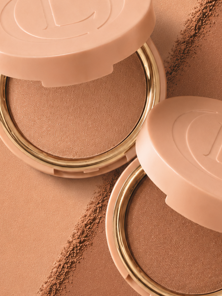
Too Faced’s Chocolate Collection Gets a Spring Update Too Faced is adding three new products to its Chocolate franchise this spring, all sharing the line’s signature cocoa scent and warm brown aesthetic. The collection spans complexion, eye, and face in one cohesive drop. Leading the launch is the Chocolate Soleil Matte Blurring Bronzer, a buildable, soft-focus formula that blends easily without settling into lines. Alongside it comes the Chocolate Soleil Multi-Use Sculpting & Defining Pencil, a creamy, water-resistant pencil designed for lips, face, and brows in one step. Completing the trio is a new Chocolate Brown shade of the brand’s Ribbon Wrapped Lash mascara. The tubing formula uses Ribbon Wrap Technology to form length-maximising tubes around each lash, with the Lash Extension brush delivering root-to-tip coverage. It’s smudge-proof, flake-proof, and humidity-resistant, with 24-hour wear, and removes with warm water only. The new shade offers a softer, more natural alternative to the original black. The collection launches at Sephora on 13 April, at KICKS, Matas on 22 April, and at H&M Beauty on 27 April 2026.

Design

Barber Osgerby and Kasthall: Letting the Loom Lead

Barber Osgerby and Kasthall: Letting the Loom Lead Text by Natalia Muntean Atlas and Bon Bon, the first collaboration between London-based Barber & Osgerby and Swedish carpet manufacturer Kasthall, were born directly from the conditions of the industrial loom. Working closely with Kasthall’s team in Kinna, Edward Barber and Jay Osgerby spent time on the factory floor, immersing themselves in the rhythm and constraints of the mill before a single design decision was made. Rather than imposing a fixed aesthetic, they allowed the tools, techniques and archive of a 135-year-old company to shape the direction of their work, arriving, through experimentation and some sixty prototypes, at two collections that are as different from each other as they are from anything Kasthall has produced before. Natalia Muntean spoke with Edward Barber. Natalia Muntean: A lot of the collaboration with Kasthall was about listening and understanding their process. Was there something that surprised you, or maybe a limitation that inspired you when you were working with their industrial loom, something that changed the process, or made you rethink certain things?Edward Barber: I’d never done woven carpets before, so it was a completely new experience for me. And with every project I do, before designing anything, I always like to go and see where the objects are made and how they’re made, and talk to the people who make them, especially if it’s a craft project. And in a way, whilst this is industrial, for me this is also very much a craft project.So I spent a few days at the factory in Kinna to understand the process. They explained how the loom works. The basics are incredibly simple: you have the warp, and then you weave in between it, but when it comes to creating different patterns and techniques, it suddenly becomes much more complicated. They also have an extensive archive, so I spent some time going through it, mainly to see the range of colours they offer. A lot of it is very decorative and floral, which wasn’t what we were doing. The thing about archives is that they’re useful to a certain extent, but if you get too deep into them, you get lost, and they influence you too much. It’s good to get an idea and then close the door. After that, we started putting some experiments together. It was a back-and-forth process of them making samples, sending them to me, me changing the size of the weave or the colours, or asking more questions. When you come to something completely new, you have no preconceived ideas about what’s possible and what isn’t, so you ask what might seem like stupid questions. And sometimes they say, that’s interesting, we hadn’t thought of doing that before. They’re so nice to work with, such amazing people. We had a great dialogue, and it was really just a question of samples, changing them, more samples, until eventually we got to three different designs, three different patterns. They’re very simple, just straightforward woven carpets, but they’re really beautiful. I’m very, very pleased with them.NM: When you decided to work together, you didn’t have a preconceived plan as such; you went to Kinna, got to know their process, and that’s how the ideas started?EB: I’d seen Kasthall carpets over the years. I was aware of the company, and I’d seen various designs, but I didn’t think, this is what we need to do. It was really looking at some of the techniques they’d used in the past and saying, well, what about if we do this, but change this aspect of it? Can we make this bigger or smaller? What if we add two different coloured threads instead of using a single colour? Things like that, just asking questions, really. NM: Tell me about the two collections, Atlas and Bon Bon. How did you come up with the names, and what distinguishes one from the other?EB: Bon Bon is much stronger, more graphic in terms of its colourways. We use colour a lot in the studio, in a way that’s quite experimental, quite strong. With Bon Bon, we really went for it and tried to mix three colours on each carpet to create one finished colour. So the pattern is quite small, from a distance it might look like the carpet is one colour, but as you get closer, you can clearly see three different colours working together. It felt like a jar of sweets. And the names all reflect edible things. You’ve got Liquorice, Lemon, Toffee, Berry, Rhubarb, and Damson. They’re more playful, possibly even for a younger market.  Atlas is a very chunky weave, so you get quite a thick carpet. And what we’ve done is mix two or three colours, on one we’ve got four, and it comes across quite randomly. So each carpet will look different because the threads moving across don’t go evenly every time. Sometimes you have a green thread on top and sometimes an orange thread, so you get this nice variation of tone and colour. I would call this a more organic, natural-looking carpet, and the colours reflect that. We called it Atlas because these colours, when woven, were quite reminiscent of older Moroccan carpets, with natural dyes for the threads. The Atlas Mountains are in Morocco, and when you look at the design, you see triangular shapes that resemble a mountain range. So we thought, Atlas. The two are completely different directions. NM: The intriguing thing about Atlas is that when you look closely, you can very clearly see the warp. Why was it important to leave it exposed, and how does it change how the rug feels?EB: Whenever we design anything, we always try to find a different way, or a new way to do something. With carpets, that’s pretty difficult – they’ve been around for thousands of years. But it’s a little unusual to be able to see the warp exposed the way it is. After some of the experiments, I was

Opiates

Manasi 7 Launches Eye Glow Colour in Two New Shades

Manasi 7 Launches Eye Glow Colour in Two New Shades The Swedish organic beauty brand expands its cult cream eyeshadow range with Adzuki and Chaura, two buildable, shimmer-finish shades suited to day and evening wear. Manasi 7 has added two new shades to its Eye Glow Colour line, a certified organic cream eyeshadow that has become one of the brand’s signature products. The formula is built around Sweet Almond Oil, Beeswax, Apricot Kernel Oil, and Shea Butter, giving it a texture that blends like a cream and sets like a powder. The new shades are Adzuki and Chaura, will be available starting April 22nd, at 37 EUR / 370 SEK. The Eye Glow Colour is designed to work with fingers or a brush, with a single swipe delivering a sheer, light-catching effect and additional layers building to a more dramatic finish. The formula is silicone- and alcohol-free, with organic oils that are activated by the warmth of the skin. CHAURA “A versatile mauve shade that creates an effortlessly sophisticated look” A brown mauve that reads as both modern and timeless. Wearable from day to evening — light for a subtle effect or layered for depth and richness. ADZUKI “A striking multichromatic shade with cooler undertones” Shifts between brownish red, purple, greyish blue, silver, and gold depending on the light. A modern, multidimensional shade that works across skin tones.

Opiates

Dua Lipa Steps Into Nespresso’s Next Chapter

Dua Lipa Steps Into Nespresso’s Next Chapter Nespresso has announced Dua Lipa as its new Global Brand Ambassador, marking what the brand describes as a new creative chapter, 40 years after it first changed how people make coffee at home. The choice of Lipa reflects where Nespresso wants to be culturally: she is known not just for her music but for her broader influence across fashion, arts, and media. Beyond recording and touring, she has built platforms around storytelling and creative culture, collaborating across a wide range of artistic disciplines. Nespresso sees those qualities: curiosity, range, a willingness to evolve as a natural fit for the brand.  “She symbolises curiosity, openness, and the courage to always try new things – an energy entirely aligned with the direction we’re taking as a brand,” says Leonardo Aizpuru, CMO, Nespresso For Lipa, the partnership was an easy decision. “I feel as though I’ve grown up with Nespresso,” she says. “There has always been a machine nearby: at home with my family, on recording sets, in hotel rooms. I love how they constantly explore new flavours and new ways to challenge themselves. We’ve already had a lot of fun together, and this is only the beginning.” On April 14th, Nespresso launches Vertuo World – a new global campaign across all platforms led by Lipa. It will also feature a brief appearance from existing ambassador George Clooney, connecting the new direction to the brand’s longer history.

Fashion Articles

A New Standard of Luxury: Inside KARAAT with Julia Hakanpää

A New Standard of Luxury: Inside KARAAT with Julia Hakanpää text by Natalia Muntean In an industry long defined by tradition and opacity, Julia Hakanpää is part of a new wave reshaping the meaning of fine jewellery. As founder and CEO of KARAAT, the Finnish brand championing lab-grown diamonds and recycled gold, she is building a vision of luxury rooted not only in craftsmanship and design, but in transparency and responsibility. What began as a personal search for an engagement ring has since evolved into a growing label challenging conventions and redefining modern heirlooms.  Natalia Muntean: You discovered lab-grown diamonds while searching for your own engagement ring. What was the exact moment you realised this wasn’t just a purchase, but a business idea?Julia Hakanpää: The moment came during our visit to Antwerp. I remember sitting across the table from our partner there, learning about lab-grown diamonds for the first time. I was fascinated that something so beautiful and technologically advanced existed, yet almost no one in the Nordics was talking about it. What made the moment particularly powerful was that I had just gone through the exact experience that many of our customers have today. I had been the customer searching for an engagement ring, trying to understand the options, and wanting to feel confident about the choice I was making. It immediately struck me how different that experience could be. Here was a gemstone with the same physical and optical properties as mined diamonds, but without many of the environmental or ethical concerns tied to mining. It answered so many of the questions I had been struggling with myself. That was when the idea started to form. If this discovery felt so meaningful to me as a customer, it could feel the same way to many others. Bringing lab-grown diamonds to the Nordics suddenly felt less like a business opportunity and more like something that simply needed to happen. NM: KARAAT was born out of a desire to “update” a traditional industry. What, in your opinion, most urgently needs updating?JH: For me, the biggest thing was transparency. When we were looking for engagement rings, I often felt that the industry relied heavily on tradition and authority; customers were expected to trust the process without always understanding it. There wasn’t always clear information about where diamonds came from, how they were produced, or what different choices really meant. At the same time, from a design perspective, I struggled to find pieces that felt like me. Many of the designs I encountered felt overly traditional or simply not aligned with my style. I was looking for something timeless, but with a fresh and modern feeling. Today’s customers want to feel informed and confident in their decisions, but they also want design that reflects the way they live today. With KARAAT, I wanted to create what I call modern heirlooms, pieces that feel contemporary today but will still look beautiful and relevant decades from now. Updating the industry, in my view, means combining traditional craftsmanship with modern transparency, responsible materials, and a design language that speaks to a new generation. NM: How has your original vision for KARAAT evolved in the past five years?JH: In the beginning, the vision was quite focused: introducing lab-grown diamonds to the Nordic market and helping people understand that there was another option. When we started, lab-grown diamonds were still relatively unknown in our region. A large part of our work was simply educating customers and building trust around something new to many people. Over the past five years, that vision has grown into something much bigger. Today, KARAAT is not only about introducing lab-grown diamonds – it’s about redefining what modern fine jewellery can look like. It’s about combining responsible materials with timeless design, exceptional craftsmanship, and a more personal way of experiencing jewellery. What hasn’t changed is the core idea. We still want to create pieces that feel meaningful, transparent, and lasting. The difference is that today we see the potential to build something much larger, a brand that resonates far beyond the Nordics. NM: Lab-grown diamonds were once a “well-kept secret”. What misconceptions do you still encounter today?JH: The most common misconception is still that lab-grown diamonds are somehow different from mined ones in terms of quality or authenticity. In reality, they are chemically, physically, and optically identical to mined diamonds. They are graded using the same standards and can only be distinguished in specialised laboratories. Another persistent myth is that mined diamonds retain their value better. When founding KARAAT, I learned much more about the traditional diamond industry and the mark-ups that have historically existed within it. Many of the early lab-grown diamond brands shared the same mission: bringing those mark-ups down and creating a more transparent market for customers. The value of jewellery, in my view, is not defined by speculative resale prices. The true value lies in the materials and craftsmanship, gold and diamonds that, when cared for properly, last for generations. That durability is what allows jewellery to become heirlooms. For many people, discovering lab-grown diamonds is still a moment of surprise, very similar to the one I experienced myself years ago in Antwerp. NM: Sustainability is often used as a marketing term. For you personally, what does responsibility truly mean in luxury?JH: For me, responsibility in luxury starts with honesty and transparency. Customers today want to understand what they are buying, where materials come from, how they are produced, and the impact behind them. Luxury should never rely on mystery or blind trust. People deserve clear information so they can make choices that align with their own values. At KARAAT, we work with lab-grown diamonds produced using renewable energy and 18-karat recycled gold, and our pieces are crafted by highly skilled goldsmiths in Italy. For us, responsibility is not only about the materials themselves, but also about craftsmanship and longevity, creating jewellery that is made with care and designed to last. True luxury should never be disposable. Gold and diamonds are incredibly

Opiates

aim’n’a Spring Senses Collection Arrives With Pilates in Mind

aim’n’a Spring Senses Collection Arrives With Pilates in Mind aim’n’s new Spring Senses collection launches this month with a clear brief: clothes for the growing number of women turning to Pilates, barre, and low-intensity training as a long-term approach to movement rather than a passing trend. The palette reads accordingly: Blush, Ballerina, Dark Clay, shades that feel more like a state of mind than a colour story. Central to the collection is the Sense fabric, soft and flexible in a way that disappears against the body, which is precisely the point. A new one-shoulder bralette introduces a modern silhouette that the brand plans to carry into future collections – a quiet signal that this is less a seasonal offering than a direction. The Ribbed Seamless range expands into Dark Clay, and several styles in both fabrics are built to move seamlessly from studio to street, a line aim’n has been blurring with increasing confidence. Two tops in an entirely new material, Luminous, round out the range. Lightweight and fluid with a semi-matte sheen, the fabric leans into drape and movement, with ruched and draped details at the sleeves and sides that catch the light. There is also a dress in the Sense fabric, designed for everyday wear but cut from the same soft logic as everything else in the collection. The most practical addition may be the most telling: Pilates grip socks, the brand’s first foray into accessories, developed for studio stability. A small thing, but a precise one, the kind of detail that signals a brand paying close attention to how its customers actually live. “Our community is asking for garments that feel soft, flexible and refined, pieces they can wear both in the Pilates studio and at the office,” says CEO and founder Tekla Acs. “This collection is created with exactly that feeling in mind.” Spring Senses is available now at aimn.se and in stores, in sizes XXS–XL.

Design

Norwegian Design Makes its Move on Sweden

Norwegian Design Makes its Move on Sweden On a recent evening at the Norwegian Embassy in Stockholm, six Norwegian design brands gathered for an intimate showcase hosted by Norsk Industri. The event was less a trade fair than a declaration that contemporary Norwegian design, rooted in landscape, material honesty, and a near-philosophical commitment to longevity, has something urgent to say to the Swedish market. The brands ranged from century-spanning furniture makers to a new generation rethinking acoustics, textiles, and stone. What united them was a resistance to trend cycles and a conviction that how something is made is inseparable from what it means. Flokk & Fjell works with waste wool that would otherwise be discarded, dyeing it with plant-based pigments from local raw materials to produce handmade acoustic panels that are also objects of beauty. Founder and architect Annemieke Koopmans unveiled a new collection, Winter Landscapes, exclusively at the Stockholm event, her ambition being to bring indoors the same stillness one finds out in nature.  Norsk Dun’s new collaboration with designer Gustav Ovland takes a similar approach to materiality. Recycled fibres, mineral-based pigments, pomegranate peel – the collection’s palette is drawn from what already exists and would otherwise be lost. The results are textiles with a warmth that synthetic processes rarely achieve. “Good design is about creating something people want to live with for a long time,” says Ovland.  LK Hjelle has been making furniture in Sykkylven since 1940. Every piece still leaves their own factory, still bears the Made in Norway mark, still built for repair and reupholstery rather than replacement. Their collaborators, Andreas Engesvik, Hallgeir Homstvedt, Jonas Stokke, are among Norway’s most respected designers, and the furniture has found its way into the Norwegian National Opera and embassies worldwide. CEO Jens Peter Brunstad’s vision is simple and unsparing: no one should ever need to throw away a piece of LK Hjelle furniture.  Ekornes brought two new Stressless® models, Adam, recently awarded the Red Dot Design Award, and Bay, that make ergonomic rigour feel like luxury rather than compromise. Both are built for durability, both designed to support the body in the way the body actually moves. Comfort, here, is not a selling point. It is the whole point. Fora Form’s BAST, designed by London-based Norwegian duo Hunting & Narud, is a modular low table system that thinks in the long term. Solid oak, floating aluminium, three sizes that can stand alone or compose into something larger. Every joint engineered for disassembly and repair, with longevity written into the object’s logic from the start. The most structurally ambitious proposition came from Lundhs Real Stone®. Their Larvikite and Anorthosite, formed hundreds of millions of years ago, entirely free of quartz, are no longer simply surface materials. A ten-storey building on Finchley Road in London now uses Larvikite as its load-bearing exoskeleton, replacing concrete and steel in what is believed to be a first of its kind. “Larvikite is more than a surface material,” says Business Developer Thomas Løvald. “It is architecture in its most fundamental form.” From Oslo’s Sommerro House to the University of Oslo, the stone keeps finding new ways to hold things up.

Opiates

Iittala and Byredo Announce Collaborative Collection LJUS

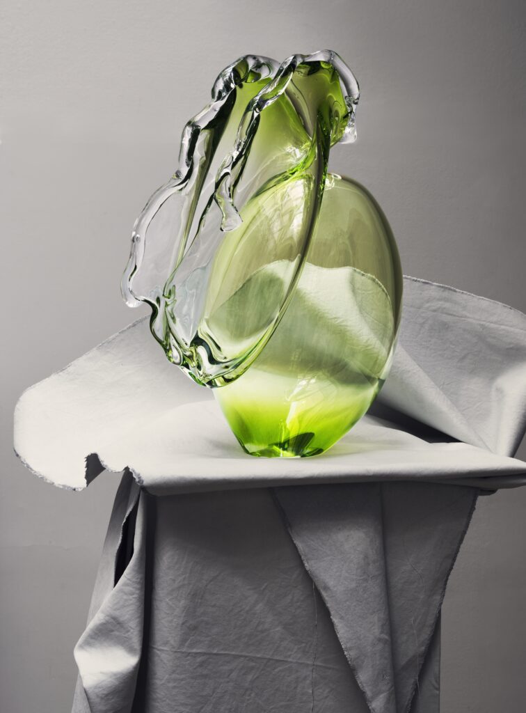
Iittala and Byredo Announce Collaborative Collection LJUS Finnish design house Iittala and Byredo have announced LJUS, a limited-edition collection that explores the intersection of light, scent and domestic ritual through handcrafted glass objects. The collaboration brings together Iittala’s heritage in glassmaking with Byredo’s approach to scent and modern culture, rooted in shared Nordic values and a respect for material and craft. The collection takes its name from the Swedish word for light, which serves as both theme and material, with the objects being designed to reflect the shifting qualities of Nordic light, from the intensity of the midnight sun to the quiet intimacy of winter. All glass objects in the collection are handcrafted at Iittala’s historic factory in Finland and are intended to be paired with Byredo candles and incense, becoming vessels that transform everyday moments into sensory rituals. Janni Vepsäläinen, Creative Director at Iittala, described the collaboration as an exploration of Nordic light in its most honest form. “In this collaboration, light is treated as a material – shaped by human hands and judgement. When Iittala’s glass meets Byredo’s fire, a new light emerges: elemental, restrained and deeply human,” she said in a statement. The collaboration will make its conceptual debut at the MATTER and SHAPE exhibition in Paris in March 2026, presented as a sculptural installation introducing the creative vision behind the partnership. The full LJUS collection is scheduled to launch globally in October 2026 for the Holiday season.

Opiates

Charlotte Tilbury Unveils New Formula of Iconic Magic Cream

Charlotte Tilbury Unveils New Formula of Iconic Magic Cream Charlotte Tilbury has launched an updated version of its best-selling Magic Cream moisturiser, incorporating a breakthrough ingredient, developed over a decade of research. The new formula is built around Recoverstem™ Peptide, a complex created exclusively for Charlotte Tilbury. Derived from the stem cells of the Eternal Jasmine Youth Plant™, it contains over 100 multi-action peptides designed to address multiple signs of ageing. According to the brand, the naturally sourced ingredient works to transform and recover the look of skin both instantly and over time. The updated formulation targets ten visible signs of ageing: hydration, glow, plumpness, redness, uneven texture, firmness, elasticity, fine lines and wrinkles, lift, and neck lines. It also includes an enhanced version of the brand’s Cushion + Lift Mesh Technology™, now with rosehip oil, oat extract, and ectoin, an ingredient intended to support the skin barrier. “I am always innovating, and as our lifestyles become more fast-paced, digital and dehydrating, I have seen our skin needs evolve,” says Charlotte Tilbury. The original Magic Cream was created by Charlotte Tilbury as a backstage product to revive tired skin before shows and red carpet appearances. Since its commercial launch, it has become a flagship product for the brand, with one pot being sold every minute globally.

Art

Klara Wirsén Suchowiak Feels Owned

Klara Wirsén Suchowiak Feels Owned text by Natalia Muntean “The things you own end up owning you,” says Klara Wirsén Suchowiak about ÄGD, her solo exhibition at WAY Gallery in Stockholm. Wirsén Suchowiak is known for her tactile, sculptural explorations of the body as both site and narrative. Trained at Beckmans College of Design, Gerlesborg School of Fine Art and Nyckelviksskolan, has previously shown at venues such as Liljevalchs Spring Salon and Värmlands Museum. Opening on March 5th, the exhibition looks at experiences of parenthood, desire and vulnerability and turns them into unsettling, seductive and humorous encounters that invite both emotional and physical engagement. Natalia Muntean: The title ÄGD (OWNED) is very powerful and direct. Can you talk about the decision to use this word?Klara Wirsén Suchowiak: I am owned. Owned by life, owned by the artistic process, owned by my paycheck, owned by the social structures, owned by capitalism, owned by the gender roles, owned by my family life, owned by my children.  NM: The exhibition highlights the “contradictory experiences of parenthood”, desire, care, vulnerability and excess. How do you balance these opposing forces in a single work or installation? Was there a specific piece where this paradox was most challenging to capture?KWS: In my latest work, “My sister’s milk,” I have been working with real breast milk that I’ve collected from different people. The milk sprays out from sculpted breasts and a baby’s mouth, in a large fountain placed on a dining table.Breastfeeding is like dynamite; it’s a subject everyone has strong feelings and opinions about, even if they might not dare to admit it. The body is political, especially bodies that do things like lactation. In this work, I have explored and wrestled with the many different emotions and positions that come with breastfeeding itself. On the walls around the fountain, tongues are sticking out. They are artworks that stand on their own, but they can also be interpreted as observers. In the piece, I have a combination of materials that present a discrepancy. The milk is beautiful, white, and frothy. The breasts and the baby’s mouth are cast in a smooth stone composite, and the fountain itself is made of fibreglass and epoxy. The colour and texture of the fibreglass make me think of some kind of toxic boat construction, something you don’t want close to your skin, something you don’t want to touch. Yet the baby and the breasts lie there in the middle, gurgling and spraying. On March 5th, at 16:00, everyone who is breastfeeding is welcome to help me inaugurate the fountain by spraying their milk into it. We’ll see if anyone later dares to drink from it. NM: You work with a wide range of materials, from stone to textile to found objects. Could you give an example of how a specific material was essential to express an emotion in ÄGD? KWS: For a long time, I’ve had a vision of creating an artwork where the feeling should be like the sensation you get when a hair is caught in your throat. You pull out something fuzzy, invasive, from your glossy, gagging mouth. That feeling inspired me to create the works called “:P,” which are several tongues of different materials and sizes sticking out from the walls. Some of the tongues are smooth and glossy, others are filled with lots of small objects – babies, metal pieces, etc. And some of the tongues are covered with textile fibers so they are hairy and soft like velvet. The tongues hang next to each other like trophies, or perhaps like spectators in the room. So in this installation, the encounter between different materials was important. I wanted to create a clash between shapes and materials that gives me a physical reaction. NM: You mention the viewer as a “recipient.” What is it that you hope viewers will receive from this installation?KWS: I hope that those who encounter my works feel something. What that feeling is, I don’t want to control. NM: You mention using found objects in your practice. Are there any incorporated into ÄGD? If so, what was the story or previous life of that object, and how does its history resonate with the themes of the exhibition?KWS: The sculpture “Domestic” is like a large body, but also a house at the same time. The house is furnished with countless dollhouse furniture, toys, and small things I’ve collected throughout my life. Together, these objects create a house where the parents have lost control, it’s incredibly messy, and no child is sleeping; all the kitchens are on fire. The house and the body have become one, and it is very heavy to carry. The objects in the house come from many different places: from my own old toys, flea markets, my parents’ home, travels, dumpsters and some I’ve been given because people know I collect things. The searching and collecting is something I see as part of the process. And as we know, the things you own end up owning you, and I will probably end up as a hoarder like the ones you see on TV. NM: You’ve created several public artworks with your mother, Stina Wirsén. How does that intergenerational collaboration influence your approach to themes of parenthood and the body? KWS: I have been creating for as long as I can remember, next to my siblings and parents. That’s how we spend time together and how we communicate best, by making. Other families might play soccer or sing or cook; we have always sat next to each other with pen and paper. So, making art with my mother wasn’t really something new; the only new things were the scale, the materials, and the fact that the works would be received by others. Our artworks deal with themes like family, body, care, and vulnerability, but in a public space. How can we make forms radiate those qualities? That’s what we are working on. We made our first sculptures a few months after I

Scroll to Top