Fashion Articles

Fashion Articles

Through Her Own Lens: Julia Hetta’s Poetic Portrait of Sweden for Louis Vuitton

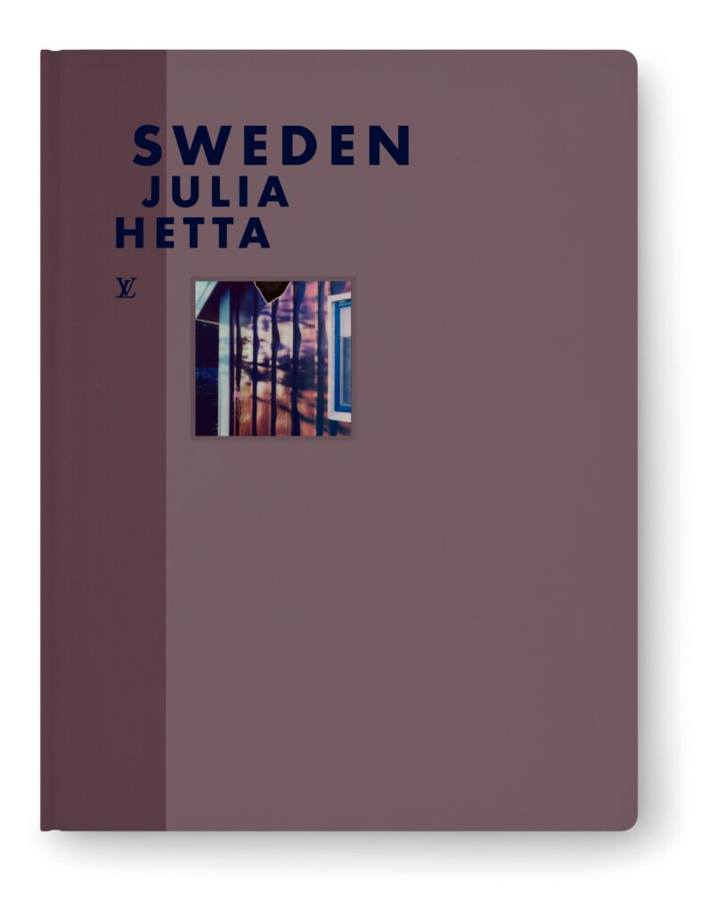
Through Her Own Lens: Julia Hetta’s Poetic Portrait of Sweden for Louis Vuitton Book Images courtesy of Louis Vuitton In Fashion Eye Sweden, Julia Hetta captures her home country through a deeply personal and painterly lens, using Polaroid film to trace shifting seasons, textures, and light. Created as part of Louis Vuitton’s travel-inspired series, the book unfolds as an accordion-style visual diary. An evocative sequence of landscapes and quiet moments that transform everyday life into something cinematic and poetic. Text Ulrika Lindqvist Ulrika Lindqvist: How did your relationship with photography begin? What first drew you to this medium? Julia Hetta: Well, it really started through my father, who was interested in photography, while I was interested in painting and drawing. Then we had a darkroom in the basement, so little by little I started experimenting with photography instead. UL: That cannot have been very common, having a darkroom in the basement? JH: I actually think it was. This was in the seventies. Back then people had basement living rooms and hobby spaces and so on, so I do not think it was all that unusual at the time. UL: How did this collaboration with Louis Vuitton come about? And what attracted you to the project? JH: I got an inquiry from Patrick Remy, who works on the project, and I immediately felt quite strongly that it was a very fun project, because I had been longing to work on something of my own and just have the camera and be by myself. The condition was that it would be done in Polaroids, so both the technique itself and the project as a whole were exciting to me. I also trust Patrick Remy’s judgment. UL: Had you worked much with the Polaroid format before, and how does it differ from other techniques? JH: Yes, I had. When I was younger I worked a bit with large format Polaroids, and I also did that in this project, partly in the self portraits. But apart from that I had not done it for many, many years. UL: And compared to how you usually photograph, how does the technique and the result differ? JH: It is much more spontaneous, a more spontaneous kind of photography, and that was what I liked and felt I wanted to return to. UL: What did your creative process behind Fashion Eye Sweden look like? Did you work from already existing material, or was everything created specifically for the book? JH: No, it was created specifically for this book, and it began almost like a diary project and also ended that way, because I made the self portraits at the end. But it took me a while to understand what I was going to do, because I felt it was difficult to depict your own country and how to approach that, until one day I realized that this is my life here in Sweden. I had already started doing that a little before the project, but then I developed it further. UL: I think the colors really capture Sweden and the light. JH: Oh, how nice. I think very much about colors and materials and light. Those are the three components that are very important to me in my photography. UL: How did you work with the selection of which images would be included in the book? JH: Editing is a very big part of the job for a photographer, I think. It is something I have trained myself in over the years, and also when I worked as a photo editor when I was twenty, so it is something I am very practiced in, and I think it is an important part of a photographer’s work. I had a large number of Polaroids, maybe a body of material four times as large, which I then edited down. UL: Was an editor involved, or did you make the selection yourself? JH: No, I made the selection myself, but I did discuss it back and forth with the team at Louis Vuitton and with Patrick Remy. UL: What would you say you yourself are trying to express and explore in your photography? JH: In this project, I think I was trying to explore what my perception looks like, what I see, and to be as direct as possible. More broadly, I think my photography is really about that, about somehow lifting up life, elevating life as such in some way. I am also interested in details and materials, and in what beauty is, and also darkness and light. UL: What do you want the viewer to feel when looking at your images and at Fashion Eye Sweden? JH: I hope that I have, in some way, visualized one side of Sweden, and that people abroad who either have a connection to Sweden or are interested in Sweden in some way will get a feeling for the country. Swedes living abroad are one audience, but also people who have recently arrived in Sweden. It feels interesting to present an image of the country to them as well. I also often work in a relatively poetic way, and I want it, in some sense, to be like a story about my life and a country. UL: Where did you take the pictures? Which locations did you use? JH: They are really from northern to southern Sweden, but a large part was done in and around central Sweden, around Uppsala and Stockholm, where I have my country house, but also in Norrland, where we also have a country house with my parents on an isolated island, and some of it was also shot in Skåne. So I think I really tried to stretch across the whole country. That felt right, because Sweden is so large and the landscape is so different from north to south, and I also wanted to capture the different seasons. UL: So how long did it take from when you started photographing for the book until it was finished? JH: Three years. UL: Do you have a project or an image or something within you that you would like to visualize, and if

Fashion Articles

Kappahl Celebrates Modern Families with a Fresh Take on “We Are Family”

Kappahl Celebrates Modern Families with a Fresh Take on “We Are Family” What does “family” look like today? For Kappahl, the answer is that it does not have just one shape. In its new spring campaign, the Swedish fashion brand turns its focus to the many ways people define family in modern life, whether that is through blood, friendship, or the bonds we choose along the way. It is a natural evolution for a company that has spent more than 70 years dressing generations, but this time, the storytelling feels more personal than ever. At the heart of the campaign is a reimagined version of the iconic “We Are Family,” performed by the Swedish “dream pop duo” Genom Natten. The new rendition keeps the warmth and familiarity of the original while introducing a softer, contemporary tone, mirroring the campaign’s message that while the idea of family endures, its expression continues to evolve. Visually, the campaign plays with contrast. Classic family portrait setups are reinterpreted to include blended families, close knit friends, single parents, siblings, and chosen communities. The effect is both nostalgic and quietly progressive, an acknowledgment that tradition and change can coexist.   “For us, family is not about what it looks like, but what it means,” says Andrea Stenhamre, Kappahl’s Marketing Director. “It is about the relationships that shape us, and those are the ones we dress.” That philosophy carries through to the collection itself. The Spring 2026 line leans into versatility, with timeless silhouettes, easy layering pieces, and durable materials designed for everyday life. These are not statement pieces meant for a single moment. They are clothes meant to live in, to share, and perhaps even to pass on. While Kappahl has long focused on practicality, clothing entire families across generations, the brand now places equal weight on identity and self expression. The goal is to create garments that feel relevant not just to individuals, but to the relationships that define their lives. “In a changing world, we want to stand for something that feels safe, human, and inclusive,” Stenhamre adds. “The collection is designed to work in real lives and real relationships, no matter what a family looks like.” With this campaign, Kappahl is not just showcasing clothes. It is telling a story many people recognize. Family is not a fixed idea. It is something we create, nurture, and carry with us, in all its forms.

Fashion Articles

Sézane introduces their SS26 Collection

Sézane introduces their SS26 Collection All images courtesy of Sézane Spring, in the language of Sézane, is less about arrival and more about atmosphere. Light shifts, color re-emerges, and with it comes a wardrobe that leans into softness rather than statement. The new collection unfolds through embroidery, muted tones and considered detailing, creating pieces that feel quietly animated. There is a balance between the familiar and the new, where timeless essentials are revisited alongside updated silhouettes. Flowing dresses sit לצד more structured forms, while shaped tops and coordinated sets suggest an ease that does not compromise on intention. What defines the collection is its adaptability. Clean lines and subtle design choices allow each piece to move across contexts, worn as part of a layered whole or standing on its own. It is clothing designed not for a moment, but for continuity, extending naturally beyond the season itself. Accessories remain central to this vision. Long embedded in the brand’s identity, they carry the same lightness, with jewelry, shoes and leather goods reflecting a shift toward brightness and wearability. These are objects made to accompany, to be revisited and retained over time. Rather than chasing transformation, the collection stays close to Sézane’s core. It proposes a version of spring that is lived in gradually, where renewal is found in nuance, and where getting dressed becomes an extension of the season’s quieter return.

Fashion Articles

A New Standard of Luxury: Inside KARAAT with Julia Hakanpää

A New Standard of Luxury: Inside KARAAT with Julia Hakanpää text by Natalia Muntean In an industry long defined by tradition and opacity, Julia Hakanpää is part of a new wave reshaping the meaning of fine jewellery. As founder and CEO of KARAAT, the Finnish brand championing lab-grown diamonds and recycled gold, she is building a vision of luxury rooted not only in craftsmanship and design, but in transparency and responsibility. What began as a personal search for an engagement ring has since evolved into a growing label challenging conventions and redefining modern heirlooms.  Natalia Muntean: You discovered lab-grown diamonds while searching for your own engagement ring. What was the exact moment you realised this wasn’t just a purchase, but a business idea?Julia Hakanpää: The moment came during our visit to Antwerp. I remember sitting across the table from our partner there, learning about lab-grown diamonds for the first time. I was fascinated that something so beautiful and technologically advanced existed, yet almost no one in the Nordics was talking about it. What made the moment particularly powerful was that I had just gone through the exact experience that many of our customers have today. I had been the customer searching for an engagement ring, trying to understand the options, and wanting to feel confident about the choice I was making. It immediately struck me how different that experience could be. Here was a gemstone with the same physical and optical properties as mined diamonds, but without many of the environmental or ethical concerns tied to mining. It answered so many of the questions I had been struggling with myself. That was when the idea started to form. If this discovery felt so meaningful to me as a customer, it could feel the same way to many others. Bringing lab-grown diamonds to the Nordics suddenly felt less like a business opportunity and more like something that simply needed to happen. NM: KARAAT was born out of a desire to “update” a traditional industry. What, in your opinion, most urgently needs updating?JH: For me, the biggest thing was transparency. When we were looking for engagement rings, I often felt that the industry relied heavily on tradition and authority; customers were expected to trust the process without always understanding it. There wasn’t always clear information about where diamonds came from, how they were produced, or what different choices really meant. At the same time, from a design perspective, I struggled to find pieces that felt like me. Many of the designs I encountered felt overly traditional or simply not aligned with my style. I was looking for something timeless, but with a fresh and modern feeling. Today’s customers want to feel informed and confident in their decisions, but they also want design that reflects the way they live today. With KARAAT, I wanted to create what I call modern heirlooms, pieces that feel contemporary today but will still look beautiful and relevant decades from now. Updating the industry, in my view, means combining traditional craftsmanship with modern transparency, responsible materials, and a design language that speaks to a new generation. NM: How has your original vision for KARAAT evolved in the past five years?JH: In the beginning, the vision was quite focused: introducing lab-grown diamonds to the Nordic market and helping people understand that there was another option. When we started, lab-grown diamonds were still relatively unknown in our region. A large part of our work was simply educating customers and building trust around something new to many people. Over the past five years, that vision has grown into something much bigger. Today, KARAAT is not only about introducing lab-grown diamonds – it’s about redefining what modern fine jewellery can look like. It’s about combining responsible materials with timeless design, exceptional craftsmanship, and a more personal way of experiencing jewellery. What hasn’t changed is the core idea. We still want to create pieces that feel meaningful, transparent, and lasting. The difference is that today we see the potential to build something much larger, a brand that resonates far beyond the Nordics. NM: Lab-grown diamonds were once a “well-kept secret”. What misconceptions do you still encounter today?JH: The most common misconception is still that lab-grown diamonds are somehow different from mined ones in terms of quality or authenticity. In reality, they are chemically, physically, and optically identical to mined diamonds. They are graded using the same standards and can only be distinguished in specialised laboratories. Another persistent myth is that mined diamonds retain their value better. When founding KARAAT, I learned much more about the traditional diamond industry and the mark-ups that have historically existed within it. Many of the early lab-grown diamond brands shared the same mission: bringing those mark-ups down and creating a more transparent market for customers. The value of jewellery, in my view, is not defined by speculative resale prices. The true value lies in the materials and craftsmanship, gold and diamonds that, when cared for properly, last for generations. That durability is what allows jewellery to become heirlooms. For many people, discovering lab-grown diamonds is still a moment of surprise, very similar to the one I experienced myself years ago in Antwerp. NM: Sustainability is often used as a marketing term. For you personally, what does responsibility truly mean in luxury?JH: For me, responsibility in luxury starts with honesty and transparency. Customers today want to understand what they are buying, where materials come from, how they are produced, and the impact behind them. Luxury should never rely on mystery or blind trust. People deserve clear information so they can make choices that align with their own values. At KARAAT, we work with lab-grown diamonds produced using renewable energy and 18-karat recycled gold, and our pieces are crafted by highly skilled goldsmiths in Italy. For us, responsibility is not only about the materials themselves, but also about craftsmanship and longevity, creating jewellery that is made with care and designed to last. True luxury should never be disposable. Gold and diamonds are incredibly

Fashion Articles, Uncategorized

Samsøe Samsøe Shapes Its Future with the HERØ Bag

images courtesy Samsøe Samsøe Samsøe Samsøe Shapes Its Future with the HERØ Bag The new HERØ bag marks a new chapter for Samsøe Samsøe. For Naima Chamberlayne, Head of Footwear and Accessories, this moment isn’t about redefining the brand but articulating its core more confidently. The bag supports that shift through proportion, construction and a silhouette that is both clean and assertive. Its sculptural form draws from Danish architecture, while the ergonomic shape introduces a subtle challenge to the straight lines often associated with Scandinavian restraint.   Experimentation with material plays an important role in the design. Though the silhouette remains constant, each leather and finish gives the form a different attitude, creating a dialogue between accessories and ready‑to‑wear. Even the updated Ø detail reflects a more assured embrace of identity, integrated into function rather than applied as branding.   In conversation with Naima Chamberlayne, we explored how HERØ came to define this new direction. How did you translate the idea of a “new era” for Samsøe Samsøe into a physical object? For me, it wasn’t about inventing a new era or redefining what Samsøe Samsøe is. It was about becoming clearer about who we already are. We’ve always stood for considered minimalism, but this moment called for more definition and confidence.   The HERØ bag became a way to distill that shift into something tangible. We focused on proportion and construction. The silhouette is clean but assertive. The details are subtle but intentional. It’s less about decoration and more about identity.   I think it represents a brand that knows exactly who it is.   When you think about the HERØ bag, what emotion or attitude did you want it to carry? Quiet strength.   I wanted it to feel self-assured without trying too hard, which feels very Scandinavian to me. modern, composed, and slightly directional. The HERØ bag customer doesn’t chase attention; she or he commands space through presence.   There’s a softness in the curves, but also structure. That duality felt important, strength and ease coexisting. The bag has a sculptural, almost architectural silhouette. How did you approach shaping that form? There’s a strong influence of Danish architecture in that process, which to me is about form, proportion, and practicality, a way of elevating the everyday.   Living and working in Copenhagen, you’re constantly surrounded by that thinking. There are so many references here, from functionalist buildings to contemporary design. Yet I find that Danish people don’t always celebrate it enough.    Scandinavian design is often associated with straight lines and restraint. Introducing a curved ergonomic silhouette was a subtle way of challenging that. The curve brings softness and movement, while the flap remains sharp and controlled.   That contrast was intentional.   What role did material experimentation play in the development of the bag? Material was central because the silhouette remains constant, but the expression shifts.   We developed the HERØ in recycled leather, Italian polido skins, distressed finishes, and a dotted hair-on-cow leather, which is the most directional interpretation. The polished leathers feel precise and architectural, while the distressed leather version brings edge and character. The hair-on-cow introduces texture and depth, and it connects directly to a statement outerwear piece in the ready-to-wear collection.   That dialogue between accessories and RTW was important. It allows the bag to move beyond being an isolated object and become part of a broader narrative.   I like the idea that the same shape can speak to different personalities. The structure is consistent, but the material gives it attitude. The updated Ø detail is subtle but symbolic. How did you rethink this signature element? The Ø is part of our name, so it naturally carries meaning. But it’s also a very specific sound in Danish language, it is quintessentially Danish and fundamental to our identity.   When designing it, we wanted to avoid treating just as branding. Instead, applying it onto the bag, we integrated it into the function. It became part of the design. A sign of a more confident era for the brand to embrace our identity.   Does the HERØ bag set the tone for a broader accessories universe you’re building? Yes, it does.   The HERØ bag establishes a clear design language, defined silhouettes, purposeful details, and confidence in restraint. That language will extend beyond bags.   Footwear is a natural next step. We’re thinking about accessories as a complete universe, with the ambition to dress our customer head to toe and across gender in a way that feels cohesive and considered.   It’s not about expanding into the category for the sake of it. It’s about building consistency. The same clarity you see in the bag should translate into shoes and other categories, creating a stronger overall expression of the brand.   What excites you most about where the accessories category is heading under your direction? What excites me most is the opportunity to build something with longevity.   Accessories have a unique power; they can sharpen a silhouette instantly, but they also live with you over time. They’re carried daily, they age, they develop character. Designing with that lifespan in mind is incredibly motivating.   I’m excited about refining the point of view across bags, footwear and other accessories, and creating pieces that feel relevant now but still meaningful years from today.   For me, it’s about building an even stronger appetite for the brand’s accessories. Samsoe has a loyal customer base, which has been achieved not through noise, but through consistency and conviction.

Fashion Articles

The Caterpillar and the Butterfly: Matthieu Blazy’s Masterful Reconstruction of Chanel

The Caterpillar and the Butterfly: Matthieu Blazy’s Masterful Reconstruction of Chanel Under the glass vault of the Grand Palais, something extraordinary unfolds. The runway stretches across a shimmering holographic floor, reflecting light like liquid metal. Above it, towering construction cranes painted in bold primary colors rise into the cavernous space. The message is unmistakable: the house of Chanel is under construction. And the architect at the helm is Matthieu Blazy. For those of us who have been waiting with bated breath, the Chanel Fall/Winter 2026 show titled La Conversation – Part Two was the moment we knew our patience had paid off. Blazy, the visionary designer who brought such tactile magic to Bottega Veneta, has arrived at Rue Cambon. And he is not here merely to preserve a monument. He is here to build a living, breathing future. The Second Meeting This collection marks the second meeting between Matthieu and Gabrielle “Coco” Chanel. If his debut was about laying the foundation, this season is about raising the scaffolding. Blazy dug deep into the archives, finding resonance in a quote Gabrielle Chanel gave to Le Figaro in 1955: “Fashion is both caterpillar and butterfly. Be a caterpillar by day and a butterfly by night. There is nothing more comfortable than a caterpillar and nothing more made for love than a butterfly. We need dresses that crawl and dresses that fly. The butterfly doesn’t go to the market, and the caterpillar doesn’t go to the ball.” This paradox, the tension between function and fantasy, the sensible and the seductive, forms the beating heart of the FW26 collection. Blazy embraces this duality, creating a canvas for women to be unapologetically themselves, whether navigating the demands of the day or taking flight into the night. A Masterclass in Metamorphosis The setting, the casting, the clothes, and the designer aligned in a perfect storm of creative energy. The show opened with a trio of sporty, understated takes on the suit in merino wool and silk, grounded by backless heeled mules. It was the caterpillar: practical, comfortable, yet undeniably chic. But as the show progressed, the metamorphosis began. The rigid strictness of the traditional Chanel tweed suit dissolved. Blazy reimagined it through new textiles and constructions. Bouclé tweeds blended with technical fibers. Knitted suits rendered surprisingly light. Jackets drifting closer to blousons. Waistlines shifted into a drop-waist silhouette that Coco herself favored in the 1920s, bringing a fresh, relaxed energy to the runway. The craftsmanship on display was nothing short of breathtaking. Blazy collaborated with Chanel’s legendary métiers d’art houses: embroiderers Montex and Lesage, and feather experts Lemarié. Together they pushed the boundaries of fabrication. Black and yellow paillettes shimmered across dresses. Rubber and silk appeared on delicate cotton gauze. Suits looked as though they had been subjected to bursts of “action painting,” putting Jackson Pollock to shame. As day turned to night, the papillon de nuit emerged. The collection shifted toward the luminous and fluid. A standout moment featured tweed printed onto chainmail, inspired by an Edwardian bag Coco Chanel once favored. The fabric shimmered with iridescent light as it floated through the Palais. Streamlined coats and dresses in sylphlike silhouettes cascaded down the runway, designed for movement and nocturnal flight. Accessories continued this dialogue between reality and illusion. Like an iridescent Impressionist painting, the opalescent set was echoed in color-saturated enamel and resin jewelry, artificially tinted mother-of-pearl pieces, and second-skin cap-toed boots in supple pastel leathers. The bags ranged from practical to playful. There was the essential suede flap bag featuring the divan matelassé quilting inspired by Gabrielle Chanel’s apartment sofa, and the extravagant pomegranate minaudière with its subtly poisoned iridescence. A House at Work What makes Blazy’s Chanel so compelling is his understanding of the women who wear it. The casting, which included mature models such as Stéphanie Cavalli, signaled that Blazy is not selling fantasies of youthful beauty, but visions of ageless elegance. He is designing for women who live practical lives within a rarefied universe. Women who need clothes that transition effortlessly from boardroom to ballet. The frenzy in Paris boutiques following the show is already a testament to his instinct. Editors, executives, and loyal clients alike are lining up, suggesting that Blazy may have cracked the elusive Chanel code. He has managed to create a unified aesthetic that speaks to multiple generations of clients simply through the styling of each piece. As the neon-lit cranes inside the Grand Palais suggested, Matthieu Blazy is still building. He is lifting, reworking, and reassembling the elements that have long formed Chanel’s language. It is careful recalibration. An act of reconstruction that honors the past while confidently stepping into the future. Matthieu, we Chanel lovers have been waiting for you. And what a spectacular metamorphosis it is.

Fashion Articles, Uncategorized

The Architecture of 1. cre ar+ {Uno Crear Más}: Designed by Yola Colón

photography Ashley Jahncke The Architecture of 1. cre ar+ {Uno Crear Más}: Designed by Yola Colón 1. cre ar+ {Uno Crear Más} by YOLA COLÓN grows out of a practice that blends architecture, art history, and a deep respect for materials. Founder Yolanda Colón‑Greenberg studied architecture at Cornell and later completed a Master’s in Art History at NYU’s Institute of Fine Arts. That background shapes the way she builds garments: intentional, memory‑driven, and made to last. Her work doesn’t follow seasons. Instead, it grows as an archive: slow, iterative, and guided by the surplus textiles she chooses to work with. Puerto Rican heritage, an architectural eye, and long‑standing relationships with New York workrooms give the brand its quiet, precise language. In this conversation, she reflects on rebuilding her practice after Hurricane Maria and the pandemic and on how sustainability, material scarcity, and hands‑on making guide her work today. fashion Yola Colón (1.cre ar+ {uno crear más})hair and makeup Andrea C. Samauelsmodel Sylvia Gao / ONE Models You’ve described your garments as “living archives.” What does that idea mean to you?1. cre ar+ {Uno Crear Más} by YOLA COLÓN is built as an ongoing body of work rather than a sequence of seasons. A living archive reflects a consistent brand ethos centered on elevated workwear and enduring pieces. Core staples are produced in editions that respond to available materials, while new designs are introduced as layers rather than replacements. Instead of adhering to the traditional fashion cycle, the work develops cumulatively, allowing form, material, and identity to deepen over time.   How does your Puerto Rican heritage shape the way you think about clothing as a form of memory? For me, clothing preserves meaning through reinterpretation—carrying the memory of an original form while allowing it to evolve. The Guayabera—traditionally a tailored Caribbean shirt defined by vertical pleats, embroidery, and four front pockets—is an early example of this. Growing up in Puerto Rico, I observed it was worn almost exclusively by men, with no equivalent worn by women. That absence stayed with me and led me to reimagine the form for women. My architectural training reinforces this approach, treating garments as constructed forms shaped by use, proportion, and context. This way of thinking—of caring for memory through form and material—is how I approach fashion pieces as concepts.  1. cre ar+ {Uno Crear Más} Guayabera Editions rework the traditional silhouette through fit and scale, using surplus cotton voile and its iconic pintucked stripe locally crafted in New York artisanal workroom. Realizing that many other women shared the same desire to wear it affirmed the relevance of carrying that cultural memory forward through construction and recontextualization rather than replication.   When working with excess or historical textiles, what kinds of cultural or personal histories are you intentionally preserving or reactivating? I work with textiles that have been left behind—materials displaced by time or shifting systems of value. Discarded tablecloths at a market point to gatherings that no longer take place: the dressed table, embroidered initials, stains, repeated washing, starching, and pressing. I imagine how those surfaces might move again on the body. The same logic applies to Japanese selvedge denim sourced from closed or overstocked warehouses—fabric rooted in workwear, durability, and labor, produced with precision and then rendered surplus. Reworking these materials returns them to use, shifting them from dormancy back into circulation.   You rebranded 1. cre ar+ {Uno Crear Más} by YOLA COLÓN after the Covid pandemic. What pushed you to make that change? The shift began earlier, after Hurricane Maria devastated Puerto Rico while my parents were there and unreachable. That experience heightened my awareness of environmental instability, intensifying storms, and the urgency of rethinking priorities—including the impact of fashion systems. During the Covid lockdown, the pause created space to reflect more deeply. I took a virtual course at LIM College (The Business of Fashion and Lifestyle division) focusing on sustainability, and while many businesses in the fashion district shut down, the period also led to a renewed reconnection with specialized workrooms I had collaborated with before. Around the same time, reading H of H Playbook by Anne Carson—and encountering her drawing of red overalls—sparked a decisive moment. In the context of Herakles, it suggests a figure carrying burden after devastation. For me, the simple sketch defined an outline of labor, vulnerability, and endurance. That image resonated deeply. It led me to restart with a single workwear piece: the overalls. That garment became the foundation for the rebrand—designed to be sustainable, long-lasting, and highly tailored, using utilitarian hardware and refined details like piping to elevate function into an enduring form.   What does the new identity represent for you personally, especially after such an uncontrollable period? I think less about representation and more about how the work feels in practice. The new identity is grounded in direct local engagement—with pattern makers, specialized artisans, and cut-and-sew rooms, whether the process involves pleating, embroidery, or laser etching. Being present, asking questions, and refining details alongside the people who make the garments restores a sense of agency through process, and that closeness is also what makes the practice sustainable.  Your practice focuses on reclaiming surplus textiles and working with material intelligence. What does ecological responsibility mean to you, and how is it interpreted in your atelier? Ecological responsibility is not a marketing position for me—it’s a design constraint. The work is made locally in New York, in high-standard workrooms, in small batches and editions where what evolves is the material rather than making collections. By working with surplus textiles, the practice reduces the need for new material production. Forms are repeated and refined through reinterpreted fabrics, and leftovers are intentionally used for belts, bags, or panel-pleated skirts. Production is highly finished and tailored so pieces are built to last, often made on demand thus no need to discard of inventory. Every decision privileges longevity, care, and precision over speed.   You studied architecture and art history. How do those two backgrounds come together in your design process? They converge through structure

Fashion Articles, Uncategorized

It’s Gucci by Demna

It’s Gucci by Demna Last week ended with a show stopper. Demna presented his first collection for Gucci — and it marked a clear new direction. Focused, precise, and all about the product. The collection introduces lighter, body-aware silhouettes with seamless construction, invisible edges, and curved hems that follow the natural shape of the body. It opens with a white seamless minidress — simple, confident, and strong. The tailoring feels fluid and easy, designed to move from day to night. Jackets are styled with skirts, leggings, or trousers, showing versatility. Hybrid pieces stand out: trackdresses, leggings fused with trousers, and ultra-fitted garments that merge tops and jackets into one. Volume appears through feather details and soft leather pieces, while sculpted silhouettes subtly reference classical statues. Eveningwear brings bold energy — high slits, embellishment, and a backless gown revealing a diamond GG thong. Accessories update Gucci icons with a practical twist, including a sleeker Bamboo 1947 bag and the new minimalist Manhattan sneaker. At its core, this collection is about clarity and wearability. Strong design. No over-explaining. Just Gucci — redefined by Demna.         images courtesy Gucci

Fashion Articles

MADH: Redefining Denim Through Craft, Customisation, and Creative Independence

MADH: Redefining Denim Through Craft, Customisation, and Creative Independence ALL IMAGES COURTESY OF MADH  After nearly two decades shaping denim at Acne Studios, MADH founder Martin Gustafsson set out to build something slower, more deliberate, and deeply personal. Launched in 2023, MADH positions denim within a high-fashion context, combining Italian craftsmanship, sustainable production, and customisation to challenge the conventions of seasonal fashion. Ulrika Lindqvist: Please tell me a bit of your backstory, I know you founded MADH in 2023, what had you done before that and what was the idea behind MADH? Martin Gustafsson:  I studied at the Textile University in Borås and completed my internship at Acne Studios, where I was later hired and began working in the denim department. I was fortunate to be part of the brand’s journey, spending nearly 20 years focused on denim development and design. With MADH, the idea is to create looks centered on exclusive denim within a high-fashion context. The focus is on quality and sustainability, supported by the close relationships we’ve built with Italian mills and industry specialists. UL: How did MADH come together as a company? MG:  When the brand was still just an idea, I reached out to a small group of people I had worked with over the years: individuals from across the industry whom I found inspiring and who I felt would be a strong match for MADH as a platform for creative work. UL: You offer ready-to-wear as well as customisable denim, how do you combine your customised service with a world of fast fashion? MG:  Customisation is an alternative to the traditional, season-driven business model. When it comes to jeans, we believe certain styles will always function as core pieces in a wardrobe. An on-demand setup allows both customers and stores access to a wider range of options and unique designs that are only produced when there is an actual demand. This approach significantly reduces leftover products after each season — a situation that is neither sustainable for the business nor for the environment. UL: What are the steps of buying a MADH SKINS piece? MG:  You pick you fit, black or blue denim, then you can pick from light or dark shade. After that you can add plain wash or vintage look. Final step for the ones that want to create a true customised look you can also add holes, embroideries or patches.   UL: What is the inspiration behind your designs? MG: The process starts through style-out session in Stockholm or Paris.  We combine previous seasons jeans with vintage clothing that are combined to a new look. Garments will need reconnection, cut, stitch, pin tuck and within the process you find inspiration for what feels interesting. We work a lot with the fabrics to develop  finishes or techniques that sometimes give inspiration to a garment. UL: What would you say are the 3 core values for MADH? MG: Innovation, Creative collaboration and Responsibility UL: How would you describe the MADH customer? MG:  Someone that loves denim and fashion, likes to create their style trough unique products produced in best quality and sustainable mindset. UL: How do you source your materials? MG: We work directly with a few mills in Italy. We develop fabrics together with them based on look, quality and sustainability. This is one of the most inspiring parts of the process.  UL: How do you approach designing your unisex collection? Does it differ from designing menswear or womenswear? MG: This comes naturally, if it wouldn’t I don’t think it would work. Often we make the fitting on different body types to see how the appearance looks. Small technical pattern changes will sometimes give a more characterful look. Fit is crucial and its start with look we want to create.   UL: What have been the most challenging aspects during these first years? MG:  We live in a world and market that is within constant change and the challenge I would say is all the small things within a company with few people that needs to be take care of and adapted to the changes needed and spend money right. Its costly to introduce a brand so the financial situation will always chase you. UL: What can we expect from MADH in the near future? MG:  To be seen in more high end stores in Europe, so far we been focusing on Japan and US.  We also plan to make some pop-up exhibitions in collaboration with some artists.

Fashion Articles

From Dalarna’s Lakes to Timeless Swimwear: Paula on 30 Years of PAULA Beachwear

From Dalarna’s Lakes to Timeless Swimwear: Paula Malm on 30 Years of PAULA Beachwear What began as a personal pursuit of the perfect swimsuit has evolved into a cult Swedish beachwear label defined by precision, restraint, and longevity. As PAULA Beachwear marks its 30-year anniversary, founder Paula Malm looks back on her early inspirations, her creative process, and the philosophy of timelessness that continues to shape the brand. Ulrika Lindqvist: Looking back, what inspired you to start PAULA Beachwear in the first place? Paula Malm: I have always loved the ocean and water, spending my childhood and teenage summers by a small lake in Dalarna, but also in the west coast archipelago of Sweden. The feeling and memories of salty shoulders after long days of swimming and crab fishing are my eternal sources of inspiration. I swam many miles in the pool on the island of Marstrand in a super simple striped swimsuit that I wore for several summers – an inspiration for the classic swimwear I still create today. UL: Could you tell us a bit about your background? What did you study and work with before founding PAULA Beachwear? PM: I studied tailoring and pattern making in Sweden, and design and drawing at Parson in New York City. I worked for a short time at Björn Borg, parallel to design projects in Kenya and Zimbabwe, before starting my own brand. During my studies, I also worked in a very chic lingerie boutique, which later became a great asset in understanding fit and quality. UL: How would you describe your creative process? PM: I am always inspired by three things – a material, colours, and a lack of garments that I want for myself. I only design pieces that I would wear myself, no matter what. I usually visit fabric fairs, and when I feel a new material, I can already envision the garment it will become. UL: How have your designs developed over these 30 years? What discoveries have you made? PM: My designs are constantly being refined for a better fit and improved materials, even though the styles remain basic and timeless. I believe in classic cuts in high quality that will live long in your beach wardrobe. A PAULA swimsuit today is even better than it was 30 years ago – I think it fits more body types, and there is always a wide range of colours to choose from. I have learned that fashion colours sell later in swimwear, and how important it is to stay true to my original vision rather than designing for everybody or every occasion. UL: What pieces would you describe as the core classics of the brand? PM: Our signature piece, Swordfish, is truly a core classic – totally timeless and equally beautiful as both a top and a swimsuit. I have met clients who own it in seven or eight colours. Poppy is another clean, classic suit, and for bikinis, our bra Mermaid is also becoming a timeless favourite. UL: Do you have a favourite sea, lake or beach in the world? PM: Oh yes – the small lake in Dalarna, Sweden, where I learned to swim; the ocean around the island of Marstrand on the Swedish west coast; and the beaches of Martha’s Vineyard, south of Boston, USA. UL: Is there a particular moment in your career that stands out as especially memorable? PM: Recently, Swedish Television presented a new version of the Astrid Lindgren series Vi på Saltkråkan, where my childhood idol is wearing a PAULA beachwear swimsuit. I watched it with my children and got goosebumps. UL: What are you most looking forward to in the coming year? PM: There is so much fun ahead! Our new collection is larger than ever, and the photos shot in Sicily truly capture the spirit of the season. It is such a joy to see the garments in their right element, and we had the best team ever for this project.   All images courtesy of PAULA Beachwear

Scroll to Top