Author name: Odalisque

Beauty Editorial

Joyful Joyful,

photography Andreas Johansson / Agent Bauermakeup Pari Damani / Agent Bauermodels Wilma Falk / Select Models Management paint Make Up For Ever whitepowder Ben Nye super white face powdereyeshadow Make Up For Ever pigmentseyeliner Chanel Beauty calligraphie de chanelmascara YSL Beauty vinyl couture blacklips chromagraphic pencil MAC Cosmetics landscape greenmakeup remover IT-Cosmetics bye bye makeup cleansing balm lips Make Up For Ever pigment redcheeks YSL Beauty couture blush no2eyeliner Chanel Beauty calligraphie de chanelmascara YSL Beauty vinyl couture blackeyeshadow MAC Cosmetics eraeyebrows Danessa Myricks cream palette paint Make Up For Ever whitepowder Ben Nye super white face powdereyelinerChanel Beauty calligraphie de chanelmascara YSL Beauty vinyl couture blackpigment MAC Cosmetics process magentalip stain YSL Beauty tatouage couture liquid matte fucshiaand matte pigment Make Up For Ever red moisturizer Lancome hydra zenfoundation Chanel Beauty les beigesconcealer By Terry touche veloutéepaint Make Up For Ever whiteeyeliner Chanel calligraphie de chanelmascara YSL Beauty vinyl couture blackcheeks YSL Beauty couture blush no2lips MAC Cosmetics lady danger moisturizer Lancome hydra zenfoundation Chanel Beauty les beigesconcealer By Terry touche veloutéepaint Make Up For Ever whiteeyeliner Chanel calligraphie de chanelmascara YSL Beauty vinyl couture blackcheeks YSL Beauty couture blush no2lips MAC Cosmetics lady danger & ruby woo

Beauty Editorial

CHANEL

lips Chanel Beautyrouge allure velvet 237 beige ardentblush Chanel Beautyilluminating blush powdereyes Chanel Beauty eyeshadow-liner-khol and quadra eyeshadow 306 splendeur et audace blue photography SANDRA MYHRBERGmakeup ELVA AHLBIN on all imagesskin Chanel Beauty le beiges water fresh tint medium plus and deep, les beige healthy glow foundation hydration and longwear br 152 and bronzing makeup basenails Chanel Beauty le vernis longwear nail colour 773 chaíne ďor lips Chanel Beauty les beige healthy glow foundation hydration and longwear br 152blush Chanel Beauty illuminating blush powdereyes Chanel Beauty eyeshadow-liner-khol, le beiges natural eyeshadow collection les indespensibles lips Chanel Beauty rouge allure velvet 237 beige ardentblush Chanel Beautyilluminating blush powdereyes Chanel Beautyeyeshadow-liner-khol and multi-effect quadra eyeshadow 306 splendeur et audace blue lips Chanel Beauty les beige healthy glow foundation hydration and longwear br 152blush Chanel Beauty illuminating blush powdereyes Chanel Beauty eyeshadow-liner-khol, le beiges natural eyeshadow collection les indespensibles lips Chanel Beauty eyeshadow-liner-khol and rouge coco gloss 76bblush Chanel Beauty illuminating blush powdereyes Chanel Beauty multi-effect quadra eyeshadow 247 codes elegants illumine highlight lips Chanel Beauty rouge allure velvet 237 beige ardentblush Chanel Beauty powder blush 64 pink explosioneyes Chanel Beauty eyeshadow-liner-khol and multi-effect quadra eyeshadow 306 splendeur et audace green photography SANDRA MYHRBERGfashion JAHWANNA BERGLUNDmakeup ELVA AHLBINhair SWEDISH HAIR MAFIAmodel SAGAL / MIKAsassistants NIKE ORTIZ DAHL & EDWIN ERIKSSON

Art

“The Erosion of Reason”: Gustaf Lilliestierna on Blurring Reality and Imagination

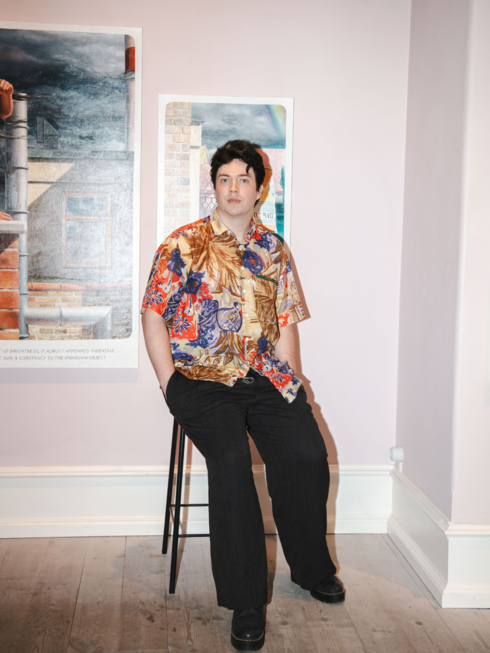
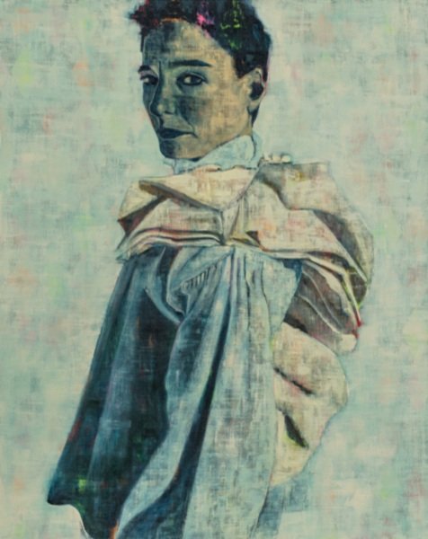
“The Erosion of Reason”: Gustaf Lilliestierna on Blurring Reality and Imagination text Natalia Muntean In his latest exhibition at WAY Gallery in Stockholm, titled The Erosion of Reason, Gustaf ​​Lilliestierna invites viewers into a world where reality and imagination blur, creating a “parallel sense of time” that feels both familiar and foreign. His paintings, which he describes as “hyper images,” are more than just visual representations, they are layered with fragments of memory, ideas, and visual impulses that challenge our understanding of what is real. “I enjoy the childish qualities,” he admits, reflecting on the playful yet profound nature of his work. “I want it to be as enjoyable for a six-year-old as it is for a sixty-year-old theorist.” Gustaf’s process is deeply intuitive, often starting with a single image or idea that leads to another. “One thing just leads to another,” he explains. “I might have 50 ideas, and then I’m trying to understand how these ideas relate to each other. How can they be combined?” For Gustaf, the act of painting is as much about discovery as it is about creation. “They are always a mystery,” he says of his works. “I do wish to see them, so I make them. But in the end, they become material for new thoughts.” Through evocative painting and a deep engagement with nostalgia and inspiration, Gustaf’s art invites viewers to explore the spaces where reality and imagination intersect. Natalia Muntean: How did you develop the concept of “hyperimages,” and what is the most challenging part of creating them?   Gustaf ​​Lilliestierna: “Hyperimagery” started as a term I used once, and I noticed how helpful it was. Without it, I could describe my practice as a problematisation of referencelessness, or perhaps referential ambiguity, in visual representation. Or, I could say it’s a playful attempt to provoke new mental images through depiction. But neither explanation fully captures my practice, and they’re unfair to the immediate experience of my pieces. I often spiral when asked, “What do you do?” So, I embraced the term “hyperimagery,” which popped into my head, and it’s been useful ever since. When I use it, I’m referring toimages that are intuitively, and perhaps even ontologically, perceived as more than one image. NM: How do you define the relationship between reality and imagination in your work?  GL: This question is larger than life! Every attempt to define this relationship pushes the line that represents the “between.” If we assume reality is everything that exists independently of our thoughts, then no such line can exist without us imagining it. A perspective from that line—bordering reality on one side and imagination on the other—would inevitably come from a position within the “non-real.” Any answer inspired by this juxtaposition will be unsatisfactory. We must consider whether we’re answering from individual, separate realities and imaginations, positioned behind a line we can’t fully access. If so, it’s hard to say anything definitive about “the” or “a” reality. If we still believe we can describe “the” reality we all share without including imagination, our book of knowledge would be very thin. Perhaps I’m too cautious to answer this question. But I can say this: I love being a mind. And as a mind, I find myself superpositioned between these fields, though I try to avoid the border between them. NM: How do you decide on the colour palette and composition for a piece? GL: I always start by drawing. Sometimes the final product of this ‘thinking by doing’ activity consists of several, usually 5-10, drawings. Sometimes it results in depictions of buildings, people, streets, objects, or just faces. This collection gives me an idea (if I’m not currently under the influence of one). The idea however is never better than the composition and is only worth realising if I’m pleased with the aesthetic quality of the visuality in a given form. I therefore make a lot of lines and measurements within a drawn dimensional frame. It is perhaps a golden ratio fetish, but I need it for motivation. When the proportions of my ‘abstract composition’ correspond with my collection of imagery nicely, I compose the image using the chosen means. I then translate the drawing into an oil painting. I try to keep it as mind-dependent as I possibly can, but sometimes I do real-life drawing, and build models or digital illustrations as support. The colour palette depends on the mood, which is revealed by the scene. It always ends up in a certain place, at a certain hour. NM: How do you know when a painting is finished, especially when dealing with such abstract and elusive concepts?  GL: It’s a question of just stopping. In one way, they’re never thematically finished. I finish the drawing when it’s close to what I had in mind, and I finish the painting when it looks cool and convincing. Sometimes I manipulate the idea, maybe adding a road sign, a lamp, or another figure. But this is risky, and when it happens, I often start over. I do a lot of work outside the studio: thinking, drawing, reading, exploring, and writing. I usually trust the process once I pick up the brush. I also evaluate my process between paintings, being careful about the direction a series is headed. NM: What does the title The Erosion of Reason mean to you, and how does it reflect the themes of the exhibition? GL: I wanted a title that reflected my previous claims about the immediacy of artistic experience. I wanted to align this with the view that every artwork represents a possible antithesis to a possible linguistic conclusion. I decided that “The Erosion of Reason” was a good fit, since it packs several punches: “The Erosion of Motive”, “The Erosion of Cause”, and “The Erosion of Rational Thinking”. In the case of art, something like an erosion of reason (as the erosion of motive, cause, and rational thinking) becomes beneficial if we wish to see, experience and feel without limitation. In such cases, the erosion of reason occurs

Beauty Editorial

Daniil

photography Linus Moralesmakeup Elva Ahlbinmodel Daniil K / Slash Ten Models skincare WELEDA Skin Foodfoundation BOBBI BROWN foundation palettelips BLISTEX skincare WELEDA Skin Foodfoundation BOBBI BROWN foundation palettelips BLISTEXface paint GRIMAS water makeup pure black 101 paint palette KRYOLAN Supra Color uv paint EULENSPIEGEL yellow

Art

Where Muses Dare: Sara Berman at Larsen Warner

Where Muses Dare: Sara Berman at Larsen Warner text Natalia Muntean “Where Muses Dare” is the first solo exhibition in Sweden by British artist Sara Berman, hosted by Larsen Warner Gallery. This collection features 12 oil paintings on linen, each exploring the societal constructs that shape the female experience. Through evocative storytelling, Berman’s characters navigate realms of power, reflection, and transformation. Berman plays with colour, texture, and form, creating melanges of neon pinks and fiery oranges pulsing beneath deep petrol blues and shadowed greens, with bruised surfaces, textured by layers of scraping, smudging, and wiping. Clothing plays a central role in Berman’s work, both as a metaphor for societal expectations and as a literal, tactile element in her process. Drawing from her background in fashion, she sources and inhabits vintage garments, using staged photographic recordings as the foundation for her paintings. In these shifting personas, the artist explores the fluidity of identity, blurring the boundaries between self-portraiture, fiction, and performance. Through this lens, Where Muses Dare delves into the tensions between personal and collective histories, between authenticity and artifice. Berman’s paintings embody the contradictions of contemporary existence—celebrating, questioning, and confronting the complex realities of gender, power, and self

Beauty Editorial

Real Time

photography NINJA HANNAfashion MARIA BARSOUM / LinkDetailsmakeup JOSEFINA ZARMÉN / LinkDetailshair KAROLINA LIEDBERG / LinkDetailsmodels IVY & CAROLINE BWOMONO / MIKAs on all pictures WELEDA skinfood base GLOSSIER stretch concealereyes LUSH liquid eyeliner Venus & PAT MCGRATH LABS gold 001lips RMS BEAUTY wild with desire lipstick red & lip shine sacredsuit FRIDA NILSSON base LAURA MERCIER flawless lumière foundationdipbrow pomade ANASTASIA BEVERLY HILLS ebony eyes Inglot amceyeliner gel no77 & FENTY BEAUTY snap shadows no 4lips GLOSSIER coconut balm dotcomdress ELI SOLBERG dress FRIDA NILSSON foundation RMS BEAUTY “un” cover-up cream foundationeyes CHANEL BEAUTY stylo yeux waterproof nr 939eyeshadow PAT MCGRATH LABS silver 005dipbrow pomade ANASTASIA BEVERLY HILLS ebonylips GLOSSIER coconut balm dotcomjacket FRIDA NILSSON full look ELI SOLBERG foundation RMS BEAUTY “un” cover-upgreen color MAC COSMETICS new croppalette ILIAMASQUA liquid metal paletteeyeliner RMS BEAUTY Vintage cake linercheeks KRYOLAN uv-dayglow compact colour uv-red foundation RMS BEAUTY “un” cover-up eye palette ILIAMASQUA liquid metal palette liquid eyeliner LUSH jujube lip balm EOS sweet mint dipbrow pomade ANASTASIA BEVERLY HILLS ebonyjacket MATILDA ÅBERG jacket STANDtrousers NAND full look ELI SOLBERG foundation RMS BEAUTY “un” cover-up creameyeshadows PAT MCGRATH LABS blue 002, copper 002, gold 001and fuschia 002liquid eyeliner LUSH venuslips SOLEY ORGANICS KISS tu mig lip balm jacket MATILDA ÅBERG base GLOSSIER stretch concealereyes & lips GLOSSIER vinylic lip babyeyebrows GLOSSIER brow flickblack jacket ELI SOLBERG

Design

Nude Ateljé is crafting stories through space

Nude Ateljé is crafting stories through space text Natalia Muntean Eva-Lotta Axelsson, founder of Nude Ateljé, describes her brand as a storyteller of spatial experiences, where architecture and life intertwine. “Rooms are performances,” she explains, “with layers that magnify over time, inviting subtle mannerisms and inhabitation.” Drawing inspiration from the uncultivated beauty of Alvaret’s limestone landscapes and the wild creativity of old fashion houses, where production, studio, and shop coexisted, Axelsson infuses her designs with a sense of timeless exploration. This philosophy is embodied in the NOTKATEsideboard, a sculptural piece born from a collaboration with a Stockholm boutique hotel. What began as a humble sketch on a plane evolved into a bold, functional design that balances elegance with playfulness. Crafted from materials like birch, concrete, and corten steel, the sideboard reflects Nude Ateljé’s commitment to blending aesthetics and functionality. “The result is a piece with enough confidence to fill a room by itself,” Axelsson says, “yet with the grace to team up alongside any other furniture.” Rooted in traditional craftsmanship and inspired by the interplay of space and life, the NOTKATEsideboard is a testament to Nude Ateljé’s vision of creating enduring, lived-in narratives. Natalia Muntean: The sideboard was born from a collaboration with a boutique hotel. Can you share more about how collaborations influence your design process and the unique challenges or opportunities they present? Eva-Lotta Axelsson: We listen. A lot, and often. The customer is central to everything we do; we usually say that we interpret the assignment based on location, function, and client. Testimony to these values is our projects with boutique hotels and the one with Dennis Pop Awards, for which we created one of our lamps, Chimes of Light. The lamp was originally created for the auction at the 2017 Denniz Pop Awards. This lamp is our tribute to a talented and inspiring late music producer. We aim for this piece to embody the same warmth and brilliance he represented, honouring his legacy. It features thirty hand-turned walnut pendulums, each adjustable in height, dimmable, and emitting a warm glow. With these kinds of projects, my intention is to broaden the idea of creation, to inspire but also to be inspired. Then sustainability and quality are equally important, both in terms of materials and people. The process begins with meeting the person for whom the room is for. I love observing them from every angle, carefully absorbing their world. Then I ask them a series of questions: what do you want to do in the room? How do you want it to feel when you leave it? When I have explored all this, I create a mood board, a one-pager, which we agree on as the strategy ahead, and then the drawing begins. Observing spatial culture and creating tailored spaces go hand in hand with Nude Ateljé’s anthropological pursuit, an investigation that gets translated into a collection of products. There is a fascinating process to unpack, maybe strategically framed as a day in the life of observations and qualitative questions. NM: The sideboard features materials like birch, concrete, travertine, corten steel, and hardened glass. What inspired this specific combination of materials, and how do they complement each other in terms of aesthetics and functionality? ELA: The common theme in our material expressions is elegance, eclecticism, and boldness, often accompanied by a degree of dissonance and friction. This creates a sense of tension and contrast. The products we design are objects where aesthetics and functionality are given equal consideration. NM: Given that the NOTKATE sideboard is handmade, what role does traditional craftsmanship play in its creation, and how do you ensure consistency and quality across each piece? ELA: The NOTKATE sideboard is a testament to the art of traditional craftsmanship. Each piece is carefully handcrafted by our small team of skilled artisans, who have years of experience working with solid wood. We value classic woodworking techniques, ensuring that every detail, from sturdy joints to a smooth finish, reflects our commitment to quality. At the same time, we’ve refinedour process to keep each sideboard consistent while preserving the wood’s natural look and character. We follow clear design guidelines and use specialised tools to ensure precision, but we never hide the wood’s unique grain patterns that make every piece one of a kind. Before leaving our workshop, each sideboard is carefully inspected to make sure it meets our high standards. The result is a piece that highlights the warmth and beauty of natural wood, crafted to last for years to come. NM: Nude Ateljé is known for experimenting with innovative materials. How do you decide which materials to work with, and what role do sustainability and durability play in these choices? ELA: Nude Ateljé has a distinct eye for creating life, discovering specific approaches through an anthropological process that starts with collecting materials. The work results in translations between inside and outside and the spaces in between rooms. For us, sustainability and durability are centred around longevity, using materials that outlast us, and improve over time with a natural patina and can be repaired or repurposed. For example, wood can be sanded and refinished multiple times. For NOTKATE we buy whole trees that we dry in the carpentry, from where we form the construction, the base and top of the object. Our room scent ‘Forest Temple’ is created with leftover wood from the production of the sideboard. NM: Are there any upcoming projects, materials, or design concepts that you’re particularly excited about? ELA: There are a lot of interesting things happening right now, and we are working on both residential and commercial projects, developing the architecture part, our furniture collections and the carpentry at the same time. We might even explore working with other materials and mediums going forward. We are particularly excited about “Grundvik,” a concrete house where we have worked on both the architecture and interior design. This house will showcase Nude Ateljés’ entire universe, encompassing architecture, interiors, and curated objects. It will serve as a “moment of truth” – a

Beauty Editorial

Just A Touch

foundation GIORGIO ARMANI maestro foundationconcealer HELENA RUBINSTEIN magic concealerlips CARMEX photography Pauline Suzormakeup Martin Sundqvistmodel Josefine Fellbom / Elite Stockholm glitter MAC COSMETICS silver glitter MAC COSMETICS gold large glitter MAKE UP FOR EVER no1 gold

Beauty Editorial

Ballroom Ballerina

photography ALEXANDER BELLO makeup CATARINA CRUZ model MONIKA KACZANOWSKA / Elite Stockholm face care MAC COSMETICS prep+primeeyes & cheeks MAC COSMETICS trend forecast palette ss16eyeliner MAC COSMETICS kohl feline lipstick MAC COSMETICS antique velveteyebrowsTOM FORD brow sculp body CLARINS moisture-rich body lotionface acrylic paint MAC Cosmetics white eyes MAC COSMETICS trend forecast palette ss16faceELIZABETH ARDEN 8 hour cream

Beauty Articles

A Dazzling New Chapter in Chanel’s Chance Story: Introducing Chance Eau Splendide

A Dazzling New Chapter in Chanel’s Chance Story: Introducing Chance Eau Splendide text Jahwanna Berglund Just when you think the game is over, Chanel rolls the dice once more and this time, the outcome is splendid. The beloved Chance fragrance family welcomes a new addition: Chance Eau Splendide, a radiant scent painted in purple a shade of magic, rebellion, and quiet nobility. It’s the colour of dreams, depth, and daring. Following the energizing green of Eau Fraîche, the tender pink of Eau Tendre, and the fiery orange of Eau Vive, this latest creation takes us into a new dimension: one that’s both playful and profound. Crafted by Olivier Polge, Chanel’s In-House Perfumer-Creator, Chance Eau Splendide is a fragrance of paradoxes. It dances between lightness and gravity, flirtation and finesse. A sparkling raspberry accord opens the experience, fresh, crisp, and joyful, before unfolding into a floral heart where rose and violet meet the elegance of rose geranium, partly cultivated in Chanel’s very own fields in Grasse. The dry down is where the magic settles: cedarwood and white musk, softened with the powdery sophistication of iris, linger long after first spritz, like an echo of laughter after the curtain has fallen. This fragrance is an invitation to take risks. To believe in serendipity. To follow instinct and embrace the unknown. Chance Eau Splendide is the kind of perfume you wear when you want the universe on your side. A spritz on the neck becomes a small ritual of hope, daring, and intention.As Olivier Polge reflects, “The original idea behind chance was a state of mind that we interpreted in very different styles… Each chance fragrance is unique, but they all express the same emotion—something very lively and very direct.” Chance Eau Splendide embodies that philosophy, and then some. It arrives unannounced, with a mischievous wink and a dazzling energy. It’s the fragrance of those who believe fortune isn’t found, it’s made.And for those who dare to seize it, Chance Eau Splendide is a shimmering leap into what’s next.

Scroll to Top