Odalisque Magazine Interviews Efva Attling
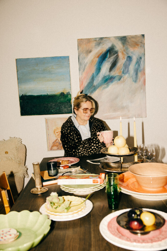
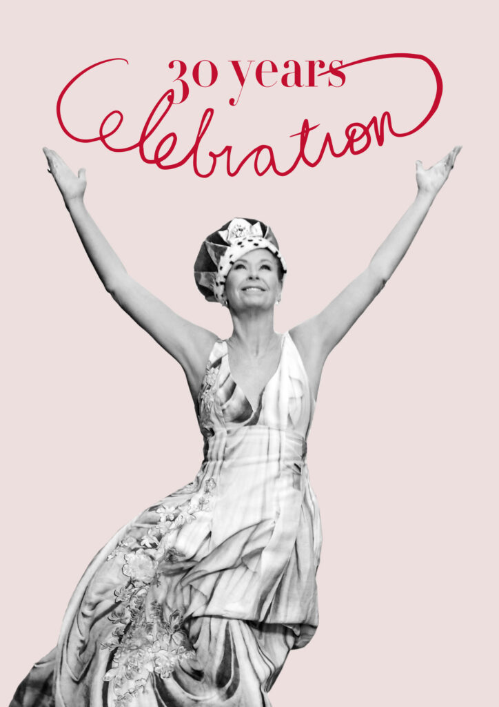
Odalisque Magazine Interviews Efva Attling images courtesy Efva Attling Efva Attling has never followed a straight path. From modeling and music to silversmithing, her creative journey has shaped a distinct voice in contemporary jewellery. Since founding her brand in the mid 90s, Attling has become known for designs that merge clean Scandinavian aesthetics with powerful messages about love, identity, and equality. Now, as Efva Attling Stockholm approaches its 30 year milestone, her work remains as relevant as ever. Jahwanna: You moved from modeling to Gogo dancing to silversmithing. How do music, dance, and fashion still influence your jewelry today? Efva Attling: Well I moved from Go Go dancing at night and silversmithing in the daytime when I was sixteen to modelling at seventeen. I can’t live without music, and dance is so good for your body and mind. It always inspires me to create new designs. JB: You actually began training under Bengt Liljedahl at age 16 before your modeling career took off. What was it about returning to the bench in the mid-90s that felt like the right ‘homecoming’ for your creativity? EA: I never thought about creating jewellery for nearly 30 years. So when I got back to jewelry I was really ready. I needed to live my colorful life, with all the experience I got from modelling, being a pop star, and having two sons. JB: As you mark 30 years of Efva Attling Stockholm in 2026, you’ve seen the brand grow from a small atelier in Södermalm to a global name. If you could send a piece of jewelry back to yourself in 1996, which one would it be, and what message would it carry? EA: The Homo Sapiens necklace, “the thinking man” in Latin, and the Human ring. My message would be to respect and be respected. JB: The “Homo Sapiens” collection became internationally known when Madonna wore it. Why do you think the “thinking human” message feels even more relevant in today’s digital age? EA: The Knowing Man in Latin. I divided the word. What I want to say is that all human beings are equal and have the right to love whoever they want. Just as important then as it is now. JB: Your philosophy is ‘Beauty with a Thought.’ You’ve mentioned that jewelry should be a ‘conversation piece.’ Can you share a story of a customer whose life was changed or ‘boosted’ by the message on one of your pieces? EA: Glenda Bailey, former editor of Harpers Bazaar, got the ring Fuck Off and said this piece gives a whole new meaning to jewellery. She needed it every day… JB: With your sub-brand ‘The Högdalen,’ you’ve created a ‘cocky little sister’ to your main line. How does this outlet allow you to express the more rebellious, ‘rule-breaking’ side of your personality that might not fit the classic elegance of the main collection? EA: Jonas Åkerlund, who is a fantastic film director making videos for Madonna and recently for Billy Idol, made some jewelry with upside down crosses. One big cross worn by Ozzy Osbourne weighed a quarter of a kilo. It is fun to play with other talented artists. JB: You often mix the ‘cool’ of sterling silver with the ‘warmth’ of gold. In collections like ‘Twosome’ or ‘Love Knot,’ how do you use these contrasting materials to symbolize the complexity of human relationships? EA: My basic thoughts are about human relationships…, love, humor, and politics. Jewellery has always been around mankind as talismans wishing for love, a better crop, a better self consciousness, and maybe even a change of life.