Author name: Kaat Van Der Linden

BackStage, Uncategorized

Chanel Beauty FW26 Show – Backstage

Chanel Beauty FW26 Show images courtesy Chanel MAKEUP STEP BY STEP SKINCARE:Apply a small amount of SUBLIMAGE L’EXTRAIT DE NUIT to the cheeks, forehead and neck. With both hands, smooth over the face from the centre outwards. For the neck, follow your jawline. Apply SUBLIMAGE LA CRÈME TEXTURE UNIVERSELLE and perform LE GESTE SUBLIME RADIANCE: bend the fingers and massage from the centre of the face outwards in a wide circular motion. For an extra touch of pampering, apply SUBLIMAGE L’EXTRAIT HUILE LÈVRES occasionally throughout the day. The golden metal applicator fits the shape of the lips perfectly and delivers just the right amount for an immediate feeling of comfort. Apply SUBLIMAGE LA BRUME under or over makeup. Spray on each side of the face, followed by the forehead. With closed hands, help the product absorb by using your knuckles to apply light upward pressure to the face, working from the centre outwards. COMPLEXIONApply LES BEIGES WATER-FRESH COMPLEXION TOUCH using the 2-IN-1 FOUNDATION BRUSH FLUID AND POWDER N°101. Correct any imperfections on the face with ULTRA LE TEINT LE CORRECTEUR and the RETRACTABLE DUAL-ENDED CONCEALER BRUSH N°105 where needed. Apply JOUES CONTRASTE INTENSE – Rose Radiant or JOUES CONTRASTE INTENSE – Beige Éclatant (depending on your skin tone) to the center of the cheek, then blend and diffuse slightly upwards along the cheekbones. To sculpt the contours of the face, apply LES BEIGES HEALTHY GLOW BRONZING CREAM under the cheekbones, blending along the hollow of the cheek, from the inside to the outside of the face with the RETRACTABLE KABUKI BRUSH N°108. Pick up a small amount of BAUME ESSENTIEL – Transparent or BAUME ESSENTIEL – Sculpting (depending on your skin tone) with a brush or fingertips, then apply with light touches to the tops of the cheekbones and the bridge of the nose to bring light. Gently tap to blend the product into the skin. LOOK N°1: EYESDepending on your skin tone, apply STYLO YEUX WATERPROOF 20 Espresso, STYLO YEUX WATERPROOF 10 Ebène, or STYLO OMBRE ET CONTOUR 12 Contour Clair along the upper lash line to intensify the lash fringe or between the lashes.For more intensity, continue in the outer corner of the lower lash line. LIPSApply ROUGE COCO BAUME – 914 Natural Charm directly onto the lips with the bullet and blend with your finger. LOOK N°2: EYESApply OMBRE ESSENTIELLE 32 Lilas Poudré over the entire mobile eyelid.Then apply a generous amount of OMBRE ESSENTIELLE 20 Blanc Perle on top of the previously applied shade.For more dimension, continue in the outer corner of the lower lash line. LIPSApply ROUGE COCO BAUME – 936 Chilling Pink directly onto the lips with the bullet and blend with your finger.Finish with BAUME ESSENTIEL – Transparent over the entire lips. EYEBROWSRedefine your brow line using the STYLO SOURCILS HAUTE PRÉCISION, then brush them upward. NAILSProtect and smooth the nail with LA BASE CAMÉLIA.Apply two coats of LE VERNIS 111 Ballerina.Enhance the lacquered shine with LE GEL COAT.Moisturize your hands with LA CRÈME MAIN.

Opiates, Uncategorized

Natalie Portman for Tiffany & Co.

images courtesy Tiffany & Co Natalie Portman for Tiffany & Co. Tiffany & Co. introduces Natalie Portman as its newest global House ambassador, marking a focused shift in the brand’s storytelling. Shot by Gordon von Steiner at The Landmark on Fifth Avenue, the campaign presents Portman in a series of pared‑back portraits wearing key Tiffany collections, including HardWear, Knot, Sixteen Stone, and T. Portman’s presence aligns naturally with the House’s direction: intelligent, refined, and grounded in a modern interpretation of luxury. Her approach to craft and narrative mirrors Tiffany’s own emphasis on heritage and emotional connection, values that have shaped the brand since 1837.  The partnership highlights Portman’s balance of strength and elegance, qualities that resonate with Tiffany’s evolving identity. She also appeared in a campaign film that debuted during the 98th Academy Awards® on March 15, 2026.

BackStage, Uncategorized

Celebrities Attending the CHANEL FW26 Show

Chanel FW26: The Stars of the Front Row Chanel Always Brings The Stars At the unveiling of Matthieu Blazy’s Fall/Winter 2026 collection, the front row became a constellation of international talent. A gathering of cinema, music, and contemporary culture, each presence a testament to Chanel’s enduring dialogue with the world’s most influential voices. The venue itself, the iconic Grand Palais, was transformed into a vibrant “under construction” landscape, complete with towering primary-colored cranes. It was a setting that mirrored Blazy’s mission: the careful, modern reconstruction of Chanel’s heritage. images courtesy CHANEL LILY-ROSE DEPP Stepping outside her usual silhouette, Lily-Rose embraced “peak feline energy” in a leopard-print midi dress from the Pre-Fall 2026 collection. The look was topped with a matching cat-ear fascinator, a playful nod to the house’s more whimsical side under Blazy’s direction. MARGOT ROBBIE The Australian actress and long-time house ambassador debuted a striking hair transformation: a blunt, shoulder-grazing bob with wispy bangs. She paired her fresh cut with a sheer, layered ivory top and jean-inspired trousers from the Spring 2026 Haute Couture collection.  OPRAH WINFREY Making a grand return to Paris Fashion Week, Oprah Winfrey wowed in what she described as “classic Chanel” that she “upgraded and modernized.” She wore a white longline trench coat with navy blue piping over a matching midi dress, completed with a sleek high ponytail and a unique triangular handbag. OLIVIA DEAN Rising star Olivia Dean played with the collection’s most tactile elements. She wore a patterned jacket paired with a textured, feathered mermaid skirt. While the combination was visually heavy, it showcased the incredible range of fabrications Blazy is introducing to the house. TEYANA TAYLOR: Platinum Impact Teyana Taylor was arguably the most unrecognizable star of the night, debuting an icy platinum blonde bob. She layered a transparent PVC raincoat over a printed tweed ensemble, a futuristic twist that perfectly complemented the industrial, “under construction” set design. JENNIE KIM: The “Human Chanel” BLACKPINK’s Jennie took a breezier approach to front-row dressing. She wore a matching cardigan and skirt in a beaded open knit, featuring glimmering dark green embellishments. Leaning into the “exposed underwear” trend, she styled the set with a black bra and briefs, adding a pop of red with a patent leather bag. KYLIE MINOGUE Kylie Minogue the pop icon delivered a masterclass in graceful interpretation. Wearing a delicate, floral-embellished silk set from the Pre-Fall 2026 collection, Kylie’s look felt completely natural to her style, light, feminine and timelessly chic. As the cranes loomed over the Grand Palais, it was clear that Chanel is in a state of beautiful evolution. Whether it was Margot’s new bob or Jennie’s sheer knits, the front row proved that while the house is “under construction,” the foundation remains as star-studded as ever.

Contributors, Uncategorized

Tara Ziegfeld

STYLIST & PHOTOGRAPHER
Tara Ziegfeld is a Paris‑born fashion stylist and photographer with French‑American roots, drawing inspiration from travel, literature, and the arts. Known for blending vintage elements with contemporary design, she shapes visual narratives through clothing, silhouette, and texture. After studies in Uppsala and Borås, she built a career as a stylist (since 2011) and fashion and beauty photographer (since 2018), working between France, Sweden, and the UK. Guided by a love of past eras and strong storytelling, she creates cohesive 360° concepts that bring clients’ visions to life.

Fashion Articles, Uncategorized

Samsøe Samsøe Shapes Its Future with the HERØ Bag

images courtesy Samsøe Samsøe Samsøe Samsøe Shapes Its Future with the HERØ Bag The new HERØ bag marks a new chapter for Samsøe Samsøe. For Naima Chamberlayne, Head of Footwear and Accessories, this moment isn’t about redefining the brand but articulating its core more confidently. The bag supports that shift through proportion, construction and a silhouette that is both clean and assertive. Its sculptural form draws from Danish architecture, while the ergonomic shape introduces a subtle challenge to the straight lines often associated with Scandinavian restraint.   Experimentation with material plays an important role in the design. Though the silhouette remains constant, each leather and finish gives the form a different attitude, creating a dialogue between accessories and ready‑to‑wear. Even the updated Ø detail reflects a more assured embrace of identity, integrated into function rather than applied as branding.   In conversation with Naima Chamberlayne, we explored how HERØ came to define this new direction. How did you translate the idea of a “new era” for Samsøe Samsøe into a physical object? For me, it wasn’t about inventing a new era or redefining what Samsøe Samsøe is. It was about becoming clearer about who we already are. We’ve always stood for considered minimalism, but this moment called for more definition and confidence.   The HERØ bag became a way to distill that shift into something tangible. We focused on proportion and construction. The silhouette is clean but assertive. The details are subtle but intentional. It’s less about decoration and more about identity.   I think it represents a brand that knows exactly who it is.   When you think about the HERØ bag, what emotion or attitude did you want it to carry? Quiet strength.   I wanted it to feel self-assured without trying too hard, which feels very Scandinavian to me. modern, composed, and slightly directional. The HERØ bag customer doesn’t chase attention; she or he commands space through presence.   There’s a softness in the curves, but also structure. That duality felt important, strength and ease coexisting. The bag has a sculptural, almost architectural silhouette. How did you approach shaping that form? There’s a strong influence of Danish architecture in that process, which to me is about form, proportion, and practicality, a way of elevating the everyday.   Living and working in Copenhagen, you’re constantly surrounded by that thinking. There are so many references here, from functionalist buildings to contemporary design. Yet I find that Danish people don’t always celebrate it enough.    Scandinavian design is often associated with straight lines and restraint. Introducing a curved ergonomic silhouette was a subtle way of challenging that. The curve brings softness and movement, while the flap remains sharp and controlled.   That contrast was intentional.   What role did material experimentation play in the development of the bag? Material was central because the silhouette remains constant, but the expression shifts.   We developed the HERØ in recycled leather, Italian polido skins, distressed finishes, and a dotted hair-on-cow leather, which is the most directional interpretation. The polished leathers feel precise and architectural, while the distressed leather version brings edge and character. The hair-on-cow introduces texture and depth, and it connects directly to a statement outerwear piece in the ready-to-wear collection.   That dialogue between accessories and RTW was important. It allows the bag to move beyond being an isolated object and become part of a broader narrative.   I like the idea that the same shape can speak to different personalities. The structure is consistent, but the material gives it attitude. The updated Ø detail is subtle but symbolic. How did you rethink this signature element? The Ø is part of our name, so it naturally carries meaning. But it’s also a very specific sound in Danish language, it is quintessentially Danish and fundamental to our identity.   When designing it, we wanted to avoid treating just as branding. Instead, applying it onto the bag, we integrated it into the function. It became part of the design. A sign of a more confident era for the brand to embrace our identity.   Does the HERØ bag set the tone for a broader accessories universe you’re building? Yes, it does.   The HERØ bag establishes a clear design language, defined silhouettes, purposeful details, and confidence in restraint. That language will extend beyond bags.   Footwear is a natural next step. We’re thinking about accessories as a complete universe, with the ambition to dress our customer head to toe and across gender in a way that feels cohesive and considered.   It’s not about expanding into the category for the sake of it. It’s about building consistency. The same clarity you see in the bag should translate into shoes and other categories, creating a stronger overall expression of the brand.   What excites you most about where the accessories category is heading under your direction? What excites me most is the opportunity to build something with longevity.   Accessories have a unique power; they can sharpen a silhouette instantly, but they also live with you over time. They’re carried daily, they age, they develop character. Designing with that lifespan in mind is incredibly motivating.   I’m excited about refining the point of view across bags, footwear and other accessories, and creating pieces that feel relevant now but still meaningful years from today.   For me, it’s about building an even stronger appetite for the brand’s accessories. Samsoe has a loyal customer base, which has been achieved not through noise, but through consistency and conviction.

Art, Uncategorized

Molten Glass Memories: Härkomst ~ Hågkomst by Sarah Yasdani

photography Olivia Huerta Bratteng  Molten Glass Memories: Härkomst ~ Hågkomst by Sarah Yasdani text Kaat Van Der Linden “I hope viewers encounter the exhibition through their own sense of loss and longing. I believe we all carry lost spaces within us – places and people we can no longer return to,” says Swedish‑Persian artist Sarah Yasdani about Härkomst ~ Hågkomst. Currently on view at Galleri Glas in Stockholm, the exhibition runs from February 19 until March 19th, 2026 and explores ideas of inherited memory and the physicality of remembering. Yasdani construct what she calls a “hestorical house“”; a dreamlike structure built from fragments of her foremothers’ lives. “What matters is the quiet knowledge that memory lives in the body as much as in the mind.” photography Olivia Huerta Bratteng To bring her “herstorical house” to life, she needed a material that could, over time, fuse with an object and everything it has ever held. A need that ultimately led her to glass, through which she began exploring questions of heritage and memory. “When I first got in touch with the material, I was carried away by the sense that glass remembers,” says Yasdani. “I came to realise that the quality of glass echoed what I was already drawn to in my conceptual practice. Glass holds traces and mirrors the way heritage and memory are carried: altered by time, yet never erased.” When her grandmother passed away, each family member was asked what they wished to inherit from her now‑lost home. Yasdani was the only girl among all the grandchildren, but she was the one who had spent her childhood in the studio with her grandfather. So when they were allowed to choose something to take with them, she already knew what she wanted: “I immediately thought of the tools my grandfather and I used together. But when I arrived at the house, the tools were gone. It made me both angry and sad, because to me they carried so many memories.” Unable to take one of her grandfather’s tools, Yasdani searched for another meaningful object to bring home. Eventually, she decided to remove a threshold from the doorframe, which she later kiln-cast in glass. That threshold became the first element of Härkomst ~ Hågkomst. That threshold now holds more than just the memory of her grandmother’s house: “To me, the threshold holds time and space sealed within an in-between – where no one passes anymore, in a house that both exists and does not. Generations of movement and lived time are embedded in its surface, carrying the weight of countless footsteps. The threshold became for me both an object and a passage: a site where my origin and my memory could meet.” photography Olivia Huerta Bratteng photography Julia Nesterenko photography Julia Nesterenko photography Olivia Huerta Bratteng Using memory as a material is therapeutic for Yasdani, enabling her to keep her cultural history alive. It allows her to remain in the past while still moving forward, to inhabit what has been while shaping what is to come. “Memory is a generous material because it is endless. I never reach the bottom of the keepsake casket. Each object I open contains another layer, another echo, another fragment asking to be held. Even absence offers substance. What is missing becomes as important as what remains.” The story of her two grandmothers, who never met, forms the emotional core of the work. Their absence becomes a generative force, shaping both how and why Yasdani works. “Absence does not signify loss alone, but the possibility of an imagined connection. My grandmothers are finally able to meet; I am rippling on their waters.” Her culture lives not only in her genetic inheritance, but also in the materials she is drawn to; in what she collects, casts, shapes and preserves. Rather than trying to resolve her identity, Yasdani uses the exhibition as a way to hold it. “I grew up with Persian gestures, scents and sensibilities present in a Swedish landscape. One heritage was carried in the body: the other shaped the ground beneath my feet. In the exhibition, they move into one another.” Working on this exhibition hasn’t changed how she relates to her heritage; it has deepened it. The process has felt like moving closer to the source, like tracing her hand along the grain of something ancient and recognising it as her own. Härkomst ~ Hågkomst takes viewers through parts of Sarah Yasdani’s past, but for the artist, it also marks a transition toward something new. “While glass has always been my chosen medium, I’ve recently felt drawn to wood carving. Glass carries the presence and memories of my grandmothers, whereas wood connects me to my grandfather, who was a woodcarver. Embracing this new chapter feels like finding a way to be closer to him.” photography Julia Nesterenko photography Julia Nesterenko

Fashion Articles, Uncategorized

The Architecture of 1. cre ar+ {Uno Crear Más}: Designed by Yola Colón

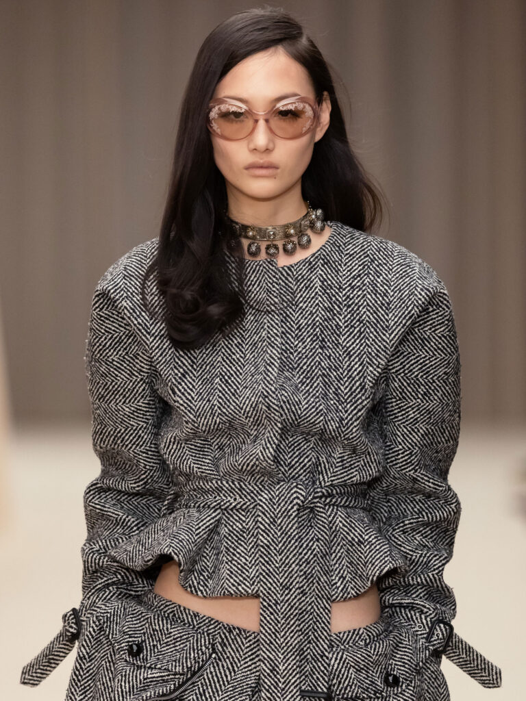
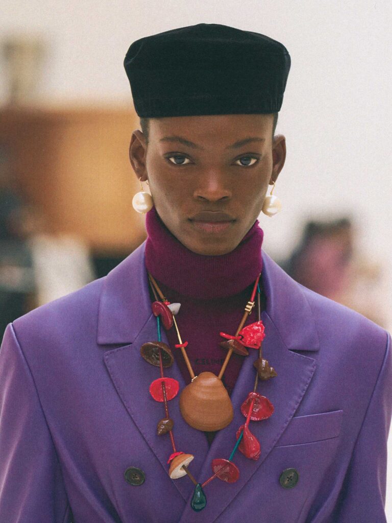
photography Ashley Jahncke The Architecture of 1. cre ar+ {Uno Crear Más}: Designed by Yola Colón 1. cre ar+ {Uno Crear Más} by YOLA COLÓN grows out of a practice that blends architecture, art history, and a deep respect for materials. Founder Yolanda Colón‑Greenberg studied architecture at Cornell and later completed a Master’s in Art History at NYU’s Institute of Fine Arts. That background shapes the way she builds garments: intentional, memory‑driven, and made to last. Her work doesn’t follow seasons. Instead, it grows as an archive: slow, iterative, and guided by the surplus textiles she chooses to work with. Puerto Rican heritage, an architectural eye, and long‑standing relationships with New York workrooms give the brand its quiet, precise language. In this conversation, she reflects on rebuilding her practice after Hurricane Maria and the pandemic and on how sustainability, material scarcity, and hands‑on making guide her work today. fashion Yola Colón (1.cre ar+ {uno crear más})hair and makeup Andrea C. Samauelsmodel Sylvia Gao / ONE Models You’ve described your garments as “living archives.” What does that idea mean to you?1. cre ar+ {Uno Crear Más} by YOLA COLÓN is built as an ongoing body of work rather than a sequence of seasons. A living archive reflects a consistent brand ethos centered on elevated workwear and enduring pieces. Core staples are produced in editions that respond to available materials, while new designs are introduced as layers rather than replacements. Instead of adhering to the traditional fashion cycle, the work develops cumulatively, allowing form, material, and identity to deepen over time.   How does your Puerto Rican heritage shape the way you think about clothing as a form of memory? For me, clothing preserves meaning through reinterpretation—carrying the memory of an original form while allowing it to evolve. The Guayabera—traditionally a tailored Caribbean shirt defined by vertical pleats, embroidery, and four front pockets—is an early example of this. Growing up in Puerto Rico, I observed it was worn almost exclusively by men, with no equivalent worn by women. That absence stayed with me and led me to reimagine the form for women. My architectural training reinforces this approach, treating garments as constructed forms shaped by use, proportion, and context. This way of thinking—of caring for memory through form and material—is how I approach fashion pieces as concepts.  1. cre ar+ {Uno Crear Más} Guayabera Editions rework the traditional silhouette through fit and scale, using surplus cotton voile and its iconic pintucked stripe locally crafted in New York artisanal workroom. Realizing that many other women shared the same desire to wear it affirmed the relevance of carrying that cultural memory forward through construction and recontextualization rather than replication.   When working with excess or historical textiles, what kinds of cultural or personal histories are you intentionally preserving or reactivating? I work with textiles that have been left behind—materials displaced by time or shifting systems of value. Discarded tablecloths at a market point to gatherings that no longer take place: the dressed table, embroidered initials, stains, repeated washing, starching, and pressing. I imagine how those surfaces might move again on the body. The same logic applies to Japanese selvedge denim sourced from closed or overstocked warehouses—fabric rooted in workwear, durability, and labor, produced with precision and then rendered surplus. Reworking these materials returns them to use, shifting them from dormancy back into circulation.   You rebranded 1. cre ar+ {Uno Crear Más} by YOLA COLÓN after the Covid pandemic. What pushed you to make that change? The shift began earlier, after Hurricane Maria devastated Puerto Rico while my parents were there and unreachable. That experience heightened my awareness of environmental instability, intensifying storms, and the urgency of rethinking priorities—including the impact of fashion systems. During the Covid lockdown, the pause created space to reflect more deeply. I took a virtual course at LIM College (The Business of Fashion and Lifestyle division) focusing on sustainability, and while many businesses in the fashion district shut down, the period also led to a renewed reconnection with specialized workrooms I had collaborated with before. Around the same time, reading H of H Playbook by Anne Carson—and encountering her drawing of red overalls—sparked a decisive moment. In the context of Herakles, it suggests a figure carrying burden after devastation. For me, the simple sketch defined an outline of labor, vulnerability, and endurance. That image resonated deeply. It led me to restart with a single workwear piece: the overalls. That garment became the foundation for the rebrand—designed to be sustainable, long-lasting, and highly tailored, using utilitarian hardware and refined details like piping to elevate function into an enduring form.   What does the new identity represent for you personally, especially after such an uncontrollable period? I think less about representation and more about how the work feels in practice. The new identity is grounded in direct local engagement—with pattern makers, specialized artisans, and cut-and-sew rooms, whether the process involves pleating, embroidery, or laser etching. Being present, asking questions, and refining details alongside the people who make the garments restores a sense of agency through process, and that closeness is also what makes the practice sustainable.  Your practice focuses on reclaiming surplus textiles and working with material intelligence. What does ecological responsibility mean to you, and how is it interpreted in your atelier? Ecological responsibility is not a marketing position for me—it’s a design constraint. The work is made locally in New York, in high-standard workrooms, in small batches and editions where what evolves is the material rather than making collections. By working with surplus textiles, the practice reduces the need for new material production. Forms are repeated and refined through reinterpreted fabrics, and leftovers are intentionally used for belts, bags, or panel-pleated skirts. Production is highly finished and tailored so pieces are built to last, often made on demand thus no need to discard of inventory. Every decision privileges longevity, care, and precision over speed.   You studied architecture and art history. How do those two backgrounds come together in your design process? They converge through structure

Scroll to Top