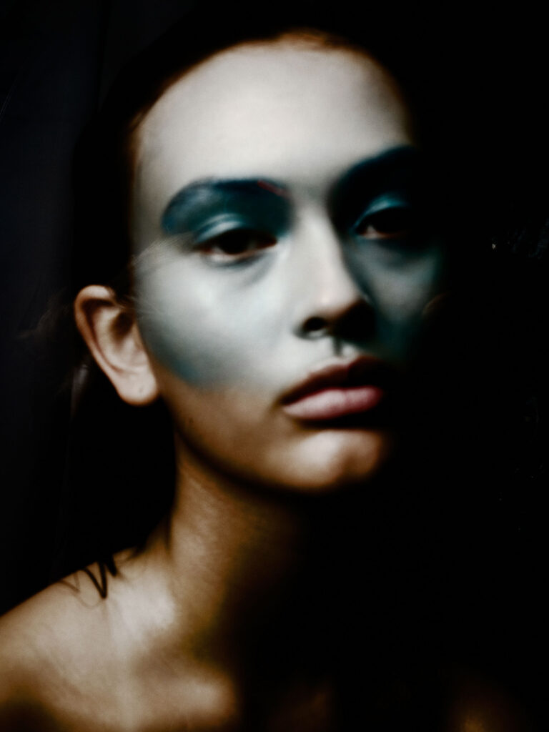
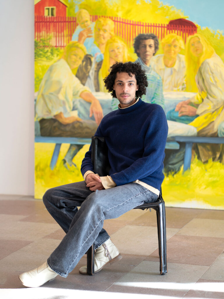
Author name: Kaat Van Der Linden

Beauty Articles

L’AURA: A New Swedish Premium Wellness Brand for Women

L’AURA: A New Swedish Premium Wellness Brand for Women L’AURA is a new Swedish premium brand focused on women’s health, created for those seeking quality, clarity, and modern wellness routines. Founded by Elin Mendola, L’AURA offers simpler, more effective supplements for women, developed with clinically studied ingredients, advanced liposomal technology, and clean formulations. The goal is to make wellness both simple and beautiful. Products are designed to look stylish in your bathroom or kitchen, with easy pipette dosing. All L’AURA products are developed in collaboration with experts and manufactured in a GMP certified facility in the UK. Formulations are vegan, gluten free, non GMO, and free from fillers or unnecessarily complex blends. Designed to accompany women throughout their lives. The first two products, Cycle Flow and Glow Elixir, will be followed by additional supplements tailored to different life stages, always liposomal, science backed, simple, and purpose driven, explains Elin Mendola. Women’s health is one of the fastest growing categories in wellness today. Interest in hormonal balance, energy, skin health, and how women’s needs change through life is increasing steadily. At the same time, more consumers are seeking cleaner products with clear benefits, a philosophy where fewer, better choices take priority. This is the space where L’AURA steps in. The brand focuses on liquid liposomal formulations, often hailed as the next generation of supplement delivery due to improved absorption, clean ingredients, and easy everyday use. While L’AURA primarily targets women aged 35 to 65, its approach appeals to anyone seeking a thoughtful, modern relationship with their health. “L’AURA started with a simple insight: women deserve clearer, more thoughtful supplements. After years of complicated routines, many products, and confusing information, it was clear the market lacked an option that was both science based and easy to understand. I wanted to create a cleaner format, science backed and simple enough to use every day,” says Elin Mendola, founder of L’AURA. Cycle Flow for Supporting Your Natural RhythmA liposomal liquid supplement designed to support women’s natural rhythm throughout the month. The formula contains vitamin B6, vitamin B12, zinc, and maca, carefully selected ingredients that contribute to normal hormonal activity, energy, and reduced fatigue. Modern and simple to use daily, with a refreshing lemon and ginger flavor. Price 499 SEK (recommended dose 60 ml / 2 ml per day). Glow Elixir for Skin, Hair, and NailsA liposomal beauty supplement in liquid form combining biotin, vitamins C and E, zinc, hyaluronic acid, and lycopene. These ingredients support the body’s natural processes for skin, hair, and nails, and help protect cells against oxidative stress. The formula supports normal skin function and daily balance, with a light lemon and ginger taste. Price 449 SEK (recommended dose 60 ml / 2 ml per day). L’AURA products are available from February 2026, exclusively online at www.mylaurahealth.com, through Meds.com, and at VANA SPA in Vasastan.

Opiates, Uncategorized

Tiffany & Co. Introduces the Enamel Watch

Tiffany & Co. Introduces the Enamel Watch Tiffany & Co. revisits one of its most storied crafts with the Enamel watch, a new timepiece shaped by the vivid paillonné enamel Jean Schlumberger revived in the 1960s. Three variations make their debut, each framed by a rotating ring of Tiffany Blue® or white enamel and the collection’s signature cross‑stitch motif in 18k gold. The dial is a study in light: a diamond‑set center encircled by enamel that shifts with every movement of the wrist. The stitches mark the hours, but never stay still — a quiet, playful gesture that echoes Schlumberger’s approach to design. Presented in a 36 mm case of white or yellow gold, the watch is produced in limited quantities. The craft behind it is meticulous. Paillonné enamel requires layers of gold or silver leaf, translucent color and repeated firings to achieve its depth and radiance. The rotating ring alone demands 65 hours of work. Diamonds are snow‑set across the case and dial, creating an almost continuous surface of reflection. Matching alligator straps in Tiffany Blue® or white complete the piece, while a high‑jewelry version pairs the enamel with a full pavé bracelet in 18k white gold. A modern tribute to a near‑forgotten craft, the Enamel watch carries Tiffany & Co.’s legacy forward; luminous, intricate, and unmistakably its own.

Opiates, Uncategorized

Dior Introduces the Crunchy Bag

Dior Introduces the Crunchy Bag For Spring–Summer 2026, Dior unveils the Crunchy bag, a new silhouette shaped by Jonathan Anderson and defined by a contemporary take on the cannage motif. The leather is the first thing you notice: slightly crunchy, subtly crinkled, catching the light through its three‑dimensional texture. Dense yet supple, it creates an interplay of reliefs that gives the bag its name — and its attitude.  Soft in appearance with a semi‑gloss finish, the Crunchy comes in two sizes and a refined palette that moves from black and brown to pastel yellow and deep green. Gold handles offer multiple ways to carry it, from hand to shoulder to crossbody, while a delicate “Dior” signature slips between the chain eyelets. A study in contrast and ease, the Crunchy bag arrives in stores on March 12, 2026. Image courtesy Dior

Opiates, Uncategorized

Levi’s® Introduces “Behind Every Original”

Levi’s® Introduces “Behind Every Original” Image Courtesy Levi’s® Levi’s® launches a new global campaign, “Behind Every Original,” celebrating the people who move culture forward, this time from an unexpected point of view. Debuting during the Super Bowl with the film Backstory, directed by Kim Gehrig, the brand shifts the spotlight to the backside, the most iconic angle of Levi’s® denim. The film brings together a cast of Originals,  from Doechii and ROSÉ to Shai Gilgeous‑Alexander, Questlove and Stefanie Giesinger, alongside everyday figures who shape culture in quieter ways. Each appears only from behind, sharing their story through movement, attitude and the unmistakable details of Levi’s® jeans. Shot across Los Angeles, Oklahoma City and London, the production leans into authenticity, casting real cowboys, construction workers, climbers and youth. The soundtrack, James Brown’s “Get Up Offa That Thing,” infuses the film with energy, echoing the campaign’s celebration of motion and self‑expression. Following the Super Bowl, the campaign unfolds through short reveal films, social and digital storytelling, and in‑store experiences. Photography captures the cast in raw, behind‑the‑scenes moments; stepping into their denim, stepping into their story. “Behind Every Original” continues Levi’s® long relationship with culture, spanning music, sport and fashion. From classic silhouettes to custom pieces created for the cast, the styling reflects the brand’s legacy and the individuality of each Original.

Fashion Articles, Uncategorized

An interview with Wood Wood’s Brian SS Jensen on their AW26 collection

An interview with Wood Wood’s Brian SS Jensen on their AW26 collection text by Ella Nelson For over two decades, Wood Wood’s Magnus Carstensen, Karl-Oskar Olsen, and Brian SS Jensen have built and positioned the Copenhagen-based brand as a defining force within the European street couture scene. With a clear nod to the outdoors—while remaining true to the brand’s contemporary streetwear sophistication—Wood Wood’s AW26 collection, titled ‘Field Studies’, presents a polished selection of outerwear, hefty knits, layered pieces, and select accessories, seamlessly merging functionality with fashion. Drawing inspiration from rural Norway and the Scottish Highlands, the collection’s color palette is dominated by shades of brown and forest green, punctuated by pops of pink and orange. In conversation with Odalisque, Brian SS Jensen, co-founder and creative director of Wood Wood, discusses the starting point of the AW26 collection, its hidden references, and the brand’s continued comeback.  Image Courtesy Wood Wood Please tell us about how the AW26 collection came to life. What inspired it, what did the creative process look like, and how does the installation reflect those ideas?  The collection was inspired by a lot of different things; I think the first spark came from a conversation about the ‘Hessdalen lights’ – this strange light phenomena that happens in rural Norway, which attracts curious visitors from all over the world. We thought a lot about the friction that can occur between outsiders and locals in these small, remote communities. The Scottish highlands became another touchpoint. We wove these different references into a loose narrative that helped guide us through the process, giving the collection a sense of place and story without being too literal about it.    Which key elements played a role in shaping the AW26 collection?  The fundamentals: shape, texture, colours, prints.    Are there any specific pieces, details, or ideas you’d like to highlight from this collection?  I really like some of the heavier wool and leather outerwear pieces. There’s a weight and substance that feels right for the themes we were exploring.  What challenges did you face in creating the collection, and what are you most proud of? I’m generally quite happy about this one. It always feels like a battle to finish a new collection, but when I look at all the pieces together now, I believe we landed in a good place.  What do you hope audiences feel or walk away with after experiencing the AW26 showcase? I hope they will get a sense of the underlying stories that informed the collection. I don’t expect people to recognise or decode the specific references, nor do I really want them to, but hopefully it makes the individual pieces feel connected to a larger context.  How does this collection build on and strengthen the ongoing narrative of WOOD WOOD? Each season represents a new layer added to the brand. This collection is a reflection of our interests right now, but it’s also another chapter of a much bigger story.  Looking ahead, what’s next for WOOD WOOD?  The company has recently gone through a rather significant transformation which took a lot of time and hard work, but we are now in a strong position to build and move forward. I can’t say too much yet, but we are planning some exciting projects, and we have our 25th anniversary coming up next year!

Art

Florence Montmare’s Synchronicities: A Nocturnal Geometry

Florence Montmare’s Synchronicities: A Nocturnal Geometry text Kaat Van Der Linden  “I wanted to create a sense of wonder as you enter the space,” says Florence Montmare about her exhibition in Visby, on the Swedish island of Gotland. “The compositions of images, projections, reflections, different surfaces, music, and the juxtapositions of simultaneous narratives make up the kaleidoscope, but it never stays the same. That sense of randomness is something I find really exciting,” the Swedish artist explains. Synchronicities brings together works spanning Montmare’s artistic career, allowing moments and pieces that might initially seem unrelated to reveal deeper connections, forming meaningful coincidences and resonances across time. The exhibition opens with the short film Hemkomst, in which Montmare explores themes of migration on the islands she has called home at different points in her life. Bringing together both locals and refugees, the film reflects on themes of identity and home, and conditions of migration and displacement. Moving through the exhibition, it becomes difficult not to notice how many of Montmare’s works engage with broader societal issues. “I don’t do it on purpose, but they are hard to avoid,” she says. “In ‘America Series’, I collect personal histories throughout the USA, and they tend to be directly linked to societal issues.” Throughout her career, Montmare has explored a wide range of recurring themes, including displacement and belonging (It Happens in the Meeting), the hopes and dreams of strangers (America Series), time and memory (Illuminations), the elemental conditions of landscape and figure (Scenes from an Island), time geographies (Missed Connections), and the origin, cycles, and nature of the self (KRIΣ). images courtesy Florence Montmare Rather than unfolding as a chronological retrospective, Synchronicities follows a more intuitive logic. By abandoning a conventional timeline, the exhibition forms a personal narrative shaped by associations and encounters. “When I started thinking about what I wanted this exhibition to inhabit, I drew a sketch, planning where each work would be placed,” Montmare explains. “As the exhibition came together, I realised that not every artwork was in the right position. The reflections within the works, and the spatial organisation of the pieces, made it clear that the ordering needed to be reconsidered.” Montmare describes the experience of moving through the exhibition as watching a film reveal itself. The works are arranged to suggest a narrative, while still leaving space for the viewer’s own interpretation. Light plays a crucial role in shaping the exhibition’s dreamlike atmosphere. Montmare paid careful attention to the lighting design, changing all of the spots to achieve the desired effect. The spaces between the images are as important as the images themselves, because what is left unseen becomes part of the experience. Carefully chosen indigos and purples create what Montmare describes as a “nocturnal landscape.” On view until March 1, Synchronicities marks a kind of homecoming for Montmare, as she returns to what she does most naturally: choreographing and building intimate spaces. This was one of her earliest practices, and in Synchronicities, these elements are brought together and fully integrated. Within Montmare’s wider practice, this exhibition represents both a pause and a turning point, with the sense of pause being embedded in the experience itself, offering visitors space to slow down and breathe. “Some responses I’ve received say that the work feels meditative,” Montmare reflects. “Which is a given, since many of the works are directly related to, and have grown out of, the practice of meditation. In this sense, it is a pause, yet also a forward movement.”

Opiates, Uncategorized

Breitling Joins Aston Martin for a New Chapter in Speed

Breitling Joins Aston Martin for a New Chapter in Speed Image Courtesy Breitling & Aston Martin Breitling steps into a new era as it joins Aston Martin and its Formula One™ Team as Official Watch Partner. The partnership connects handcrafted performance with precision engineering, beginning with the Navitimer B01 Chronograph 43 Aston Martin Aramco Formula One™ Team; a timepiece marking the watchmaker’s return to Formula 1®. Two worlds shaped by speed now move together. From Aston Martin’s vehicles built in Gaydon and St Athan to the team’s pursuit on the circuit, the collaboration spans the full Aston Martin universe. “Every line, finish, and proportion has purpose,” says Georges Kern, CEO of Breitling. Lawrence Stroll highlights the shared values of ambition, craftsmanship and engineering excellence. The Navitimer B01 Chronograph 43 Aston Martin Aramco Formula One™ Team reflects that alignment. Limited to 1,959 pieces, it carries Aston Martin Racing Green with lime accents from the team’s livery. A lightweight titanium case, the first on a Navitimer, meets a carbon‑fiber dial inspired by the cockpit of an F1® car. A textured leather strap recalls a racing harness, while enhanced nighttime visibility keeps the watch legible under pressure. Through the open sapphire‑crystal caseback, the Breitling Manufacture Caliber 01 reveals its COSC‑certified precision, complete with a matte‑black tungsten rotor created for this edition. Engravings mark the series: “One of 1959” and “Instruments for Drivers.” The partnership will be visible throughout the Grand Prix season, beginning with the AMR26 launch on 9 February and continuing at the Australian Grand Prix in March. As the collaboration evolves, fans can look forward to exclusive releases, a continued meeting of time and speed.

News, Uncategorized

Rörstrand Celebrates 300 Years in Blue

Rörstrand Celebrates 300 Years in Blue Rörstrand continues its 300-year celebration with a focus on blue and white, a palette that carries the brand from spring into summer. This season sees the return of one of its most iconic archive collections as Blå Eld is relaunched, alongside an expansion of the Swedish Grace glass collection in a new blue shade. Together, the releases highlight Rörstrand’s heritage and its ongoing commitment to contemporary design. Blå Eld, designed by Hertha Bengtson and produced between 1951 and 1971, remains one of Rörstrand’s most beloved series. Known for its relief-patterned surface, asymmetrical forms and deep cobalt tones, the collection introduced a unique color concept: white for what one ate or drank from, blue for plates, bowls, jugs and serving pieces. Today, it stands as one of the brand’s crown jewels; a classic that continues to be highly sought after. “Blå Eld shows how Rörstrand’s design throughout history has been ahead of its time,” says Malin Herdevall, Brand Manager at Rörstrand. Relaunching the series during the anniversary year underscores the brand’s ability to honor its heritage while evolving for future generations. The Swedish Grace glass collection, introduced in 2025, now arrives in an elegant blue tone that harmonizes with Rörstrand’s classic patterns, including Blå Eld and Ostindia. The color enhances the collection’s characteristic relief pattern, giving each piece a more defined expression. Mouth-blown and mold-shaped, the glasses and carafe balance precision with a handcrafted feel. The carafe receives additional hand-finishing at the neck and rim, while the glasses, made from robust and thick glass, remain practical for everyday use and refined enough for festive settings. Designed by Rörstrand’s in-house team, the pieces carry the familiar Swedish Grace language: a rounded base, tulip-shaped opening and subtle relief. The result is a collection that complements the brand’s porcelain while standing confidently on its own. image courtesy: Rörstrand

Culinary, Uncategorized

Pontus Wellén on a New Culinary Chapter at Sheraton Stockholm

Pontus Wellén on a New Culinary Chapter at Sheraton Stockholm Sheraton Stockholm Hotel is entering a new chapter and at the heart of this transformation stands its bold new restaurant concept, Mr. Bronck. Named after the Swedish-born settler Jonas Bronck, who gave his name to the New York borough of the Bronx, the restaurant draws inspiration from that same spirit of exploration and cultural exchange.  At Mr. Bronck, Swedish ingredients reinterpret classic American dishes through the lens of local produce and Nordic seasonality. The kitchen is led by medal-winning chef Pontus Wellén, whose craftsmanship and curiosity set the tone for a dining experience that is both confident and welcoming. To understand how the concept comes to life on the plate, chef Pontus Wellén offers his perspective on the ideas driving Mr. Bronck. Image Courtesy Sheraton Stockholm What kind of personality would you give Mr. Bronck? Mr. Bronck has a confident but unpretentious personality. He’s curious, social, and well-travelled — someone who appreciates craft and quality, but never takes himself too seriously. There’s a sense of ease and generosity to him: a place where you feel welcome whether you come for a full dinner, a drink at Sally’s, or simply to see what’s happening.   How does the story of Jonas Bronck and New York influence the restaurant? Jonas Bronck represents movement, exchange, and new beginnings. His journey from Scandinavia to what would later become New York mirrors the idea of cultural cross-pollination. That spirit lives in the restaurant through a meeting of Swedish ingredients and values with American flavours, techniques, and confidence — not as nostalgia, but as a modern interpretation of that transatlantic connection.   What makes Mr. Bronck different from other hotel restaurants in Stockholm? What truly sets Mr. Bronck apart is its breadth and generosity. The menu moves effortlessly from raw bar and seafood to grill classics, comfort dishes, and playful desserts — designed for sharing, mixing, and returning often.   Furthermore, we will offer an ambitious wine program that highlights the energy and curiosity of the New World, with a special focus on American wines. Guests are welcome to simply pop in for a glass at our vibrant wine bar counter.   It’s not a single-lane concept, but a place that works just as well for a long dinner as for a spontaneous bite or a late dessert. That flexibility, combined with a strong culinary identity, is still rare in Stockholm’s hotel restaurant scene.   Will the restaurant be open to the public, or only for hotel guests? Absolutely open to the public. Mr. Bronck is very much intended for Stockholmers as well as hotel guests — a place you come to because you want to, not because you happen to be staying here. Is the concept more casual or fine dining? It sits confidently in between. The food is ambitious and ingredient-driven, but the atmosphere is relaxed and social. You can dress up or dress down, come for a celebration or a spontaneous weekday dinner — the experience adapts to the guest, not the other way around.   How does Mr. Bronck fit into Sheraton’s overall transformation? Mr. Bronck is a key expression of Sheraton Stockholm’s transformation toward a more lifestyle-driven, culturally connected hotel. It reflects our ambition to be part of the city rather than separate from it — creating spaces that feel relevant, contemporary, and rooted in local culture while still international in outlook.   What gap in Stockholm’s restaurant scene does this aim to fill? There’s a gap for a restaurant that combines strong identity, warmth, and generosity with real culinary credibility — without becoming formal or inaccessible. Mr. Bronck aims to be that place where atmosphere and food carry equal weight, and where people genuinely want to linger.   What kind of American dishes are you planning to put on the menu? The menu takes cues from classic American cooking — shrimp cocktail, oysters, lobster roll, smash burgers, steaks from the grill, and iconic desserts like cheesecake and pecan pie. These are familiar reference points, but always executed with precision and restraint, and adapted to a contemporary European dining context.   How will Swedish ingredients influence the menu? Swedish ingredients form the backbone of the menu. From local seafood and roe to Nordic vegetables, apples, cabbage, and regional cheeses, seasonality and origin are central. These ingredients bring freshness, balance, and a lighter expression to dishes inspired by American comfort and confidence.   Could you give examples of how Swedish ingredients will influence American dishes? A classic shrimp cocktail might be lifted with Nordic herbs and bright acidity. American-style grilling is applied to Swedish meats and seafood. Roe from Kalix or Älvdalen appears where you might otherwise expect caviar. Comfort dishes are balanced with Swedish vegetables, apples, and fermented or pickled elements — creating familiarity without heaviness. What attracted you to this concept? I was drawn to the creative freedom of the concept and the cultural dialogue it allows. The idea of blending American food culture with Swedish ingredients and sensibility gives me room to be expressive — while still staying grounded in quality, craft, and simplicity.   How is Mr. Bronck different from your previous work? Mr. Bronck is less about making one strict culinary statement and more about creating a living, social place. It’s broader, more playful, and more people-driven — a restaurant designed to evolve with its guests and with the city.

Scroll to Top