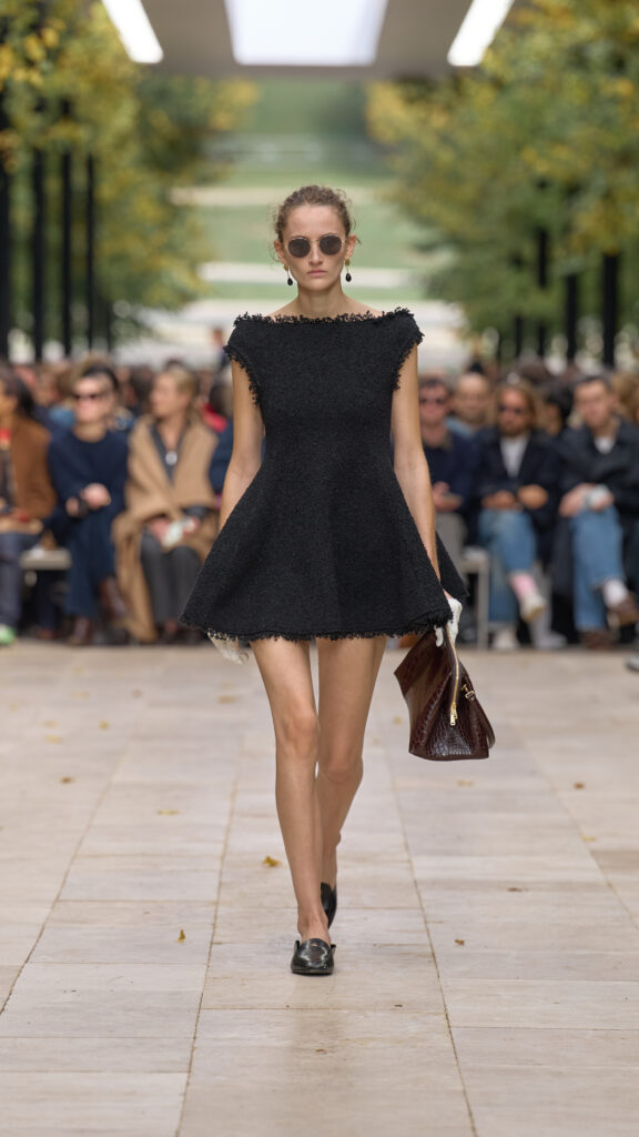
BALENCIAGA SS26
BALENCIAGA SS26

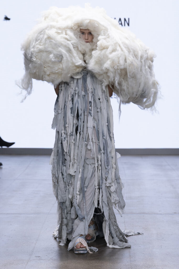
Fashion Scout’s ONES TO WATCH 2 SS26 designer Bergman Designs designer La toile designer Lana parell designer Nathan Slate designer Nichoir designer Yonzu
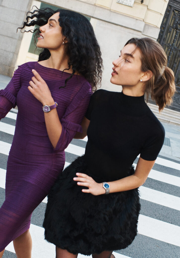
Breitling Reimagines Its Past with the Lady Premier Collection text Natalia Muntean Last week, Breitling launched the Lady Premier collection, inspired by its 1940s Premier Fantaisies models. This new line features elegantly sculpted elliptical cases, vibrant colour gradients, responsibly sourced gold and traceable lab-grown diamonds, marking a bold shift in feminine watchmaking. The collection honours the women who have influenced Breitling’s design, including founder Willy Breitling’s wife, Beatrice, and icons like Raquel Welch in the 1960s. “Lady Premier is a new take on the elegant watch that’s confident, feminine, and full of character, just like the woman who wears it,” says Georges Kern, CEO of Breitling. The design philosophy, described by Head of Product Design Pablo Widmer as “modern retro,” starts with an archival piece updated for today. Key features of the Lady Premier include sculptural silhouettes with distinctive elliptical cases in 36mm and 32mm sizes, inspired by the seamless case-to-bracelet flow of vintage models, radiant hues and finishes, with dials available in rich colours like Aubergine, Sage, and mother-of-pearl, complemented by matching ombré alligator leather straps. A new tapered Chevron bracelet offers a feminine twist on a classic design. The collection is powered by high-performance movements, with the 36mm models housing the COSC-certified Breitling Caliber 10 automatic movement and the 32mm models featuring a COSC-certified SuperQuartz™ movement. The accompanying campaign, featuring models Meghan Roche and Shahed Elnakhlawy, and surfer Mason Barnes, captures the spirit of the Lady Premier woman: effortless, charming and with a touch of playful elegance.

Carsten Höller's "Stockholm Slides" invites you to a controlled fall from Moderna Museet text Natalia Muntean A new large-scale art installation transforming the facade of Moderna Museet is more than a slide. It is a physical exercise in surrendering control. “Stockholm Slides,” a pair of spiral slides by internationally renowned artist Carsten Höller, opened to the public last week. The artwork consists of two identical, mirror-image slides, each 39 meters long, allowing two people to ride simultaneously in what the artist describes as a “mirrored choreography.” But for Höller, the core of the experience lies in the psychological state it induces. “In a slide, you must give up everything to do with your own control.” Höller elaborates on the unique tension of the ride: “You know exactly what is going to happen. There is no surprise… But you cannot do anything during the process between the beginning and the end.” This regulated loss of control is, for the artist, the source of a powerful and contradictory sensation, finding this duality fascinating, placing the rider “on two extremes simultaneously. You have hard joy and fear.” When asked if the work, a literal controlled fall, relates to the contemporary feeling of political or environmental free-fall, Höller acknowledged the metaphor while also emphasising the openness of art. “It’s an artwork, which means we cannot say it means this or that. It means many things. And I think that’s the great thing about art, that it’s not just one thing, but many, many, many things.” This perspective aligns with Höller’s history of creating what he calls “influential environments” – installations designed to provoke specific states of mind like disorientation, doubt and exhilaration. “Stockholm Slides” invites visitors to physically release control, challenging the traditional passive museum visit, and exploring what it means to fall and to let go.
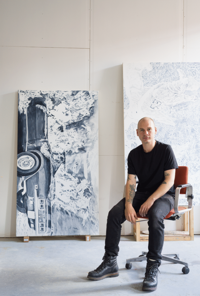
Gerdman Gallery Debuts with Johnny Höglund’s Digital Memories text Natalia Muntean “My hope is to contribute to Stockholm’s ever-growing gallery landscape by presenting artists of my own generation, both from across Sweden and internationally, working in a variety of media,” says Peter Gerdman, founder of the newly opened Gerdman Gallery in the heart of Stockholm. This clear vision defines the new space, which enters the scene with a collaborative and curatorial approach. “I want to grow alongside the artists I work with,” Gerdman explains, “so beyond the strength of their practice, it’s important that we share values and goals.” His strategy is both focused and expansive. “My approach is to look broadly, starting in Sweden, then across the Nordics, and more widely as the gallery develops.” While an artist’s career stage is a key factor, the final selection is ultimately a personal one. “It’s also a matter of taste,” Gerdman explains. “I follow my conviction in an artist’s practice, trusting that belief as the foundation for what is presented.” This philosophy is reflected in the gallery’s inaugural exhibition, “What is Gathered is Not Memory” by Johnny Höglund. Gerdman has been tracking Höglund’s artistic journey for some time, but it was the body of work showcased during Annual, Malmö Art Academy’s yearly exhibition, that ultimately convinced him. “I immediately sensed that his work would be ideal for the gallery’s first presentation. His practice not only stands strongly on its own, but also conveys the kind of visual vocabulary and conceptual qualities I want people to come to expect from Gerdman Gallery,” says Gerdman. Höglund’s paintings capture the anonymous, everyday moments frozen by our screens. In his hands, these fleeting digital fragments are metabolised through the slow, physical labour of oil painting on large-scale canvases. Höglund’s works are an invitation to challenge the speed of the scroll, inviting us to pause and reconsider what we gather and what we truly remember. Portrait taken by Hannes Östlund Natalia Muntean: The exhibition title suggests a difference between collecting information and creating memories. In your art, what do you collect and what becomes a true memory in your paintings? Johnny Höglund: I base my selection of images on the fact that they have, in some way, managed to capture my attention enough for me to take a screenshot. It can be anything to me; the content does not matter. It happens almost unconsciously. There is something in the image that appeals to me, but I don’t necessarily know what it is or understand when I begin working with it. For me, it’s not about preserving a specific image or memory, but about understanding why it appears in my feed, and, by extension, becomes part of an autobiographical narrative, without becoming a self-portrait in the traditional sense. NM: You slow things down when you paint, going from a quick digital move to a slower physical one. When does a small piece of a digital image stop being just a random part and become something that shows your personal touch? JH: I believe it does the minute the brush touches the canvas. At that moment, I’m fully invested in the image. The process beforehand is slow and takes several days. I build my own stretchers, then I put down two layers of glue, followed by three layers of gesso. Every layer needs a light sanding and time to dry. During this process, I’m already thinking of the image that I will be painting onto that canvas. But there’s still time to have second thoughts. Time to even discard the image and use another screenshot (because the image still needs to work as a painting). So I would say that from the first brush stroke onwards, that’s when my hand is present and the image becomes an extension of myself. NM: You use classic materials like linseed oil on canvas to show digital experiences. Is this a choice about lasting quality, or do the paints help show what digital images are like? JH: I think working with our hands is becoming increasingly more important. And to let the human hand show through in its work is so important. It has so much inherent feeling with all its so-called imperfections in contrast to the very clean and crisp digital image. A brush stroke can contain so much emotion in its simplicity. But painting is, above all, a way of processing. It is not about illustrating something that already exists, but about allowing something to take shape through doing. And once complete, the painting holds its ground in real space. It cannot be scrolled past. NM: You explore a “collective memory shaped by algorithms.” As an artist, are you trying to rebuild what was lost in the digital screenshot or make a new story through painting? JH: The collective memory of the screenshot. A collective memory which is shaped not only through what we save and send forward, but also through all those images we scroll by, which are pre-cognitively imprinted in our memories. I see this fragmented timeline as something more poetic than prosaic. Connected as autobiographical material shaped through the algorithm, and then processed by hand. The saved image is saved to our tangible reality. I place it back into the world on new terms, inviting the viewer to experience it through their whole body. NM: The large scale of the works implies a physical, bodily engagement for both you and the viewer. How does this physical act push back against the feeling of just scrolling on a screen? JH: The scale of the paintings demands attention differently compared to that of the feed. You cannot scroll or swipe. You move around in the room as a viewer, not the image. With a painting of this size, the body has to adjust, to move closer or further away, to stand still for a longer moment. It creates a different temporality, one where the image doesn’t vanish but instead insists on staying with you. For me, this

The iconic Kawasaki footwear is back Kawasaki Footwear is back and ready for a new chapter. The iconic Kawasaki Footwear is making its return. In partnership with Vernon Sport, Sports Group Denmark is relaunching the legendary brand across the Nordics, blending heritage, craftsmanship, and a bold new creative vision. First introduced in 1972 as a simple white badminton shoe, Kawasaki quickly became a cult favorite far beyond the court. Its clean lines, colorful canvas designs, and effortless attitude turned it into a timeless icon of casual style. Now, that same spirit is back, reimagined for a new generation. With Vernon Sport’s passion for enduring brands and Sports Group Denmark’s market expertise, Kawasaki is ready to step forward once again, bridging its authentic roots with a fresh, modern energy. A classic reborn.
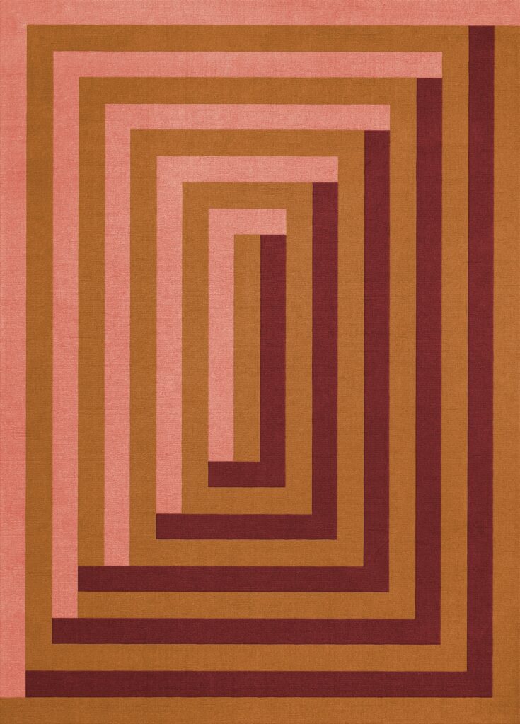
Teklan x Layered: A Continued Exploration of Color and Form text Ulrika Lindqvist photography Andy Liffner Known for her bold use of color and immersive spatial design, Stockholm-based designer Tekla Evelina Severin, or Teklan, has built a practice that bridges interiors, architecture, and visual storytelling. In this interview, she shares her creative process, recent highlights, and the inspiration behind her latest collaboration with Layered. Ulrika Lindqvist: Hi Tekla, can you share how long you’ve been working as an interior designer and what inspired you to start your career in this field? Tekla Evelina Severin: I graduated in 2010 from Konstfack University of Arts, Crafts and Design in Stockholm, specializing in Interior Architecture and Furniture Design, and have been working in the field ever since. During the first few years, I worked as a more traditional interior architect at an architectural firm. 2015 I took my first baby steps towards my current direction, and founded my own studio and multidisciplinary practice, working through the language of colour. My inspiration to start my own practice came from a longing for something beyond the prevailing conformity in design and CMF-design at that time. (And my initial inspiration for becoming a spatial designer in the first place, came from a desire to create new immersive experiences and meaningful environments that stand the test of time, as all good designs should.) UL: Have there been any particular projects or events in your career that stand out as especially memorable? TES: Yes, many , and every project have its own magic, but creating ”an apartment of one’s own” for Spanish furniture company sancal during Milan design week 2022 was definitively a highlight in every way. The wholehearted creative trust from the magic sisters behind the family company, the generous support of co-collaborators like Huguet Mallorca who brought my wild, customised design ideas to life, the patient care of builders and visionary project leaders, the spatial unfolding of my creative vision – and, finally, the overwhelming response from both visitors and press. Another unexpected highlight is the ongoing journey of my tile collection Färgblock. What began as a simple design has evolved over the years, expanding with new finishes and formats and finding its way into projects around the world. Each day I encounter it in new contexts, and it’s delightful to witness how seamlessly it inhabits so many different styles UL: Can you walk us through your creative process? Do you have any specific routines or practices that help spark your creativity? TES: I have no problem with finding inspiration, I have rather the opposite problem, to find enough time to fulfill all my ideas. My creative process is quite straightforward, unfolding in several clear stages. It begins with an in-depth analysis of the client, the brief, the premises, and the space itself. From there, I move on to shaping an atmosphere—creating mood boards, researching materials, and developing colour schemes. In the next phase, I translate these ideas into concrete form through 3D sketches and presentations. This is followed by technical drawings for manufacturers and builders, enabling both budgeting and, ultimately, production. Once production begins, I focus on styling research, followed by on-site supervision and personal involvement to ensure that every detail is realised as intended UL: What does a typical day look like for you as an interior designer? TES: There is no such thing as a typical day. Also, since most of my clients are international, I often work abroad. My time is divided between developing or refining new CMF designs, moving through different stages of interior and exhibition projects, directing or styling upcoming collaborations, and—like now—giving interviews, talks, and behind-the-scenes insights ahead of various launches UL: How do you use rugs and carpets in your interior design? TES: Often, it’s a rug or carpet that allows the room to truly “land.” Beyond anchoring the space, it also adds a softness to the atmosphere and dynamic through material and texture, while naturally improving the acoustics UL: This is you second collaboration with Layered, how does it feel to return? TES: I wouldn’t really call it a return, since our last collaboration was quite recent and the collection is still available and doing well. That said, it’s always a pleasure to be ‘back’ and to continue building on what we’ve created together. In one sense, the process feels easier now that we know each other so well. But in another, it is more demanding—to move forward, to push boundaries, and to somehow outshine the collection that came before. UL: How did you choose the location for the campaign shoot, Villa Volman in Prague? TES: For many reasons, the architecture offered a wonderful palette of matching colours, clean geometrical shapes, and strong perspectives, all of which harmonised beautifully with their collection. There is also something about the spirit of modernism—it feels timeless, while at the same time resonating with my own nostalgic fondness, I often refer to this phenomena as ”newstalgia” UL: What was your inspiration for this collection? It starts where your first collaboration “prism collection” ended, but where did you find the inspiration for this one? TES. Both the collections carry the same creative vision present in all my work: a fascination with the meeting point between two and three dimensions, where perspective shifts and optical illusions emerge—clearly reflected in both Diagonal and Labyrinth DiagonalDiagonal is an homage to one of my dearest patterns: the stripe. Here, reinterpreted diagonally with a darker contour line, it creates an optical shadow effect that emphasizes direction and adds an extra “bam” to the expression. The blue and brown/burgundy pairing is one of my signature combinations—what I like to call “something flirty and something dirty”—a balance where lightness meets depth and earthiness. For the second colourway, I wanted a more graphic and stylistic feel, but with warmth, so I added ochre brown to create richness and comfort. LabyrinthLabyrinth reflects one of my most beloved spatial layouts; in fact, I often build my room installations as labyrinths of different sequences. Here, it appears