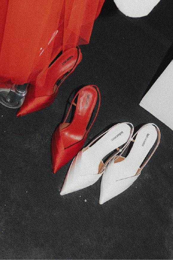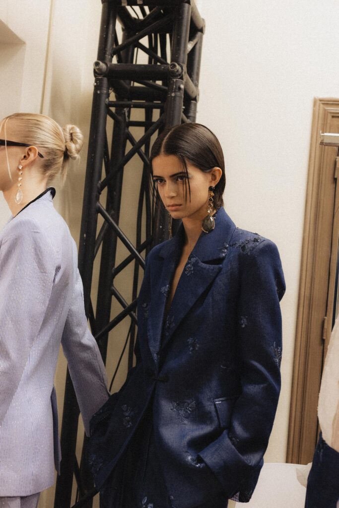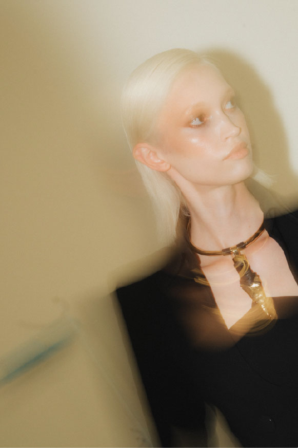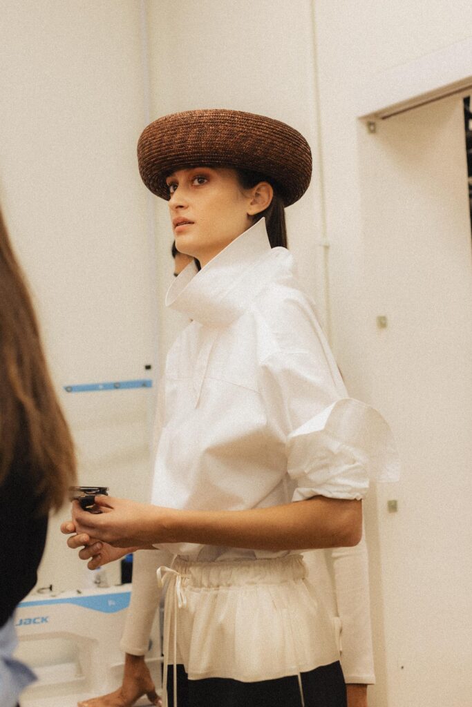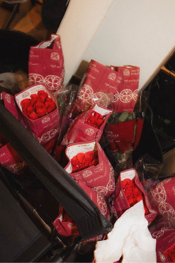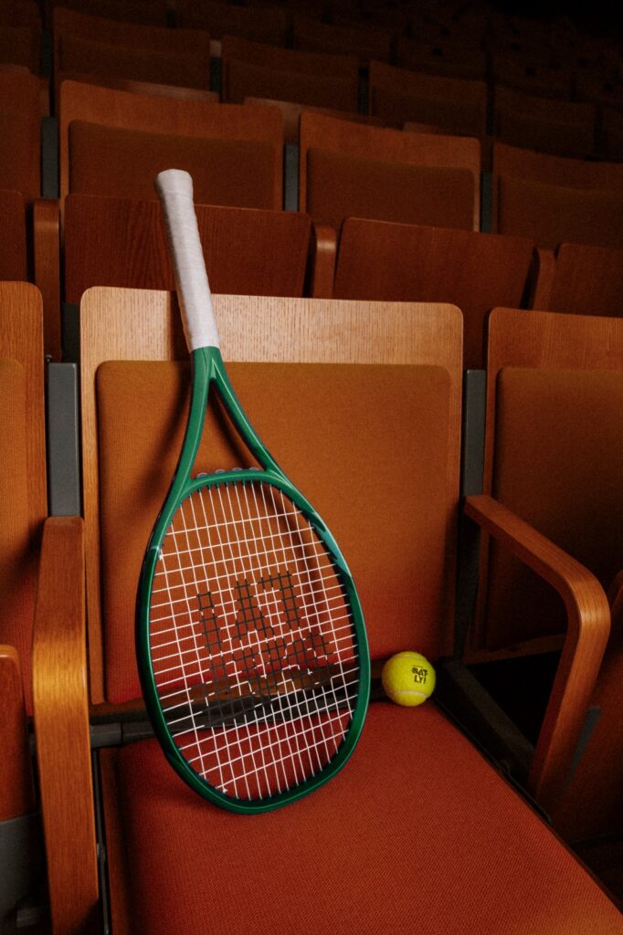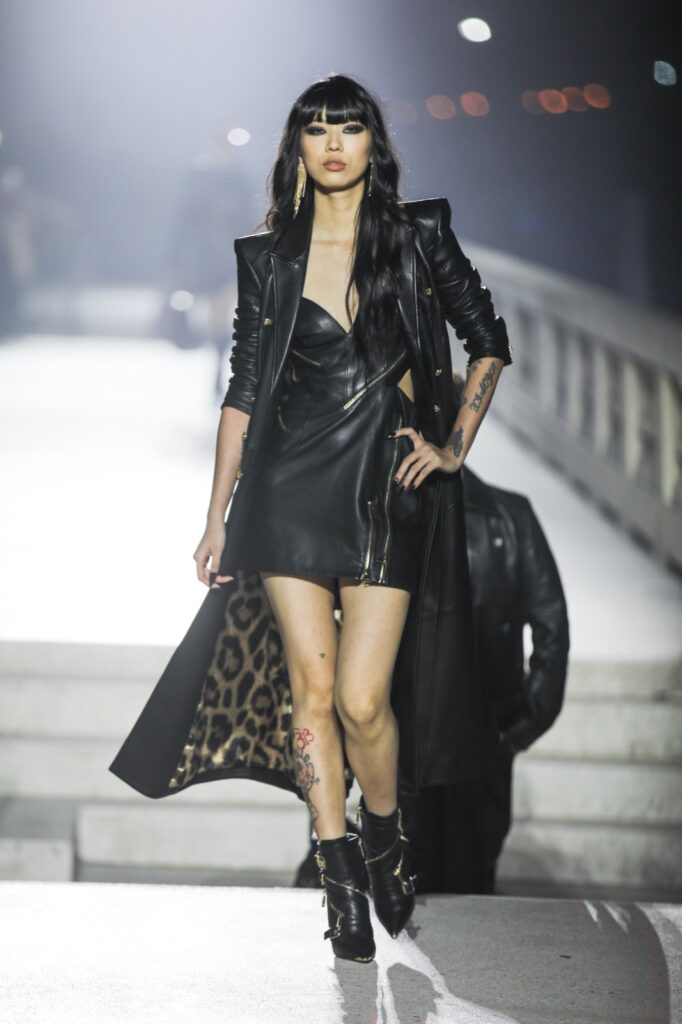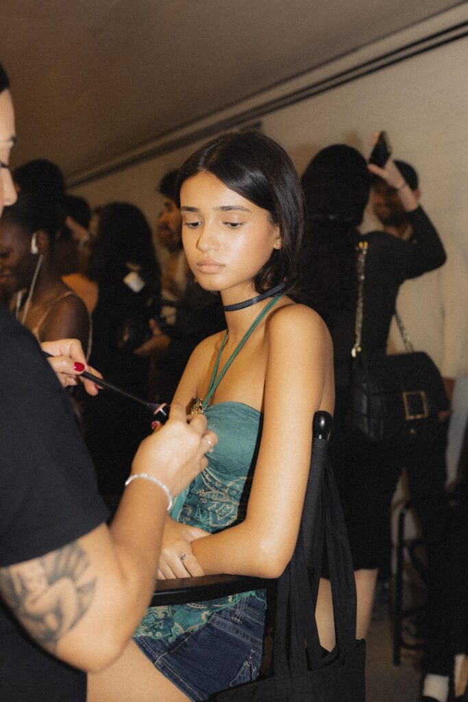
Backstage at Marks & Spencer F/W26 | LFW
Backstage at Marks & Spencer F/W26 | LFW photography Henry Hu
Odalisque x Oatly, An Interview with Petra Fagerström on Fashion and Flavour Before the pleats, the glitches and the almost digitally rendered surfaces, there was a figure-skating dress. Born in Gothenburg, Petra Fagerström used to create and decorate her costumes as a kid, before discovering her passion for fashion through Tumblr and Nicolas Ghesquière’s Balenciaga. After working at Acne Studios and Balenciaga, she set out to create her own practice, one that is personal, occasionally strange but always centered on clothes that women can wear and feel at home in. That philosophy now manifests itself in a kind of language of contradictions: femininity without nostalgia, traditional craftsmanship next to digital approaches and designs that are both functional and flamboyant. The latest London Fashion Week offering sees the brand collaborating with Oatly, interpreting elements of the collection in the form of flavour. In our conversation, Fagerström talks about finding her own language, contradictions that continue to inspire her and the importance of growing without losing touch with one’s personal instincts. Fagerström’s first garments were made for the ice. As a competitive figure skater in Gothenburg, she decorated and made her own dresses long before fashion became a career. “In all honesty, I think the main thing I’ve taken with me is a love for sparkle,” she says. “I can’t help myself but to make a sequin dress each season.” Her real interest in fashion came later, via Tumblr. “I discovered Nicolas Ghesquière’s Balenciaga and I was hooked.” image courtesy Petra Fagerström Sandra Myhrberg: You worked at both Acne Studios and Balenciaga before developing your own label. What did those experiences teach you about the kind of designer and brand you wanted to become? Petra Fagerström: I think it especially taught me a lot about the product. To me the most exciting part about fashion is thinking about how I want to feel and show up as a woman, and working at other houses didn’t really allow me to do that, which led me to pursue my own practice in the end. S: “My design is critical, melancholic and practical,” you once told ELLE. Was there anything in the larger houses you consciously set out to challenge when you started your own label? P: I think working within larger fashion houses made me realise how important it is for me to protect the more personal and critical side of my practice. My design can be quite melancholic and strange, but I also want it to be practical and wearable. With my own label, I’ve wanted to create space for those things to exist together rather than feeling that a garment has to fit into one clear category. It’s about keeping the point of view very personal while still making clothes that women genuinely want to live in. S: Femininity is one of the central themes in your work. How do you explore and define femininity through garments? P: I’m interested in femininity as something that can hold contradictions. I don’t want it to be defined only through softness, purity or nostalgia. I’m much more interested in a woman who has agency and presence, and in taking familiar feminine codes – florals, fitted silhouettes, glamour – and shifting them into something stranger, sharper or more powerful. photography Rebekah Powers S: “Glitchifying” is a word you’ve used to describe your process. What does it mean to you, and where do we see it in the clothes? P: The glitch is my method of breaking the codes of conservative archetypes in fashion. Through the “glitch” I can change the attitude of the garment and by that also how the woman wearing it feels. S: Your lenticular pleating has become almost synonymous with your work. What is it about this technique that continues to fascinate you? P: What fascinates me is that it allows a garment to hold more than one image or reality at the same time. Hundreds of pleats are constructed by hand, but when the wearer moves the surface shifts almost like a digital animation or hologram. I love that contradiction – something incredibly labour-intensive and physical producing an effect that looks almost digitally generated. S: Hundreds of pleats made by hand, and a surface that looks “almost digitally generated.” That tension seems to run through all of your work. What draws you to it? P: That tension is really central to my work. I use digital tools conceptually, but I never want the final garment to simply feel digital. I start digital, but then the idea goes through painting, pleating, construction and hours of handwork. I like when you can’t immediately understand where the digital ends and the human begins. She is less convinced by the current wave of AI. A year long research project with the Swedish company Substorm AI explored how AI tools could protect IP and genuinely help creativity, but the conclusion was sobering. “What I did conclude was that the most helpful is actually admin support,” she says. “Generative AI is rather useless when it comes to originality. S: Your creative vision extends beyond the clothes themselves. How do you think about translating your aesthetic and ideas into other parts of an experience, from fashion to food and beverages? P: For me, a fashion show is about creating a complete world around the collection, where everything from the space and sound to what guests are served can contribute to the experience. Working with Oatly feels like a natural extension of that. They have such a strong and creative way of thinking about their brand and how they communicate, which makes the collaboration feel like a creative exchange. I also really like the idea of bringing a Swedish brand with such a distinct creative identity into the London fashion scene. S: You describe a show as “a complete world around the collection.” What does a brand from outside fashion bring to that world, and to your own practice? P: I think collaborations are most interesting when the two
A Search for Stillness: An Interview with Odette Álvarez photography Framae Studios image courtesy Madrid Fashionweek There is a stillness to Nimba. Odette Álvarez looks to the shifting sky for its cadence, one that moves from the pale blues and whites of the clouds to the scarlet of sunset, bleeding into the black of night. Ethereal volumes meet more defined, Japanese-influenced silhouettes allowing softness and structure to exist together. It is not without reason. Nimba is born at a point where Álvarez herself is looking for greater balance and stillness. In our conversation, she speaks of trying to translate it into clothes, letting colour tell a story and the unexpected piece that came to define the collection. Sandra Myhrberg: There’s a contrast between very ethereal volumes and more structured silhouettes. How did you approach finding that balance? Odette Álvarez: The balance between the more ethereal volumes and the structured silhouettes comes directly from the collection’s two main sources of inspiration. On the one hand, the clouds, whose volume, lightness and ethereal quality I wanted to translate into the garments. On the other, Japanese inspiration, which brings more structure and definition to the silhouettes. The combination of these two references is what creates that balance between more fluid shapes and more structured volumes. SM: The colour palette moves from soft, cloud-like tones to black and scarlet red. What role did colour play in expressing the mood of the collection? OA: Colour played a key role in expressing the mood of the collection, as the colour palette evolves alongside the inspiration. The first series begins with soft, cloud-like tones, mainly white and light blue, which reflect the sense of tranquillity and lightness of the clouds. The palette then becomes more intense, moving into a deeper blue, followed by pink tones and the scarlet red of the sunset, before ending in the black of night. This gradual evolution of colour reflects the changing sky throughout the day and helps me express the mood of the collection. SM: Was there one look or piece that became especially important in defining your collection Nimba? OA: I think the red dress became one of the most important pieces in defining Nimba. It was not something I had planned from the beginning, but once the collection had been designed, I felt there was a transition missing between the blue tones and the black. In the end, that dress became a key piece because it completed the colour transition and helped reinforce the narrative of the collection. SM: What feeling would you like people to leave with after seeing the collection on the runway? OA: I would like people to leave the runway with the feeling that the brand offers looks that can take us from morning to night, from simpler pieces to more sophisticated ones, while always maintaining our signature identity: original clothing, handmade in Spain using high-quality fabrics. SM: Do you feel Nimba represents where you are personally as a designer right now? OA: Absolutely. Nimba represents where I am personally as a designer right now. In fact, the collection was born from that personal moment. It has been a way for me to reflect and to create a kind of pause in the fast-paced lives we lead. Right now, I feel I am in that place — call it zen, call it tranquillity — where there is a conscious search for calm, balance and connection with myself. I think Nimba reflects exactly where I am personally as a designer at this moment.
Swedish Stockings Unveils Its First Advent Calendar Swedish Stockings introduces its Advent Collection, a limited-edition holiday gift set featuring four drawers to be opened weekly throughout the festive season. The calendar includes three pairs of tights and a two-pack of socks, combining classic Swedish Stockings styles with designs created exclusively for the collection. Designed as a slower alternative to the traditional daily advent calendar, the collection highlights the versatility of hosiery as a way to refresh existing outfits through accessories. The Swedish Stockings Advent Calendar is available from September 24 at swedishstockings.com. image courtesy Swedish Stockings
Backstage at Isabel Sanchis SS27 | MBFW photography Framae Studios images courtesy Isabel Sanchis
Backstage at Canarias Islas De Moda SS27 | MBFW photography Framae Studios images courtesy Canarias Islas De Moda
Romantic, but Never Too Delicate, An Interview with Yolancris Before becoming a recognized name in the bridal and couture industry, there were wedding dresses, fittings, and materials. Growing up around her mother’s bridal business and helping her older sister Cristina with fittings, Yolanda Pérez knew that a dress has to be based on the woman who will wear it. This quality, among other things, has made her the creative force behind the label Yolancris . For now, Pérez is focused on research and development, which is reflected in the latest collection called Ophelia. Created with the help of her Barcelona-based team, the designer spoke of experimenting with feminine roles, which means that a girl can be both romantic and strong, ethereal yet resilient. The designer embraced contradictory textures and flowers to portray this duality as Yolancris returns to Madrid Fashion Week. Speaking with Pérez, we learn more about growing up around the bridal business, her design process, and why she still enjoys experimenting and making mistakes even after years of experience. photography Framae Studios image courtesy Madrid Fashion Week Sandra Myhrberg: Ophelia explores femininity through flowers, texture and movement. What kind of femininity did you get to express through this collection? Yolanda Perez: For me, femininity has never been just one thing. With Ophelia I wanted to talk about a woman who can be romantic and delicate, but also very strong and very sure of herself. I like that contrast. The flowers bring that more romantic side, but then you have the volumes, the textures and the movement that give the looks much more character. I think women today don’t want to be defined in one particular way, and I like that freedom. SM: Yolancris began with a desire to challenge traditional bridal design. How has that desire to do things differently evolved over the years? YP: When we started Yolancris, bridal fashion was much more traditional and I felt there was space to do something different. We never really thought too much about following the rules. We just designed what we liked and what we felt was missing. Of course, the brand has changed a lot since then, and so have I. Today we work with bridal, couture and ready-to-wear, but that need to experiment is still there. SM: Your designs are developed closely with the artisans in your Barcelona workshop. How much does a piece change through that collaboration? YP: I can have an idea in my head or make a first sketch, but then you start working with the fabric, putting it on the mannequin, trying different volumes… and the dress starts telling you where it wants to go.I work very closely with the team in our Barcelona atelier and there is a lot of conversation during the process. Someone tries something, we change it, we take it apart and start again. I really enjoy that part because you never know exactly what the final result will be. For me, the hands of the people who make our clothes are as important as the original idea. SM: You grew up around your mother’s bridal business. What from that experience still influences you today? YP: So much. Cristina and I basically grew up surrounded by wedding dresses. We saw our mother working, we saw the fittings, the fabrics, the clients… It was all very normal for us.I think what stayed with me most is the importance of the woman wearing the dress. You can create something beautiful, but in the end somebody has to put it on and feel like herself in it. And also the respect for craftsmanship. I saw from a very young age how much work there is behind a dress, and I think that has always stayed with me. SM: What does presenting at Madrid Fashion Week mean to you at this stage in the brand’s journey?YP: It makes me very happy. We have shown our collections in different cities and countries over the years, but being in Madrid and being part of Spanish fashion is important to me.Yolancris has been around for many years now, but I don’t feel like we have arrived somewhere and that’s it. I still want to experiment, make mistakes, change things and keep moving. Every collection is another opportunity to show a different side of the brand. And I think Ophelia represents very well where we are right now.
Backstage at Antonio Del Canto SS27 | MBFW photography Framae Studios images courtesy Antonio Del Canto
Pandora x Pat McGrath This autumn, Pandora proves there are no grey areas when it comes to self-expression, with a colour-drenched collection created in collaboration with legendary make-up artist Pat McGrath. Giving us something to shout and pout about, Pat’s fearless use of bold hues has defined runways and inspired trends for over two decades. The Pandora x Pat McGrath collection brings together Pandora’s renowned craftsmanship and Pat McGrath’s transformative use of colour, celebrating jewellery as a powerful way of self-expression that encourages wearers to reveal every shade of who they are. image courtesy Pandora The Pandora x Pat McGrath collection celebrates the power of colour in a jubilant meeting of the beauty and jewellery worlds. The spirit of this vibrant collection shines through in 17 charms and rings, including McGrath’s iconic glossy lips, Pandora’s shimmering hearts and miniature make-up icons. Highly saturated hues shimmer and shine in McGrath’s most beloved colours: the commanding power of red, the passion of purple and the lustrous gleam of gold. Sealed with a kiss, lip-shaped signet rings and charms, each with a heart nestled within its pout, are crafted in glistening ombré enamel. Beauty tube and lipstick dangle charms glisten with crystals, while medallions feature empowering mantras synonymous with the “Mother” of the make-up world. A fearless expression of the wearer’s true colours, the pieces are designed to be layered: suspended from chains, hoop earrings and bracelets, stacked in mixed metals or paired in daring tonal combinations. “This collection is the result of two creative voices coming together around one powerful idea: colour as a force for transformation. Inspired by the textures, finishes and visual effects found in beauty, we pushed materials to create surfaces rich in depth and emotion.” — Pandora Creative Directors Francesco Terzo and A. Filippo Ficarelli. “To me, makeup and jewellery have always been the same art. I adorn the body with colour, light, crystal, glitter, and pure pigment. Jewelry is that same instinct made eternal. With Pandora, the two arts I have always loved became a single language.” — Pat McGrath To mark the launch, Pandora x Pat McGrath will make its colour-emblazoned debut with a series of vibrant, empowering events hosted by McGrath around the world. The collection will launch on 8 October at pandora.net and in selected stores, with prices ranging from €39 to €199. A celebration of colour, creativity and unapologetic self-expression, the collection ensures that blending in is never an option.
Madrid Fashion Week: An Interview with Franx de Cristal of ACROMATYX From fashion archives, we rarely learn about things that might be. Fashion archives for ACROMATYX are a point of departure in design thinking. Going back to pattern and silhouettes from past collections, Madrid-based label ACROMATYX thinks about its past work as something to reconstruct rather than something to repeat, adjusting proportions and materials and relationships to the body until something old feels new again. Transformation has always been key to the ACROMATYX language. Traditional fabrics meet technical materials, fitted forms meet oversized shapes, and black, the brand’s signature, becomes less a single colour than a study of texture, transparency, light and volume. In our conversation, ACROMATYX thinks back to the process of going into its archive, without looking back, but forward-designs from the body outwards, explores creative contradictions and looks to what else may be explored in black. Sandra Myhrberg: This collection revisits and reinterprets elements from your own archive. What made you want to look back at your previous work this season? Franx de Cristal: For us, looking back is not about nostalgia. It is about understanding our own evolution. We wanted to return to certain ideas from previous collections and see what they could become from where we are now. ACROMATYX has always been about transformation, so revisiting the archive felt like another way of moving forward. The same idea can become something completely different when you change the material, the proportion or the way it interacts with the body. S: How did you decide which past ideas or patterns you wanted to bring into the collection again? F: It was very instinctive. We looked for patterns and silhouettes that still felt relevant to us, pieces that somehow contained part of the identity of ACROMATYX. Rather than reproducing them, we deconstructed and rebuilt them. Sometimes we changed the proportions, sometimes the fabric completely transformed the original pattern. We were interested in seeing how far we could take something familiar until it became new again. S: The body is described as a starting point for the collection. How does the body influence the way you develop a garment? F: The body is always our first reference. We are interested in the relationship between the garment and the body: when it follows it, when it hides it, and when it creates a completely new silhouette around it. We work a lot with this tension between fitted and oversized proportions. For us, clothes don’t simply dress the body; they can transform the perception of it. photography Framae Studios image courtesy Madrid Fashion Week S: You combine traditional fabrics with more innovative materials. What interests you about bringing those two worlds together? F: Contradiction is fundamental to ACROMATYX. We like placing materials with very different identities next to each other, organza with technical nylon, satin with cotton or cold wool. Traditional fabrics bring history and familiarity, while innovative materials introduce something unexpected. When these two worlds meet, both materials can be perceived differently. That tension creates a new language. S: Black is such a strong part of the Acromatyx identity. How do you continue to reinvent something that has become such a signature for the brand? F: For us, black is never just one colour. It changes completely depending on the material, texture, transparency, light and volume. A black organza doesn’t speak in the same way as black wool, satin or technical nylon. We see black almost as a blank canvas, a way of removing distraction and allowing the silhouette, construction and material to become more visible. So rather than feeling limited by black, we feel there is still an infinite territory to explore within it.