
Satisfyer unveils its 2025 Advent Calendars
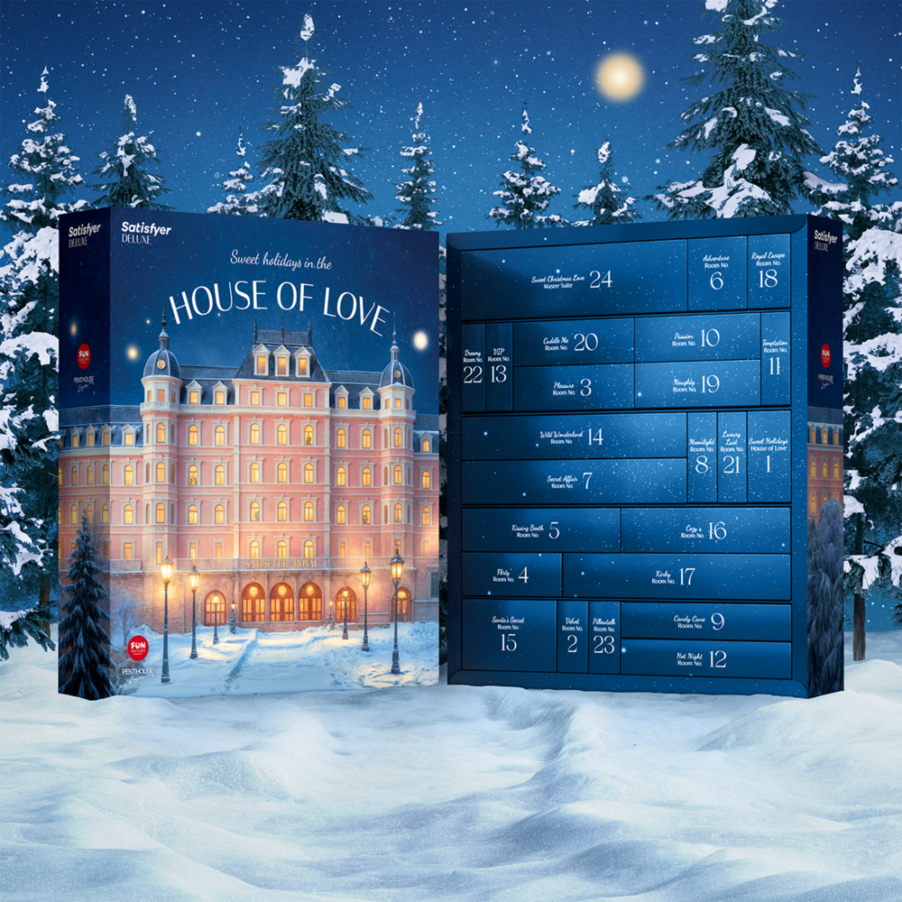
Satisfyer unveils its 2025 Advent Calendars – 24 days of pleasure, play, and discovery images courtesy of Satisfyer This festive season, Satisfyer invites you to step inside the House of Love with the launch of its new Advent Calendars for 2025. Inspired by the allure of an elegant hideaway, the DELUXE and PREMIUM editions promise to make December a little hotter. Behind each of the 24 doors lies a sensual surprise — from playful toys and luxury oils to seductive accessories and daring bondage-inspired pieces. Designed for both singles and couples, each calendar celebrates pleasure, intimacy, and self-discovery in all its forms. Satisfyer DELUXE Advent Calendar — 24 days of desire and delight Turn December into a month of anticipation with the DELUXE edition — a curated collection of everything needed to spark excitement and variety. Expect massage oils, candles, lubricants, and one of Satisfyer’s iconic pleasure eggs. For the first time, the calendar also includes products from Fun Factory, featuring a new toy alongside vibrators, anal accessories, kegel balls, and sleeves. Completing the set are handcuffs, lingerie, and other playful accessories for a season of passion and adventure.Price: 1,250 SEK Satisfyer PREMIUM Advent Calendar — 24 days of sensual luxury For those seeking something even more indulgent, the PREMIUM edition brings together Satisfyer’s most coveted toys, games, and luxurious accessories. Featuring powerful vibrators, anal toys, and kegel balls from both Satisfyer and Fun Factory, the calendar also includes elegant extras such as nipple clamps, bondage tape, and sensual lingerie. A playful dice game adds an element of surprise — perfect for sharing or savouring solo.Price: 2,080 SEK Get the calenders here