Art

Art

Heather Chontos on Intuition, Nature, and Turning Paintings into Rugs

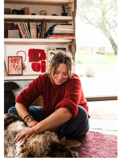
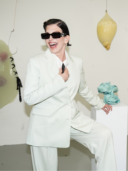
Heather Chontos on Intuition, Nature, and Turning Paintings into Rugs text Ulrika Lindqvist For multidisciplinary artist Heather Chontos, creativity is less a career choice than a way of being, spontaneous, intuitive, and inseparable from daily life. Speaking from her farm in Portugal, Chontos reflects on her journey from set design to abstract painting, her recent collaboration with Swedish design brand LAYERED, and how wildflowers, light, and chance encounters continue to shape her practice. Ulrika Lindqvist: Hi Heather, can you tell us how long you’ve been working as an artist, and what first drew you to this path? Heather Chontos: I have always been an artist in one form or another. I always drew and made things as a child, and my work as an artist of one type started officially at 18 as a prop stylist and set designer. Then I moved on to fashion illustration and art direction. I was all the while painting but did not fully commit until I was 30 , so 16 years now. It was always just obvious to me, it is who I am. UL: How did your collaboration with Layered come to life, and what has that creative exchange been like for you? HC: It all happened very randomly on my end. My daughter is half Swedish and lives in Stockholm,  studying for her masters degree. So when I saw it was a Swedish company contacting me, I was intrigued.  The exchange has been very fluid and easy . They have an amazing team of people who are truly respectful of my work and the individual creative process. It has been a lot of fun to see the artwork come to life in a new way. UL: Three of your paintings have recently been reimagined as rugs. Can you walk us through how you chose which pieces to transform? HC: I didn’t choose the works on my own. I think  they have a very clear vision at LAYERED and understand what works best with the way the rugs are made. I came to see the showroom to understand the different methods of weaving and it helped me understand the vast  possibilities. Lisa Nyman, the designer at LAYERED truly looks at the artwork and understands how it can be transformed through this new medium, so it was a joint effort in choosing the works. UL: Nature seems to play a significant role in your work. Are there any specific landscapes or environments that particularly inspire you? HC: I love every little piece of the landscape around me at home in Portugal, the wildflowers and red grasses, the insects and birds, the cork oak trees and rocky cliffs and formations. I just have to walk out my front door and it is right there for me. What us. Most important, is the light . Nature has many shades of light and thus bring my attention to many different parts of nature all day long. UL: Looking back on your career so far, are there any projects or moments that feel especially meaningful or memorable? HC: Yes, the ceiling I painted in Paris this year was a new challenge for me. I painted 90 sq meters of beamed ceiling in a historical private residence . There were a lot of challenges to making it, but the result was a wonderful new version of my work. UL: Can you share a bit about your creative process? Do you have any rituals or routines that help spark new ideas? HC: I don’t have any rituals. I work very spontaneously . I have a working farm here with horses and chickens and dogs, so I paint in between doing chores. I find that it is so very engrained in what I am doing every waking and non waking minute of my life that I can’t really separate it out, it’s like breathing or drinking water, I just have to do it. It has chosen me. UL: What does an ordinary day in the studio look like for you? HC: I am always working on more than one thing, and I tend to work in the studio and around it outside. I have multiple tables and surfaces where I work on various things. I am always moving around from one thing to the next. There is no ordinary day. UL: How would you describe your personal interior style at home? HC: Eclectic and very focused on everything being handmade UL: And finally, what’s on the horizon for you? Are there any upcoming projects or ideas you’re especially excited about? HC: Yes, I have many projects, some I can mention, some I cannot… I have an exhibition in The Hague, Netherlands, where I will fill an entire house with my work, that opens in May and then the exhibition schedule for 2025-2026 is in the works for Paris and possibly Portugal.I just built a house and am trying to finish all of its details, so that will be my other main focus. I can’t wait to see everyone’s reaction to the rug collaboration. I think they are so wonderful. I am very grateful.  
Art

Two New York Feminists Discuss Their Booth at Future Fair

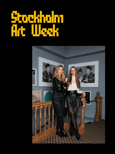
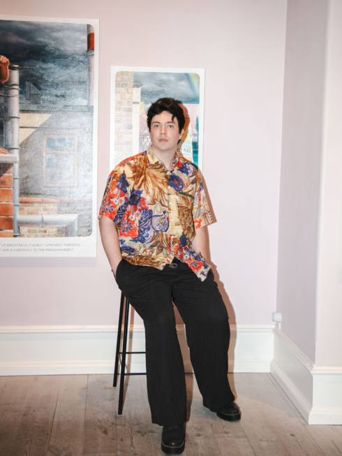
Two New York Feminists Discuss Their Booth at Future Fair text Zohra Vanlerberghe New Yorkers, whether they are born or bred, are a certain kind of breed. They know what they want and are not afraid to go get it. For those in the creative sphere, this means a work and life that is curated, full of collaboration, and where art often spills into personhood—Lesley Bodzy, is no exception, exceptionally chic (we love the photos that accompany this piece), she always looks impeccable and put together, with Jackie O as her ultimate inspiration. “What can I say, I love style,” she told me on the phone while we were discussing this Odalisque feature. Her sculptural work tackles themes of youth, beauty, time, and aging with deft, subtlety, and humor through material exploration, incorporating materials as diverse as latex, meat hooks, ribbons, acrylic paint pours, paper bags, bronze, glitter, and resin. It is daring to uncover societal pressures, fears, and hopes head-on and to dismantle what she calls the ‘artifice’—our second skin. Erica Criss, an artist and curator, has found her livelihood in supporting artists through her consultancy Criss Collaborations, and is showing Bodzy’s work during New York’s Art Week in May.. Criss has curated more than thirty exhibitions, of which three were with Bodzy. Both are unapologetically feminist. I invited them to discuss their newest show that will be opening on May 7th at Future Fair. Lesley Bodzy: Someone asked me how I came up with curating my work on multiple levels, eye level, above-head, and on the floor. This is really something that curators have led me to do. Including you, Erica. I see the role of the curator as enhancing my work and bringing it to the public eye in ways I can not even imagine. I think you should tell Odalisque’s readers more about your curatorial vision for Future Fair and how you think about curating, because it is very interesting. Erica Criss: My vision for Future Fair is to continue the conversation that was started last year between you and Katie Commodore in Womanhood 102—titled like a university class. You have both been hard at work creating new pieces, and I’m excited to debut several of them at the fair. I love how your works speak to each other. When curating a show like this, or any show really, I am considering the space, the artworks, and the audience. I am always thinking about how I can activate the space, how the works play off of each other, and what is going to draw people in. It is kind of like thinking of the exhibition as an artwork itself. I paired you as artists who both explore vulnerabilities from a place of strength. You both approach your subject matter boldly and make interesting use of your materials. Commodore’s meticulous peyote stitching and your free ideation of latex and resin, in new ways, made for an interesting contrast. What I didn’t expect was Commodore’s work, which is overtly sexual, bringing more covert aspects out of your own. Can you speak about the overt and covert nature of your work and its material?   LB: My work is about aging and its effect on female beauty and sexuality. The latex works are wrinkled and deflating, yet still beautiful and compelling. As we age, women should still be considered attractive and desirable—that is, both the covert and the overt message. I think of myself as two-faced, my real self and my artifice, the latter are the more performative aspects of who I am. Women are encouraged more than men to develop their artifice, but men can hace very sophisticated ones too. How long have we worked together? And how many exhibitions of my work have you curated? EC: We were just talking about this the other day and couldn’t believe we’ve been working together for three years. Including Future Fair, I have curated three exhibitions with you. However, we have collaborated on over thirty exhibitions. So much goes into curating a show; it is not just about choosing the artworks. We work together on everything from digital marketing and installation logistics to graphic design. LB: Yes. You have supported so many artists. From your time at Manhattan Graphics Center as director of operations and chief curator, and at Kent State University, where you curated The Women’s Printmaking Invitational 2022 with over 100 artworks, and now your independent curatorial work. The world is always changing, as is the art world—what do you think artists need right now? EC: The art world is always changing, but what hasn’t changed is the artists’ need for support. I am also an artist and received an MFA from KSU. Having both experiences, as an artist and art administrator, I realized that the majority of artists do not think of their practice as a business. Traditionally, galleries handle all of the artist’s “business needs” like online presence, artist statements, marketing, sales, and more. The competition for gallery representation (and opportunities in general) is so oversaturated that the artist now has to be their own business to compete. This is one of the main reasons I started Criss Collaborations—to offer individual artists all of the services a gallery would offer, plus more. LB: Why did you decide to curate another feminist show? We have spoken about feminism at length together, and I think readers need to hear your opinion. How do you define your own feminism? EC:  For myself, feminism is about recognizing women for their talents, uplifting the female voice, and redefining narratives to fit the female perspective. It is also about just being true to yourself. Last year, I showed you and Katie together for the first time in Womanhood 102. When I started that show, I felt a little scared at first because your work was so different visually. I wasn’t sure I’d be able to make the connections for the audience. But the more I spoke with both of you, the more I realized you were tackling the same overarching issues through different lenses. The show was so powerful, in both its
Art

“The Erosion of Reason”: Gustaf Lilliestierna on Blurring Reality and Imagination

“The Erosion of Reason”: Gustaf Lilliestierna on Blurring Reality and Imagination text Natalia Muntean In his latest exhibition at WAY Gallery in Stockholm, titled The Erosion of Reason, Gustaf ​​Lilliestierna invites viewers into a world where reality and imagination blur, creating a “parallel sense of time” that feels both familiar and foreign. His paintings, which he describes as “hyper images,” are more than just visual representations, they are layered with fragments of memory, ideas, and visual impulses that challenge our understanding of what is real. “I enjoy the childish qualities,” he admits, reflecting on the playful yet profound nature of his work. “I want it to be as enjoyable for a six-year-old as it is for a sixty-year-old theorist.” Gustaf’s process is deeply intuitive, often starting with a single image or idea that leads to another. “One thing just leads to another,” he explains. “I might have 50 ideas, and then I’m trying to understand how these ideas relate to each other. How can they be combined?” For Gustaf, the act of painting is as much about discovery as it is about creation. “They are always a mystery,” he says of his works. “I do wish to see them, so I make them. But in the end, they become material for new thoughts.” Through evocative painting and a deep engagement with nostalgia and inspiration, Gustaf’s art invites viewers to explore the spaces where reality and imagination intersect. Natalia Muntean: How did you develop the concept of “hyperimages,” and what is the most challenging part of creating them?   Gustaf ​​Lilliestierna: “Hyperimagery” started as a term I used once, and I noticed how helpful it was. Without it, I could describe my practice as a problematisation of referencelessness, or perhaps referential ambiguity, in visual representation. Or, I could say it’s a playful attempt to provoke new mental images through depiction. But neither explanation fully captures my practice, and they’re unfair to the immediate experience of my pieces. I often spiral when asked, “What do you do?” So, I embraced the term “hyperimagery,” which popped into my head, and it’s been useful ever since. When I use it, I’m referring toimages that are intuitively, and perhaps even ontologically, perceived as more than one image. NM: How do you define the relationship between reality and imagination in your work?  GL: This question is larger than life! Every attempt to define this relationship pushes the line that represents the “between.” If we assume reality is everything that exists independently of our thoughts, then no such line can exist without us imagining it. A perspective from that line—bordering reality on one side and imagination on the other—would inevitably come from a position within the “non-real.” Any answer inspired by this juxtaposition will be unsatisfactory. We must consider whether we’re answering from individual, separate realities and imaginations, positioned behind a line we can’t fully access. If so, it’s hard to say anything definitive about “the” or “a” reality. If we still believe we can describe “the” reality we all share without including imagination, our book of knowledge would be very thin. Perhaps I’m too cautious to answer this question. But I can say this: I love being a mind. And as a mind, I find myself superpositioned between these fields, though I try to avoid the border between them. NM: How do you decide on the colour palette and composition for a piece? GL: I always start by drawing. Sometimes the final product of this ‘thinking by doing’ activity consists of several, usually 5-10, drawings. Sometimes it results in depictions of buildings, people, streets, objects, or just faces. This collection gives me an idea (if I’m not currently under the influence of one). The idea however is never better than the composition and is only worth realising if I’m pleased with the aesthetic quality of the visuality in a given form. I therefore make a lot of lines and measurements within a drawn dimensional frame. It is perhaps a golden ratio fetish, but I need it for motivation. When the proportions of my ‘abstract composition’ correspond with my collection of imagery nicely, I compose the image using the chosen means. I then translate the drawing into an oil painting. I try to keep it as mind-dependent as I possibly can, but sometimes I do real-life drawing, and build models or digital illustrations as support. The colour palette depends on the mood, which is revealed by the scene. It always ends up in a certain place, at a certain hour. NM: How do you know when a painting is finished, especially when dealing with such abstract and elusive concepts?  GL: It’s a question of just stopping. In one way, they’re never thematically finished. I finish the drawing when it’s close to what I had in mind, and I finish the painting when it looks cool and convincing. Sometimes I manipulate the idea, maybe adding a road sign, a lamp, or another figure. But this is risky, and when it happens, I often start over. I do a lot of work outside the studio: thinking, drawing, reading, exploring, and writing. I usually trust the process once I pick up the brush. I also evaluate my process between paintings, being careful about the direction a series is headed. NM: What does the title The Erosion of Reason mean to you, and how does it reflect the themes of the exhibition? GL: I wanted a title that reflected my previous claims about the immediacy of artistic experience. I wanted to align this with the view that every artwork represents a possible antithesis to a possible linguistic conclusion. I decided that “The Erosion of Reason” was a good fit, since it packs several punches: “The Erosion of Motive”, “The Erosion of Cause”, and “The Erosion of Rational Thinking”. In the case of art, something like an erosion of reason (as the erosion of motive, cause, and rational thinking) becomes beneficial if we wish to see, experience and feel without limitation. In such cases, the erosion of reason occurs
Art

Where Muses Dare: Sara Berman at Larsen Warner

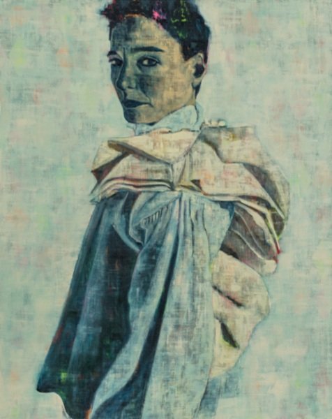
Where Muses Dare: Sara Berman at Larsen Warner text Natalia Muntean “Where Muses Dare” is the first solo exhibition in Sweden by British artist Sara Berman, hosted by Larsen Warner Gallery. This collection features 12 oil paintings on linen, each exploring the societal constructs that shape the female experience. Through evocative storytelling, Berman’s characters navigate realms of power, reflection, and transformation. Berman plays with colour, texture, and form, creating melanges of neon pinks and fiery oranges pulsing beneath deep petrol blues and shadowed greens, with bruised surfaces, textured by layers of scraping, smudging, and wiping. Clothing plays a central role in Berman’s work, both as a metaphor for societal expectations and as a literal, tactile element in her process. Drawing from her background in fashion, she sources and inhabits vintage garments, using staged photographic recordings as the foundation for her paintings. In these shifting personas, the artist explores the fluidity of identity, blurring the boundaries between self-portraiture, fiction, and performance. Through this lens, Where Muses Dare delves into the tensions between personal and collective histories, between authenticity and artifice. Berman’s paintings embody the contradictions of contemporary existence—celebrating, questioning, and confronting the complex realities of gender, power, and self
Art

Frieze Frames — A Vibe Check from LA’s Art Week

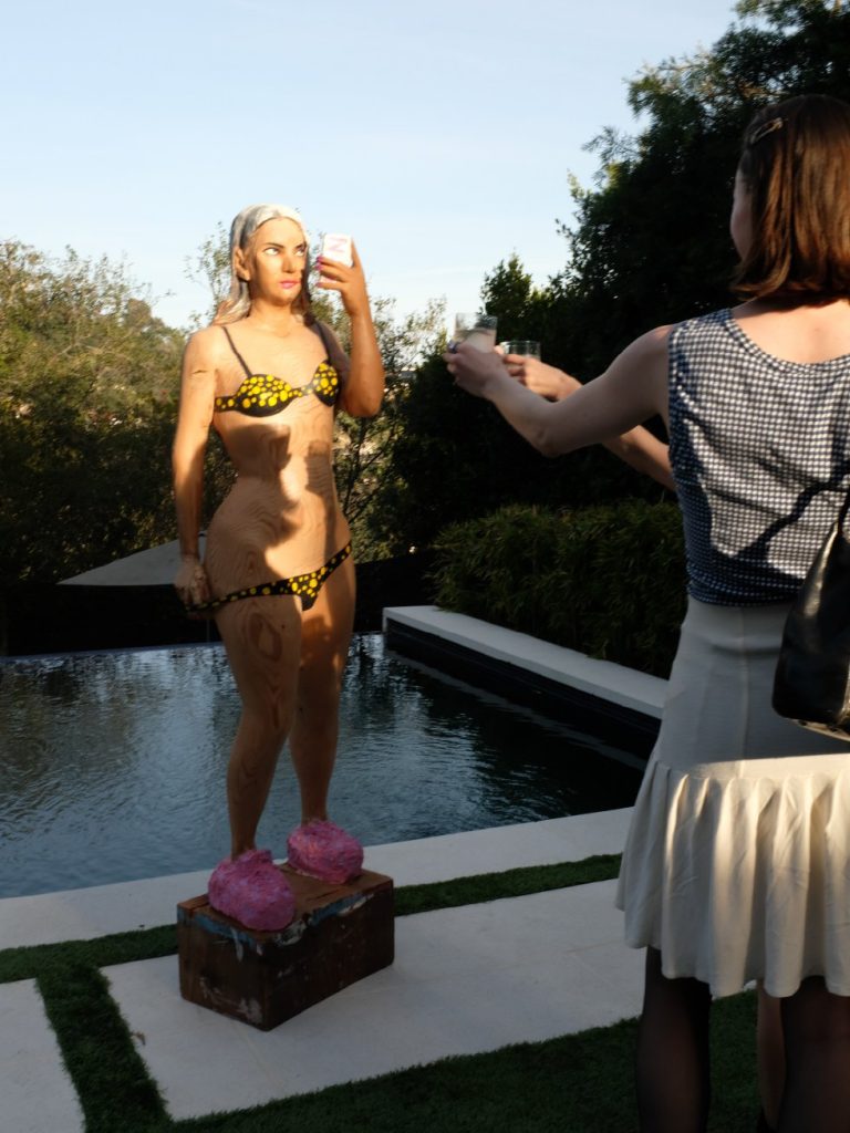
Frieze Frames — A Vibe Check from LA’s Art Week text Eddie Brannan The juggernaut that is Frieze rolled into LA last week, and as usual, the main event, held at the Santa Monica airport as in previous years, brought with it a flotilla of smaller fairs, pop-ups and openings. The buzz of what has now become a quasi-official art week was felt city-wide, from the Westside to the Hollywood Hills, from DTLA to the artist enclaves to the east. But it was a subdued Los Angeles that welcomed the annual extravaganza this year. The toll of the recent fires on the city was unprecedented, with two neighborhoods—Pacific Palisades and Altadena—almost completely razed. Everyone knows someone who lost absolutely everything in the fires. Homes are gone, studios are gone, collections are gone, archives are gone—things that can never be replaced. But the city stands strong, and Angelenos will build new homes and studios, make new art, and forge new stories. All the shows recognized the impact of recent events and offered fundraising for wildfire relief, whether at designated booths where artworks were available by artist donation, or by providing QR codes linking directly to various fundraisers. Grief And Hope is one such organization, committed to raising funds for impacted artists and art workers, and there are many other groups and endeavors working towards the same end. Aside from Frieze itself, we took the city and the art world’s temperature at other events around LA—Felix Art Fair at the renowned Roosevelt Hotel, Future Fair Tigertail in the hills of Brentwood, and The Art of Oscar group art show, at AF Projects in Hollywood. Felix kicked the week off on Wednesday, and the action was in the rooms and in particular the cabanas around the pool, where a wealth of galleries and artists showed. Out-of-towners were happy to find clear blue skies and temperatures in the 70s in LA, and took advantage of the poolside setting to socialize and acclimatize, as well as take in the works on show. Among our favorites were Meegan Barnes’ whimsical ceramic depictions of LA landmarks at One Trick Pony. Thursday was opening day at Frieze, and the four huge main rooms were full. As well as the wealth of art on show (Sydney Cain, represented by Casey Kaplan, was the stand-out among stand-outs), the people-watching was similarly top-flight. LA is a city that doesn’t typically like to dress up unless there are red carpets involved, so it’s refreshing for Angelenos to see one another in daytime finery. Talking of red carpets, Friday found us at The Art Of Oscar, a group show organized by The Hollywood Reporter to coordinate with the awards and curated by Michael Slenske, where a range of artists showed work that reimagined the famous statuette. Ellen Jong’s Oscarella, an ink-black four-foot-tall Oscar fountain projecting a tutu of water into a surrounding pool, caught visitors’ attention. Topping the most-extravagant-setting list was Future Perfect’s presentation that occupied the whole of a theatrically lit white mansion hidden behind high, high hedges under Runyon Canyon, where we saw the sculptural ceramic pieces of LGS Studio and ran into co-founders Tom Renaud and Noel Hennessy. The weekend meant multiple parties, including a garden gathering at the home of M + B Gallery’s Benjamin Trigano, and a jam-packed pool party at the West Adams home of Alexis Borges, president of Next Models. And lastly on Saturday we visited Future Fair’s pop-up group show in the Brentwood hills, where among other works we saw wonderful wood intarsia renditions of prosaic objects such as cassette mix tapes by Michael Buhler-Rose (represented by New Discretions) while a chef-prepared dinner was served to invited guests as they watched the sun set over the hills of LA, and over Frieze week 2025. photography Ellen Jong
Art

Leigh Bowery! Tate Modern Unveils a Bold Tribute to the Iconic Performer

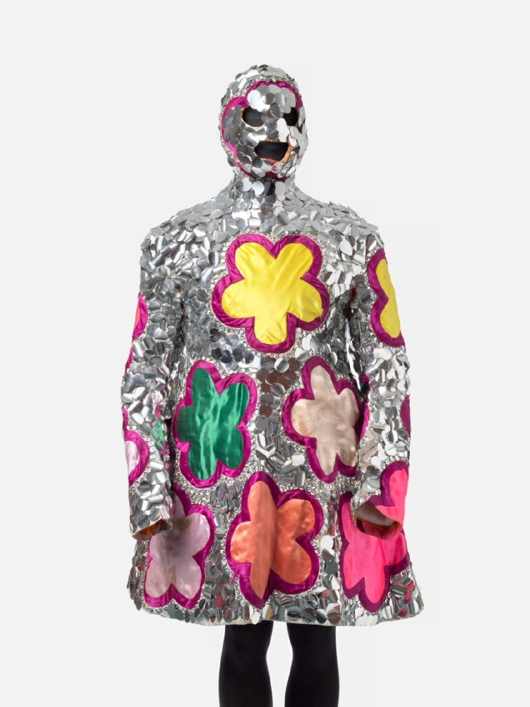
Leigh Bowery! Tate Modern Unveils a Bold Tribute to the Iconic Performer text Maya Avram Earlier this week, swarms of press flooded Tate Modern’s third floor, excitedly assembled for the preview of the museum’s latest exhibition, Leigh Bowery! Chronicling the late performer’s artistic practice in 80s and 90s London, it brings to the fore Bowery’s undeniable influence on pop culture as we know it today. “As an artist, he embodies much of what Tate Modern exists for, really; performance, reinvention, experimentation — in short, reimagining ways of seeing the world,” said Karin Hindsbo, Director of Tate Modern, as we embarked on a tour of the curated space. Closely entwined with London’s underground scene, Bowery has famously harnessed hedonism and subversion to challenge the banal. A performer, dancer, model, TV personality, fashion designer and musician, his provocative performance art was designed as a form of activism, encouraging people to push boundaries and encourage their reflection on life. The show space’s layout emulates Bowery’s chronological journey into the public eye, with each room symbolising a different part of the making of his persona. And so, the first room marks “the home”, the safe place where he (and his friends) assumed their character. It features some of his first-ever fashion designs, including gimp-inspired head masks, and other iconic motifs such as his synonymous polka-dot print. Dick Jewell Still from What’s Your Reaction to the Show 1988 © Dick Jewell. Then you step into “the club,” the gritty setting where his eccentric appearance became an aesthetic that urged onlookers to question the why and how they live. Set against the backdrop of Thatcher’s England, Bowery’s rebellion against conformity peaked with the opening of his club Taboo in 1985. The exhibition displays more than 20 of the intricate costumes he designed and hand-crafted, many with collaborator Nicola Rainbird and corsetier Mr Pearl. Bowery’s close friendship with renowned artist Lucian Freud marked a turning point in the former’s relationship with the contemporary art world. Now a subject in his own right, Bowery was depicted by Freud in the nude, bare of all embellishments to offer a fresh view of this flamboyant performer. This was a natural evolution of Bowery’s use of his body as raw material, notably stating that “flesh is the most fabulous fabric.” The exhibition culminates with Bowery’s foray into music with his band Minty. Uniting his love of performance, shock value and humour, it enabled him to push the limits of the human form while reimagining ideas around gender and drag culture. Bowery’s final performance at London’s Freedom Café in November 1994 was attended by long-term collaborator Lucian Freuda and a young Alexander McQueen, revealing how far-reaching his influence extended in the worlds of art and fashion. “I cannot think of a better way to launch our 25th anniversary programme than with a celebration of Leigh Bowery,” concluded Hindsbo. We couldn’t agree more. Leigh Bowery! Will run from 27 February to 31 August 2025, at Tate Modern, Bankside, London. Installation Photography © Tate Photography (Larina Annora Fernandes) Costume Photography 2024 © Tate Photography. Courtesy Leigh Bowery Estate. Dave Swindells, Limelight: Leigh Bowery1987 © Dave Swindells. Dave Swindells, Daisy Chain at the FridgeJan ’88: Leigh and Nicola 1988 © Dave Swindells. Installation Photography © Tate Photography (Larina Annora Fernandes) Fergus Greer, Leigh BowerySession 1 Look 2 1988 © Fergus Greer.Courtesy Michael Hoppen Gallery. Fergus Greer, Leigh BowerySession 4 Look 19 August 1991© Fergus Greer.Courtesy Michael Hoppen Gallery. Fergus Greer, Leigh BowerySession 4 Look 17 August 1991© Fergus Greer.Courtesy Michael Hoppen Gallery. Fergus Greer, Leigh BowerySession 3 Look 14 August 1990© Fergus Greer.Courtesy Michael Hoppen Gallery. Fergus Greer, Leigh Bowery Session 8 Look 38 June 1994© Fergus Greer. Courtesy Michael Hoppen Gallery. Fergus Greer, Leigh Bowery Session 7 Look 37 June 1994© Fergus Greer. Courtesy Michael Hoppen Gallery. Installation Photography © Tate Photography (Larina Annora Fernandes) Chalres Atlas, Still from Mrs Peanut Visits New York1999 © Charles Atlas. Courtesy of the artistand Luhring Augustine, New York. Chalres Atlas, Still from Beacuse We Met1989 © Charles Atlas. Courtesy of the artistand Luhring Augustine, New York.
Art

Shaping Light and Space: Morgan Persson’s Journey from Color to Cosmic Inspiration

Shaping Light and Space: Morgan Persson’s Journey from Color to Cosmic Inspiration text Ulrika Lindqvist photography Kristian Bengtsson Renowned glass artist Morgan Persson has spent years pushing the boundaries of his craft. In this interview, he shares the creative process behind his latest collection, The Milky Way, and the inspiration drawn from the vastness of space. He also reflects on memorable projects, the challenges of working with glass, and his vision for the future of his art. Ulrika Lindqvist: Can you share a bit about your beginnings—how did you first start working with glass? Morgan Persson: I first discovered glass in my early twenties, and it was a life-changing moment. At the time, I was working as a car painter and playing volleyball at an elite level. One winter evening, I had what I can only describe as a sudden epiphany: I had to dedicate my life to glass. It was a completely unexpected turn, but I followed the impulse, left my job, and enrolled at Glasskolan in Orrefors. That was the beginning of an obsession with mastering every aspect of glassmaking. UL: For your latest collection, The Milky Way, you’ve created monochrome sculptures, which marks a shift from your historical focus on color. Could you tell us about this transition and the inspiration behind the collection? MP: The Milky Way is a departure for me. I’m known for my bold use of color, but this time, I felt drawn to creating something entirely in white. I could picture the pieces before they existed, these “space stones” with a celestial quality. The inspiration came from thinking about stargazing, galaxies, and the vastness of space. It was a challenge to step out of my comfort zone and embrace minimalism, but it was also exciting to explore how the optical effects of white opal glass could evoke depth and movement. UL: You collaborated with master glassblower Peter Kuchinke on this collection. How does such a partnership work, and what are the dynamics of your creative collaboration? MP: Working with Peter Kuchinke was an inspiring experience. He’s a master craftsman with an incredible knowledge of glassblowing techniques. Collaborations like this are all about trust and communication. I brought my ideas and vision, and he brought his expertise and technical skill. Together, we experimentedand solved challenges,like achieving the desired effects in the opal glass. These partnerships are a mix of structured planning and spontaneous problem-solving, which keeps the process dynamic and rewarding. UL: What is your personal relationship with space? Are you fascinated by it, do you fear it, and would you ever consider space travel? MP: I’m deeply fascinated by space. It represents both mystery and endless possibilities, and it inspires me to think about perspective, how small we are in the grand scheme of things. While I find it inspiring, I don’t think I’d personally venture into space. I prefer exploring the unknown from a grounded, creative perspective. UL: Can you describe your creative process—do you plan and sketch in advance, or do you prefer to improvise? Additionally, what unique challenges or limitations does working with glass present? MP: My process is a mix of planning and improvisation. I start with an idea or a vision, which I might sketch or just hold in my mind. Once I begin working with the glass, I let the material guide me. Glass is unpredictable, it changes with heat, reacts to different techniques, and demands precision. One challenge is timing; you have to make quick decisions before the glass cools, but that’s also what makes it so exhilarating. I enjoy the balance between controlling the material and allowing it to take its own form. UL: Are there any particular projects or moments in your career that stand out as especially memorable? MP: There are several, but one that stands out is the moment I first experimented with recycled glass in collaboration with Leif Hauge. Creating glass objects from seized smuggled alcohol bottles for Tullverket was both challenging and rewarding, it pushed me to think differently about sustainability and design. Another memorable moment was when my family and I moved to Småland to start my own hot shop. That transition marked a new chapter in my career and creative journey. UL: What does a typical workday in your life look like? MP: My day usually starts early in the morning with preparation in the glass studio. Depending on the project, I might spend hours blowing, fine-tuning details or working in the cold shop on grinding and polishing. Running a family business means I also wear many hats, managing the showroom, or hosting visitors. It’s busy, but I love the variety and the chance to immerse myself in every part of the process. UL: Looking ahead, what’s next for you? And if you could embark on your ultimate dream project, what would it be? MP: I’m always looking for new ways to push the boundaries of what glass can do. After The Milky Way, I’d like to explore working with larger formats and experimenting more with sandcasting techniques. I’m particularly interested in creating monumental public artworks that could combine glass with other materials. Collaborating with a team on a large-scale project, it offers an opportunity to blend expertise and creativity, which often leads to surprising and powerful results. For now, I’ll keep experimenting and trusting my instincts, as they’ve always been my best guide.

Art

Hidden Place

Spencer Finch’s journey as an artist is as intricate as his work. With his distinctive approach, Finch captures the ethereal interplay between light and space, bridging historical reverence with contemporary innovation. His projects, ranging from the recreation of ancient Troy’s dawn light to the experimental “Sunset in a Cup” series, reflect a deep engagement with both scientific precision and poetic resonance, revealing the subtle power of light to evoke emotion and narrative. His work has graced public spaces across Europe and North America and is held in prestigious collections such as the Art Institute of Chicago, the Guggenheim Museum, and the Whitney Museum of American Art. From his homage to Emily Dickinson through a reimagined sunlight effect to monumental installations like Trying To Remember the Color of the Sky on That September Morning at the National September 11 Memorial Museum, Finch’s art acts as a prism, channelling his observations into abstract, glowing hues. In our conversation with Spencer Finch, we discuss his unique artistic journey and the fusion of intellectual curiosity and artistic vision. Natalia Muntean: Light plays a significant role in a lot of your work. And I wonder if there was a moment where that changed the way you see light, not just as a tool, but as a subject in itself. Spencer Finch: Yes, it happened around 2000 when I started working with light, thinking of it as a material in itself, specifically related to landscape. I didn’t come from the light and space artists of the 70s, but rather from 19th-century landscape and impressionist painting, considering light in those terms and its connection to the landscape. Instead of focusing on the phenomenology of light, like James Turrell, I was interested in light as a picture of a place. My first project involved measuring the light at dawn at the site of ancient Troy in Turkey and recreating it, focusing on the special light of that historical place, which combines myth and history. Light can be very emotional and powerful, though minimal and not abstract. NM: Your interests seem so varied, from ancient Troy to Jackie Kennedy’s pillbox hat to Emily Dickinson. How do you approach new projects? What comes first, the idea or the material? SF: Usually, it’s the idea that comes first. Occasionally, I find a material that interests me, but generally, I think about which material best reinforces the idea and subject matter. I enjoy learning new techniques and working with different processes. For example, I’ve been working with watercolour drawings for years and have improved my skills. Recently, I started a new technique with “sunset in a cup” paintings, where I use a large amount of paint in a cup to create the background and then build up the surface. My initial attempts were poor, but I learned and improved. It’s fun to explore new methods, even if they may seem unconventional, like painting in a teacup. NM: You seem like a very curious person! Do you typically start your projects with a clear intention in mind, or do you let it be more intuitive? SF: Sometimes my projects end up in unexpected places or at a dead end. For instance, I once attempted to create a work about the colour purple, which is visible to bees but on the edge of ultraviolet. I collaborated with a scientist from Berlin who specialises in insect vision to design an environment where we could experience something as bees do. However, despite my determination not to give up, this project has failed twice in 15 years. The challenge lies in making something invisible to human vision visible, which requires compensation for the loss. I haven’t figured out how to achieve this yet. Another example is my “Sunset in a cup” project. I didn’t know what to expect initially, but it evolved into using cups from Emily Dickinson’s time, similar to those she collected, to frame the sunset paintings. This approach became an homage to Dickinson. However, the paint, once dry, cracked and became less appealing. The cup, viewed from the side rather than flat, became more dominant than the painting. A photograph from above flattened the composition, making the cup a frame. This unexpected outcome led me to rethink the presentation format, ultimately finding the best solution through trial and error. NM: Speaking of Emily Dickinson, many of your works reference a lot of historical figures, including Dickinson and Sigmund Freud. How do you choose them, if you choose them? SF: I guess it comes from not being interested in self-expression. Some artists express what’s inside them, but I feel like I’m not that interesting a person and don’t have much to say just about myself. I also believe there’s a kind of artistic arrogance where artists feel they’re more important than others, which I don’t think is true. Instead, I take something from another artist, thinker, or person I admire, shift it, inflect it in my own way, and make it my own while still connecting it to that person. This approach helps create a work that’s about ideas, usually inspired by someone else’s thoughts, but through my own awareness, I aim to open it up for the viewer. The viewer then has an experience that is their own, rather than being told what to think. By using figures like Freud or Dickinson, I feel they allow me to ask questions present in the artwork. I hope that makes sense. NM: How important is your audience and its perception for you? Do you create your art trying to evoke a certain feeling in it, or do you just create and let it have a life of its own? SF: It’s a tough question. I don’t think it’s a formula where I put a feeling into the work and the viewer gets that same feeling out. I’m creating a question, analysis, or exploration. I find it interesting without fully understanding it. The viewer who connects with it has something related but not identical, as they

Art

Hermès Presents “Antre” – Joël Riff’s Seventh Exhibition as Curator at La Verrière

Hermès Presents “Antre” – Joël Riff’s Seventh Exhibition as Curator at La Verrière text Art Editor “Antre” – the French word for a lair or a den – Joël Riff’s seventh exhibition as curator of La Verrière, explores the depths from which we emerge. A metaphor for the studio, and the very antithesis of any glass roof, this obscure zone is now brought into the light by the exhibition of still-vibrant fragments, removed from their source. In this way, the project examines the tension between the violence and legitimacy of ‘the exhibition’ in the strict sense of the term, showcasing that which is often discarded. The expedition revolves around Pélagie Gbaguidi’s work, which is characterised by encounters the artist makes around the world while embracing sedentary stints at a central site in her practice, twelve kilometres south of the Brussels address of the Fondation d’entreprise Hermès. Going against the grain of extractivism, the aim is to find a balance between what we extract and what we return, encouraging an awareness of how we treat what we take. The artist navigates through brutal realities as a means to transform materials. A mediator of memories, she bears witness and passes them on. While her work is receiving increasing international recognition, Pélagie Gbaguidi has rarely exhibited in Belgium. This is her first major solo show in Brussels. The exhibition focuses on her paintings and drawings, reviving the impact of her powerful pictorial work. At La Verrière, her works are surrounded by furniture made by the Brussels collective Aygo, the words of French author Sophie Marie Larrouy (FR, b.1984), sculptures by Marianne Berenhaut (BE, b.1934) and embroideries by Hessie (JA, 1933-2017). The presence of the latter, who was the subject of a solo exhibition at La Verrière in 2016 when Pélagie Gbaguidi first met her, is also a way of raising public awareness of the 25th anniversary of the exhibition space – inaugurated in 2000 – and highlights its enduring importance. Pélagie Gbaguidi, Chaîne humaine, 2022. Pélagie Gbaguidi, The Witness, 2021

Art

Light Beyond Reality – The Ethereal Worlds of SOL Summers

Light Beyond Reality – The Ethereal Worlds of SOL Summers text Jahwanna Berglund “Parhelion” is not just the title of this latest body of work; it is a gateway into an ethereal and mesmerising exploration of light, wonder, and myth. The series delves into the phenomenon of parhelia—commonly known as sun dogs—and uses this rare interplay of light and atmosphere to evoke a sense of the extraordinary breaking into the mundane. In this interview, the artist Sol Summers discusses the inspirations and creative processes that shaped the series, drawing on everything from the paintings of Edvard Munch to the otherworldly beauty of desert landscapes. The work reflects a profound connection to nature’s fleeting, awe-inspiring moments, as well as a fascination with the idea of contemporary myth-making—placing the unexplainable and magical within the everyday. From embracing new materials and techniques to reflecting on the cyclical nature of artistic exploration, “Parhelion” represents a significant evolution in the artist’s oeuvre. Yet, at its heart, it maintains a consistent thread: a desire to distill life, energy, and emotion into each painting. Through this series, viewers are invited to pause, reflect, and perhaps find a mirror to their own sense of awe and discovery. As “Parhelion” debuts at the Untitled Art Fair during Art Basel in Miami, Sol Summers hopes these works resonate on both a deeply personal and universal level, offering a transformative experience that lingers long after the moment of encounter. In the conversation that follows, we delve into the ideas, techniques, and inspirations behind this captivating new collection. Jahwanna Berglund: “Parhelion” is an intriguing title. Can you elaborate on its significance and how it relates to the themes explored in this new body of work? Sol Summers: “Parhelion” speaks to the idea of something strange and ethereal breaking through the everyday. It has this quality of otherworldliness that feels as though it belongs to myth rather than reality. I often think about how these phenomena must have struck people thousands of years ago – they must have dropped what they were doing and stood, staring at the sky with awe, maybe even fear. Back then, things like rainbows or eclipses sparked entire mythologies, stories about gods and cosmic events. What I’m trying to capture in these series is light that defies explanation – light that forces you into a kind of magical thinking. That sense of wonder, of being momentarily untethered from the ordinary, is what I want these paintings to hold. Whether it’s an atmospheric phenomenon or a lens flare, these glitches of light bring a sense of wonder to the work. In a way, it’s a form of contemporary myth-making, placing something unexpected into a scene to disrupt its familiarity.   “Turning to nature opened everything up for me.” NM: You’ve included artists from both Sweden and other countries. How did you choose these specific artists, and how do their works connect to the exhibition’s theme?Caroline Wieckhorst: It’s been a privilege to work with these amazing artists and their artistry. A key for us has been finding a great mix and balance of art with different expressions and mediums that communicate with and challenge each other and us as viewers. Works that, in different ways, have their own gaze and agency, interacting with our emotions, challenging our perspectives and sometimes what we might take for granted or know to be true. How we interpret the artworks is individual, and this is the point – to shift the focus from how the artists, curators, and critics intend for the art to be interpreted and, instead, how the art itself makes us react and feel. For instance, an artwork that very literally gazes back at me is Ulla Wiggen’s eye, Iris. With its ice-blue colour, it’s hard not to feel watched and pierced through your inner thoughts. But is this how you would interpret or feel about this work? And Karon Davis’ sculpture Echo & Narcissus: Looking Glass, speaks to me about the fragility of life, with the plaster that is lightly pieced together and at the same time it holds a certain power and grace, that makes me act with a high sense of respect around it. Paloma Varga Weisz’s large bronze sculptures, Wilde Leute, make me want to hang and sit with them, despite their intimidating size. And Charlotte Gyllenhammar’s child sculpture, Beholder, makes me wonder what she is thinking of and how I best approach her. While Marie-Louise Ekman’s huge floor piece, 30 bilder, with her characteristic comic strip motif, makes me break the rules and let loose my inner side, walking all over the piece and acting more like a rebel. Or at least, trying to. LH: As Caroline mentioned, we aimed to create a thematic show where various aesthetics and perspectives are represented, with the body as a central theme. Some pieces are abstract, others figurative, but to me, they all convey a sense of the body. For example, Kennedy Yanko’s sculptural work using scrap metal and a material she calls paint skin – formed by pouring large amounts of paint onto a flat surface, which is then shaped and manipulated as it begins to dry – to me says something about what it is like to inhabit a body. It’s perfectly balanced yet also twisted and strange, pieced together in an oddly familiar way. Some parts of the work speak to me in more subtle and ambiguous ways, but this only strengthens its impact. Not everyone will interact with it this way, and it’s not an “intended” reaction, but that’s why we wanted the show so rich. I hope that at least one piece in the show will challenge, unsettle, or make each viewer feel self-conscious. NM: The exhibition suggests that the artworks might be ‘looking back’ at the viewers. How do you think people will feel about this idea of being observed by the artworks?CW: Aren’t we always being watched or observed? I think and hope that it might open up new ideas about who or

Scroll to Top