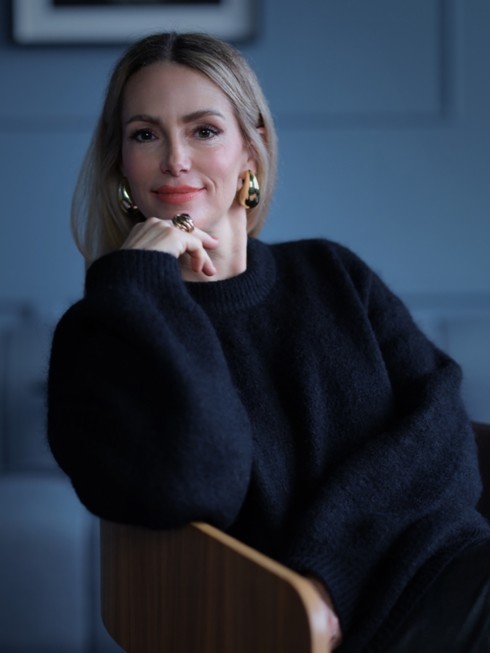
Exclusive Sit Down with Elin Frendberg the Executive Director of Fotografiska Stockholm
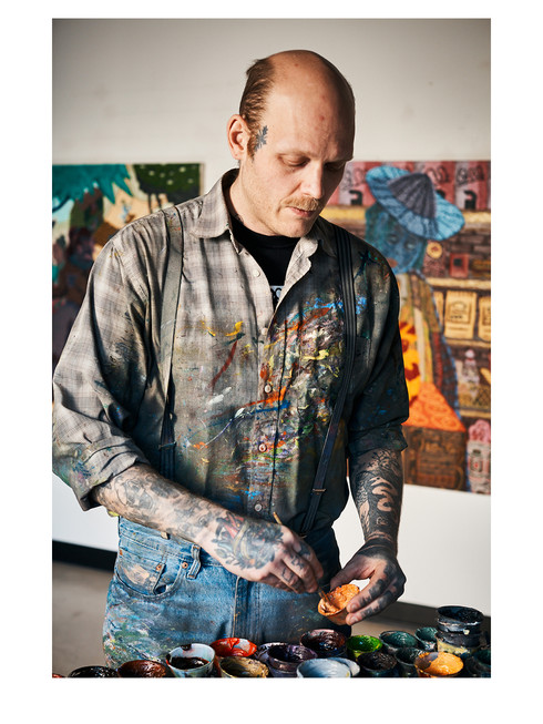
Exclusive Sit Down with Elin Frendberg the Executive Director of Fotografiska Stockholm text by Yasmine Mubarak Odalisque Magazine presents an exclusive sit down with Elin Frendberg the Executive Director of Fotografiska Stockholm – the definitive site for photography. Having studied art history in both Lund, Sweden and in Florence, Italy – Elin Frendberg has always had a strong interest for art. During her studies she took photography classes dreaming of having her own gallery. Consequently, when the opportunity came to become the Executive Director at Fotografiska in Stockholm, the choice was easy “…photography is the biggest, most inclusive and democratic art form in modern society and as a unique position to inspire people of different backgrounds” Elin replies after being asked about the future for photography as an art form “…I strongly believe in the importance of increasing accessibility to art. There are no thresholds to experiencing photographic art and it fosters a unique opportunity to create both individual growth and societal change.” Having taken over as the Executive Director right during the Covid pandemic, Fotografiska had to close during Elin’s first week on the job. With this, she and her team needed to act quickly and become creative “…the time right after (we had to close Fotografiska) was incredibly creative. The team created a 3D version of the museum, digital guided tours, pop-up photo exhibitions in bus stops all over Stockholm, opened a temporary “bicycle bakery” and sold lunchboxes from the restaurant ’’at the local supermarket…” she explaines Fotografiska was founded in Stockholm in 2012, and quickly became a success for their unique way of creating and exploring the concept of showcasing photography in a mixture of gallery and museum. “The beauty with art is that it has the ability to hold and induce all the emotional values.” Elin says describing the importance of photography and art “The best exhibitions can embrace both fear, joy, sadness and hope in the same time. Experiencing art should be like going to an emotional gym.” She continues “We (Stockholm) were the first Fotografiska museum in the world, “the mothership” and over the years, our brand has become one of the most beloved cultural brands in Sweden. We are a decade before our siblings and they are now innovators and disruptors in their markets, just like we were when we opened 15 years ago. It is incredibly inspiring to collaborate with our siblings in Berlin, Shanghai, Tallinn and soon Oslo as they pioneer in their respective markets.” Overseeing an institution such as Fotografiska, one has the power to focus on the future. Speculative about the next generation of photographers Elin express “My hope is that the next gen keeps pushing boundaries, creates new forms of expression, and uses their voices to create change. That they will find a way to navigate the major challenges and opportunities of AI to convey new imaginative stories – and that we will find a way to keep documentary photography free from AI and fabricated realities, to preserve democracy and truth.” When not having to come up with solutions at work, she tells me she gets her energy from the guests “I get massive energy and inspiration from my work, creating unique experiences for our guests at Fotografiska is incredibly valuable to me. I have the favour of working with creative geniuses across the organization from curators and artists to chefs – all with the mindset to push the needle for a more conscious world.” Photography has become increasingly accessible during the tech revolution, where everyone has a camera in their pocket. The development of photography as an art form have therefore been one to discuss fascinatingly. Asking Elin about how she feels about the development of photography especially with social media she answers“There are 5,3 billion photos taken every day and each image tells a story. The fact that people are increasing their interest in and skills for photography and video expands both the supply and demand for the art form as a whole and helps to nuance artistic expression in new dimensions. I welcome the democratization of the art form and that people are becoming creative in their own narratives and voices. It also opens up accessibility to documentary photography, which is crucial in the world we live in today.” Being asked what they are looking for choosing their next showcase she replies “We seek inspiration continuously and look for cutting edge artistic relevance in expression, and craft. We also look for relevant themes and inventive outlooks that will add new perspectives in our society. We always strive for a mix of perspectives, backgrounds and expressions from all over the world and we combine 4-5 exhibitions simultaneously to over maxed out moments. We have a fast pace so that every visit holds a whole new experience each time you visit.” However, Fotografiska has had its controversies, not only in Sweden, but Norway and other parts of the world. Being asked why she believes Fotografiska sometimes can raise discussions “We have been a disruptor from the beginning and want to change the norms in the industry by creating an elevated museum experience for the modern world. A place where world class, cutting edge contemporary art meet vanguard cuisine and diverse cultural expressions at a fast pace. An inclusive space with no white walls or quiet guests. That is our obsession, we are here for our guests and members, and we don’t focus on potential opponents.” The question on if art and Fotografiska is failing the discussion of ’’elitism’’ in art. We ask what an institution and popular destination such as themselves can do for inclusivity.“At Fotografiska, we truly believe that art should never feel excluding.” She says “It’s not about having a certain level of knowledge or and art degree – it’s about feeling something, being curious, and discovering new perspectives.” She continues “We get that not everyone has the time or money for culture right now. But we also know people are looking for real, meaningful As a conclusion we had too ask what her hopes for the next 15 years of Fotografiska will be “I hope that art