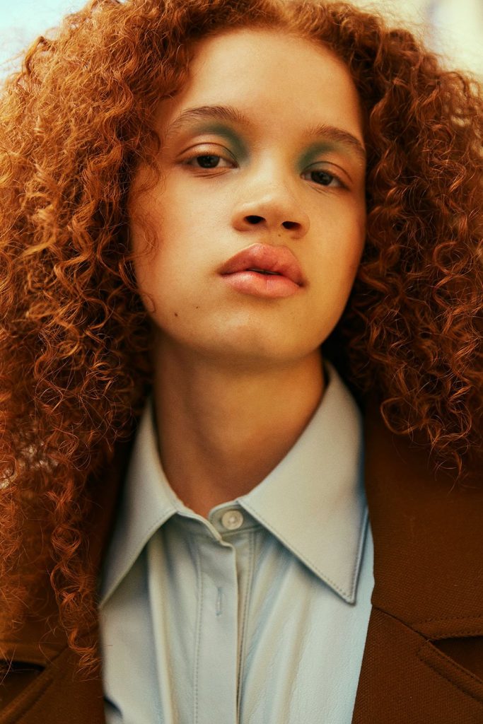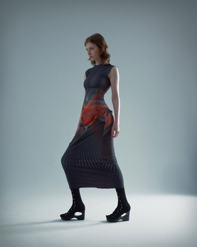
Jannike Combines Queerness and Pop Art in ‘Popwave’
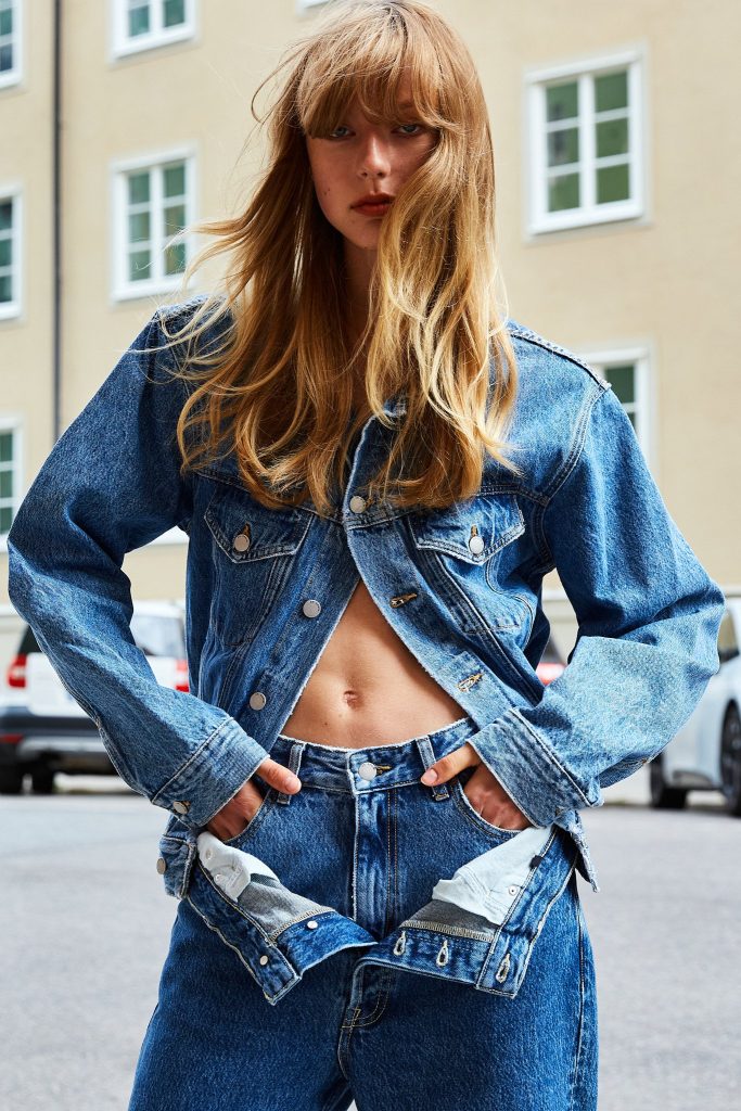
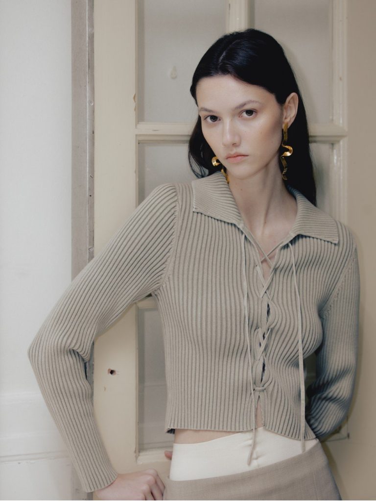
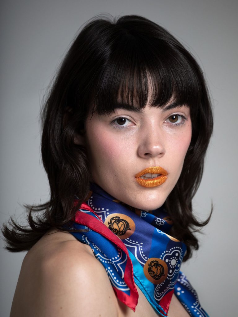
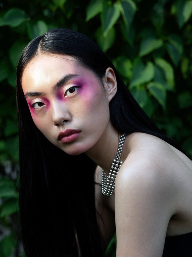
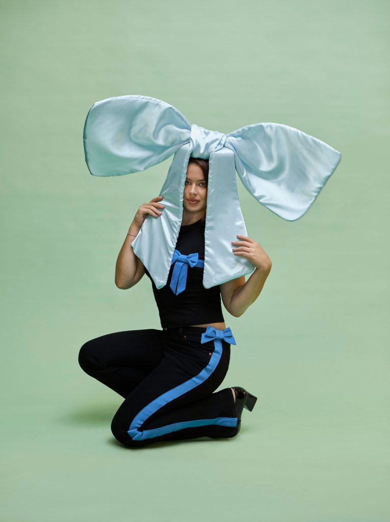
Jannike Combines Queerness and Pop Art in ‘Popwave’ text Josie McNeill Drawing from the shapes of Basquiat’s graffiti and the vibrant colors of pop art, Jannike Sommar designs for the bold, the queer, and anyone who is unafraid to express themselves. Jannike’s self-titled brand released its latest collection ‘Popwave’ on May 21, 2023. The brand will be showcasing ‘Popwave’ in the park during Stockholm Pride, which lasts from July 31 to August 6. Jannike was born and raised in Stockholm but currently resided in Paris. They began the Jannike brand alongside their partner Renata Souto after graduating from the Royal Academy of Fine Arts Antwerp in 2016. Renata now acts as both Jannike’s wife, manager, and director of e-commerce. The two work to promote the vibrant clothing that Jannike creates. How did you first build the Jannike brand?J: It started a long time ago because ever since I started doing fashion, like when I started to study, I knew I wanted to do my own brand. Then when I did my higher education in Antwerp. I did my bachelor and master in the fine arts. So then I started to develop the idea of what I wanted to start with. I wanted to do this queer brand with this patchwork technique with the pictures I do. I knew I wanted to start with this kind of kissing graphic. So I started school and then I worked for a few years and then we met and then we decided to go for it. R: We actually met at Stockholm Pride eight years ago. And one of the first things I noticed when we met, because it was very warm and Jannike had shorts on, I noticed a very gigantic Basquiat tattoo that they have in their legs. Later when we started to date, I went to Antwerp to see her masters collection. Oh my god, her show was a full Basquiat color sensation graphic, very graphic. So I was connecting this universe that they have in their mind, and I started feeling that there was a potential with the brand during COVID. Because during COVID, we had a little more extra time to work on the branding and the products. We started to launch some products as a test, and we felt a lot of traction from the spontaneous media from markets and then we decided to take the risk with our jobs. And now it’s been a little time that we are both dedicating fully to the brands. What is the inspiration behind your newest collection ‘Popwave’?J: It started with the pop star posters from the 80s and 90s. These mainly showed cis-women, so we wanted to take this mood, but put it in our queer universe. To put this pop art in a more non-binary vibe. And then we created these slogans like, “Pop Your Star,” “Gender is a Wave,” “Stay Queer,” just to convey the meaning to express exactly who you are the way you want. Stay queer. R: It’s pretty much inspired by the pop art posters and the queer community. And then what is the importance of this collection surrounding pride?R: Visibility. I think not only for this collection, but all our collections and the brand itself. It’s a statement for visibility, representativity. Because nowadays, it’s still very harsh for the queer community to thrive. So it’s really the message of we’re here, we’re queer. This is pride month, but the brand is bright throughout the whole year, and we need to give visibility to queer people and people who are not afraid to express themselves. How would you describe the style of this collection?J: Before I did more like hoodies, sweatshirts, and more like loose streetwear. Then I started doing more looks where you can feel a little bit more dressed up. And I got requests from customers that they missed some more tight pieces, and pieces that you can combine for parties maybe or the beach and other suits that you can combine as you like also. R: I would say this style of pop wave is the classical Jannike whimsical, pop, colorful pieces but translated to a dressed-up, sexy look. And then you kind of mentioned this at the beginning, but the queer kiss is kind of a motif in that collection and your past capsules. So I was wondering if you could talk a little bit about why it’s important for you to incorporate this graphic into a lot of your designs?J: The core of the brand is like the queer culture and pop art. This is part of my style, the wavy but very graphic, signature style. It’s so important that you recognize everything as a Jannike piece, which makes sense to me. Do you think there is a connection between queerness and like pop art and graffiti, especially because you mentioned Basquiat, and with figures like Andy Warhol being a pioneer of the street and pop art genre?R: Yeah, absolutely. It’s about art and arts in general. It’s not being conventional in the way of expressing yourself. So it’s absolutely connected and we’re very proud that it’s actually visible and that you’re mentioning this. What was it like dressing Robert Fux for Drag Race Sweden?J: It was really a dream. I was extremely happy to get the request because I knew him for who he was for a very long time and I looked up to him and I love what he’s doing in drag. I mean so it was really great. He’s such a nice person. It was a very nice collaboration. AR: Funny story. We are actually based in Paris and Robert Fux is based in Stockholm. So it was a whole process of defining the style, validating the sketches in distance with Zoom calls. We were fitting a friend here in Paris that has a similar body, kind of, so we did fittings, and then Jannike who went to Stockholm to do the fitting of the first one. So it was very challenging, very different, but it