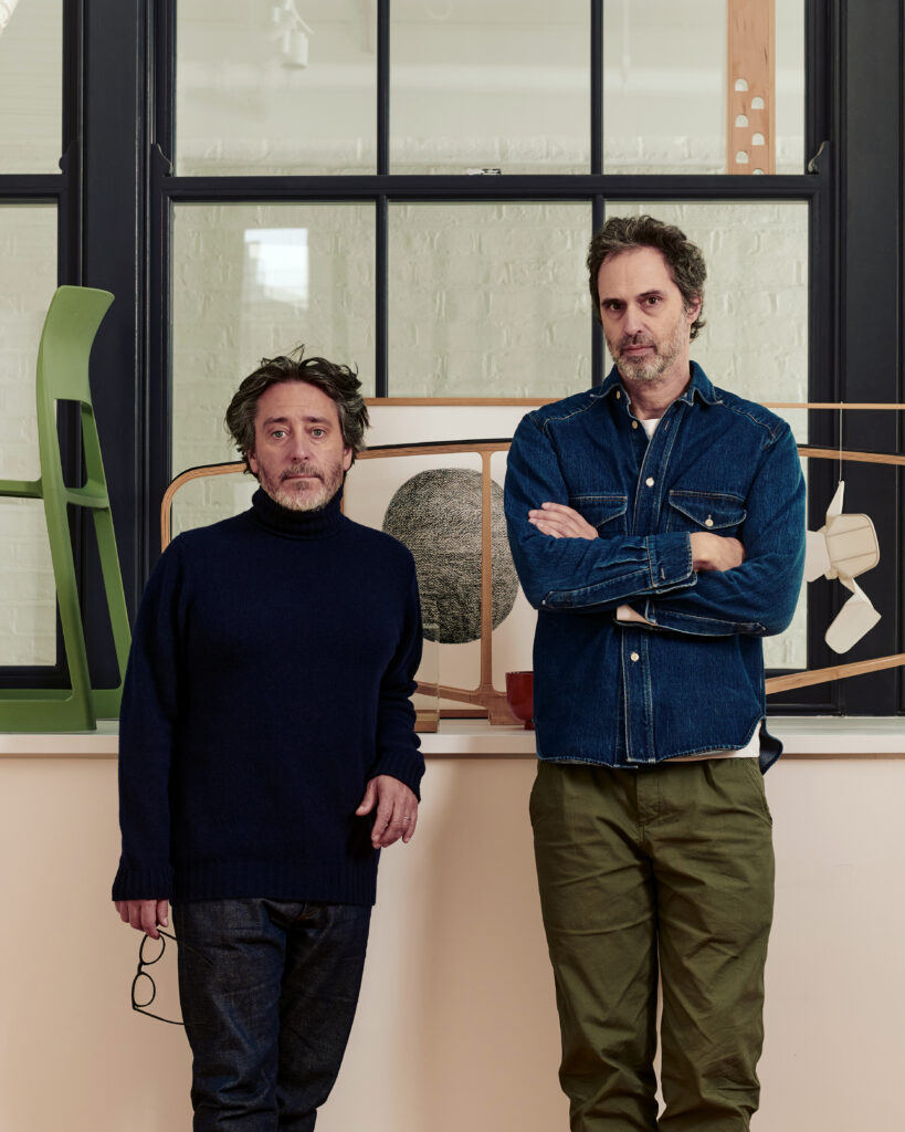
Barber Osgerby and Kasthall: Letting the Loom Lead
Text by Natalia Muntean
Atlas and Bon Bon, the first collaboration between London-based Barber & Osgerby and Swedish carpet manufacturer Kasthall, were born directly from the conditions of the industrial loom. Working closely with Kasthall’s team in Kinna, Edward Barber and Jay Osgerby spent time on the factory floor, immersing themselves in the rhythm and constraints of the mill before a single design decision was made. Rather than imposing a fixed aesthetic, they allowed the tools, techniques and archive of a 135-year-old company to shape the direction of their work, arriving, through experimentation and some sixty prototypes, at two collections that are as different from each other as they are from anything Kasthall has produced before. Natalia Muntean spoke with Edward Barber.
Natalia Muntean: A lot of the collaboration with Kasthall was about listening and understanding their process. Was there something that surprised you, or maybe a limitation that inspired you when you were working with their industrial loom, something that changed the process, or made you rethink certain things?
Edward Barber: I’d never done woven carpets before, so it was a completely new experience for me. And with every project I do, before designing anything, I always like to go and see where the objects are made and how they’re made, and talk to the people who make them, especially if it’s a craft project. And in a way, whilst this is industrial, for me this is also very much a craft project.
So I spent a few days at the factory in Kinna to understand the process. They explained how the loom works. The basics are incredibly simple: you have the warp, and then you weave in between it, but when it comes to creating different patterns and techniques, it suddenly becomes much more complicated. They also have an extensive archive, so I spent some time going through it, mainly to see the range of colours they offer. A lot of it is very decorative and floral, which wasn’t what we were doing. The thing about archives is that they’re useful to a certain extent, but if you get too deep into them, you get lost, and they influence you too much. It’s good to get an idea and then close the door.
After that, we started putting some experiments together. It was a back-and-forth process of them making samples, sending them to me, me changing the size of the weave or the colours, or asking more questions. When you come to something completely new, you have no preconceived ideas about what’s possible and what isn’t, so you ask what might seem like stupid questions. And sometimes they say, that’s interesting, we hadn’t thought of doing that before.
They’re so nice to work with, such amazing people. We had a great dialogue, and it was really just a question of samples, changing them, more samples, until eventually we got to three different designs, three different patterns. They’re very simple, just straightforward woven carpets, but they’re really beautiful. I’m very, very pleased with them.
NM: When you decided to work together, you didn’t have a preconceived plan as such; you went to Kinna, got to know their process, and that’s how the ideas started?
EB: I’d seen Kasthall carpets over the years. I was aware of the company, and I’d seen various designs, but I didn’t think, this is what we need to do. It was really looking at some of the techniques they’d used in the past and saying, well, what about if we do this, but change this aspect of it? Can we make this bigger or smaller? What if we add two different coloured threads instead of using a single colour? Things like that, just asking questions, really.
NM: Tell me about the two collections, Atlas and Bon Bon. How did you come up with the names, and what distinguishes one from the other?
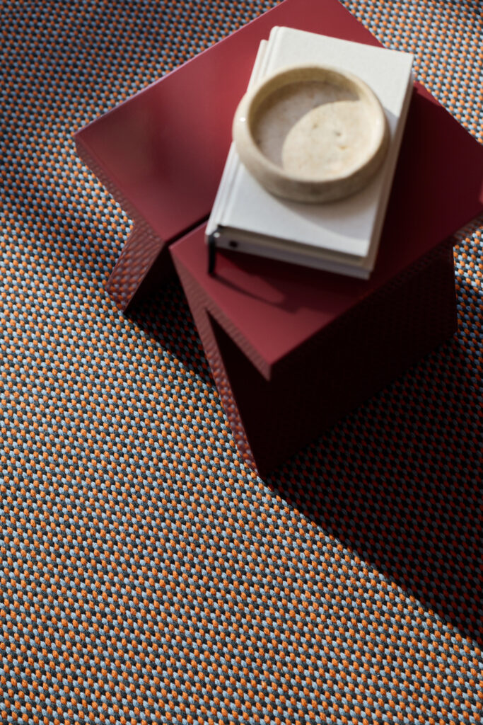
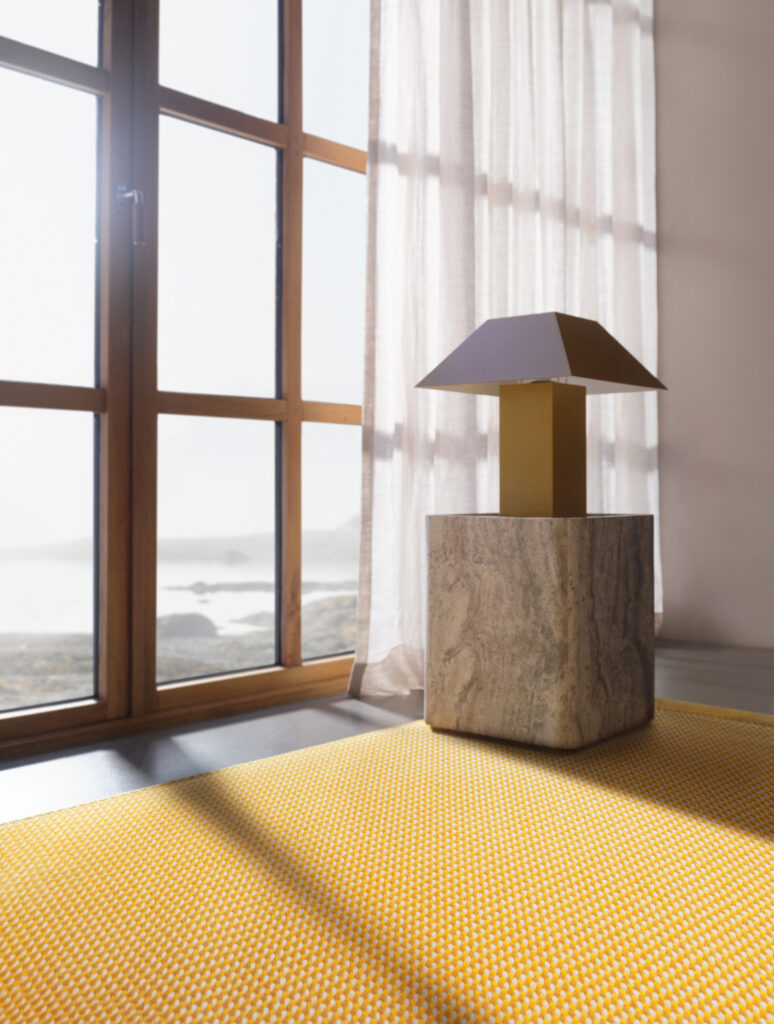
EB: Bon Bon is much stronger, more graphic in terms of its colourways. We use colour a lot in the studio, in a way that’s quite experimental, quite strong. With Bon Bon, we really went for it and tried to mix three colours on each carpet to create one finished colour. So the pattern is quite small, from a distance it might look like the carpet is one colour, but as you get closer, you can clearly see three different colours working together. It felt like a jar of sweets. And the names all reflect edible things. You’ve got Liquorice, Lemon, Toffee, Berry, Rhubarb, and Damson. They’re more playful, possibly even for a younger market.
Atlas is a very chunky weave, so you get quite a thick carpet. And what we’ve done is mix two or three colours, on one we’ve got four, and it comes across quite randomly. So each carpet will look different because the threads moving across don’t go evenly every time. Sometimes you have a green thread on top and sometimes an orange thread, so you get this nice variation of tone and colour. I would call this a more organic, natural-looking carpet, and the colours reflect that. We called it Atlas because these colours, when woven, were quite reminiscent of older Moroccan carpets, with natural dyes for the threads. The Atlas Mountains are in Morocco, and when you look at the design, you see triangular shapes that resemble a mountain range. So we thought, Atlas. The two are completely different directions.
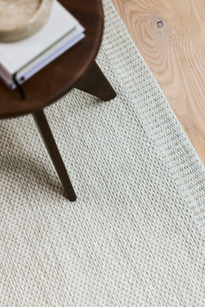
NM: The intriguing thing about Atlas is that when you look closely, you can very clearly see the warp. Why was it important to leave it exposed, and how does it change how the rug feels?
EB: Whenever we design anything, we always try to find a different way, or a new way to do something. With carpets, that’s pretty difficult – they’ve been around for thousands of years. But it’s a little unusual to be able to see the warp exposed the way it is.
After some of the experiments, I was quite intrigued by the idea that because there are so many threads going across, it doesn’t close up around the warp. So I said, could we leave it like this? And they said, well, possibly, but we would need to check that people wouldn’t catch the warp. They did some tests, and even though it’s exposed, it’s incredibly strong. It was new to Kasthall, and they were really into it.
NM: I have also read that the shimmer in the Atlas collection comes from the warp texture. How did you manage, within this collaboration, to balance the technical experiments with the need to make a product that will last for many years?
EB: We had to rely on the expertise of the people there. They’ve been making carpets for over 130 years. It’s a strong partnership – we’re directing it creatively, but in terms of the structure and the weave, they’re helping us all the way through. And to answer the shimmer question, if you look at the warp, there’s a certain shine to it. I guess it’s in the linen. You definitely see that in the Atlas collection, but not in Bon Bon.
NM: Can you tell me a little bit about the third collection?
EB: That one’s launching in June, at Days of Design. It’s again quite different from a graphic point of view. It’s a linear carpet, whereas the others aren’t. Bon Bon is almost made up of circles, Atlas is made up of triangles, and this one is made up of lines. It uses two colours to create a third, because the lines are quite fine and they change direction. It’s called North South. A different range of colours, actually, yellows and pinks and reds. It’s also a thinner weave, not like Atlas, which is much chunkier.
Traditionally, Kasthall carpets have a striped end, a two-colour striped band different from the actual weave of the carpet. With Atlas, we’ve used the same technique as the rest of the carpet to create that end, so instead of adding a different band, we’ve used the main structure to create the stripes, which they’d never done before. And with Bon Bon, we’ve completely removed the striped end and repeated the main design, scaled down to about a quarter of the size, so you’ve got the same thing happening at a much, much smaller scale.
NM: Why did you decide to shake things up when it came to the ends?
EB: We always like to experiment. I remember saying we’d done maybe 20 or 25 prototypes, and someone from Kasthall was waving at me from the back of the room saying, no, we’ve done about 60. The only way to get the best result is just to keep making prototypes. Some of these were experiments we weren’t planning to use. We were just trying things out. And then when we saw them, we thought, this would make the perfect end to the carpet. Also, the traditional stripes wouldn’t have worked that well with Bon Bon; there would have been a bit of a clash. So we tried a different approach.
NM: If we’re still talking about Atlas and Bon Bon, how do you imagine these carpets shaping the mood of a room?
EB: I think if you look across the full colour ranges of each collection, pretty much any location could fit. Atlas could work in a really modern, minimal architectural home with pine floorboards or oak and white walls, but it could also work in a really old house on a stone floor in Italy. And with Bon Bon, depending on the colourway – the yellow one might go well in a child’s bedroom, but the Rhubarb, which is the pink and green and white, could work beautifully in a very old home with old wooden furniture.
In my own home, I’m always about mixing stuff up. I like to have modern things alongside vintage furniture and older pieces. I’ve never been the type to put together one consistent look for a space. I love having an eclectic mix. Right now, looking around this room, I’ve got photographs by American photographers, a Moroccan carpet, some Italian chairs from the ’60s by Cassina, and Japanese ceramics from probably the 1920s. It’s always a mix. And I think these carpets can fit into any environment very well. Because they don’t have very strong graphics, they’re not trying to dominate.
NM: From what I’m hearing, they’re more meant to enhance elements of the room, but not take it over.
EB: I don’t think any of them will take over, honestly. Maybe some colourways are stronger, but I don’t want something so strong that it dominates the room. These are the first two collections we’ve done, and I’ve learned a lot. The next ones will be completely different. I might try something with a bigger pattern.
NM: You’ve also worked with big brands like &Tradition and Vitra. How was it different working with a Swedish brand with such a long craft tradition?
EB: When something’s made like this, the process can actually be very, very quick. I’ve probably been to the factory three or four times, and during a single day, you can make many samples, not full-size, but enough to see what’s happening. You can literally stand in front of the loom and say, right, let’s try this colour, let’s swap this thread, let’s do it this way, and you see it coming out in front of you.
If you’re working on things that have to be cast, like plastics or metals, that can take months just to see one prototype. The whole thing is slower, and the reaction time is much longer. Whereas with these carpets, you could change the direction of the project in a day. Which is quite fun for me, because I’m so used to things taking months.
NM: Sort of like magic, you think of it, and then it’s there.
EB: There are these huge spools of coloured wool everywhere. And you say, let’s take that yellow, let’s try this green, let’s mix them with the white. And within 20 minutes, it’s on the loom, and you can see it coming through. It’s incredible.
NM: What are your wishes or goals for the next collections, now that you’ve learned the process?
EB: We started with woven carpets because that’s where Kasthall started. But they also make tufted carpets, so we’ll look at those. And I want to get a little more experimental with the loom and see what other things we can do with it. There are quite a few restrictions, because it’s a piece of machinery with certain limitations, but that’s also where it becomes interesting. I want to challenge Kasthall to see if we can do something really new in weaving.