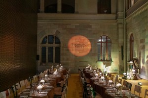
Spencer Finch’s journey as an artist is as intricate as his work. With his distinctive approach, Finch captures the ethereal interplay between light and space, bridging historical reverence with contemporary innovation. His projects, ranging from the recreation of ancient Troy’s dawn light to the experimental “Sunset in a Cup” series, reflect a deep engagement with both scientific precision and poetic resonance, revealing the subtle power of light to evoke emotion and narrative.
His work has graced public spaces across Europe and North America and is held in prestigious collections such as the Art Institute of Chicago, the Guggenheim Museum, and the Whitney Museum of American Art. From his homage to Emily Dickinson through a reimagined sunlight effect to monumental installations like Trying To Remember the Color of the Sky on That September Morning at the National September 11 Memorial Museum, Finch’s art acts as a prism, channelling his observations into abstract, glowing hues.
In our conversation with Spencer Finch, we discuss his unique artistic journey and the fusion of intellectual curiosity and artistic vision.
Natalia Muntean: Light plays a significant role in a lot of your work. And I wonder if there was a moment where that changed the way you see light, not just as a tool, but as a subject in itself.
Spencer Finch: Yes, it happened around 2000 when I started working with light, thinking of it as a material in itself, specifically related to landscape. I didn’t come from the light and space artists of the 70s, but rather from 19th-century landscape and impressionist painting, considering light in those terms and its connection to the landscape. Instead of focusing on the phenomenology of light, like James Turrell, I was interested in light as a picture of a place. My first project involved measuring the light at dawn at the site of ancient Troy in Turkey and recreating it, focusing on the special light of that historical place, which combines myth and history. Light can be very emotional and powerful, though minimal and not abstract.
NM: Your interests seem so varied, from ancient Troy to Jackie Kennedy's pillbox hat to Emily Dickinson. How do you approach new projects? What comes first, the idea or the material?
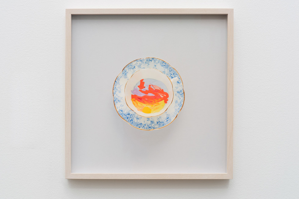
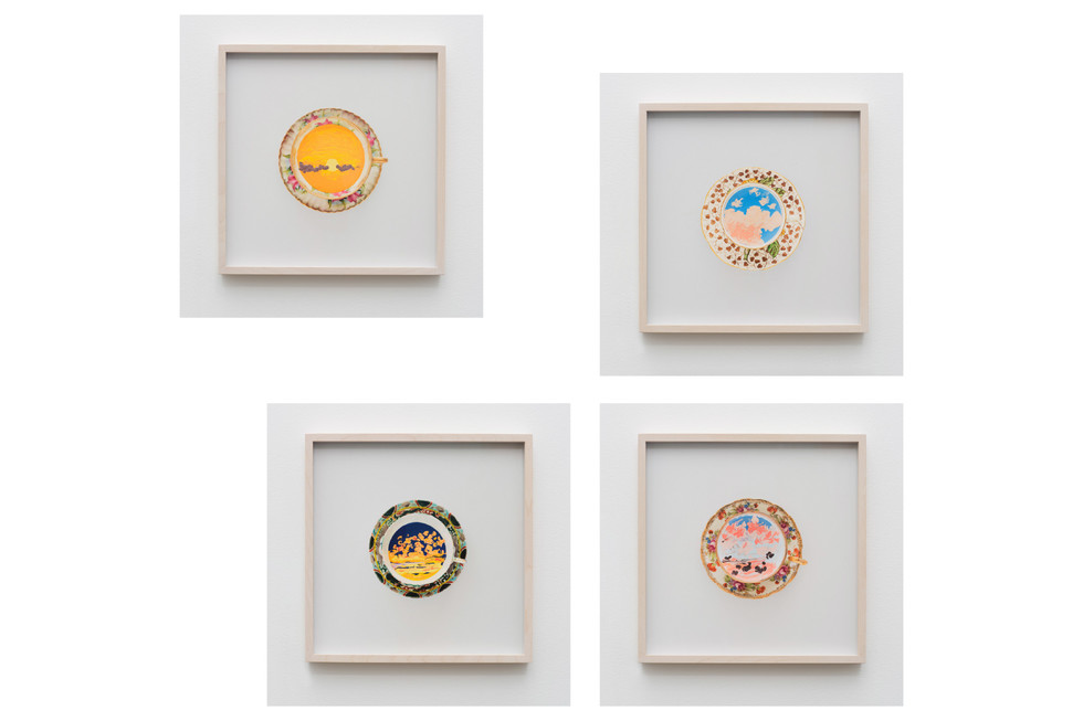
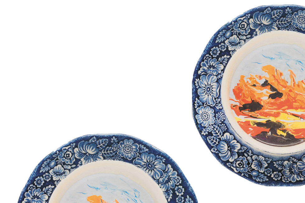
SF: Usually, it’s the idea that comes first. Occasionally, I find a material that interests me, but generally, I think about which material best reinforces the idea and subject matter. I enjoy learning new techniques and working with different processes. For example, I’ve been working with watercolour drawings for years and have improved my skills. Recently, I started a new technique with “sunset in a cup” paintings, where I use a large amount of paint in a cup to create the background and then build up the surface. My initial attempts were poor, but I learned and improved. It’s fun to explore new methods, even if they may seem unconventional, like painting in a teacup.
NM: You seem like a very curious person! Do you typically start your projects with a clear intention in mind, or do you let it be more intuitive?
SF: Sometimes my projects end up in unexpected places or at a dead end. For instance, I once attempted to create a work about the colour purple, which is visible to bees but on the edge of ultraviolet. I collaborated with a scientist from Berlin who specialises in insect vision to design an environment where we could experience something as bees do. However, despite my determination not to give up, this project has failed twice in 15 years. The challenge lies in making something invisible to human vision visible, which requires compensation for the loss. I haven’t figured out how to achieve this yet.
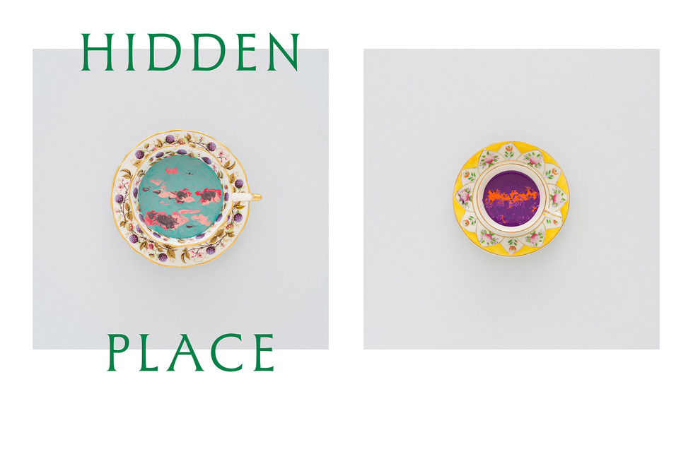
Another example is my “Sunset in a cup” project. I didn't know what to expect initially, but it evolved into using cups from Emily Dickinson’s time, similar to those she collected, to frame the sunset paintings. This approach became an homage to Dickinson. However, the paint, once dry, cracked and became less appealing. The cup, viewed from the side rather than flat, became more dominant than the painting. A photograph from above flattened the composition, making the cup a frame. This unexpected outcome led me to rethink the presentation format, ultimately finding the best solution through trial and error.
NM: Speaking of Emily Dickinson, many of your works reference a lot of historical figures, including Dickinson and Sigmund Freud. How do you choose them, if you choose them?
SF: I guess it comes from not being interested in self-expression. Some artists express what's inside them, but I feel like I’m not that interesting a person and don’t have much to say just about myself. I also believe there’s a kind of artistic arrogance where artists feel they’re more important than others, which I don’t think is true. Instead, I take something from another artist, thinker, or person I admire, shift it, inflect it in my own way, and make it my own while still connecting it to that person. This approach helps create a work that’s about ideas, usually inspired by someone else’s thoughts, but through my own awareness, I aim to open it up for the viewer. The viewer then has an experience that is their own, rather than being told what to think. By using figures like Freud or Dickinson, I feel they allow me to ask questions present in the artwork. I hope that makes sense.
NM: How important is your audience and its perception for you? Do you create your art trying to evoke a certain feeling in it, or do you just create and let it have a life of its own?
SF: It’s a tough question. I don’t think it’s a formula where I put a feeling into the work and the viewer gets that same feeling out. I’m creating a question, analysis, or exploration. I find it interesting without fully understanding it. The viewer who connects with it has something related but not identical, as they share the spirit in which it was made. I've seen many people walk through my shows without really looking at anything, so I’m realistic about this. I prefer a deeper connection with a few viewers rather than a shallow connection with many. My favourite viewers are often people from other fields or those who happen upon my work and connect with it, even if they’re unfamiliar with it. Although the work might be difficult to get into, I want it to be generous and accessible, not exclusive, so that anyone, even without an art history background, can connect.
NM: Was there a moment when a reaction to your work or the way someone interpreted it surprised you?
SF: Yes, there have been a few moments. One was with a project where I transmitted my brainwaves into outer space. To do this, I needed to find someone who could create antennas. I found someone in Maine. He understood that the wavelength needed to penetrate the ionosphere, as most radio waves bounce back at a certain level. Bill assisted me in building the antenna and selecting the transmitter. He would also come to New York to see my shows. Though he had no connection to the art world, he was very enthusiastic. When he liked something, he would start tapping his foot to keep the beat. It was wonderful to see someone from a completely different world connect with the work and share his enthusiasm.
NM: Can I ask about the project involving transmitting your brainwaves? How did you come up with this idea and why?
SF: I first did this project 30 years ago, and it was called Blue. At the time, I was exploring how to express or communicate something through art. I was also interested in SETI (the search for extraterrestrial intelligence) and thought about trying to communicate with extraterrestrials. I decided to use the colour blue as a medium. I recalled a TV show from the 70s called Hawaii Five-O, which featured a blue wave. I had someone attach electrodes to my head while I looked at this blue wave, and he recorded my brain activity. Using the transmitter and antenna from Bill, I sent this brainwave signal into space, aiming it at Rigel, the bluest star in the constellation Orion. Though it won’t reach its destination for over 800 light-years, the project was about the futility of expression and the strong desire to put something out into the world.
NM: As I mentioned, you are very curious! Your work seems to have a duality with a scientific process and a softer poetic side, from Outer Space to Emily Dickinson. Can you elaborate on this relationship?
SF: I have a lot of admiration for Emily Dickinson. I admire her incredible gift, intellect, and sensibility, which I aspire to. Her short, observational poems resonate with me because much of my work is also about observation. I feel a connection to the modesty of her poems and the profound impact they have. I hope that by being around her, both literally and figuratively through her poetry, I can absorb some of her essence. This adds a softer, less scientific, more mystical and feminine aspect to my work. I also enjoy using traditionally feminine materials like teacups and yarn, which contrasts with the minimal nature of my work and industrial materials.
NM: Did you say your work is minimal?
SF: Yes. Even with pieces like this yarn drawing, “Western Mystery (She sweeps with many-coloured Brooms)”, which is almost Rococo, it's still minimal. The images are quieter, less busy, and not overly complicated. For example, the gold leaf drawings of the sun on the water are quite minimal.
NM: Can you provide more information about the video installation, “West (Sunset in my motel room, Monument Valley, January 26, 2007, 5:36-6:06 pm)”?
SF: The video installation is a project that I'm glad to revisit and spend time with. It aimed to recreate the experience of sitting in a room and watching the sun go down. I wanted to achieve this in an interesting, resonant, and complex way without being overly complicated.
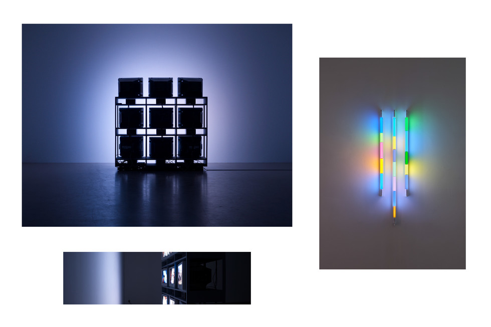
I focused on the American West, where sunsets are often spectacular. The idea came from my experience of walking home from the studio at night and seeing the flicker of light in people’s homes, which seemed somewhat melancholic to me. I considered using TV images to create a light condition and then used the film “The Searchers,” shot in Monument Valley, to project changing light in a room at dusk. I spent time in Monument Valley to measure the light in the motel room and used this data to create the projection.
When you walk into the space, you will see the backs of the TVs revealing the light through the rack. The subtle light and the images from a Western movie combine to create an engaging and illuminating experience. It's a complex work, but I hope it doesn’t feel complicated. There is a necessary relationship and clear logic between the film and the results on the wall. It’s a 30-minute film projection that reflects the pleasure of sitting in a dark room and watching the light change at dusk, a powerful experience we rarely have now due to our connection to devices.
NM: It seems like it's also a meditation, an invitation to sit with yourself.
SF: I hope so. I hope it works in that way.
NM: You've worked with many different materials, from light and sculptures to painting. How do you choose your materials when you work on a particular project?
SF: Usually, it comes from the idea. As we spoke about earlier, the material is determined by the idea because no material is neutral; it has meaning. I choose the material based on what I’m trying to convey and then try to become proficient enough in using it so that any lack of skill is not noticeable. For instance, with the gold leaf used in Sunlight on the Gowanus Canal, I’m not an expert, but I’m competent enough to use it well for my purposes. If I were working on large gilding projects, my skills wouldn’t be sufficient, but for small pieces, they would be adequate.
NM: In the two paintings where you used the thermometer, “Passing Cloud on my body - (shadow/sun),” also based on a poem, how did you combine the scientific precision with the emotional aspect of poetry?
SF: The challenge was to comprehend how a blind individual perceives the sun and convey that to a sighted person. I employed scientific tools, like a laser thermometer, to measure body temperature, and then translated it into a visual experience through colour. The colours and their relationship to the temperature scale are visual, but the goal is to express a sensation rather than a precise image. It's a basic representation that connects more with the concept of feeling rather than sight. The poetic element is drawn from Emily Dickinson's work, particularly her beautiful line on how blind individuals perceive the sun. Our visual encounter with the sun—its light, colour, and brightness—is different from thinking of it in terms of heat and temperature changes. The experience of a passing cloud and the transition from sun to shadow is a poignant feeling for me. This transition is depicted scientifically, with an instrument and a colour correlation to each temperature.
NM: Would you say you lean more towards the scientific side or the poetic side? I'm really fascinated by this interplay between the two.
SF: Everything is so specialised now. It didn't used to be like this. I see myself as old-fashioned, almost like someone from the 18th century, where artists were involved in scientific experiments and scientists in artistic ones. Take August Strindberg, for example, who created celestographs - pictures of the night sky that were both mystical and scientific. I prefer a time when the boundaries are not so clear. Nowadays, I couldn't be a scientist. My scientific skills are basic, like those of an elementary student. However, some aspects of science, such as the scientific method and observation, resonate with certain poetic concepts. Both scientists and poets observe the world and draw conclusions, albeit different ones.
NM: I never realised that! You talked about artists who are artists because they want to say something about themselves, and you don’t necessarily need that. What do you think is the role of an artist nowadays?
SF: I think it’s very different. Different artists have different roles and want to do different things. I’m pretty open to that. Some artists are about expression and identity in a way that I’m not, and I find that interesting. There shouldn’t be limits on what artists do. I don’t want other artists telling me what I can and can’t do or what the right role of the artist is. For me, one interesting aspect is the relationship between an artist and society, and how we reconcile our political positions with our artistic practice. Most artists are progressive and left-wing, believing that their artwork can advance certain agendas. My experience, particularly from working in publishing, is that my artwork can’t change the world. It might change how someone experiences the world a bit, which would be great, but I feel my obligation as a citizen is to try to improve the world, separate from my role as an artist. This realisation came from working on a textbook in the early 90s that aimed to represent Arkansas’s history more accurately and diversely. Training teachers with this book showed me that it made a real difference in how students saw themselves and their history. This experience made me realise the limits of art and the importance of making a societal impact in other ways. It was a powerful experience that led me to focus on more poetic interests in my work.
NM: I think that, as you mentioned, art can change how someone perceives or understands something, or to learn something new. This can lead to a small change in society.
SF: Yes, and hopefully it humanises people. There is artwork that engages people on a social level and can bring about change, although that's not what I do. Every artist should have that discussion with themselves about how they want to approach their work in a way that is not just for show.
NM: You said that being an artist is hard enough. What is the hardest part about being one?
SF: There’s a sort of scepticism about what it means to be an artist. In the US, there’s often a view that artists are parasites and not productive members of society. In Sweden, artists are generally seen as positive contributors. But many people want to be artists, thinking it’s a good job, though it’s very challenging. I’m fortunate to do what I want and make a living from it, but it took 15 years to achieve that. I still get nervous that everything might fall apart. If I had to return to editing textbooks now, I’d be so cranky I’d be unemployable. It’s a privilege to be an artist, but it’s hard because you want to stay true to your younger self and continue doing meaningful work. Recognition is not always fair, and some great artists don’t receive it. The world, including the art world, is not fair.
NM: It’s really not. Nowadays, with information overload, some artists might find it more difficult to get recognition.
SF: Also, to be a successful artist, you need to exist in the world to some degree. You have to work with others and get your work out there. Even if you’re a great artist, it’s hard to develop a career if you’re not willing or able to do that.
NM: You mentioned that you still have this fear or anxiety that things might fall apart. Do you feel this anxiety when you show new work?
SF: No, no, it's not that much. The “Sunset in a Cup” works; I wasn't sure about it before I showed them. After talking to people over the last couple of days, I feel like, oh yes, they are good. That made me feel good. It's new work, and I'm never totally sure about it. I'm always trying to do something new; I don't want to keep doing the same thing. The best thing was speaking to an artist from the West Coast (of Sweden). He saw the video piece and was so excited about it. He said it made him mad because it was so good. That is the best compliment because it has happened to me many times when I see an exhibition of another artist's work. I admire it so much that it makes me mad because I wish I had come up with it or done it myself. Coming from another artist, that's the best compliment. From that one conversation, I feel really energised to get back into the studio. It's funny where that energy comes from, but where he said it made him so mad that I did it—that's the best, coming from an artist.
NM: What are your upcoming projects?
SF: I’m currently working on several projects. I have a major architectural project in Australia and a light installation project that will be unveiled in September in North Carolina. Additionally, I'm working on another exciting project, but I'm unable to disclose details about it at the moment. Keep an eye out for updates.