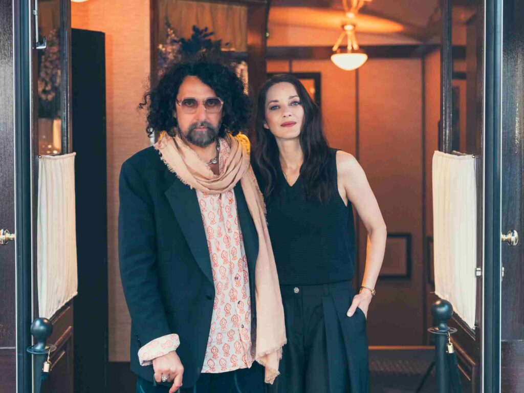
Teklan x Layered: A Continued Exploration of Color and Form
text Ulrika Lindqvist
photography Andy Liffner
Known for her bold use of color and immersive spatial design, Stockholm-based designer Tekla Evelina Severin, or Teklan, has built a practice that bridges interiors, architecture, and visual storytelling. In this interview, she shares her creative process, recent highlights, and the inspiration behind her latest collaboration with Layered.
Ulrika Lindqvist: Hi Tekla, can you share how long you’ve been working as an interior designer and what inspired you to start your career in this field?
Tekla Evelina Severin: I graduated in 2010 from Konstfack University of Arts, Crafts and Design in Stockholm, specializing in Interior Architecture and Furniture Design, and have been working in the field ever since. During the first few years, I worked as a more traditional interior architect at an architectural firm. 2015 I took my first baby steps towards my current direction, and founded my own studio and multidisciplinary practice, working through the language of colour.
My inspiration to start my own practice came from a longing for something beyond the prevailing conformity in design and CMF-design at that time.
(And my initial inspiration for becoming a spatial designer in the first place, came from a desire to create new immersive experiences and meaningful environments that stand the test of time, as all good designs should.)
UL: Have there been any particular projects or events in your career that stand out as especially memorable?
TES: Yes, many , and every project have its own magic, but creating ”an apartment of one’s own” for Spanish furniture company sancal during Milan design week 2022 was definitively a highlight in every way.
The wholehearted creative trust from the magic sisters behind the family company, the generous support of co-collaborators like Huguet Mallorca who brought my wild, customised design ideas to life, the patient care of builders and visionary project leaders, the spatial unfolding of my creative vision – and, finally, the overwhelming response from both visitors and press.
Another unexpected highlight is the ongoing journey of my tile collection Färgblock. What began as a simple design has evolved over the years, expanding with new finishes and formats and finding its way into projects around the world. Each day I encounter it in new contexts, and it’s delightful to witness how seamlessly it inhabits so many different styles
UL: Can you walk us through your creative process? Do you have any specific routines or practices that help spark your creativity?
TES: I have no problem with finding inspiration, I have rather the opposite problem, to find enough time to fulfill all my ideas.
My creative process is quite straightforward, unfolding in several clear stages. It begins with an in-depth analysis of the client, the brief, the premises, and the space itself. From there, I move on to shaping an atmosphere—creating mood boards, researching materials, and developing colour schemes. In the next phase, I translate these ideas into concrete form through 3D sketches and presentations. This is followed by technical drawings for manufacturers and builders, enabling both budgeting and, ultimately, production. Once production begins, I focus on styling research, followed by on-site supervision and personal involvement to ensure that every detail is realised as intended
UL: What does a typical day look like for you as an interior designer?
TES: There is no such thing as a typical day. Also, since most of my
clients are international, I often work abroad. My time is divided between developing or refining new CMF designs, moving through different stages of interior and exhibition projects, directing or styling upcoming collaborations, and—like now—giving interviews, talks, and behind-the-scenes insights ahead of various launches
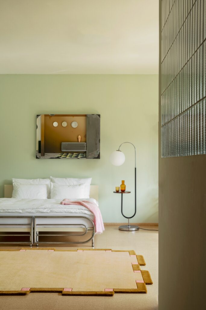
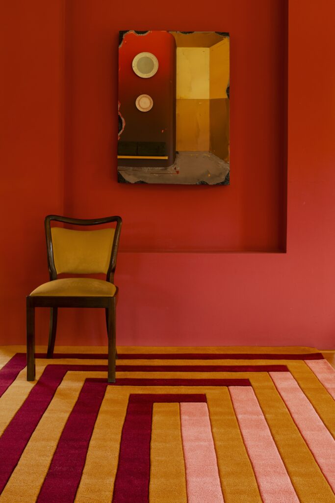
UL: How do you use rugs and carpets in your interior design?
TES: Often, it’s a rug or carpet that allows the room to truly “land.” Beyond anchoring the space, it also adds a softness to the atmosphere and dynamic through material and texture, while naturally improving the acoustics
UL: This is you second collaboration with Layered, how does it feel to return?
TES: I wouldn’t really call it a return, since our last collaboration was quite recent and the collection is still available and doing well. That said, it’s always a pleasure to be ‘back’ and to continue building on what we’ve created together.
In one sense, the process feels easier now that we know each other so well. But in another, it is more demanding—to move forward, to push boundaries, and to somehow outshine the collection that came before.
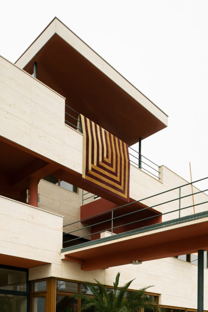
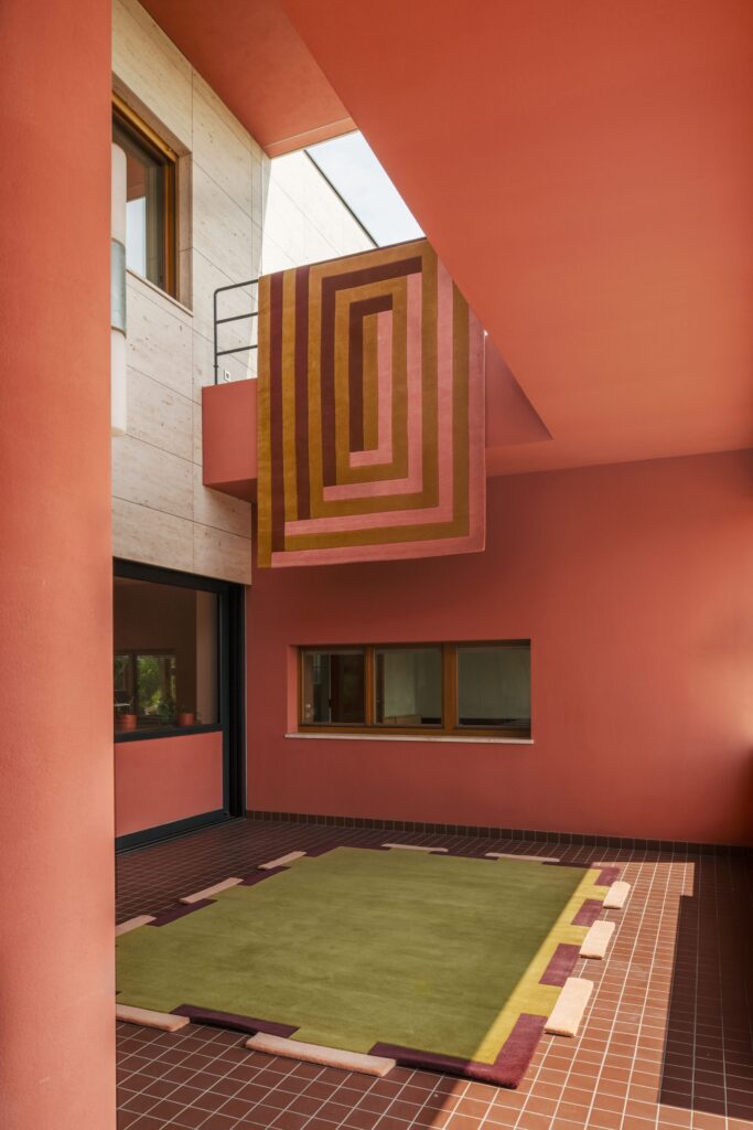
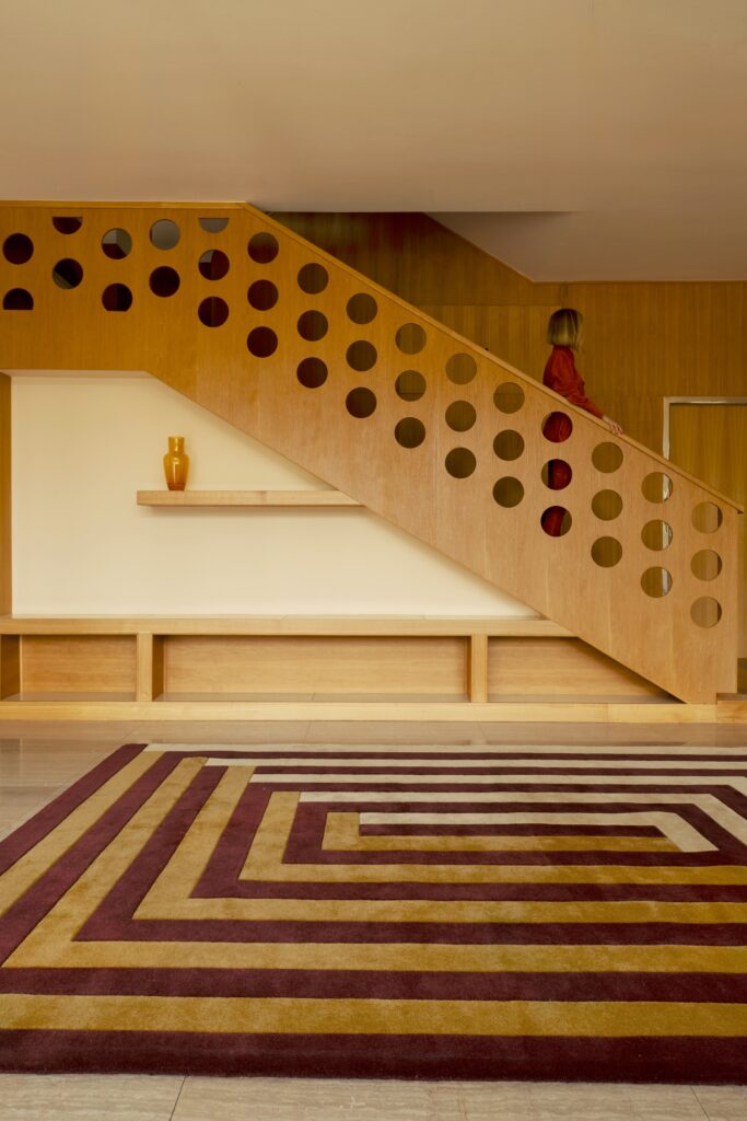
UL: How did you choose the location for the campaign shoot, Villa Volman in Prague?
TES: For many reasons, the architecture offered a wonderful palette of matching colours, clean geometrical shapes, and strong perspectives, all of which harmonised beautifully with their collection. There is also something about the spirit of modernism—it feels timeless, while at the same time resonating with my own nostalgic fondness, I often refer to this phenomena as ”newstalgia”
UL: What was your inspiration for this collection? It starts where your first collaboration “prism collection” ended, but where did you find the inspiration for this one?
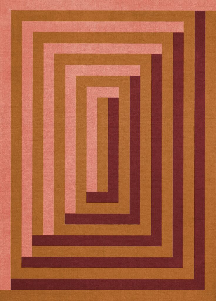
TES. Both the collections carry the same creative vision present in all my work: a fascination with the meeting point between two and three dimensions, where perspective shifts and optical illusions emerge—clearly reflected in both Diagonal and Labyrinth
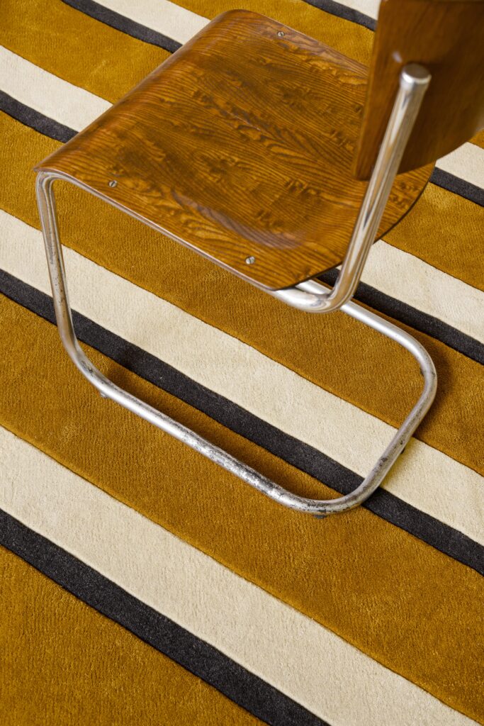
Diagonal
Diagonal is an homage to one of my dearest patterns: the stripe. Here, reinterpreted diagonally with a darker contour line, it creates an optical shadow effect that emphasizes direction and adds an extra “bam” to the expression. The blue and brown/burgundy pairing is one of my signature combinations—what I like to call “something flirty and something dirty”—a balance where lightness meets depth and earthiness. For the second colourway, I wanted a more graphic and stylistic feel, but with warmth, so I added ochre brown to create richness and comfort.
Labyrinth
Labyrinth reflects one of my most beloved spatial layouts; in fact, I often build my room installations as labyrinths of different sequences. Here, it appears as a graphic pattern with a 3D shadow effect, also nodding to Carlo Scarpa’s architecture and his brutalist Tomba Brion, which plays with light and shadow. The colourways echo each other yet differ: one sophisticated with deep red and soft butter yellow, the other more vibrant and dopamine-charged. Both are grounded with warm ochre brown.
Fregio
Fregio continues my fascination with careful interior details, inspired by floor borders and the idea of framing rooms and furniture. This also connects to my way of thinking in tiles and patterns. For the colourways, I explored a bold olive green with blush and deep burgundy for a 70s feel, contrasted with a softer colourway using a nostalgic favourite from Pippi Longstocking and Annika’s iconic outfit: yellow paired with pink.
UL: Looking ahead, what’s next for you? Are there any specific projects or goals you’re particularly excited about?
TES: Right now I’m thrilled to be working on two major CMF projects—one set to launch this winter and another coming in March 2027. I’m also preparing an exciting collaboration for a new NYC fair in November, alongside several other projects. Lately, I’ve found myself more drawn to creating permanent spaces rather than exhibitions that only exist for a moment in time. Maybe it’s something that naturally comes with age—or just a new chapter in my journey. The future will tell.