NikeLab x Sacai
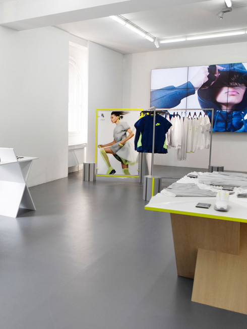
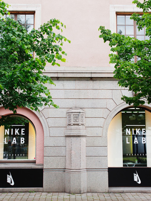
Written by pariDon’t miss to check out Nike’s incredibly cool collaboration with Sacai and stop by their pop up boutique in Stockholm today 28th of June.
Wetterling Gallery, Kungsträdgården 3


Don’t miss to check out Nike’s incredibly cool collaboration with Sacai and stop by their pop up boutique in Stockholm today 28th of June.
Wetterling Gallery, Kungsträdgården 3


Rankin has been working closely with Walter Cambell, creator of the concept and award winning creative director at TBWA, on this short film that automatically makes you sink into the innermost desires of the erotic imagination.
Dropping the visual fantasies of what may seem to be an everyday life situation, this short film will keep you on your toes, feeding you evocative images that feature Coco de Mer lingerie.
“X”’s intention is to capture their viewers into a new cutting edge type of conversation around desire; one that is liberated, progressive and accessible. The film also gives a total image about the empowerment of women.
The hype around the film is already becoming clear to the public. The new showpiece will be premiered in London, Paris, New York and Milan in the next upcoming months, and has already been expressed as a masterpiece by the insiders of the industry.
The whole concept and collaboration idea with Coco de Mer is that they want their audience to believe that the ultimate erotic experience of your life is yet to come. For them, sex is a very beautiful thing, so they create beautiful objects and experiences to celebrate the enjoyment of one another. And as a result, Rankin and Walter Cambell completely understood and embraced the brand, which turned into a further concept and an exciting collaboration.
A fashion film is the best way to express the essence of people exploring the limits of their erotic minds. It’s all about heightening the people’s appetite for desire. You immerse yourself into the experience and then make your own personal discoveries during the process. Being able to work with such talented people like Rankin and Walter, as well as the rest of the team allowed them to truly reach what they were trying to portray as a collaborative journey.
They wanted the main message of this fashion film to allow people to embrace the complexity of sexual pleasure and pave the way for more conversations around desire and eroticism. The next beautifully captivating moment is always waiting to happen.
As Rankin has said, “I see “X” as an attempt to create an experience that relates directly back to the motivation of the brand itself. Using the direct relation between erotic fantasy and voyeurism, which has a rich tradition in the erotic world.”
There is an obvious feeling of intrigue and mystery that goes around the film. It makes you feel like you’re watching something off a social media feed, but then is sped up as if it was on amphetamines.
“X” would be described as blank space in way that is hard to categorize, which was why the title was chosen to be a single letter to make it uncomplicated. Taking something forbidden and making it feel simple.
In one word, this collaboration experience would be described as inspiring.


Looking for a shopping experience curated as carefully as an art gallery? COS invites you for a journey through a landscape full of lightness and fashion in their new collaboration with Snarkitecture. The brand has sought inventive architects to create a bridge between their spring collection, the store space and an art installation. Odalisque talks to the COS head of designers Karin Gustafsson and Martin Andersson as well as Daniel Arsham and Alex Mustonen from NY based Snarkitecture about the details of their creative collaboration.
WPB: How did you collaborate with Snarkitecture?
KG: We often look to the world of art and design for inspiration when creating our seasonal collections and believe that our customers share our interest. Because of our relationship with the world of art and architecture we value the opportunity to give something back and share with our customers through creative collaborations. Both Martin and I were drawn to the work of Snarkitecture while designing the Spring Summer 15 collection. We felt their ethos of “removing anything non-essential and focusing the viewer’s experience” resonated with us and the opportunity to work on an installation in Milan during the Salone del Mobile art fair felt like a natural partnership.
MA: We believe the COS seasonal collections are reflective of the store design and equally the store design reflects collection. The interior design of the stores is created to reflect and communicate the brand ethos to our customer; modern, timeless, functional and tactile, while creating an atmosphere that is both dynamic and calm. Like the collection, our stores are functional, such as fitting rooms designed with adjustable mirrors- while at the same time reflective of our inspirations; for example, the lounge areas for customers to relax are furnished with furniture designed by the inspiring designers: Eames, Wegner and Finn Juhl.
WPB: What are the trends and inspirations for this season at COS?
KG: The Spring Summer 2015 collection is very sharp and graphic, minimal with a reduced and sculpted silhouette. We’ve done much research into traditional techniques; then turned it onto its head and used new technical finishes, such as laser cutting, bonding, and finding new ways of constructing.
MA: It’s almost like a laboratory, experimenting and finding new ways of working, like the ultimate utility wear. As well as that, there’s something about the sporty lifestyle that we liked.
KG: It’s sportiness as ready-to-wear. We also felt for lightness, technical transparency and technical finishes. There’s also an interest in mixed media, and a playful use of proportion.
WPB: How does a successful COS design attract the customers in the high- street store context?
MA: We aim to offer an inspiring collection comprised of wardrobe staples as well as re-invented classics that last beyond the season - the white shirt, contemporary chinos and tailored suiting - reinterpreted to fit the modern wardrobe and lifestyle. We look to offer understated fashionable pieces; nothing is overly fussy and details have a functional purpose.
KG: When we think of our customer we think of a group of like-minded people who are interested in current issues - cultural as well as financial and political, and of course, fashion. This group of friends tend to be confident, style conscious, have a big-city mind-set and also appreciate exceptional quality and value in every element of their lives. In essence what they share is their sense of style, confidence and personality.
WPB: How do you apply your motto “impossible voyage of an improbable crew to find an inconceivable creature” to your collaboration with COS?
DA & AM: We created Snarkitecture with the goal of making architecture perform the unexpected. Our name is drawn from Lewis Carroll’s The Hunting of The Snark, a poem which describes an “impossible voyage of improbable crew to find an inconceivable create”. In the same way, Snarkitecture is a search for the unknown between architecture and art - the indefinable moments created by manipulating and reinterpreting existing materials, structures and programs. This can be seen in our collaboration with COS, taking architecture and pushing further than others - rather than creating a building, we altered the interior to create an architectural atmosphere.
WPB: What kind of voyage can COS’ customers expect when they enter the installation at Salone?
DA & AM: We were interested in creating a space of calmness and interaction starting with the concept of a cavern as a primal form typically associated with darkness and the solidity of stone. We instead created something light and ephemeral, made from tens of thousands of white, translucent fabric strips. The resulting spaces and passageways invite visitors to explore as they navigate their way into the installation, and to discover secret moments concealed with the density of the surrounding enclosure.
WPB: Why did you choose the cave as the main construction of your installation?
DA & AM: In some ways, the quality of the material - the lightness and translucency - came first. The feel of the space was the initial brief, thinking about the qualities and creating a quiet space to evoke a reaction from the visitors. When we saw the collection, we knew we wanted to bring the perforation of translucency to the installation, shifting visual quality and architectural elements. We wanted to fill the space with fabric, playing between the lightness of the fabric and the lightness of the space to create a heavy architecture. The cave element came after, through reduction.
WPB: I saw that you had collaborated with other fashion projects, such as the “Inverted Chukka” shoe before. How important is the connection between architecture and fashion for you?
DA & AM: For us, fashion and architecture are different disciplines which last for different amount of times. We wanted to create a link and merge both worlds through creating work that is both architectural in terms of scale, but also fits with the short timescale of the fashion world. Whereas a building can take a month or years to produce, we build an installation, creating a temporary form of architecture.
WPB: What do you personally like with COS?
DA & AM: When we saw the COS SS15 collection we were definitely drawn to some of the materials and concepts that involved layering and transparency. We knew we wanted to create an environment that spoke to the clean lines, ambiguity of translucency, and layering that was so strong in the collection. We definitely see familiarities between Snarkitecture and COS’ design process. I think both of us take the existing or expected and transform it into something new.
WPB: What are you working on now and what are your dreams and plans?
DA & AM: We want to take the existing or expected and transform it into something new. We’ve been very fortunate to work on a number of great projects with amazing clients and collaborators. We’re proud of what we’ve accomplished but, of course, we are always looking forward. We do have dream projects such as the idea of a playground for children - a play city.


