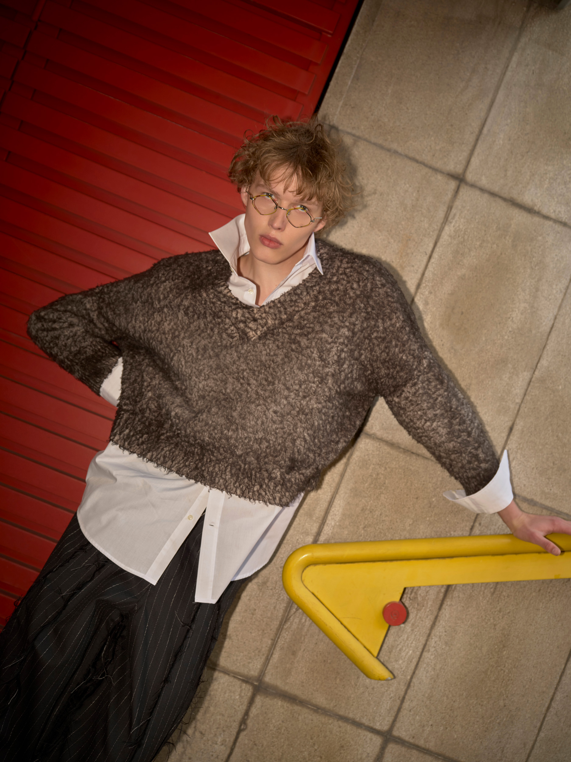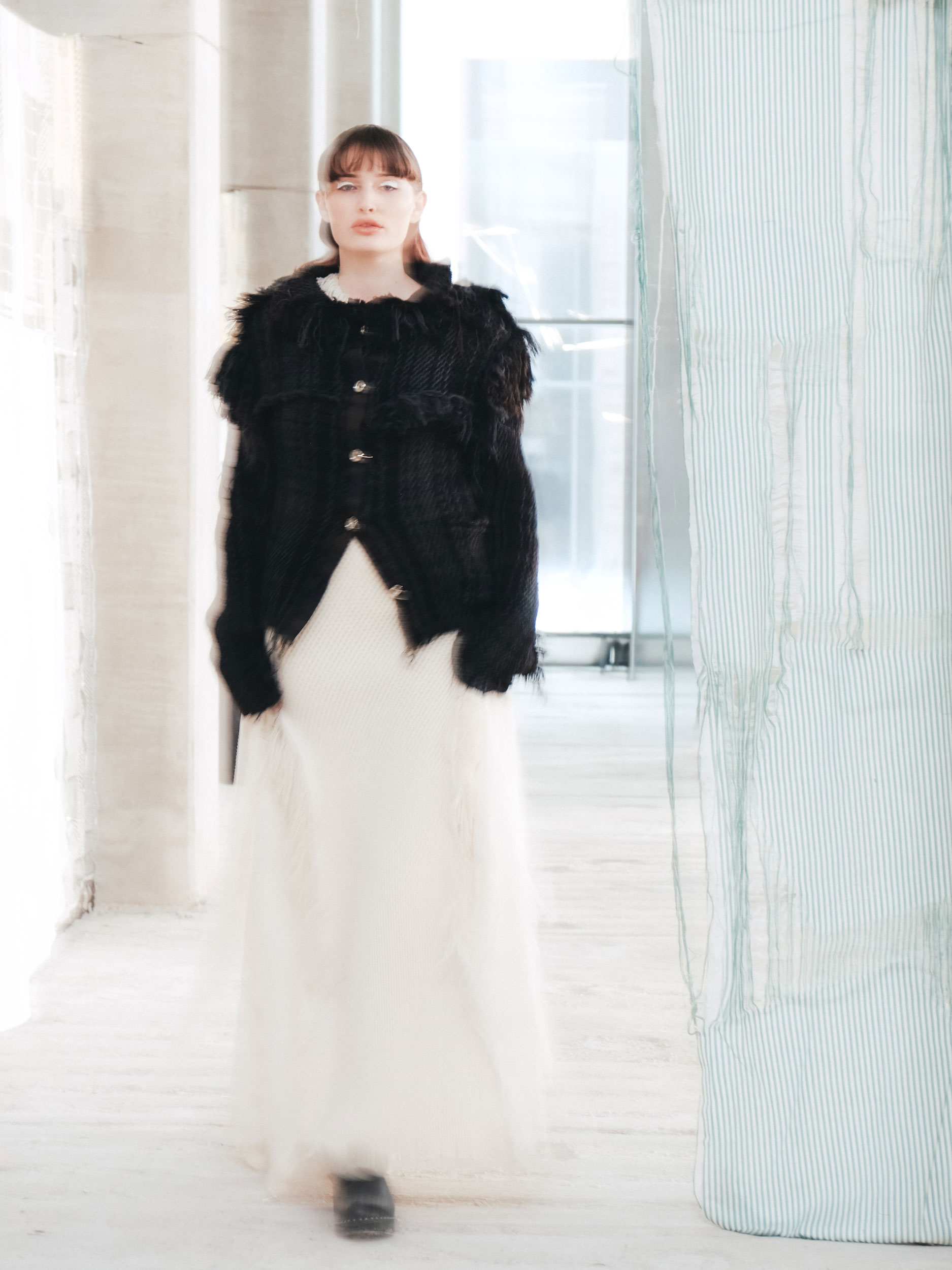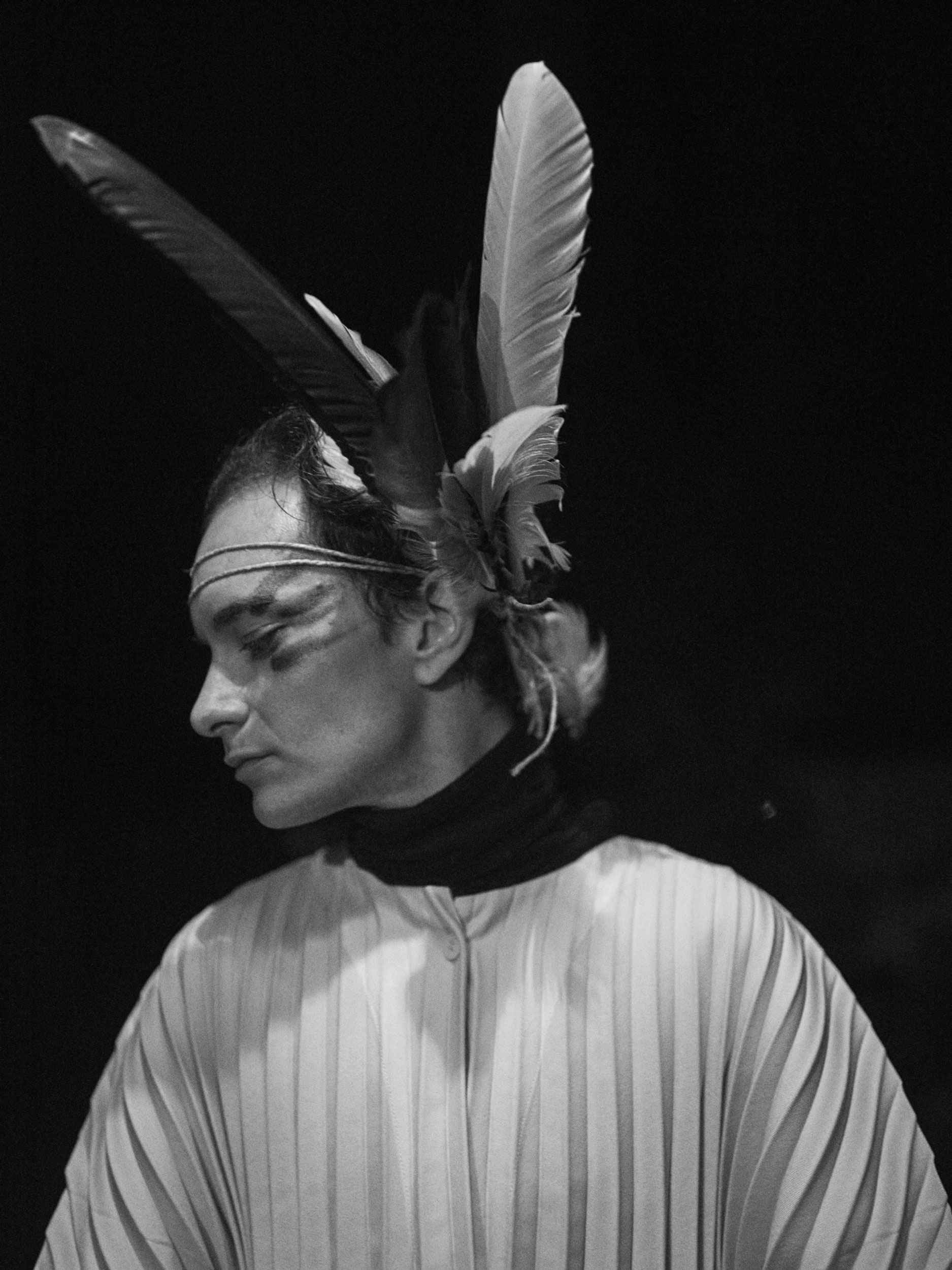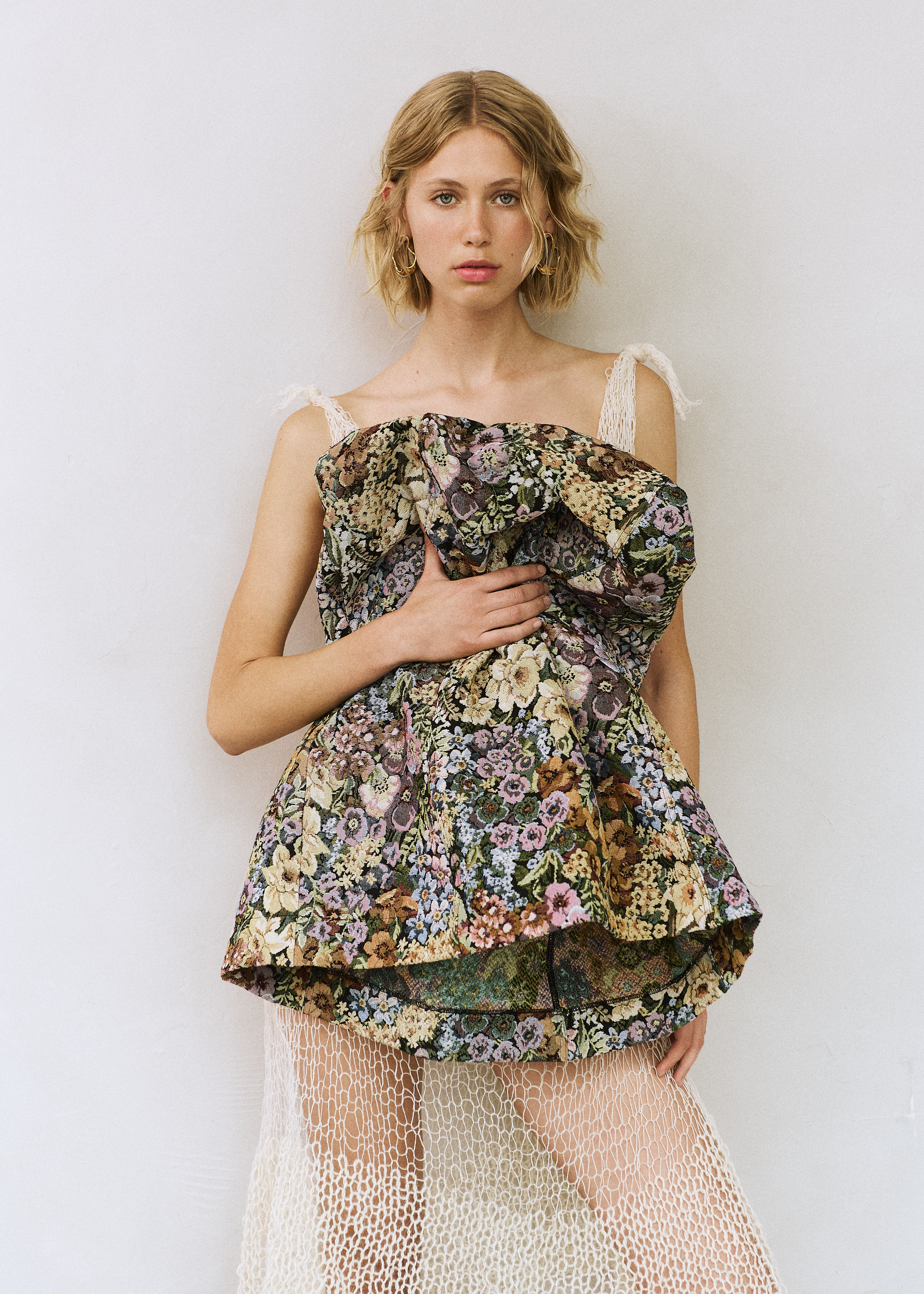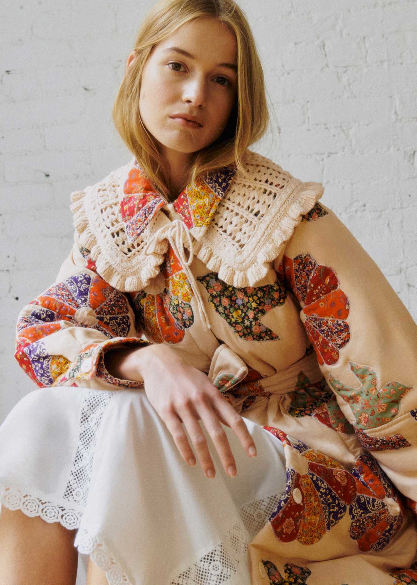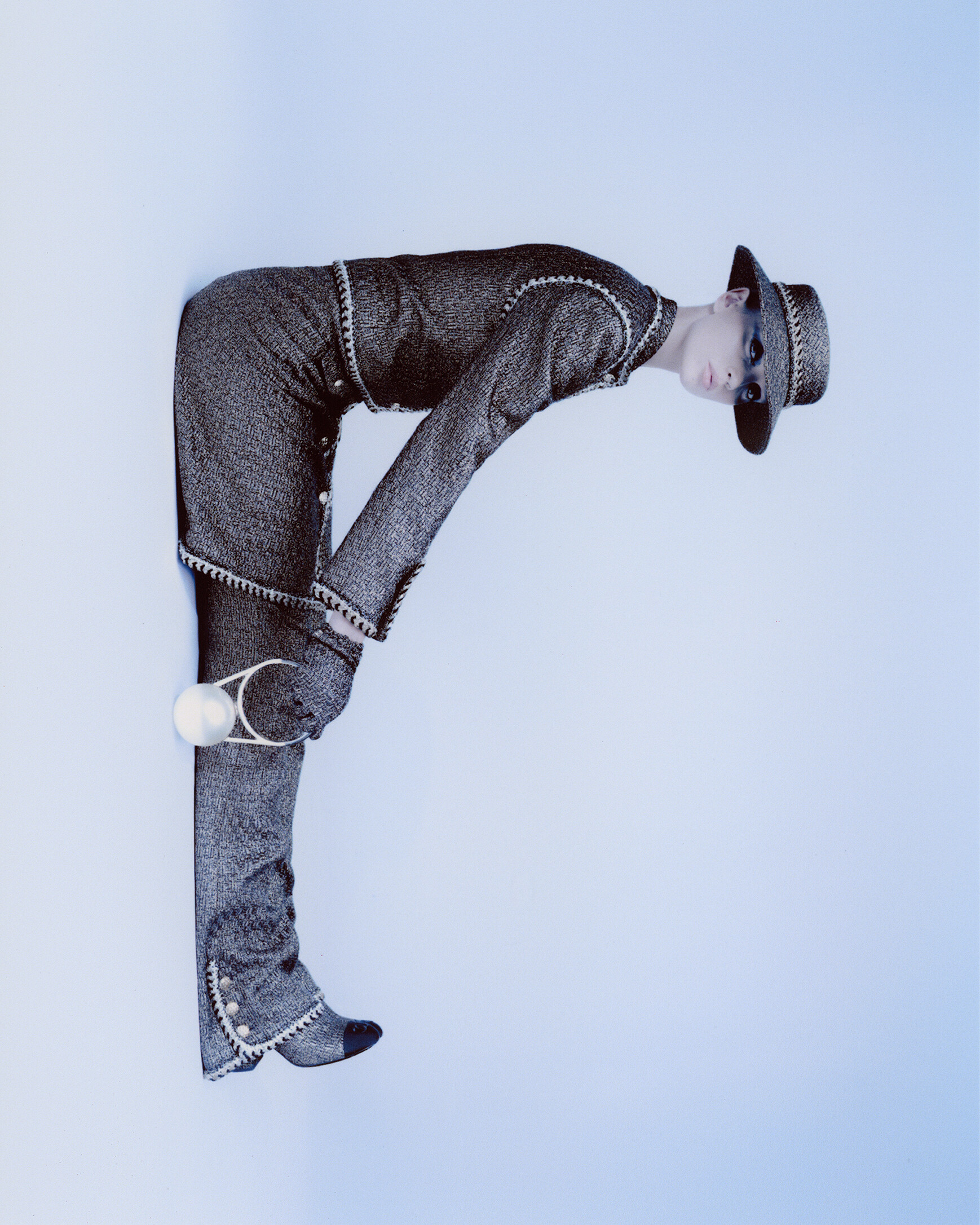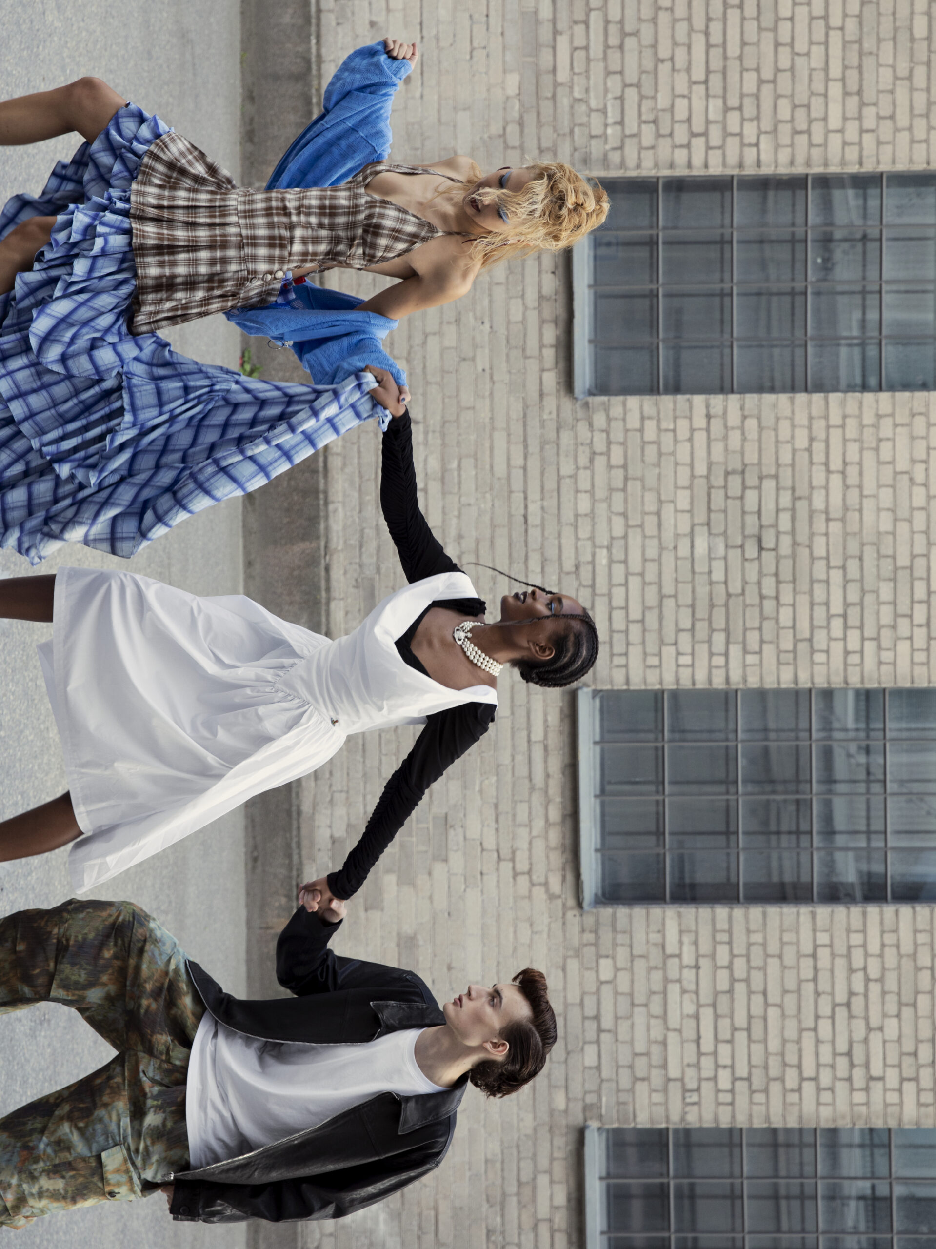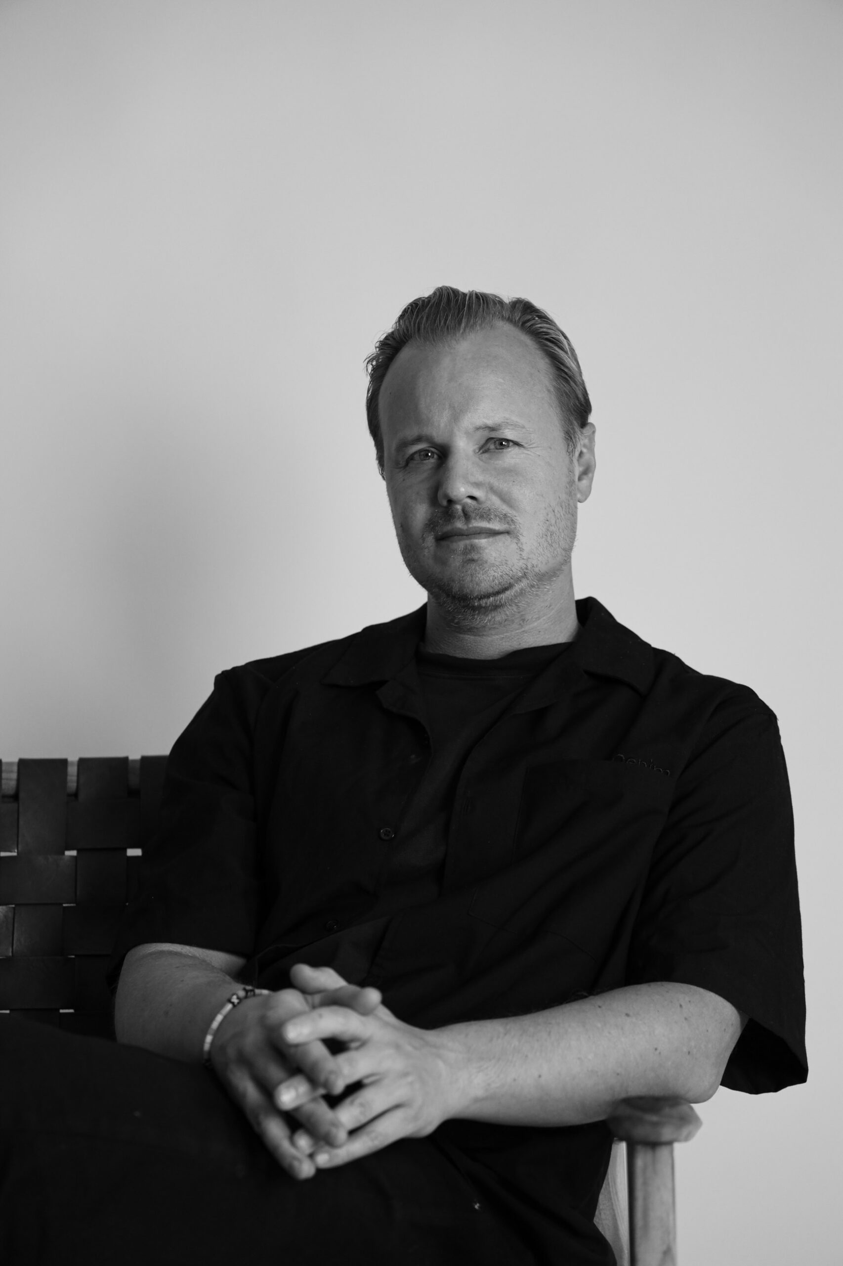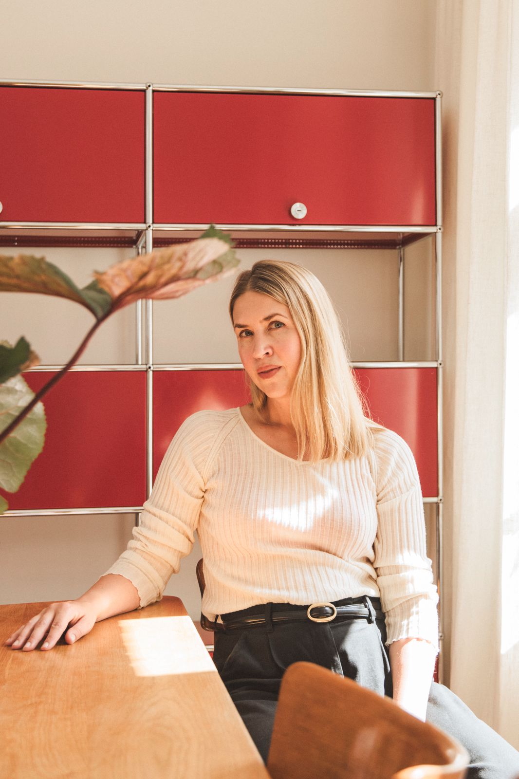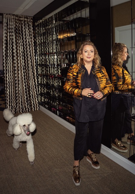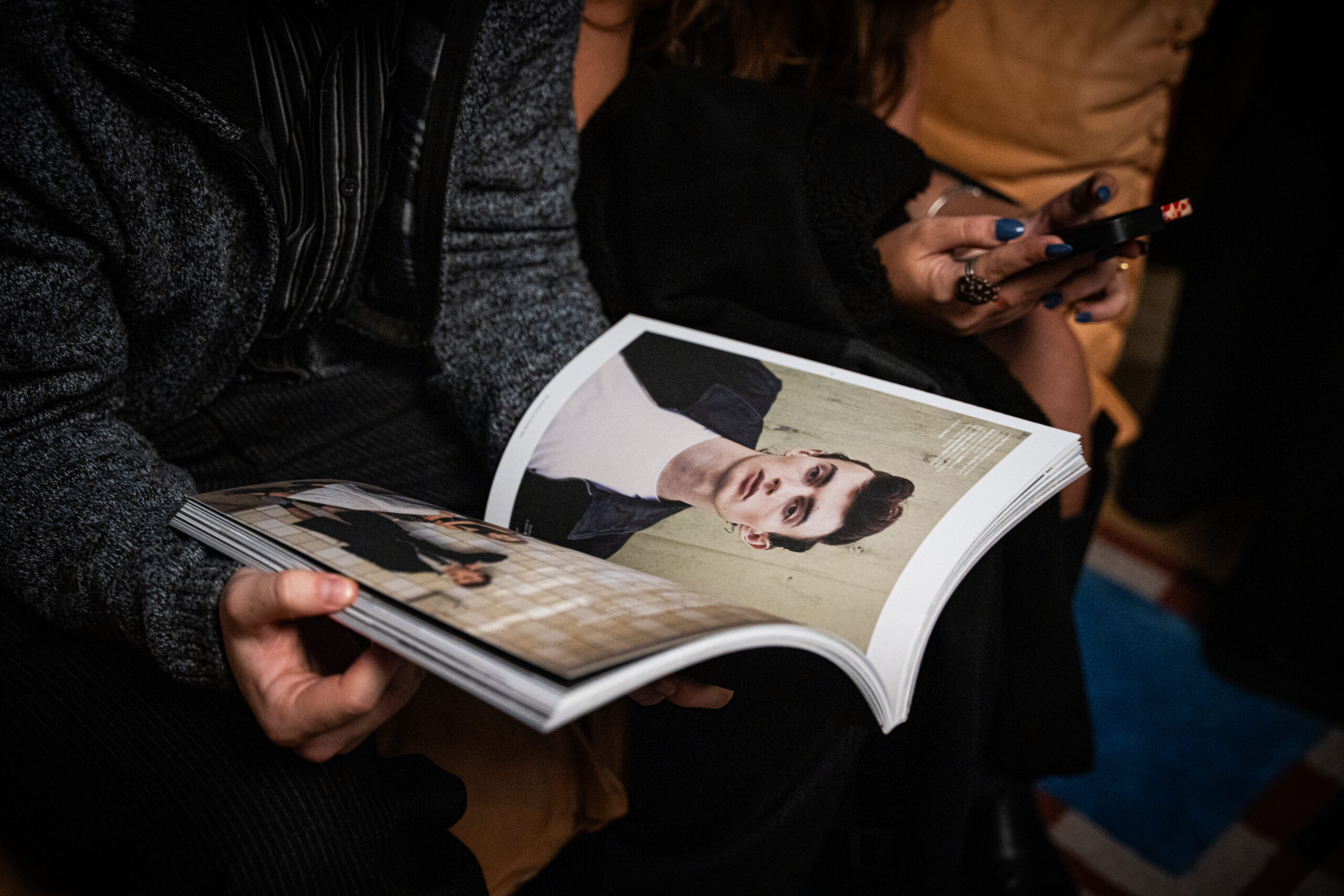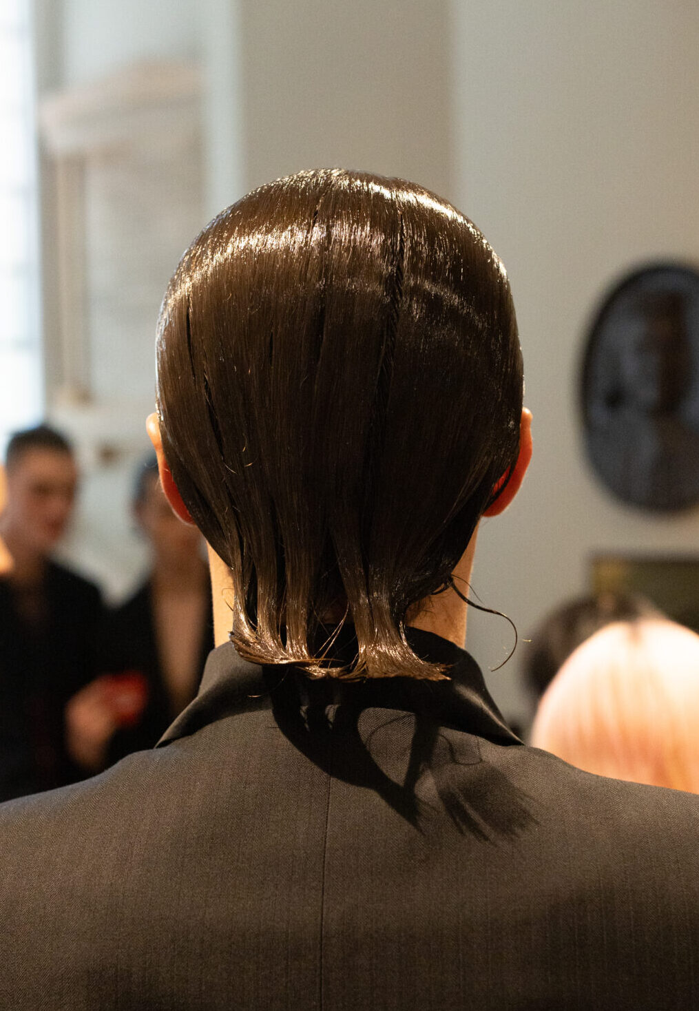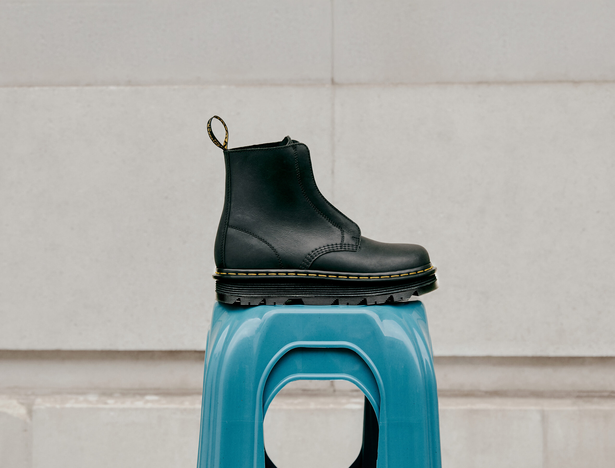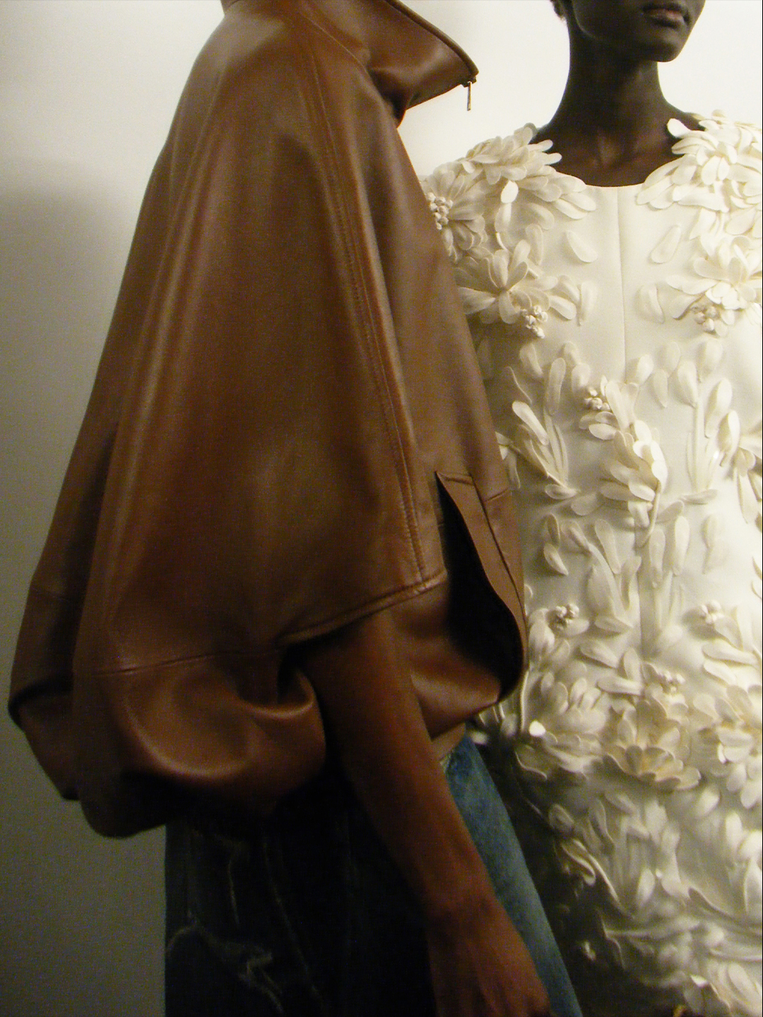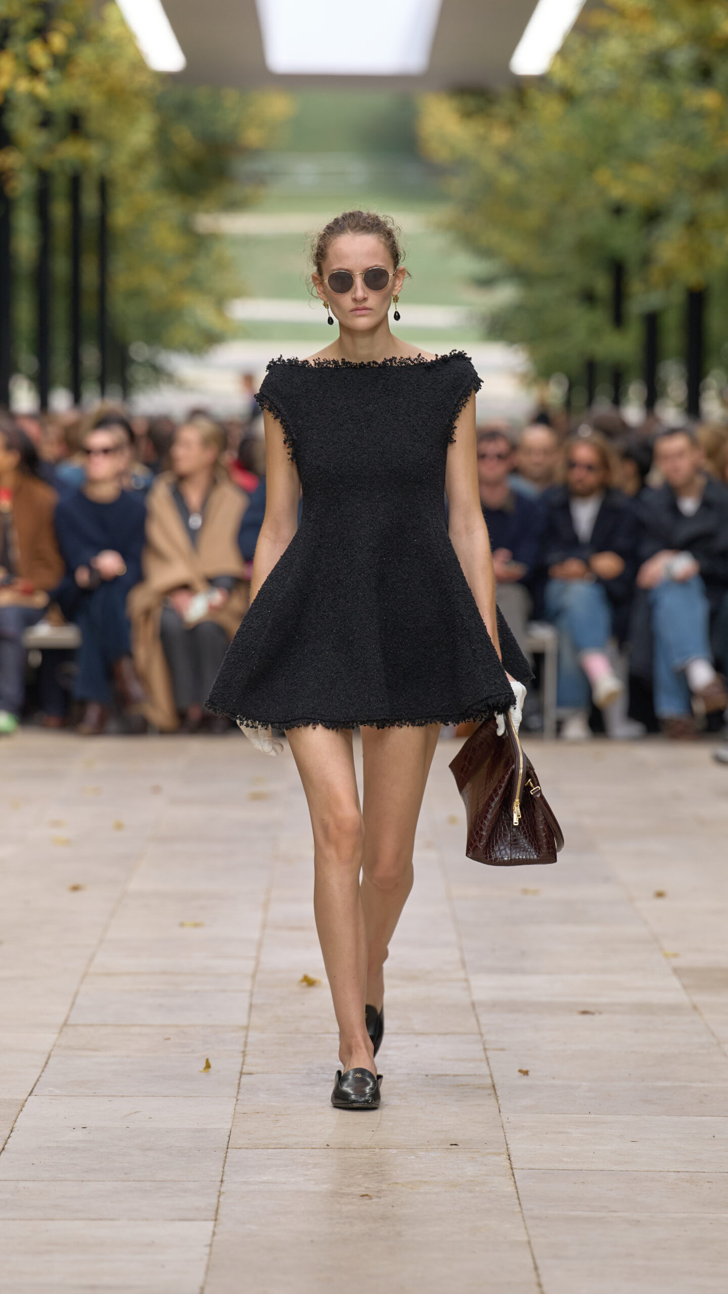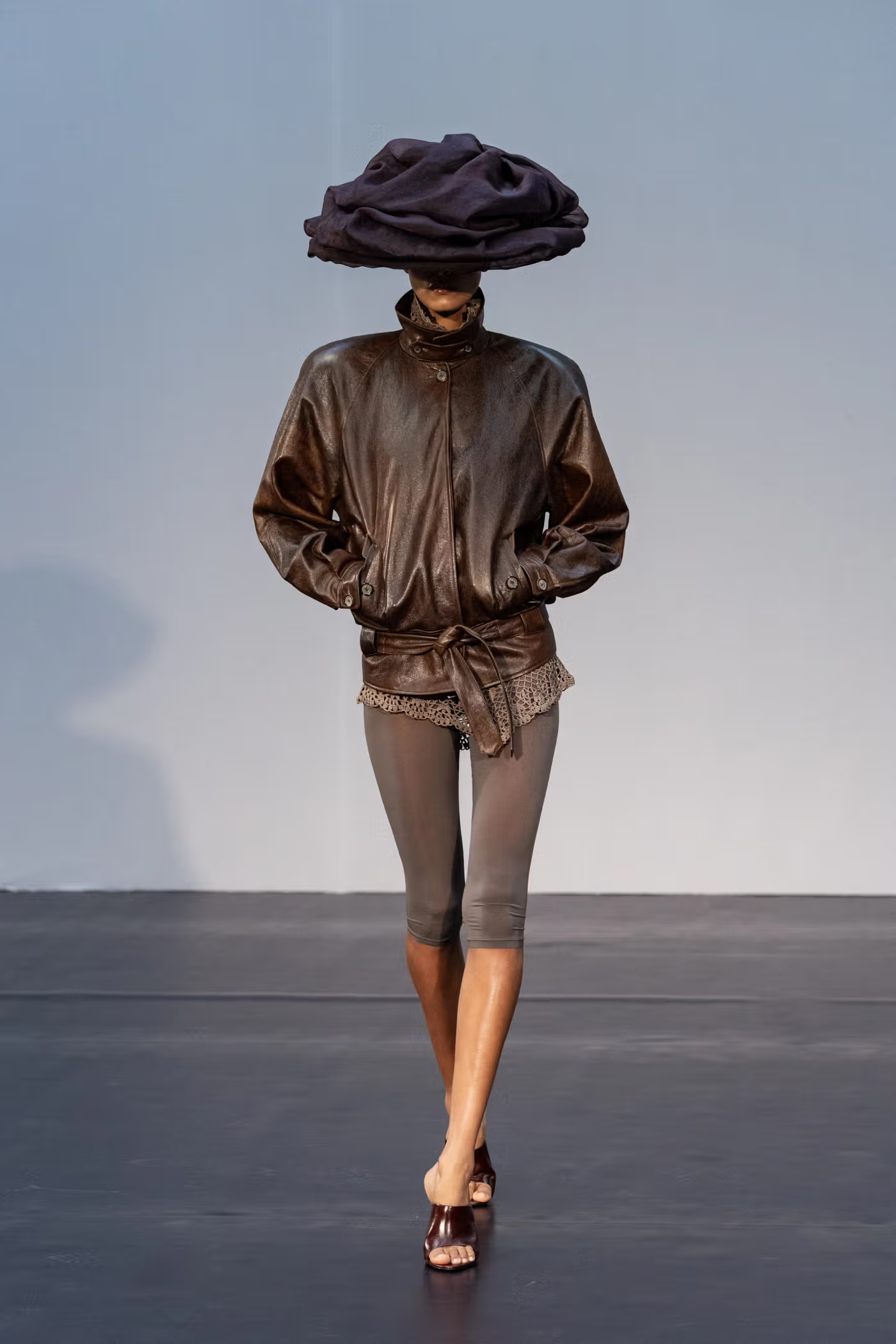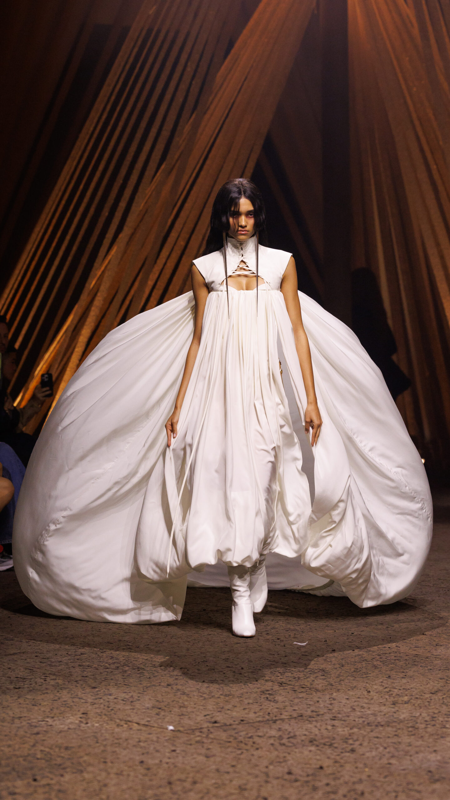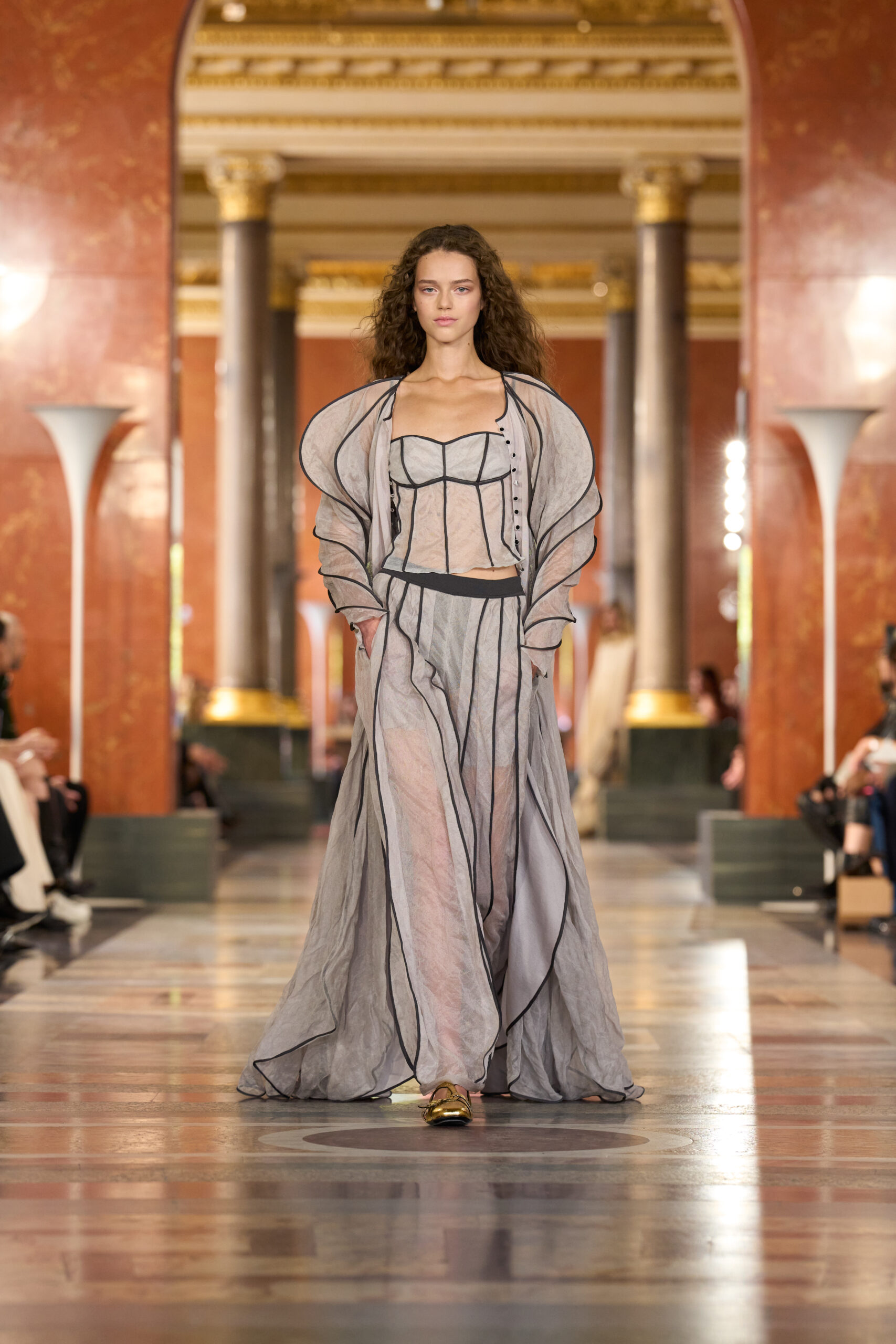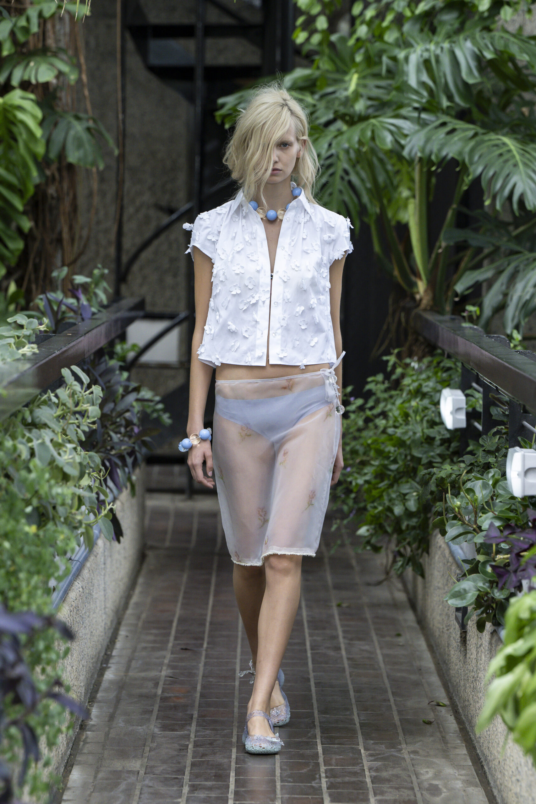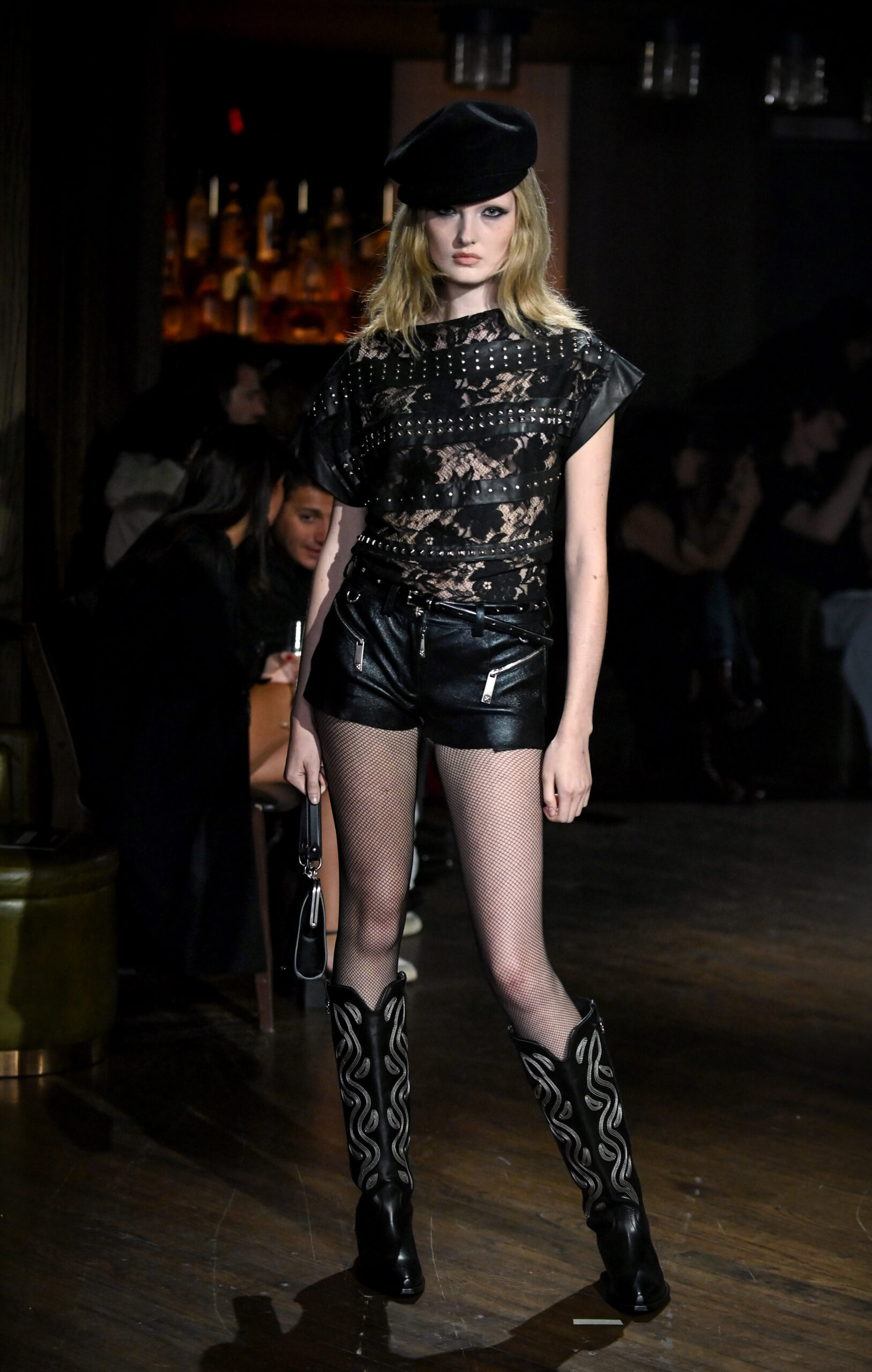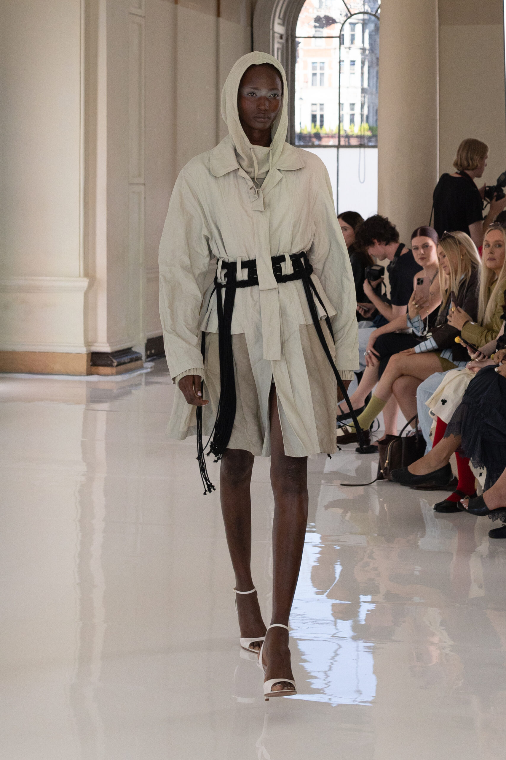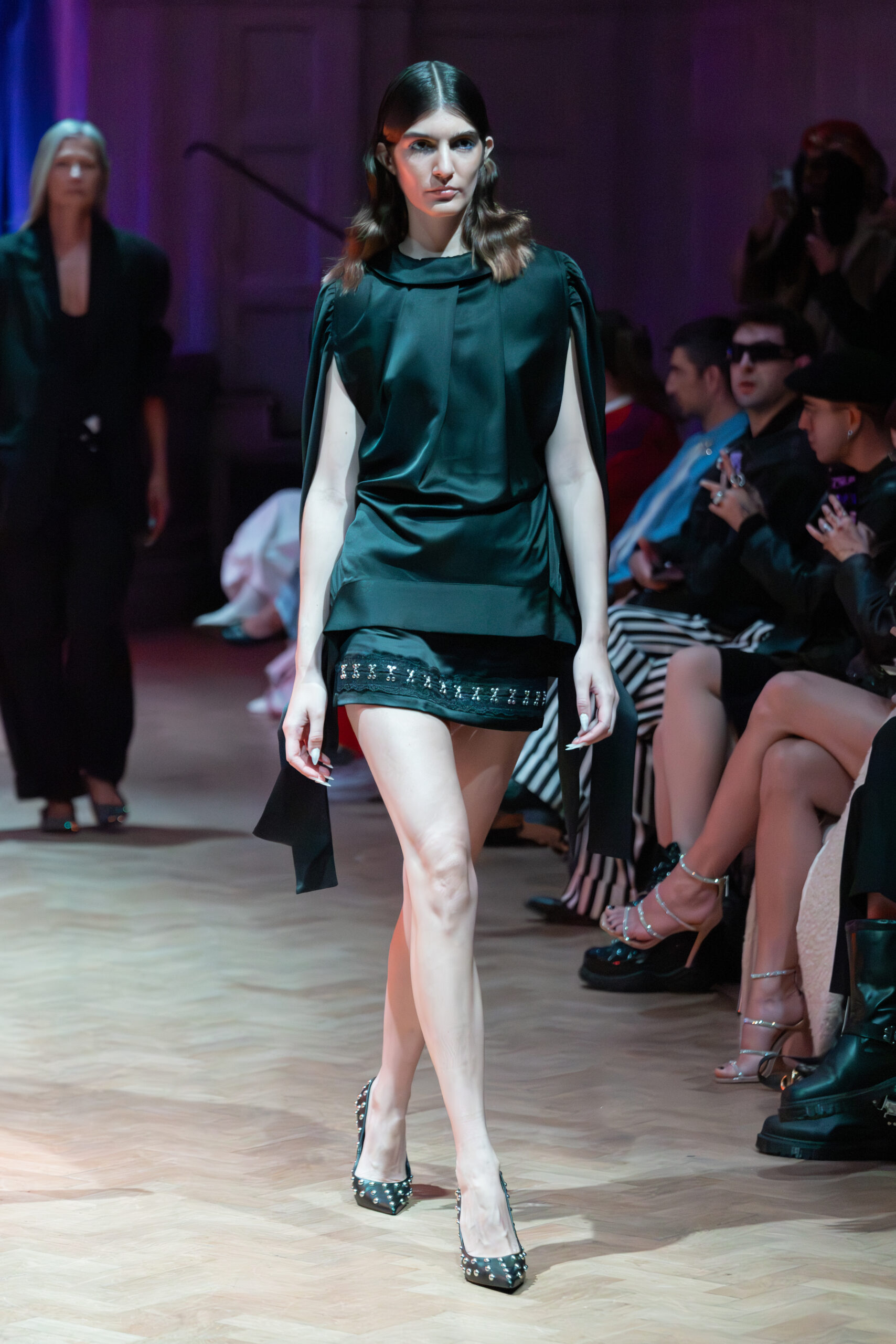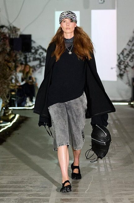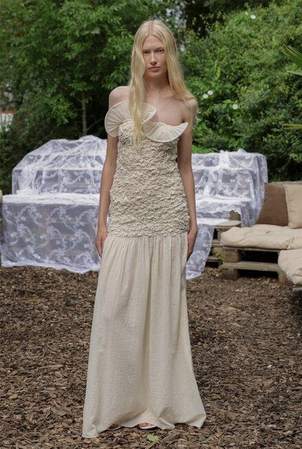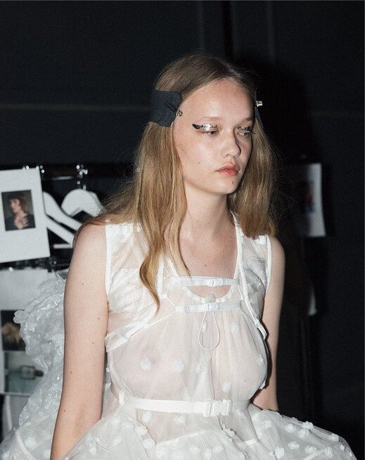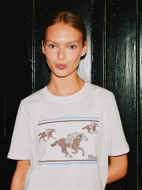
• images courtesy of Jannike Sommar

    Jannike Combines Queerness and Pop Art in 'Popwave'

    Written by Josie McNeill by Josie McNeill

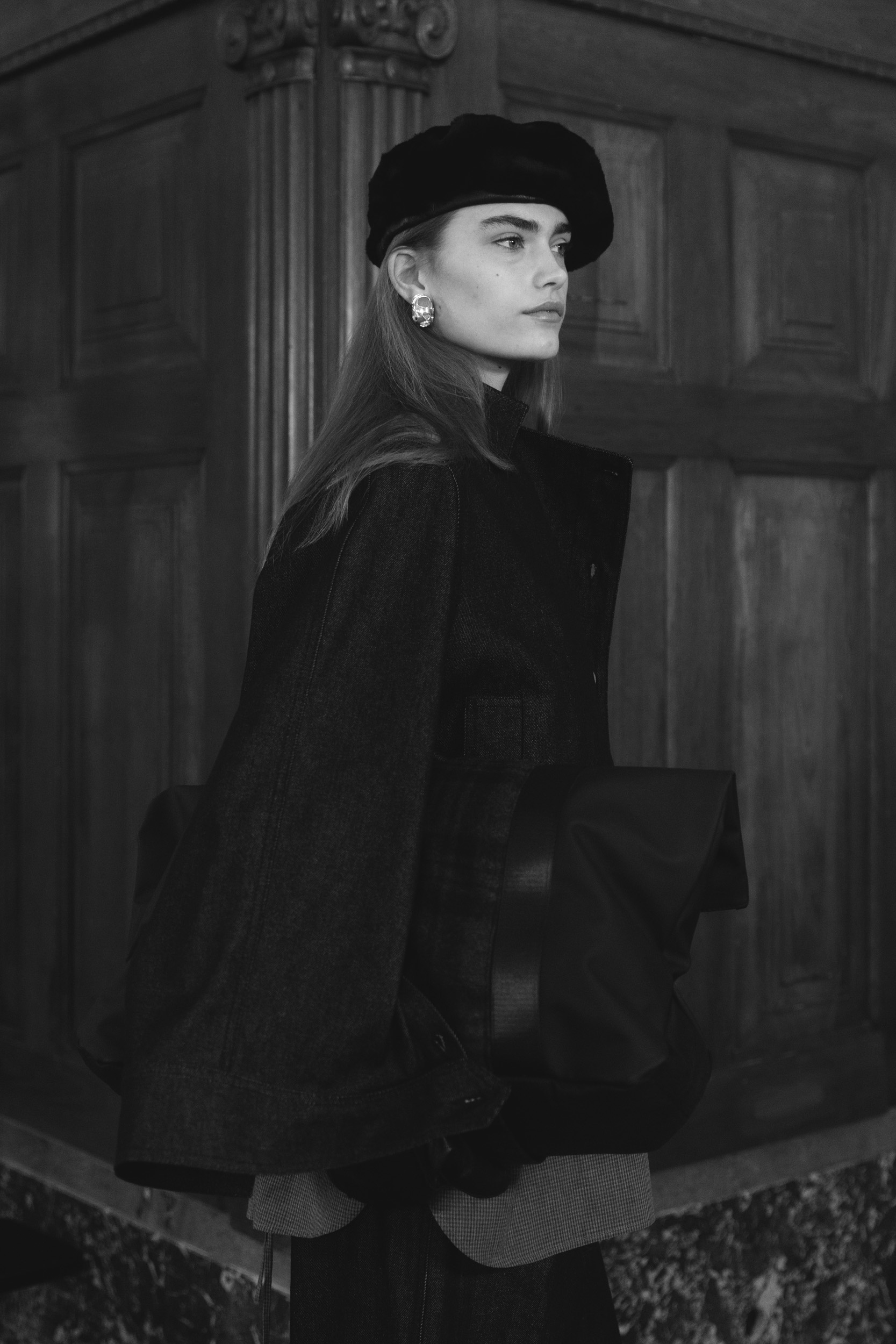
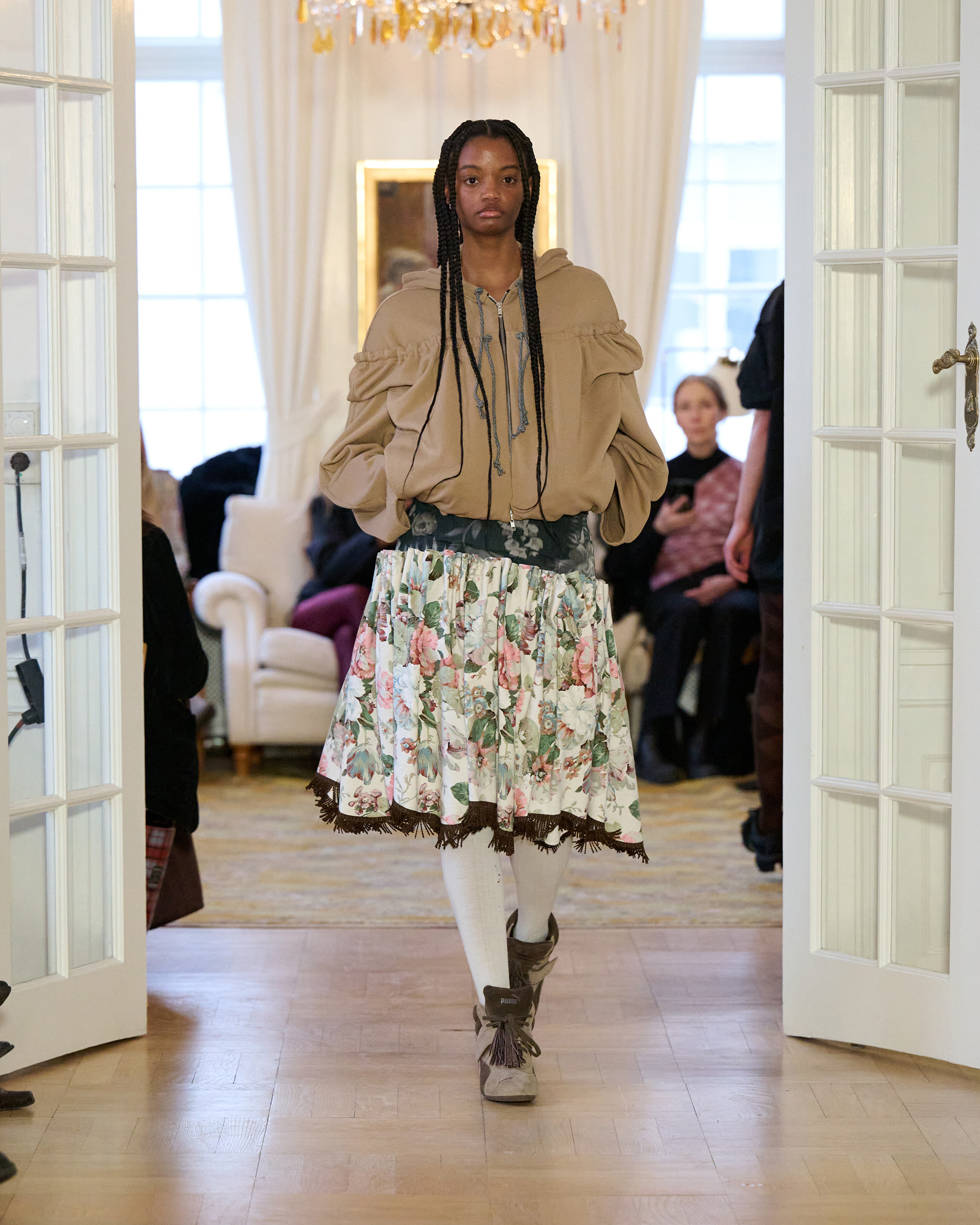
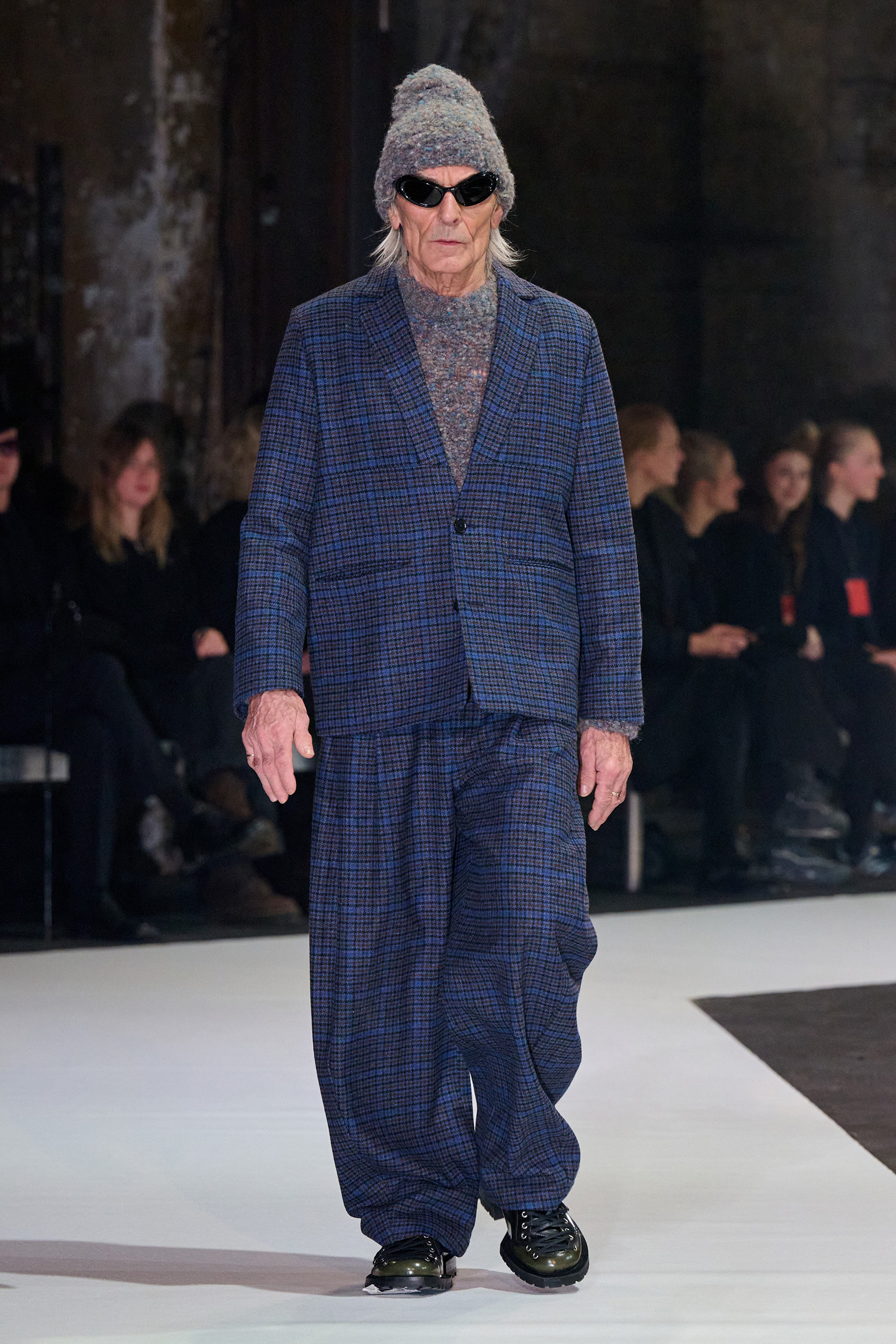
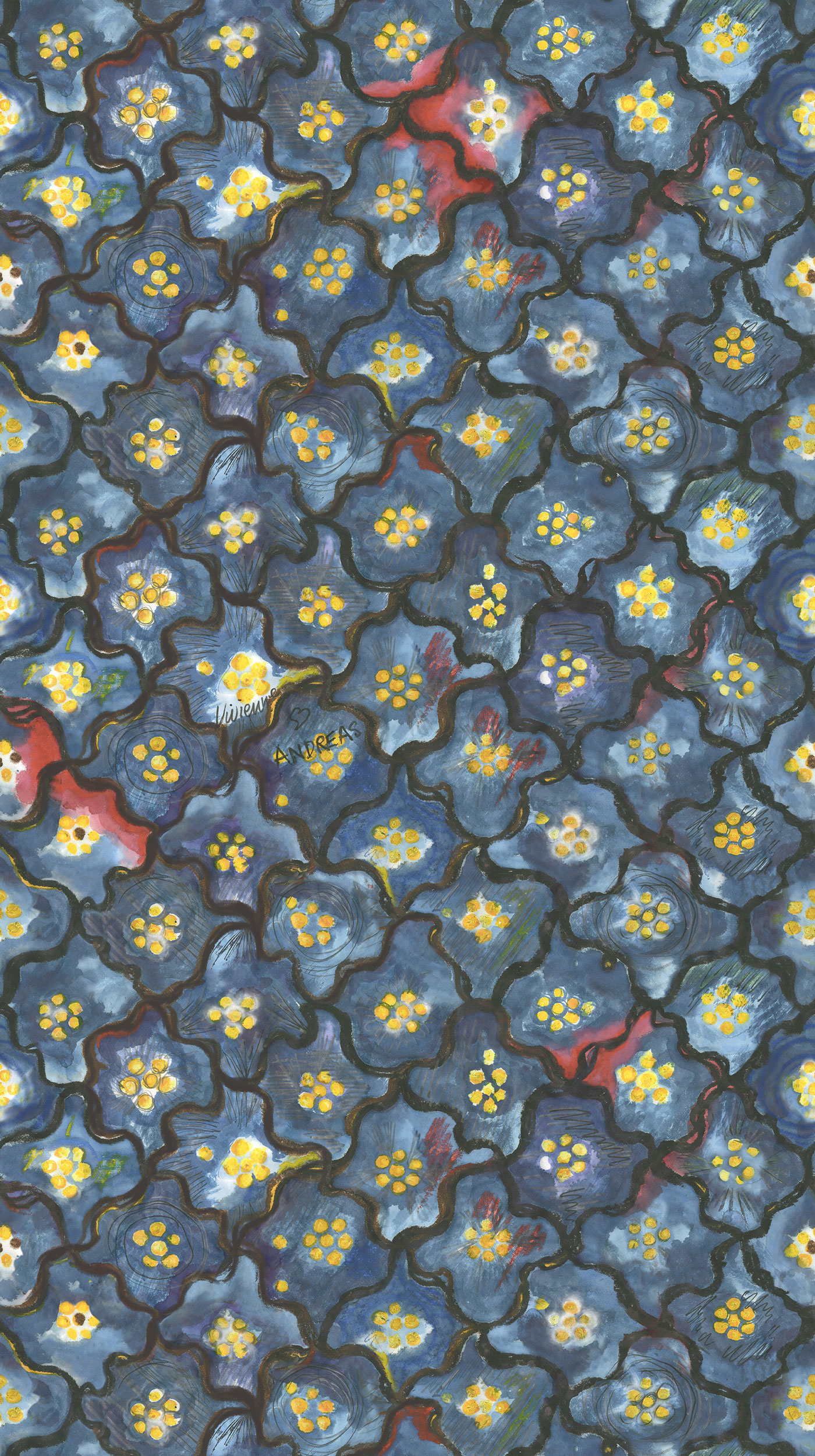
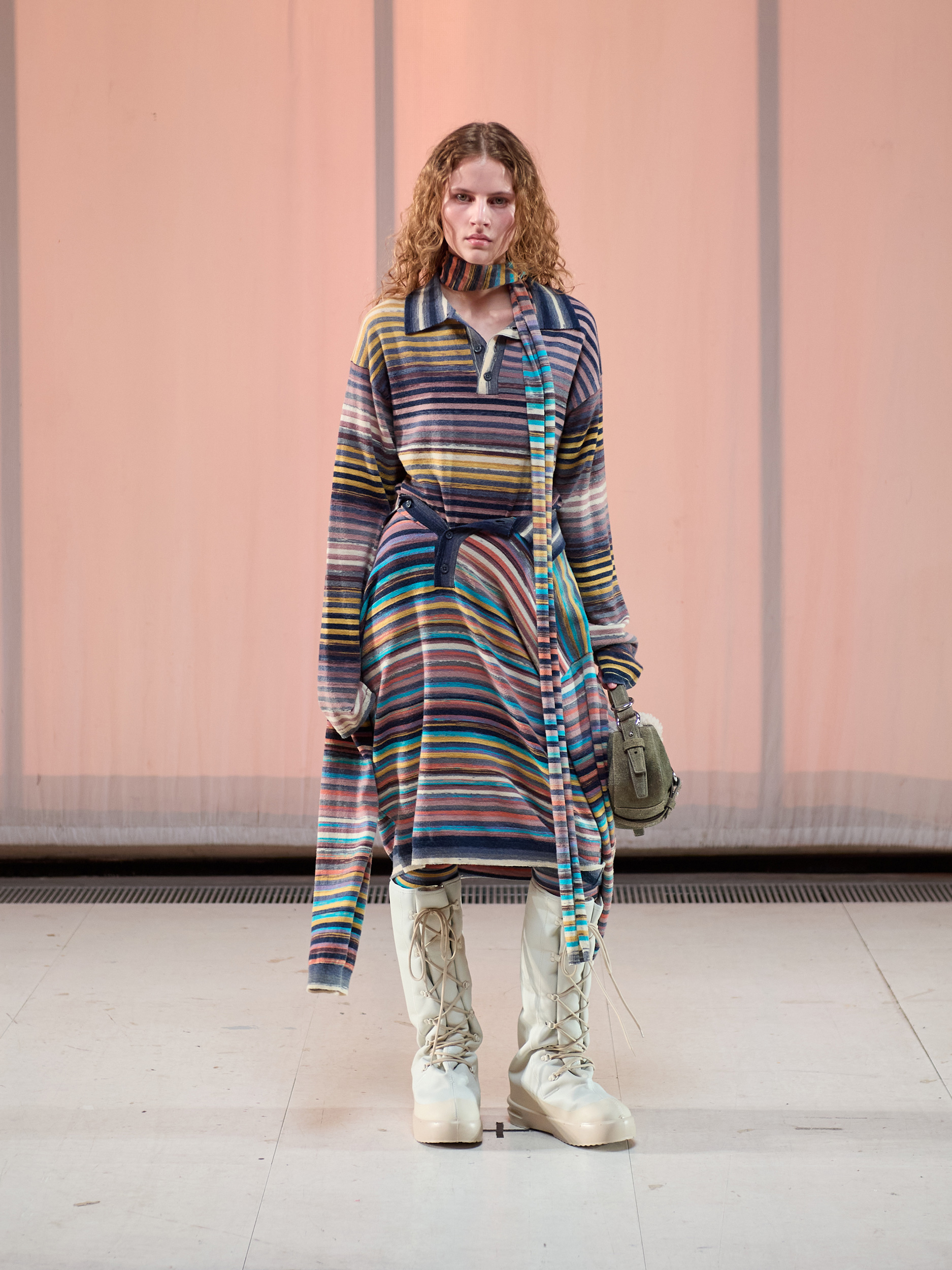
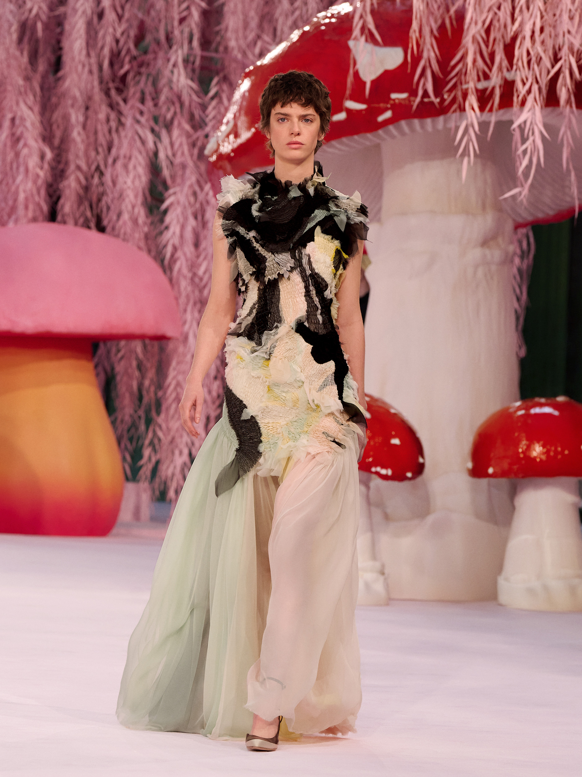
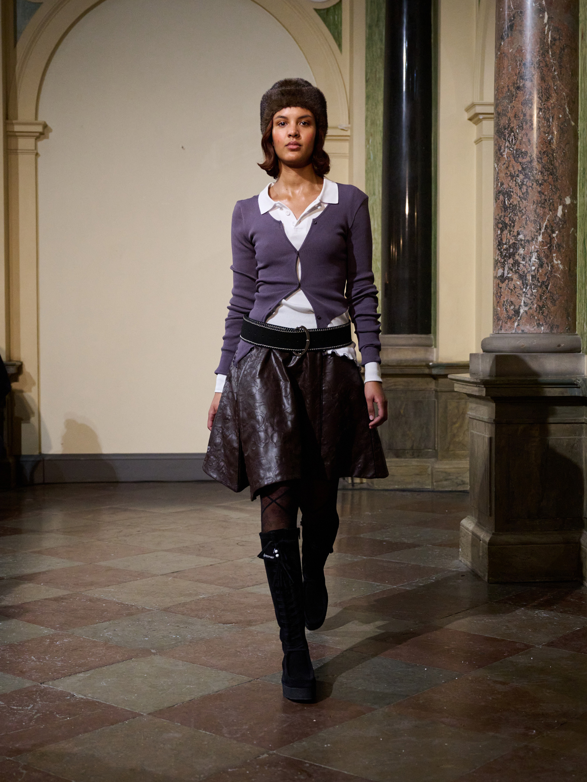
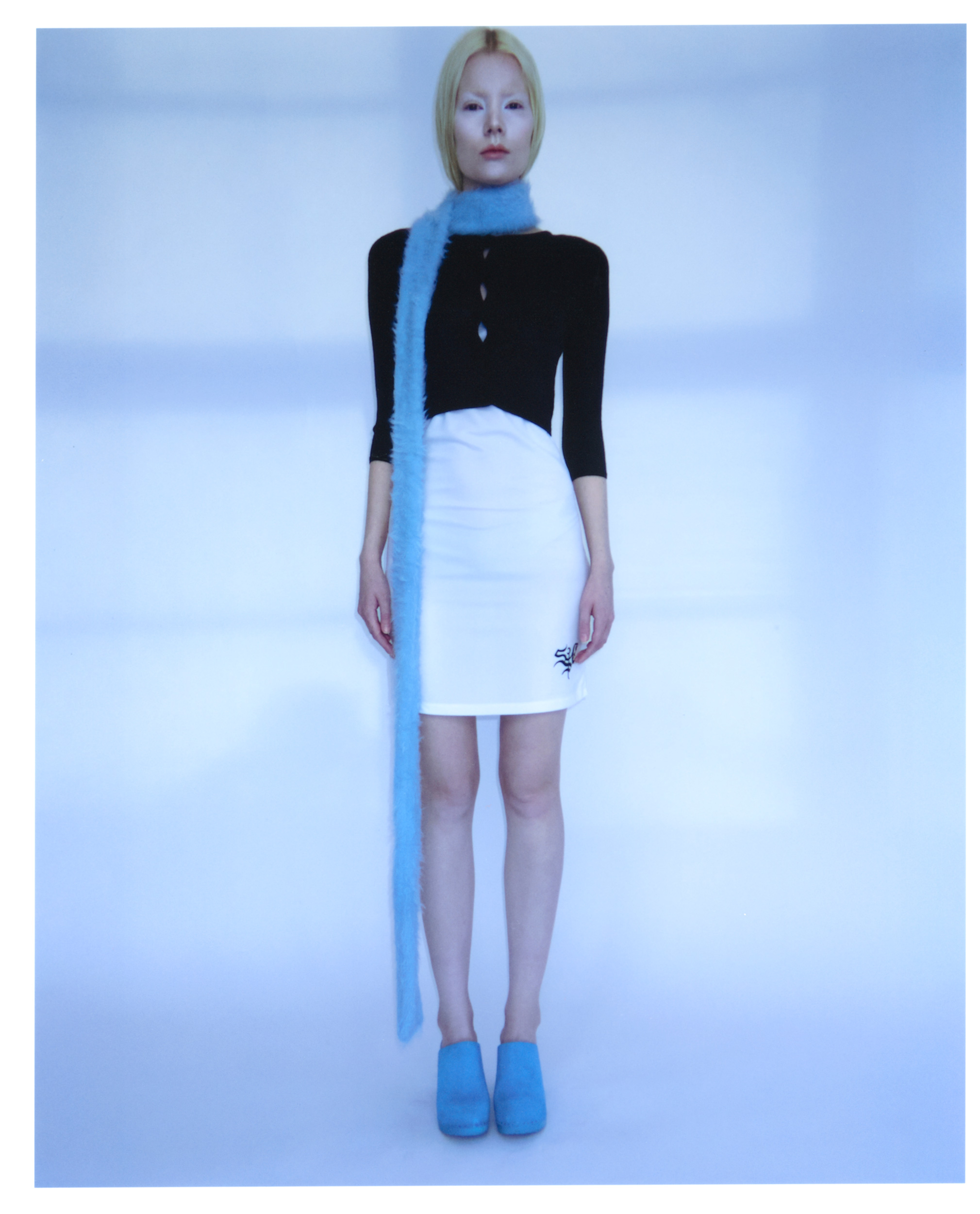
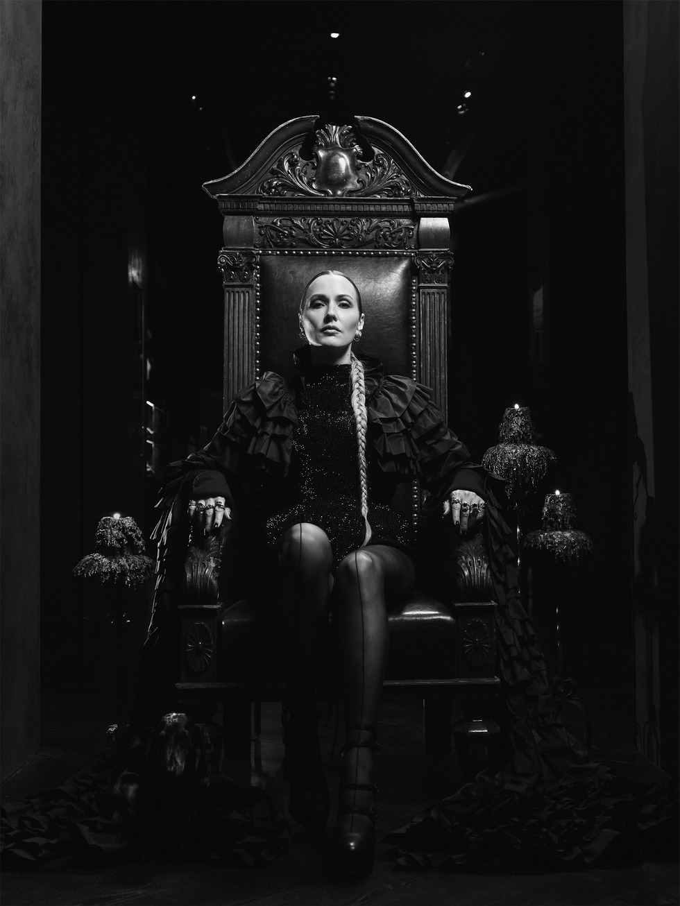
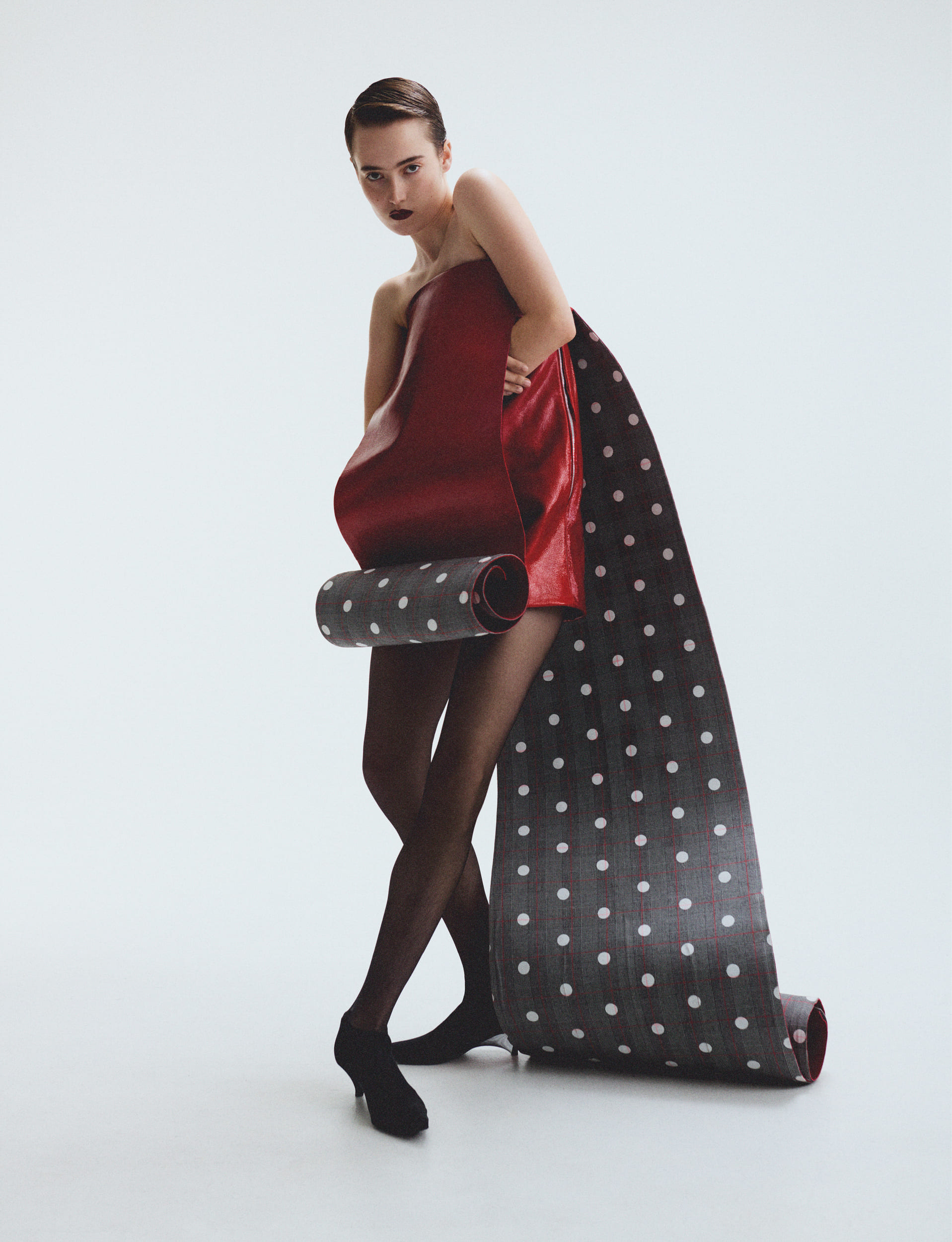
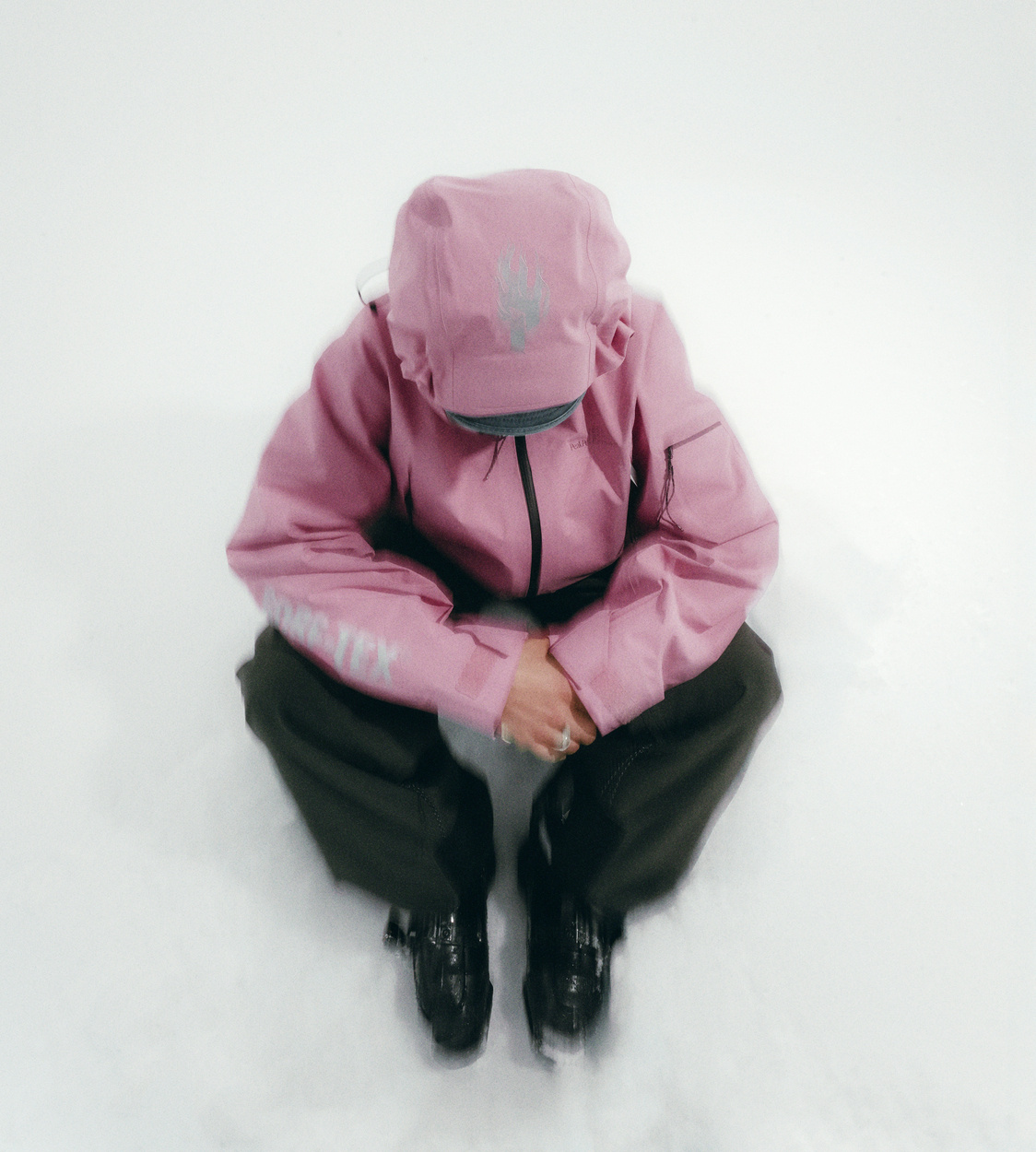
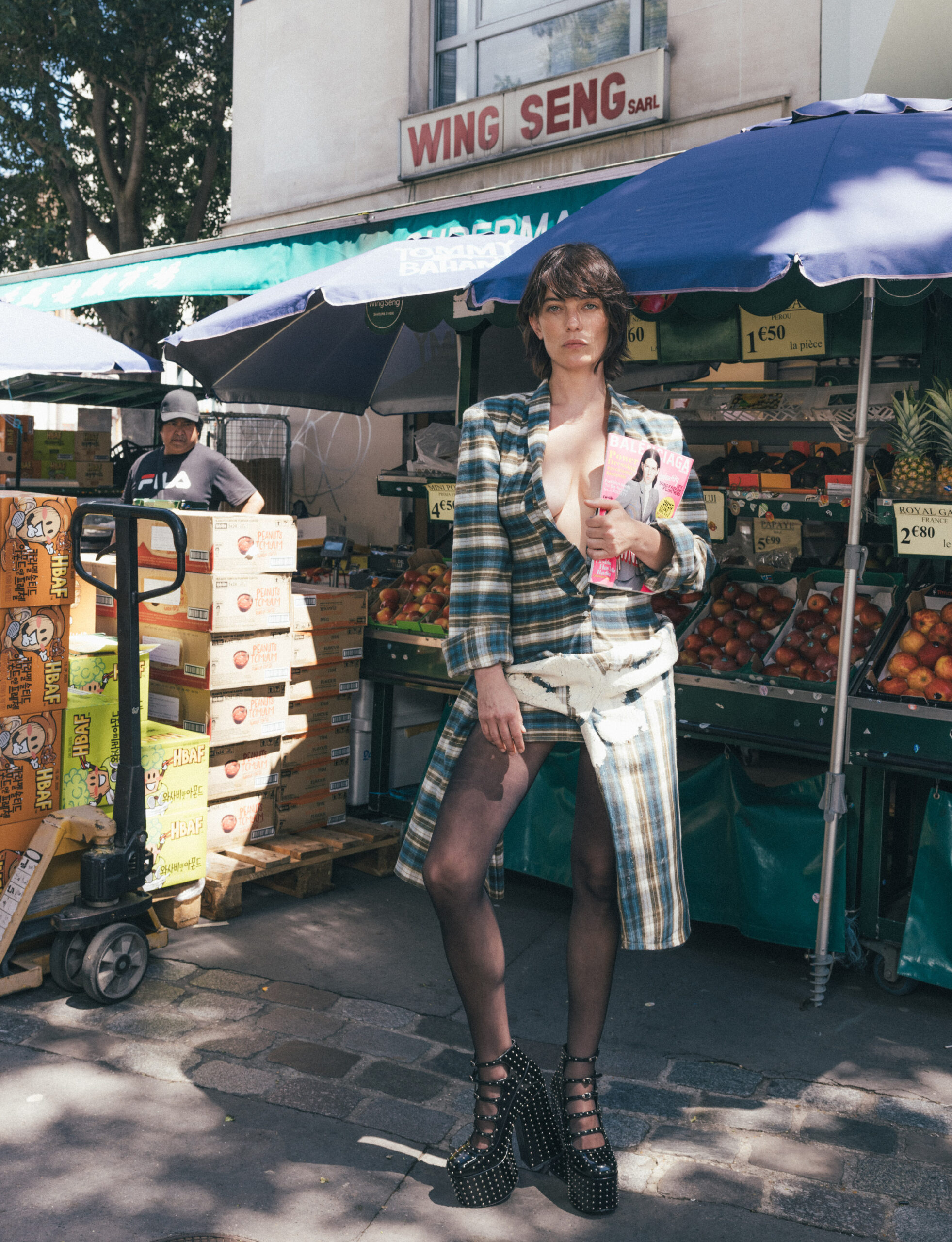
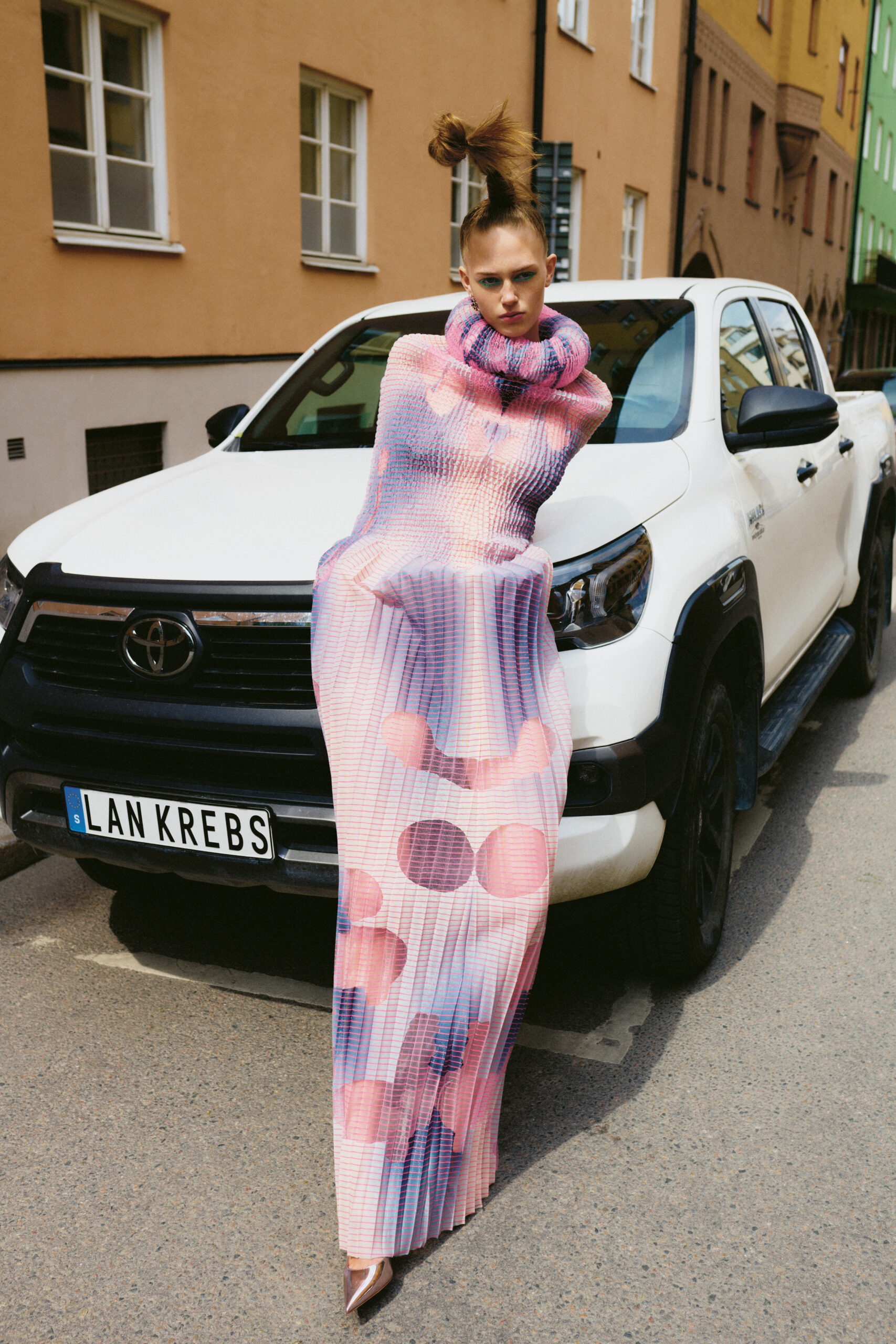
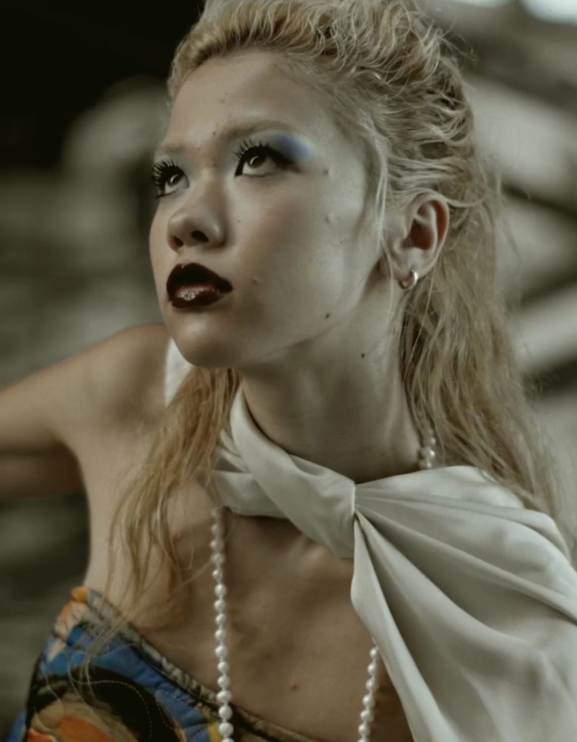
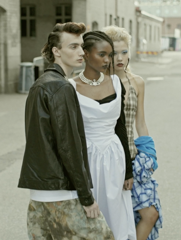
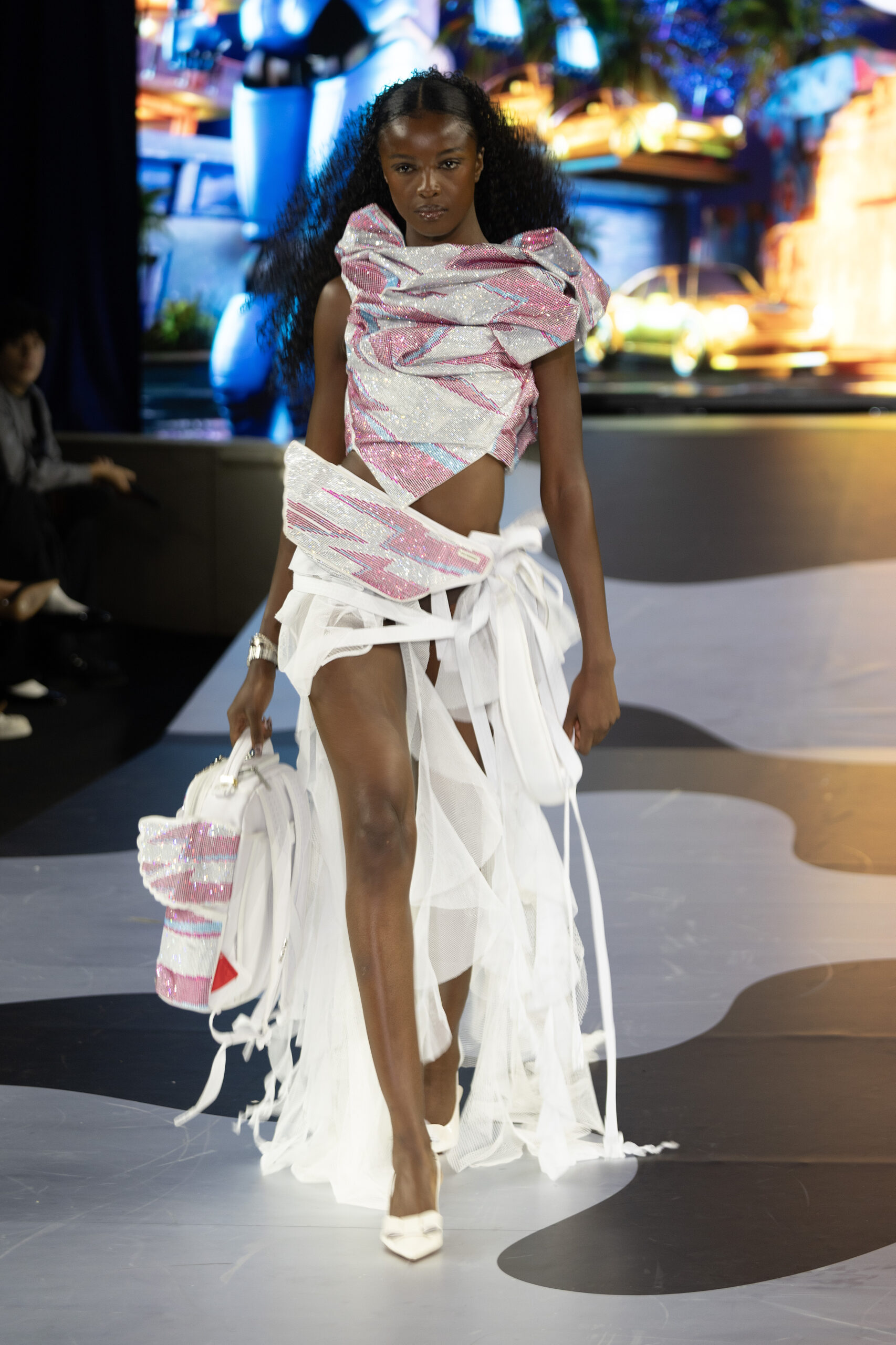
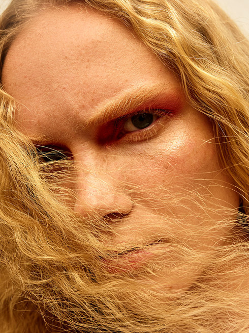
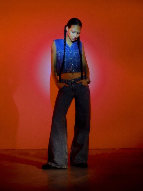
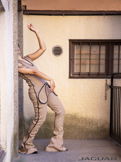
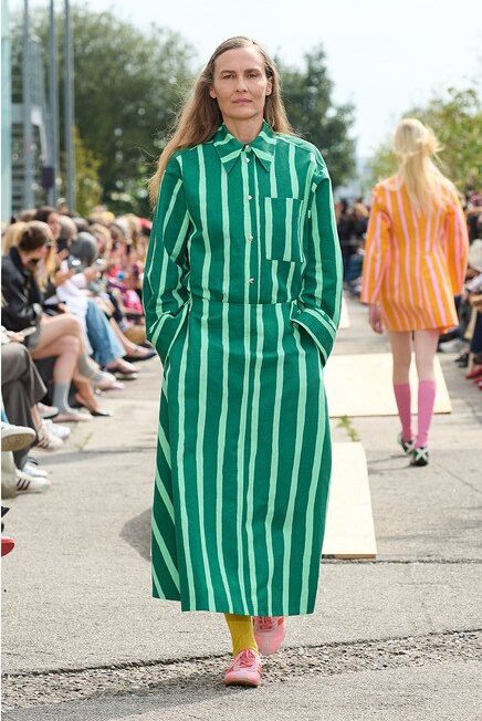
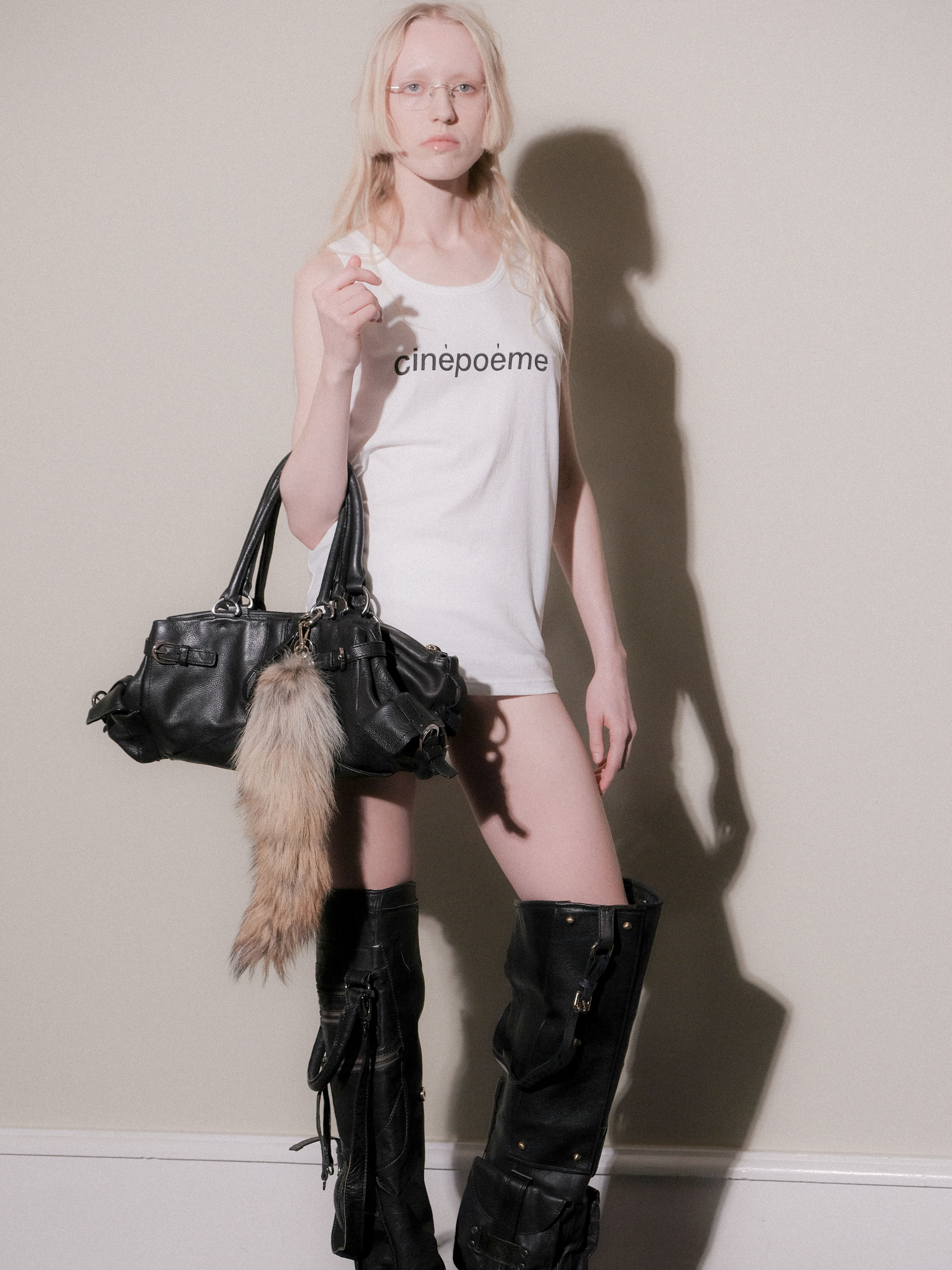
    Drawing from the shapes of Basquiat’s graffiti and the vibrant colors of pop art, Jannike Sommar designs for the bold, the queer, and anyone who is unafraid to express themselves.

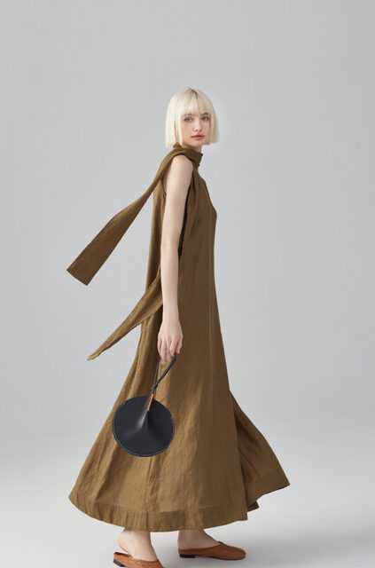
    Jannike's self-titled brand released its latest collection ‘Popwave’ on May 21, 2023. The brand will be showcasing ‘Popwave’ in the park during Stockholm Pride, which lasts from July 31 to August 6.

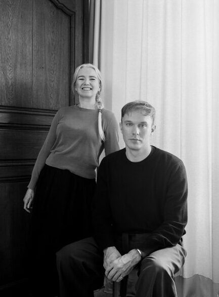
    Jannike was born and raised in Stockholm but currently resided in Paris. They began the Jannike brand alongside their partner Renata Souto after graduating from the Royal Academy of Fine Arts Antwerp in 2016. Renata now acts as both Jannike’s wife, manager, and director of e-commerce. The two work to promote the vibrant clothing that Jannike creates. 

    How did you first build the Jannike brand?
    J: It started a long time ago because ever since I started doing fashion, like when I started to study, I knew I wanted to do my own brand. Then when I did my higher education in Antwerp. I did my bachelor and master in the fine arts. So then I started to develop the idea of what I wanted to start with. I wanted to do this queer brand with this patchwork technique with the pictures I do. I knew I wanted to start with this kind of kissing graphic. So I started school and then I worked for a few years and then we met and then we decided to go for it.

    R: We actually met at Stockholm Pride eight years ago. And one of the first things I noticed when we met, because it was very warm and Jannike had shorts on, I noticed a very gigantic Basquiat tattoo that they have in their legs. Later when we started to date, I went to Antwerp to see her masters collection. Oh my god, her show was a full Basquiat color sensation graphic, very graphic. So I was connecting this universe that they have in their mind, and I started feeling that there was a potential with the brand during COVID. Because during COVID, we had a little more extra time to work on the branding and the products. We started to launch some products as a test, and we felt a lot of traction from the spontaneous media from markets and then we decided to take the risk with our jobs. And now it's been a little time that we are both dedicating fully to the brands.

    What is the inspiration behind your newest collection ‘Popwave’?
    J: It started with the pop star posters from the 80s and 90s. These mainly showed cis-women, so we wanted to take this mood, but put it in our queer universe. To put this pop art in a more non-binary vibe. And then we created these slogans like, “Pop Your Star,” “Gender is a Wave,” “Stay Queer,” just to convey the meaning to express exactly who you are the way you want. Stay queer.

    R: It's pretty much inspired by the pop art posters and the queer community.

    And then what is the importance of this collection surrounding pride?
    R: Visibility. I think not only for this collection, but all our collections and the brand itself. It's a statement for visibility, representativity. Because nowadays, it's still very harsh for the queer community to thrive. So it's really the message of we're here, we're queer. This is pride month, but the brand is bright throughout the whole year, and we need to give visibility to queer people and people who are not afraid to express themselves.

    How would you describe the style of this collection?
    J: Before I did more like hoodies, sweatshirts, and more like loose streetwear. Then I started doing more looks where you can feel a little bit more dressed up. And I got requests from customers that they missed some more tight pieces, and pieces that you can combine for parties maybe or the beach and other suits that you can combine as you like also.

    R: I would say this style of pop wave is the classical Jannike whimsical, pop, colorful pieces but translated to a dressed-up, sexy look.

    And then you kind of mentioned this at the beginning, but the queer kiss is kind of a motif in that collection and your past capsules. So I was wondering if you could talk a little bit about why it's important for you to incorporate this graphic into a lot of your designs?
    J: The core of the brand is like the queer culture and pop art. This is part of my style, the wavy but very graphic, signature style. It's so important that you recognize everything as a Jannike piece, which makes sense to me.

    Do you think there is a connection between queerness and like pop art and graffiti, especially because you mentioned Basquiat, and with figures like Andy Warhol being a pioneer of the street and pop art genre?
    R: Yeah, absolutely. It's about art and arts in general. It's not being conventional in the way of expressing yourself. So it's absolutely connected and we’re very proud that it's actually visible and that you’re mentioning this.

    What was it like dressing Robert Fux for Drag Race Sweden?
    J: It was really a dream. I was extremely happy to get the request because I knew him for who he was for a very long time and I looked up to him and I love what he's doing in drag. I mean so it was really great.  He's such a nice person. It was a very nice collaboration.

    R: Funny story. We are actually based in Paris and Robert Fux is based in Stockholm. So it was a whole process of defining the style, validating the sketches in distance with Zoom calls. We were fitting a friend here in Paris that has a similar body, kind of, so we did fittings, and then Jannike who went to Stockholm to do the fitting of the first one. So it was very challenging, very different, but it was really an honor because it's an artist that we really look up to.

    Are there any other public figures that you'd really love to dress?
    J: Yes. I mean, one queer person I’m very inspired by is Sasha Velour. It would definitely be a dream to get to dress her.

    R: The American drag from Brooklyn.

    You have a very strong and bold aesthetic. Are there any designers that kind of lead you to this aesthetic?
    I mean when I started to study,  there were designers doing more funny fashion like Jeremy Scott. I mean I always looked after him because I love his work. But I really loved what Jeremy Scott did for Moschino.

    You’re from Stockholm but currently based in Paris. What do you think is the biggest difference between the fashion scenes in those two cities?
    J: Stockholm is more basic and more black. I mean, in our world, we live in the queer world, so I feel more free here to express what I want to do. And then in Stockholm today, and the fashion scene there, I don't have too much connection to.

    R: Because in Paris, you have the classic fashion scene, you have Paris Fashion Week, which I don't need to say a word on, but also there is a parallel fashion scene in Paris, which is more underground. It’s not as well known as the British underground fashion scene, but here in Paris, we are very much connected to this underground fashion scene, which is very queer. There is a lot of freedom, and we feel very inspired.  I feel in Stockholm this doesn't exist. It's pretty much toned down. And I think here we get more pushed to disrupt with fashion. This is the biggest difference.

    And then where do you see your designs going in the future?
    J: Yeah, I want to spread the word. I want more people to get to know and to discover the brand because I do notice how happy people get. They really get happy and excited. I want to go global and expand the brand.

  • Levi's 2023 Pride Campaign

    Written by Josie McNeill by Fashion Tales

    In order to celebrate pride month and the LGBTQIA+ community, Levi’s announced its ‘How Do You Show Up’ campaign that encourages people to express themselves and their individuality.

    With this new collection, Levi’s acknowledges that expression is a spectrum, non-binary and fluid. The main color palette of the collection is lavender, which refers back to activist groups in the ’70s and ’80s that drove gay rights movements.

    The same spirit of that era is reflected in the cultural drive in today’s queer and trans youth. Now, they can rock the same color palatte with the Levi's 501® '93 Straight in Light Indigo Destructed and the Radical Love Dress, to the Liberation Trucker Vest and Pride Bucket Hat in Deep Purple.

    From clubs to protests to Pride parades, wherever people gather in love and inclusion, many of them are proudly showing off their Levi's and 501® jeans,” Lance Relicke, Vice President of Global Brand Experience, Levi Strauss & Co, said. “There is a lot of genuine love for Levi's in the LGBTQIA+ community, and we're excited to return that love all the time — but especially during Pride 2023.”

    Levi’s has been a supporter of the LGBTQIA+ community for decades. It became the first major corporation to extend domestic partner benefits to same-sex couples in 1992 and it joined a human rights campaign in 2019 that called upon the United States senate to allow a vote on legislation that would LGBTQIA+ discrimination.

    For this campaign, Levi’s photographed a group of LGBTQIA+ community from all around the world, each with a distinct voice and power in expressing themselves.

  • Mats Gustafson and Ted Muehling's journeys in Reclaiming Beauty

    Written by Natalia Muntean by Ulrika Lindqvist

    “He was wilder than me,” jokes jewellery designer Ted Muehling about his partner referring to Mats Gustafson's spirited early years in New York. “The city was kind of a magnet at that time. People came from everywhere,” continues Swedish illustrator Mats Gustafson about New York in the 70s, when he crossed the Atlantic in search of parties, creative freedom and himself. In the realm of both artistry and love, the influence between two individuals can be a profound and transformative force. In talking with Mats Gustafson and Ted Muehling about their beginnings as artists, their sources of inspiration, and the “Reclaiming Beauty” exhibition, I observed glimpses of this force, along with a strong sense of complicity, respect for each other's work, tenderness and humour. The couple, who have been together since the 90s, are currently showcasing their works in a joint exhibition hosted by Millesgarden, one of Stockholm’s most famous museums.

    Mats Gustafson’s artistic journey began in the late 1970s. While studying set design at Dramatiska Institut, he started doing fashion illustrations on the side. It was H&M that was one of his first collaborations and he considers it to be his proper school. “We’re talking about the late 70s. They were still doing advertising with illustrations and that’s how I learnt to work fast,” he recalls. Since then, he has worked with renowned fashion brands, such as Chanel, Comme des Garcons, Yohji Yamamoto, Svenskt Tenn, Viktor & Rolf and many more. His dedication to creating with his hands and paper has set him apart as an artisan. For the past ten years, Gustafson has collaborated with Dior, creating illustrations for some of the most iconic looks of the French fashion house. “My job is to understand and depict the designer’s work. I want to find the best in it, or what I consider the best, and interpret it,” he says about his work in this world.

    Mats reflects on his transition into exhibiting commercial art, a departure from his usual applied art. This shift presented both a challenge and an opportunity to view his work through a different lens. “Working with applied art or commercial art works very well for me,” says Mats. “I like not having to make up my mind all the time; somebody else decides, and I appreciate that. But I think, at some point, when I had my first show, exhibiting commercial art was an unfamiliar experience. It required me to look at it differently. Is it worth looking at? It’s meant to be consumed, and especially in the fashion world, you know how fast things move.” He recognizes that every exhibition brings something new and unfamiliar. Despite his illustrious career, he confesses, “I’m still learning. I’m still inexperienced.”

    The AIDS epidemic represented another major turning point for his art. It influenced his desire to create more portraits and explore themes of intimacy, homosexuality, and death as a way to deal with the crisis. Amidst his enjoyment of fashion-related work, he recognised the need to delve deeper and convey more profound themes. It was during this period that he gravitated towards nudes as a means of artistic expression. “My first work out of fashion was to do nudes,” he reveals. Stripping away the clothes allowed him to embark on a new artistic path. Nudes, for him, represented the most fundamental subject to depict, opening the door to exploring other classical themes such as nature and interiors and this shift marked a transformative period in his creative evolution.

    Always having nature as a starting point, Ted Muehling has created jewellery and objects inspired by nature since 1976. With a major in industrial design, he was drawn to the poetic and artistic side of making functional objects. While many of his classmates were venturing into car and appliance design, Muehling had a different vision. “I preferred creating beautiful shapes that you can hold and touch,” he shared. Despite not taking a specific jewellery class, Muehling’s talent caught the attention of the head of his department, who allowed him to focus on live drawing instead of automotive designs. “He was very generous in giving me the freedom to choose interesting subjects,” Muehling reflected. He embraced a hands-on approach, working directly with the materials to truly understand their potential. “I always think architects should build a house before using a computer, just like they build a structure,” Muehling mused, highlighting the importance of hands-on exploration. He found great joy in experimenting with materials, especially in the realm of jewellery, and acknowledged the serendipitous moments that arise from such exploration. “You see what it does, and then you think, ‘Oh, that’s a good direction.’ It keeps feeding you surprising elements,” he added. The first piece he created is part of the Reclaiming Beauty exhibition and was inspired by Gingko trees found in New York. Their bright yellow leaves adorned the streets during autumn, forming captivating shapes. “I tried to interpret this shape, which could resemble a fishtail, using a long stone and created a pin hair,” he shared. Since then, Muehling has cultivated a niche following that appreciates the authenticity and simplicity his designs embody. “We represent a quieter, more authentic life,” he asserts. He describes his customers as smart women who avoid status trappings and materialism. Their search is for something deeper, a connection to their essence. Muehling's creative journey is not just about aesthetics; it's about balance and harmony. “The jewellery I create should be a subtle punctuation mark, an intriguing little movement, as a dear friend of mine describes it. It shouldn't overpower or overwhelm. Finding the balance between too much and too little can be challenging, but it's essential,” he tells me.
    Muehling's path to success has been a gradual one, spanning nearly five decades. From having a few assistants to a team of 11 dedicated individuals, he has crafted a business that supports and nurtures its members. “I feel lucky to do what I love with such wonderful people,” he says.
    Mats Gustafson and Ted Muehling’s connection transcends beyond creative collaboration. The pair met in New York after Gustafson moved there in the 70s in search of parties, creative freedom and himself.

    The fascination with nature has remained a pillar of Muehling’s artistic journey and has become a significant part of the pair’s relationship. Nestled in the picturesque landscape of Eastern Long Island, Mats’ country house serves as a sanctuary where their creativity and creative spirits intertwine. Gustafson’s artistic vision is profoundly affected by their natural surroundings. Gustafson and Muehling’s shared experiences in this idyllic setting foster a sense of childlike wonder, capturing moments of joy and wonder. As Muehling explains, “Sometimes, there will be a tortoise walking across the lawn, and there are no turtles in Scandinavia. He gets excited and we’re like children! We’re taking pictures of it, we’re loving it, so it brings out a kind of joy.”

    As the years pass, both have felt a longing to reconnect with the nature of their youth. “The fir trees, for example, are iconic for Northern people. They are calm and a symbol of nature for us. It’s a sort of longing, a strong feeling. I am sentimental,” says Gustafson.

    Muehling reflects on New York’s bustling energy, a vibrant hub of creativity that once captivated them, but, as time passes, the allure of trendy restaurants and cultural events loses its lustre. Instead, they find solace in nature, a place where they can be truly present and awestruck by its beauty. Mats humorously admits,  “I didn’t come to New York for nature or solace, I went there to party! The nightclubs were my solace.” For Muehling, New York has always been fun, and creative, but it’s a very fast-paced place. “As you age, you don’t care about the next trendy restaurant or taking in all the culture and shows because it’s overwhelming. Instead, you find solace in nature and can be wowed or awed by walking by the sea,” he adds.

    Curious about the exhibition’s title, I ask what beauty means to them. They tell me that the concept of beauty holds immense significance, both in their artistic endeavours and in their appreciation of the world around them. Gustafson sees beauty as a multifaceted subject, manifesting itself in nature, fashion, and the artificial. He notes, “Fashion is not necessarily just about beauty, but it’s also something artificial. The beauty we talk about here is the beauty that surrounds us in nature, and it’s a fascinating system of beauty that exists.” Muehling agrees and finds parallels between the appreciation of beauty in the fashion world and the awe-inspiring experiences found in observing natural phenomena. “A beautiful person walks in the room, and everybody smiles. I think we can have the same experience in watching the birds in the country and going to the ocean,” he says. While acknowledging the broad scope of beauty, Gustafson and Muehling reveal their shared aspiration to create works that are not only interesting or strong but also undeniably beautiful because they are interested in beauty’s power to evoke profound emotions and admiration, “If someone says, ‘Oh, that’s beautiful,’ that is the most satisfying compliment we can have,” says Mats. They mention the contemporary tendency to embrace unconventional and sometimes unappealing aesthetics. “We're not afraid to express beauty. There's this tendency in art and design to be a little ironic, a little edgy. But in reality, we're softies. Maybe we're more attracted to the traditional idea of beauty. We still want to surprise sometimes, and challenge expectations. It's the simplicity of what can be beautiful. For example, an earring can be just a wire that varies in thickness. I prefer to do things that haven't been done before,” Muehling says.

    Discussing the source of their inspiration, Mats and Muehling emphasise the significance of observing and appreciating the subtle beauty found in everyday life. Muehling describes the importance of keeping the inner child alive, marvelling at the intricate details of simple elements like seaweed or botanical plants and interpreting it in a different material, gold, bronze, or fabric, embroidery. Both artists find inspiration in the intricate details and shapes of the natural world, translating them into their respective art forms.

    How do they keep their inner children alert, I wonder? Gustafson admits he doesn’t have a definitive answer to how to do it, but he is convinced it is key to creativity. Muehling emphasises the importance of maintaining curiosity and joy, stating, “If you can maintain that curiosity, it’s key to living a creative life.” Appreciating the beauty that surrounds them and relinquishing annoyance with age are essential elements in embracing a creative and fulfilling existence they tell me.

    Usually kept separate, the exhibition brings together their works side by side, revealing the red thread that is the solace and inspiration they both find in nature, with fashion illustrations complementing seashell installations, while cabinets filled with curiosities stand alongside delicate yet intricate nudes. “Reclaiming Beauty” is not just an exhibition; it is a profound exploration of the ever-present beauty that surrounds us and an invitation to observe the world with childlike wonder as Gustafson poignantly remarks, “I look for beauty in everything.”

    All photos courtesy of Millesgården 

Pages